
A great book cover idea may get you a reader for life.
But a poorly designed book cover may never capture anyone’s attention.
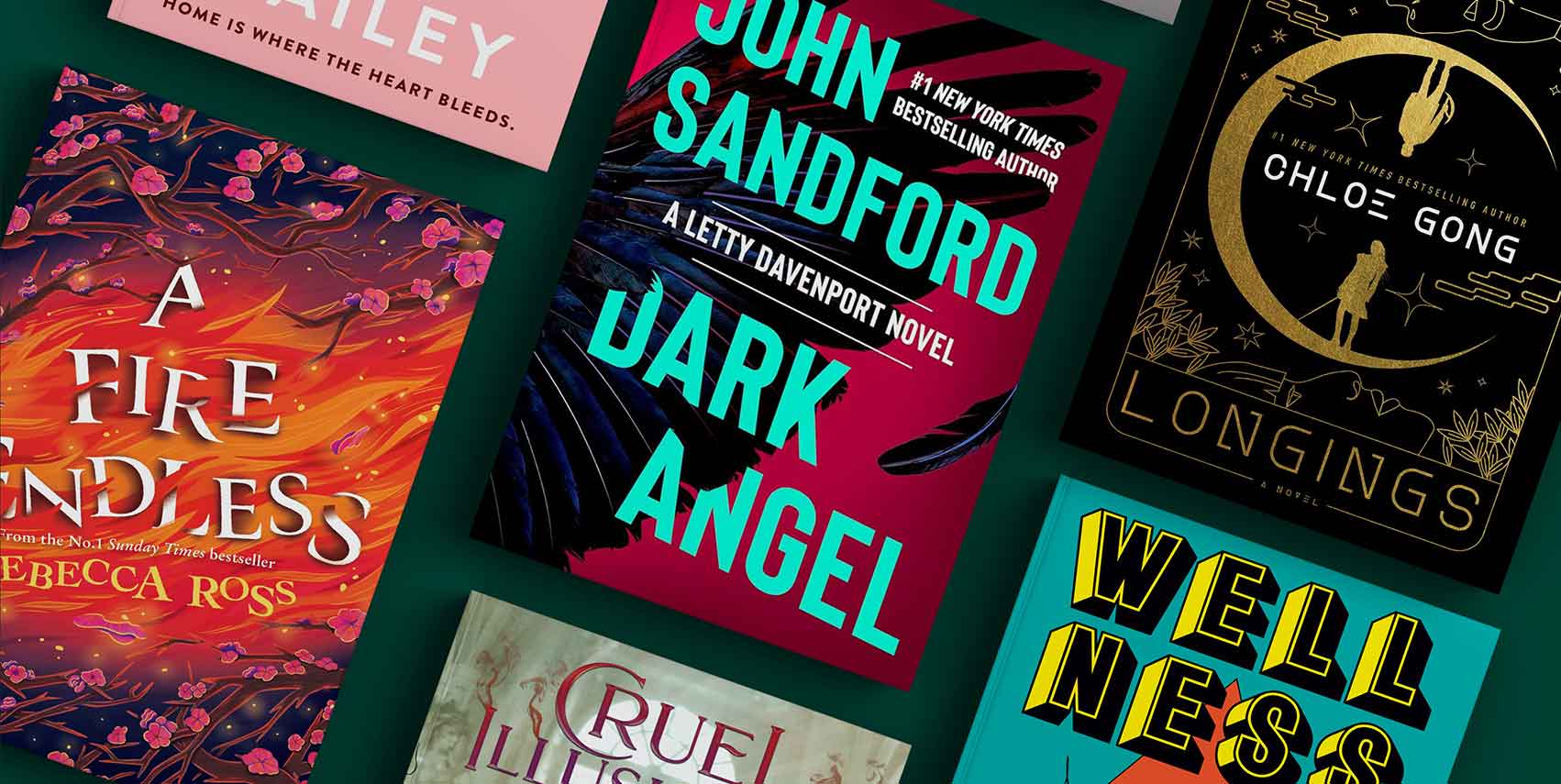
This is because everybody judges a book by its cover.
Not only can it intrigue your target reader. But, it can also be used as part of your author marketing.
You can use it as the main focus in your book trailer or you can use it as a guide to building your author website or website for a book you’ve written.
But a successful front cover doesn’t just appear out of thin air. You need a solid book cover idea.
And if you’re all out of good ideas, you’re in the right place.
Why Book Covers Matter
Your book cover is your first attempt at telling your book’s story. The colors, images, illustrations, fonts, and arrangement will give the reader an inkling of what your book is about, without giving away too much.
If the cover grips them, they’ll flip it over to read the book blurb. if that entices them, they’ll start reading the first chapter to see if they like the writing.
Bad book cover design will confuse your target readers, making them think the book is not for them.
Or worse they won’t even notice your book at all.
Starting with the right cover (or redesigning a bad one) is the quickest route to improving your book sales. So, keep reading if you want to find out how to grab readers’ attention with good book cover design ideas.
A Quick Lesson in Book Cover Design
We design beautiful websites for authors so we know a thing or two about creating something with the right atmosphere for target readers.
So, here’s our two cents on book covers:
If you scroll online or take a stroll through a bookstore, you’ll start to notice a pattern with certain genres or all books in general.
There are book cover design rules you can follow to make sure your book cover looks professional and appealing.
But you are allowed to break the rules from time to time in order to make something stand above the rest. But understanding the rules first is how you learn to break them without paying the price of low book sales.
Typography
Typography is something that could make or break the design. It needs to be legible while conveying different atmospheres for genres.
Holly Gramazio’s Husbands aptly conveys the theme and concept of the book – husbands showing up in her apartment even though she’s never met them before.
The letters stumble out of the attic clumsily, yet crystal clear to read.

Composition
A book cover idea can be good, but execution can be poor.
How you arrange the elements on your book cover determines how effective they are.
You may have heard of the rule of thirds for photography, and it definitely works for book cover ideas too.
In The Lost Bookshop below, there are 3 main points on the grid, so to speak: the top has the focal image, the middle has the book title, and the bottom has the author’s name.

Contrast
The colors and textures you choose for your book cover idea can help guide the potential reader toward a certain emotion.
For example:
- Dark, low contrasting colors give off a feeling of danger or fear.
- An accent color creates a focal point for readers to pay attention to.
- Deep colors with high contrast can give off the feeling that a dark story lies behind the book cover idea.
Christopher Paolini’s To Sleep in A Sea of Stars creates contrast with dark outer edges encapsulating a sea-blue focal point.
This connects the similarities between the sea and space, showing how what you can see is vivid, but beyond that is unknown.

Balance
Just as you arranged your book cover idea in composition, it needs to feel balanced or otherwise it will be overwhelming to look at.
There are pretty easy examples with minimal design and a clear rule of thirds shown, so we wanted to use a more complex book cover: Haven Fall by Sara Holland.
The different colors, elements, and imagery can be an overload for the reader, but because a clear midway point balances it, the reader can move their eyes from the graphic to the title with ease.
The text exists on top of plain backgrounds to create equilibrium.

How To Come Up With Book Cover Ideas
You’ve had your crash course in book cover design, now we’re going to help you find inspiration for your book cover idea.
Book’s Theme
There should be some correlation between your book cover and your book’s main concept. That way a person can somewhat have an idea if the book would interest them just by looking at it.
We love James Maxwell’s A Search For Starlight for this example. Characters stand dead center inside a star-shaped light that trails to the top of the page. The smaller stars and intertwining orange strokes are subtle and impactful.

Branding
Your book cover idea should honor your author branding while still having some individuality.
With the examples we have below, the author’s name is large and distinct – they’re the main selling point!
But let’s consider A Court Of Mist And Fury – from a popular series. Besides the author being prolific, the design and typography are unmistakable. When a new book is released, you know which series it’s part of without a second thought.


Emotive
Your book cover should make your reader feel something. What they feel depends on the genre, of course. But it should evoke a certain emotion once they lay their eyes on it.
In the House of Hollow, there are cleverly placed elements on top of the main focus of the cover to evoke emotion from the reader.
The expression on the face is somewhere between curious and afraid. There are subtle droplets and what looks like little creatures crawling on her face. This adds dimension to the already stunning design.

Big or Small
You could have the perfect book cover art but it will mean nothing if it can’t be viewed as a thumbnail.
When readers browse online on Amazon or Goodreads, your book cover will be minimized, so you need to make sure it’s easy to see in all sizes.
John Green’s The Fault In Our Stars is an excellent example because the 2 most important elements stand out in every size: His name and the title.
Around the clouds, when you’re able to see it in a bigger size, you’ll notice subtle writing that further convinces you to buy the book – but it isn’t vital information for the thumbnail.
Note that although for most indie authors, your name may not be the selling point, so keep that in mind!

Trends
Just like with fashion, there are trends for book covers.
They come and go and resurface after a few years, just like fashion, and they can help you boost book sales if you pay attention to common designs in your genre.
We’re sure you’ve noticed the common design of some romance books, as seen below for Check & Mate and Wildfire. The cartoon and bright-colored backgrounds are staples for romance at the moment.
Consider your genre and see what other authors are up to and if it suits your book.


Book Cover Ideas You Can Steal
If you’re still lost for ideas, you can borrow some design elements for your book cover inspiration below.
Obviously, it will look different for you, but having a mood board of what you’d like yours to look like will help the mental cogs turn.
Dimension
Adding 3D elements will give your book that wow factor that will not only attract readers but also have them stare at your cover in wonderment.
Hell Bent by Leigh Bardugo uses a slightly grotesque image of a rat through the title to make it feel like it’s an actual creature lying on top of the cover. It’s emotive and gives it texture.

Illustration
Sometimes if the cover is pretty, it’s enough for the reader to click buy. Who doesn’t love a pretty book?
All This Time is a cool book cover. It’s gorgeous to look at with the moody colors, plus it’s also shaped into an hourglass – which suits the title. It would look great on your bookshelf, don’t you reckon?

Imagery
Book covers matter because a picture is worth a thousand words, so choose your imagery wisely! You can use images to get a creative book cover idea.
My Darling Girl sounds endearing on its own, but with the image used on the book cover, it comes off as ominous. There’s more going on here that feels haunting or traumatic.

Minimalist
Sometimes a simple book cover idea is all that you need. Using contrasting colors and images can convey your book’s message while still intriguing your reader.
Blackout does this well by using a slider used on phones as the focal point on top of an all-black background. The main message comes through seamlessly.

Fantasy
There are many subgenres within fantasy, and following the rules for those will make sure your target reader spots your book from a mile away.
One Dark Window is a goth fantasy novel that’s aptly displayed with smokey skies and darkened elements.

Romance
There are many different vibes and genres within Romance, so picking your colors, elements, and fonts carefully will attract your ideal reader.
Happy Place is bright and vivacious, following a key trend with romance books in this genre.

Sci-Fi
Spaceships, astronauts, scientists, and ominous atmospheres will get you a sci-fi atmosphere.
A planet-looking structure on the left and deep outer space on the right create a successful contrast that amplifies the stakes of Andy Weir’s Project Hail Mary.
The astronaut looks like he’s about to be lost in space, probably needs a Hail Mary type of plan, right?

Thriller
You have to thrill with your book cover idea here, pun intended. An illustration, image, or graphic can create a tense atmosphere that draws the reader in.
Outsider by Stephen King doesn’t hold back the punches with the gritty, spooky book cover design. An upside-down creature-man has red eyes, and the font is sharp and menacing. This guy definitely doesn’t belong inside.

Children
Children’s books are probably the most fun to look at, because of the childlike wonder you once had, and the beautiful illustrations on them.
Where the Sidewalk Ends creates intrigue with black illustrations over a white background, a signature of Shel Silverstein.
Characters are enraptured with what’s below the end of the sidewalk. Kids and adults alike will be fascinated by this.

Non-Fiction
There are many different genres within non-fiction, so it’s important to watch both the trends and common practices in the subgenre.
Then you have to figure out how to stand out – because non-fiction doesn’t have to mean boring imagery!
Four Lost Cities does this well as it gives the reader a glimpse of the cities separated by white banners filled with smaller text. It gives each city its own space giving the text room to breathe.

Spine
The design of your book’s spine is just as important as front cover ideas or the back cover of a book. When a reader goes to a bookstore, they’re likely to only see the spine because of how they’re stacked on the shelves.
The Folk of The Air series has a distinctive font with a small graphic from the front cover to help readers identify it. The size of the font is great for spotting it from a distance in the bookshop too.

Beyond Book Cover Ideas…
Coming up with book cover ideas can be both fun and overwhelming because unless you have design skills, it’s a lot to do on your own!
So, it makes sense if you hire a professional to help you out.
But we hate to break it to you…your book cover idea is just one vital part of the cog in the book marketing machine. You also have to make sure you have a fabulous space online to help readers find your work.
But you don’t have to do this on your own either…
An author website is a great place to display your newly released books and all of your other works for readers and publishing professionals to find easily.
If you need help with this, it’s what we do! Ready to take the next step? Fill in this inquiry form and we’ll be happy to help!

 31")

 33")


