Are you tired of plain and boring thriller author websites?
Are you looking for something suspenseful that keeps you on the edge of your seat?
Or maybe you’re just looking for some ideas for your thriller author website?
Well here is a list of the 23 best thriller author websites we could find.
But why trust us?
At Rocket Expansion, we’ve built 100+ high-performing author websites that do more than just look good—they help authors sell more books, grow their email lists, and build thriving fanbases. We work with fiction and nonfiction authors across genres, optimising their sites for discoverability, conversions, and long-term success.
If you’re looking for a custom, done-for-you website, let’s build one together.
James Patterson
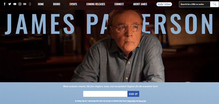
James Patterson’s website offers great use of clear imagery and a good reader magnet for his mailing list.
When you arrive on James’s website there is a clear indication that he wants you to sign up for his author newsletter, by having you sign up right at the bottom of the opening image in a bold color.
His newsletter is enticing because he offers news, free chapters, and more if you sign up.
Tim Sullivan

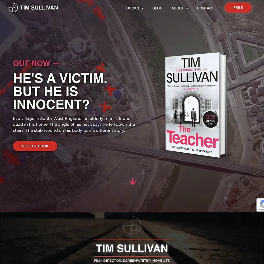
We wanted to build Tim Sullivan a thriller author website that thrill-seekers will love.
The home page is striking with eerie images that could make the hair on your neck stand! This website is not for the faint-hearted.
The atmosphere is aptly set with vibrant colors that contrast with the black layouts and the bold, clear fonts. This entices readers seeking a suspense novel they can’t put down.
A simple yet effective menu design does well not to distract from the main attractions.
Dan Brown
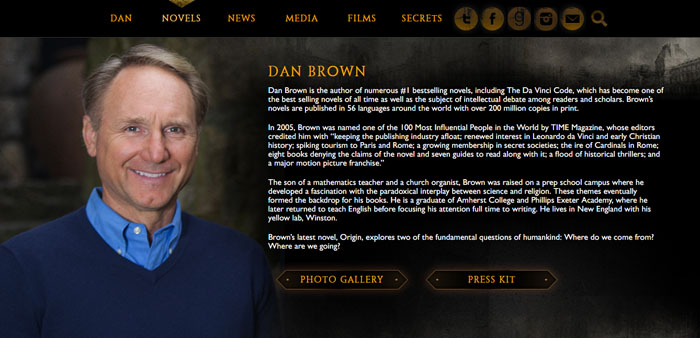
Dan Brown’s website manages to make simple look amazing.
He uses good color contrast and easy-to-read fonts.
When you enter the site the dark background with yellow elements and writing gets your attention, along with quotes and images from his books and films.
Michael Connelly
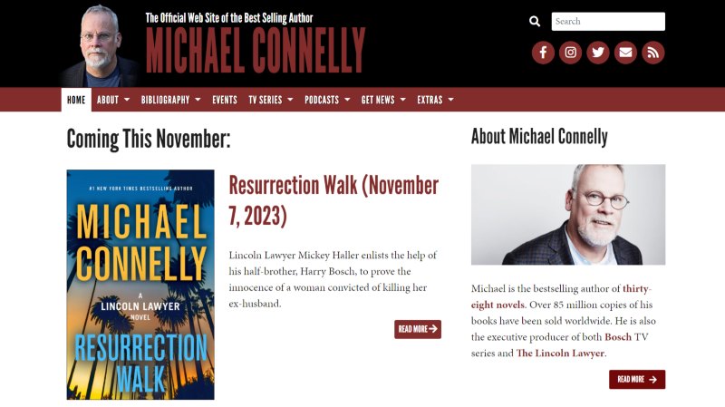
Michael Connelly’s website uses the “extras” tab to its full potential.
In this tab, he includes Photos, Music, videos and so much more.
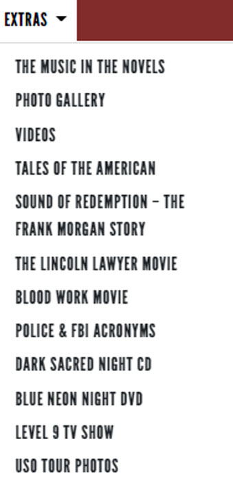
He also uses strong color contrasts on his homepage with a plain white background and bright book covers.
Ruth Ware
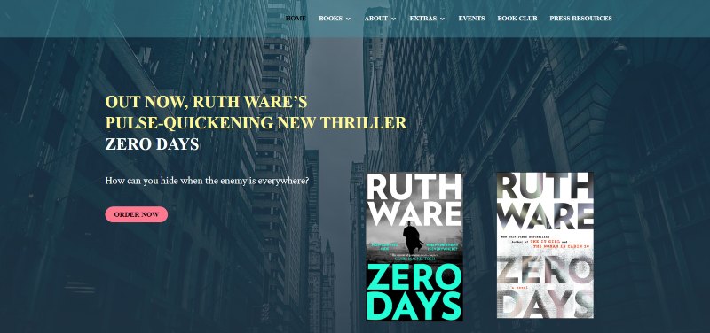
Ruth’s website has an effective call to action to buy or learn more about her books.
When you arrive on her website you are greeted with bold text next to two striking book covers, with a small amount of information and a read more button.
This shows that Ruth’s main idea behind her website is for people to buy her books, by clicking the read more button she takes you to a page with the option to order the books.
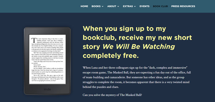
Ruth also offers readers the chance to get a free short story and other benefits if they sign up for her book club which is essentially her mailing list.
Dean Koontz
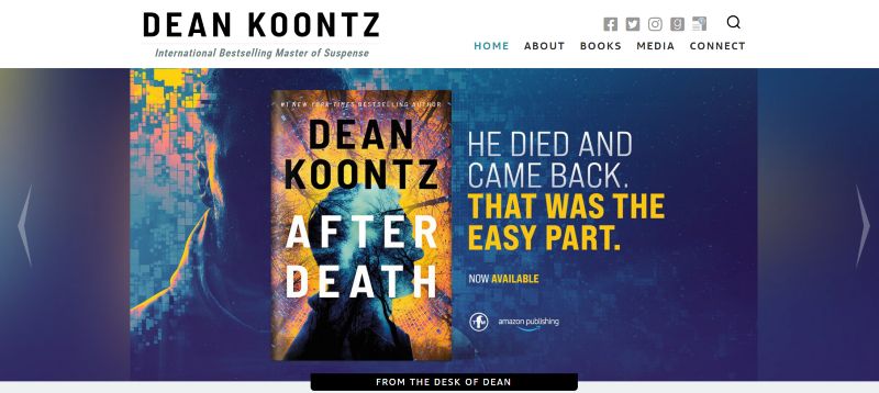
Dean Koontz uses an effective book display on his homepage, showing his new releases.
Koontz has a recognizable name in this genre, so the rest of the home page works to make connections with readers.
From his conversational blog post sneak peeks to a glance at his frequent Facebook posts, this author prioritizes his reader base.
He is the proclaimed International Bestselling Master of Suspense, and it’s nice to see someone at that level put so much effort into keeping in touch with fans.
Paula Hawkins
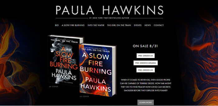
Paula Hawkins’s website shows how powerful a good call to action can be.
She uses bold and striking book covers next to her CTA to get the attention of the reader and make them more interested in pre-ordering the books.
Her whole homepage is filled with different calls to action for each of her books, all with the same enticing style that catches your eye.
Kathy Reichs

Kathy Reichs’ website is true to the genre with dark and eerie backgrounds and a font to match.
But the intro image is frequently updated to match her newest release, which is a nice touch.
The most interesting feature on her website is her “Videos” tab and her “News and Blog” tab.
In the “videos” section she offers interviews she has done for different news outlets and in her “News and Blog” section she gives up-to-date information about what she is up to and when and where people can meet her.
Peter James
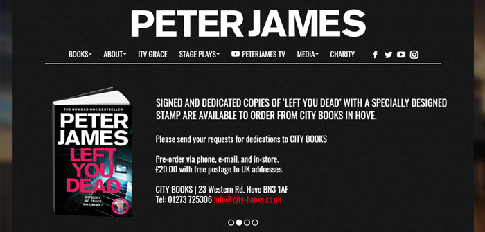
Peter James allows readers and fans of him to get signed and dedicated copies of his book.
This is a great idea as it could make for a memorable gift for someone and also in a way allows him to see where his readers are from.
Stephan King
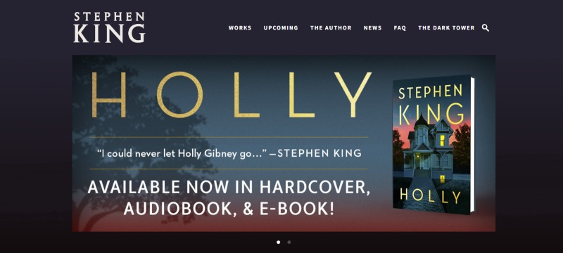
Stephen King’s website is an example of how simple color contrasts like black and white can be a powerful tool on your website.
King’s website uses a simple black and grey background with a bold font and white writing. The color comes in on his slider images below the fold. Even then he chooses to use simple but bold colors.
He also puts all his book releases on his slider images showing the readers important information so they don’t have to go searching for it.
Rachel Caine
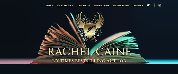
Rachel’s website displays beautiful imagery and design that fits in perfectly with the theme of her books.
The opening image on her homepage is eye-catching and uses gentle colors and bold fonts to show you where you are.
Riley Sager

Riley’s website makes it obvious what he wants from you, to buy his new book.
He has the book displayed in the foreground on the homepage and it’s the first thing you see as you enter the website.
He also uses great background colors and imagery for his website, making it noticeable but not taking away from the book covers that he is trying to sell.
Jessica Knoll
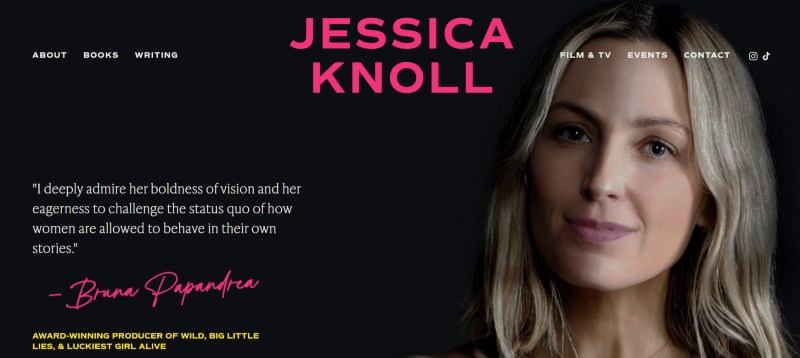
Jessica’s intro stands out with a slightly unsettling but good picture of herself next to a review that perfectly describes the type of writing the author is skilled at.
There are a few extras available in terms of news and events that fans can keep up to date with.
The colors are bright and contrasting to the backgrounds. It may not be the traditional suspenseful thriller atmosphere, but it suits the style of the books she writes.
Jessica also includes an enticing book trailer.
Sally Hepworth
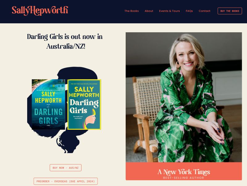
Sally Hepworth’s website is classy and vibrant, sharing her personal branding. This gives this professional website a very personal feel.
In between the information about Sally herself, reviews can be seen. These do a good job of selling the reader on the author’s abilities.
Charlie Donlea
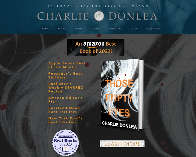
Charlie Donlea’s thriller author website is professionally designed. But it’s just as complex as the characters in his stories.
The block-style design elements make for a weaving tale of Charlie’s work. You learn about his books, then get to read some convincing reviews that rave about them. And each section has a different backdrop that is engaging in its own right.
The downside is, that even though everything looks great on its own, it can be quite overwhelming as a whole. That’s really the only negative about this website.
Sarah Pearse
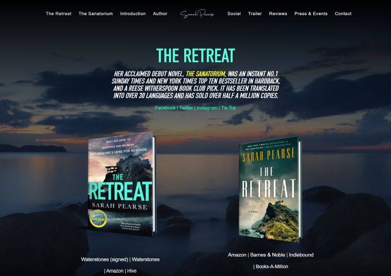
Sarah Pearse uniquely features two versions of her cover art, one from the UK and one from the US.
This is something that not many authors think to do when making their book display and something I think should be done more.

Another feature of Sarah’s website is that she allows readers to read an excerpt of her book.
This is a great marketing strategy as this gets readers interested enough to want to know what happens next.
Karen M. McManus
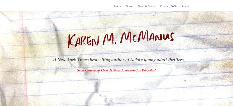
We love Karen’s thriller author website for how streamlined it is. It gets straight to the point.
The gritty design is subtle yet impactful. The background of each website section is crumpled pieces of paper that kids use at school, with red fonts to accent. This is very effective as her popular series is about characters in school. Fans or curious readers will know they’re in the right place when they arrive.
There are no fancy design elements for sections, so you can read without distraction. Lastly, her FAQ page is personable and very informative for fans.
Karen Hamilton
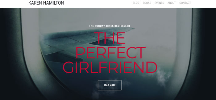
Karen Hamilton uses simple but captivating colors and images to get the attention of readers.
Her homepage features the title of her new book in a striking font in front of an airplane window.
This image is enticing enough to want readers to click the read more button to find out why this particular image was chosen.
JD Robb
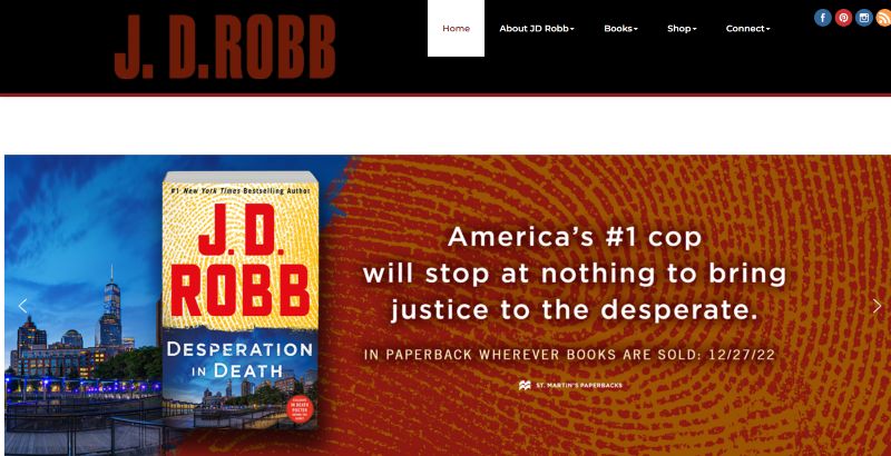
JD Robb has an amazing lead magnet for her mailing list. She offers you the opportunity to “get free stuff”. This can be seen under her connect tab.
This rewards curious readers and doesn’t push the magnet at website visitors.
If you send in a request and an envelope to her you will receive either a JD Robb calendar magnet or a bookmark. The catch is, you will be added to the mailing list for 5 years.
This is an amazing idea as she gets something free in return for giving away something. This no doubt has given her a large mailing list.
Nadine Matheson
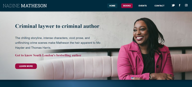
This author uses her experience in the field of crime to sell her crime novels – readers who love this genre will definitely feel more interested in her books after reading that line!
Nadine has a lot of information on her home page, but it works well as one of the sections has a tab layout that avoids making the information overwhelming.
Her branding is felt prominently throughout as the content is neatly organized and the colors used are very professional.
Mark Greaney

Mark’s website feels like a spy fan’s dream. The design elements make it feel as if you’re scrolling on a screen in your favorite espionage film’s command control room. The tabs are sleek and the banners grab attention to keep up this atmosphere.
This is a great tactic if you have a book series as it gives readers an inside into the world of the story and makes them even more interested in the books.
Harriet Tyce

The intro to Harriet’s website is simple, focusing on an image of the book and the copy A LESSON IN CRUELTY. This is the title of her new book, making readers curious to find out more.
This website focuses more on the books, sharing reviews and snippets of synopsis to convince the reader to buy one of the books by the time they’ve browsed the website.
Your Thriller Author Website
Are you looking to make a thriller author website design that will keep people on the edge of their seats? Maybe you want a website worthy of being added to this list…
Well, we’re here to help! Reach out to us and we can make this happen.
We also suggest that you take a look at our author bio tips so that you can make a quality author about page!


