Non-fiction author websites have a different goal to accomplish for their audience.
They have to combine concept, message, and brand into one package that doesn’t just tell a story, but drives meaningful impact.
That’s why I judge every non-fiction author website I come across by these 3 benchmarks:
- How well they position their expertise and authority.
- How clearly they demonstrate their value proposition.
- How smoothly they map the path to books, services, and opportunities.
Since 2019, my team and I have built 150+ custom websites for authors, speakers, and thought leaders, helping them turn their online presence into something that actively supports their work. (You can view our author website portfolio here.)
So, I know firsthand what separates a website that simply looks good from one that actually converts.
In this guide, we reviewed dozens of nonfiction author websites and selected the ones that truly stand out.
If you’re looking for ideas and inspiration for your own author, speaker, or thought leader website, read on.
And feel free to reach out to us if you need help building your own site.
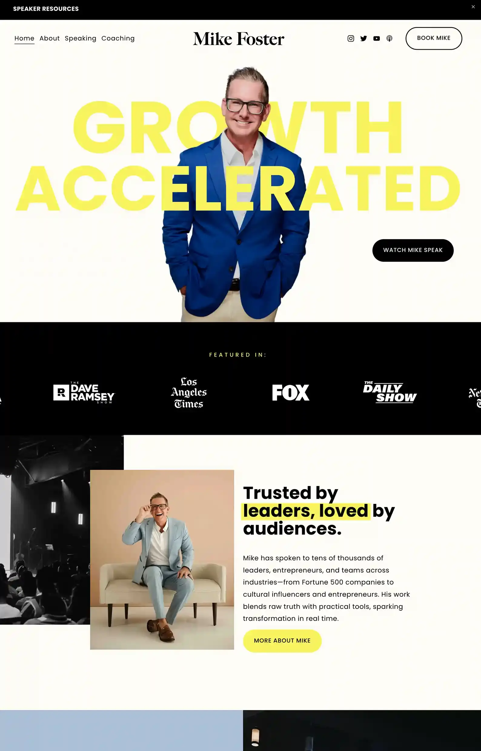
1. Mike Foster’s Website
First Impressions:
- A cool intro that has a 3D feel, where the author is positioned between the core message.
- Lively elements like sliding animations and videos that draw the eye.
Warmth and professionalism are expertly balanced on Mike Foster’s site
Unique shapes and colors keep the site vibrant and entertaining, emphasizing his brand while holding the visitor’s attention.
His site has a great user journey, especially with the use of bold, direct copy that inspires action.
Exactly the type of energy for a coach, speaker, and author!
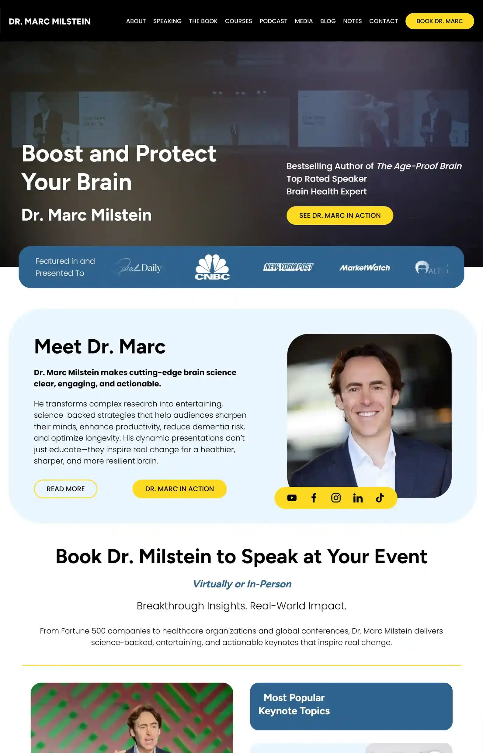
2. Dr. Marc Milstein’s Website
First Impressions:
- An intro video highlights the speaker’s core message and capabilities.
- Fresh, dynamic design elements and clear typography make the site enjoyable to explore.
We were firing on all neurons (pun intended!) when we designed this site for Dr. Marc Milstein.
It’s content-heavy, so streamlining navigation was key, but my team made it work!
And the benefit of stocking your site with content like this is that readers will be encouraged to return to discover more.
Especially when expertise is showcased through reviews, credentials, and logo walls.
We’ve built a range of author websites, some like this (content-heavy) and some simpler but still as effective. It all depends on what your brand needs.
So, if you want to see more examples of how we bring brands to life?
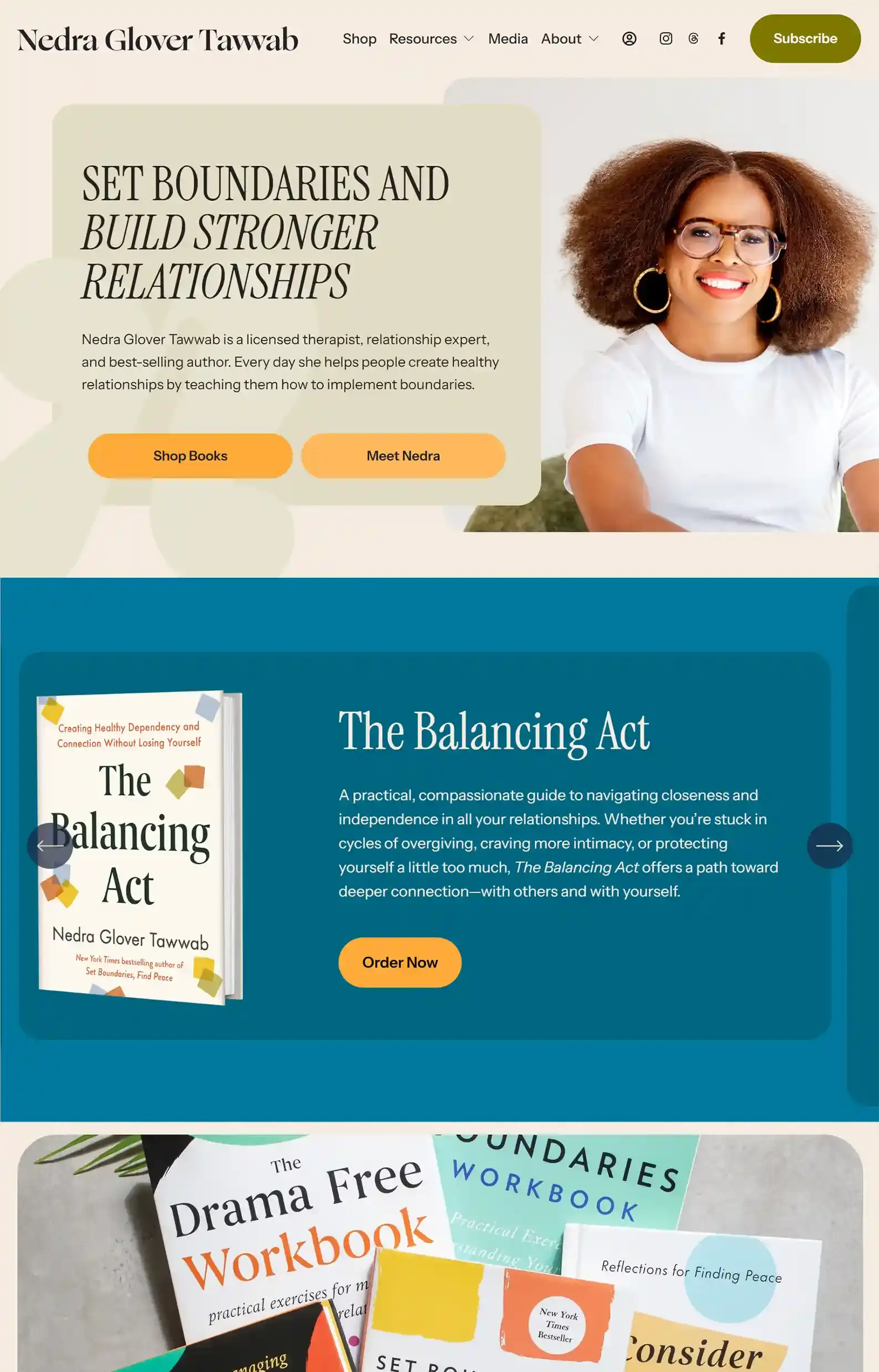
3. Nedra Glover Tawwab’s Website
First Impressions:
- Vibrant design that sparks joy in the site visitor.
- Smartly-placed CTAs and straightforward design make it easy for readers to find what they need.
From the first second that you land on this site, the author’s brand and voice are immediately obvious.
She puts her offerings upfront and backs it up with clean and credible messaging.
Lively colors are a great backdrop for her natural-feeling copy that doesn’t push readers, but gently guides them to content.
If your goal is to build trust quickly with your audience, this is an excellent example.
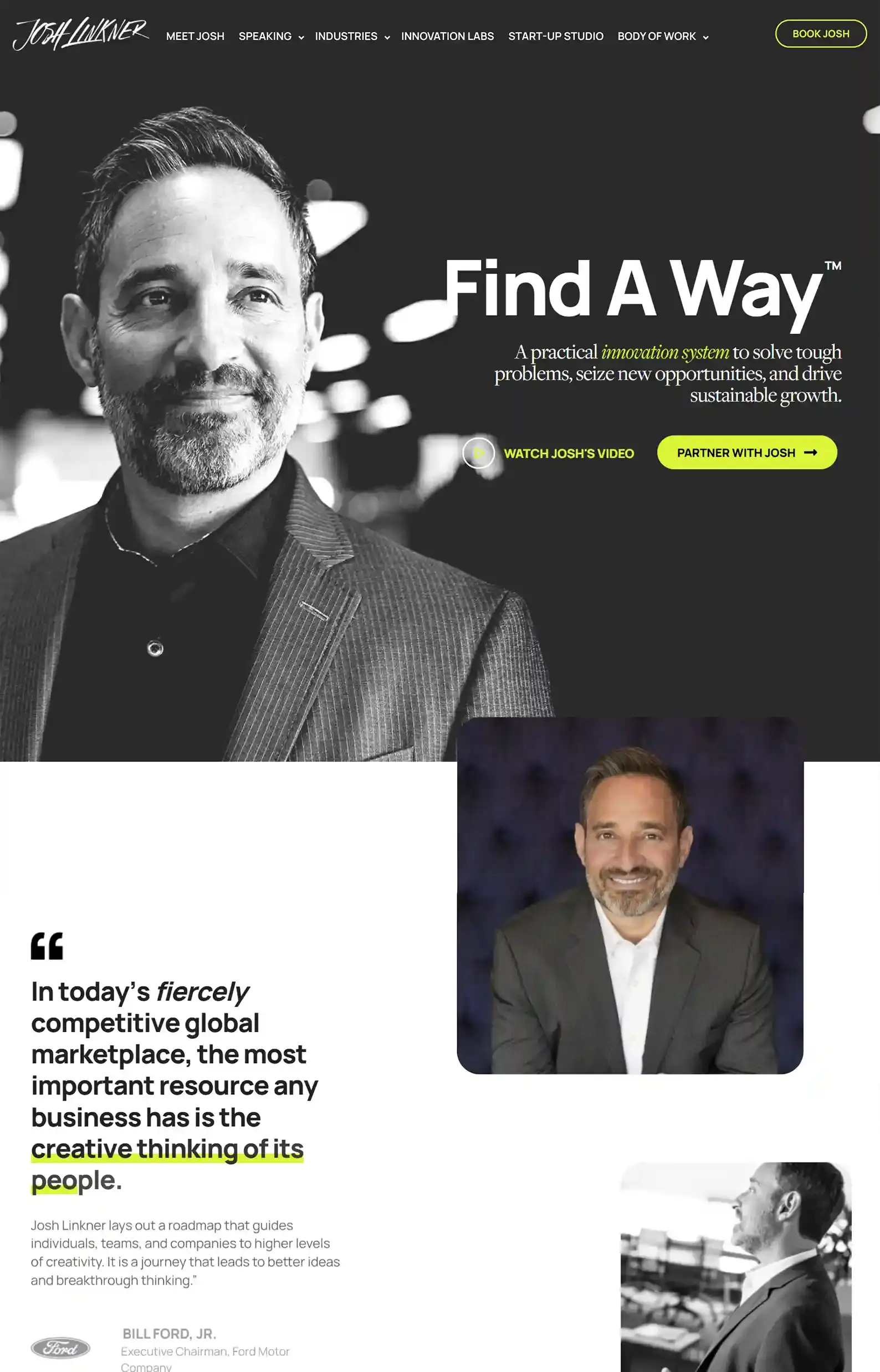
4. Josh Linkner’s Website
First Impressions:
- An interactive scrolling experience reveals content as you explore.
- Graphs and design elements present key information in an engaging, easy-to-digest way.
Josh Linkner’s site delivers authority and value upfront. Quotes, reviews, and videos of him in action all reinforce his brand in the readers’ minds, one scroll at a time.
His industry pages use logo walls to strengthen credibility and help visitors navigate his content-rich site.
If I had to make one suggestion, it would be to streamline the menu. There are quite a few options in his dropdowns, and it can be overwhelming to look at.
Otherwise, it’s a highly professional non-fiction website.
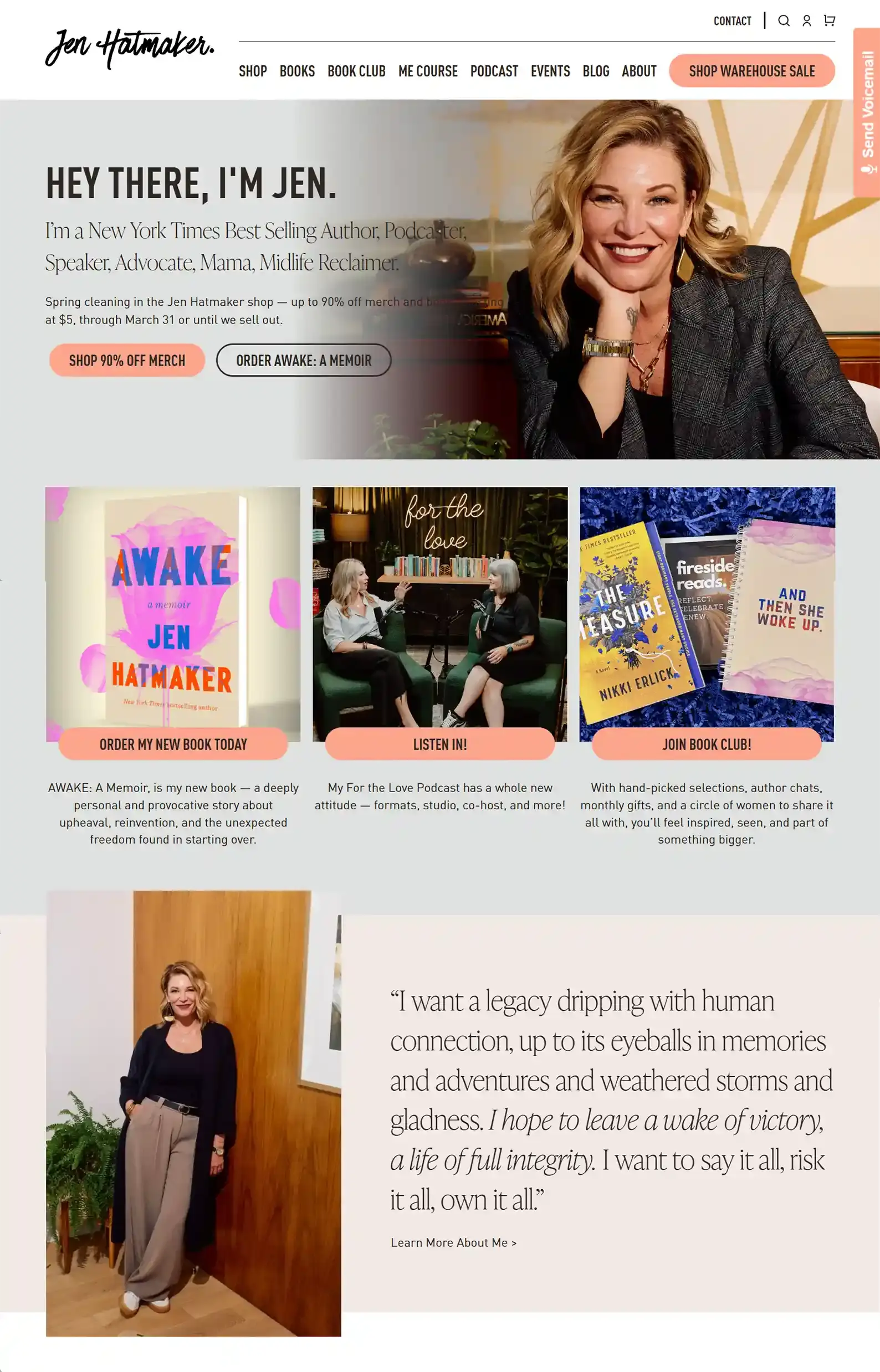
5. Jen Hatmaker’s Website
First Impressions:
- Comprehensive, easy-to-navigate pages for all her services and products.
- Clear, concise CTAs make it easy for visitors to go down the right rabbit hole.
Jen Hatmaker’s site is bursting with personality. I love how she effortlessly uses her brand to promote her many ventures.
There’s a lot to explore, but it all feels intentional. Clear and intriguing labels make it easy for readers to find what they’re looking for.
But she doesn’t just promote, she aims to engage with her audience through her Book Club, and little tidbits that help you get to know her and relate to her.
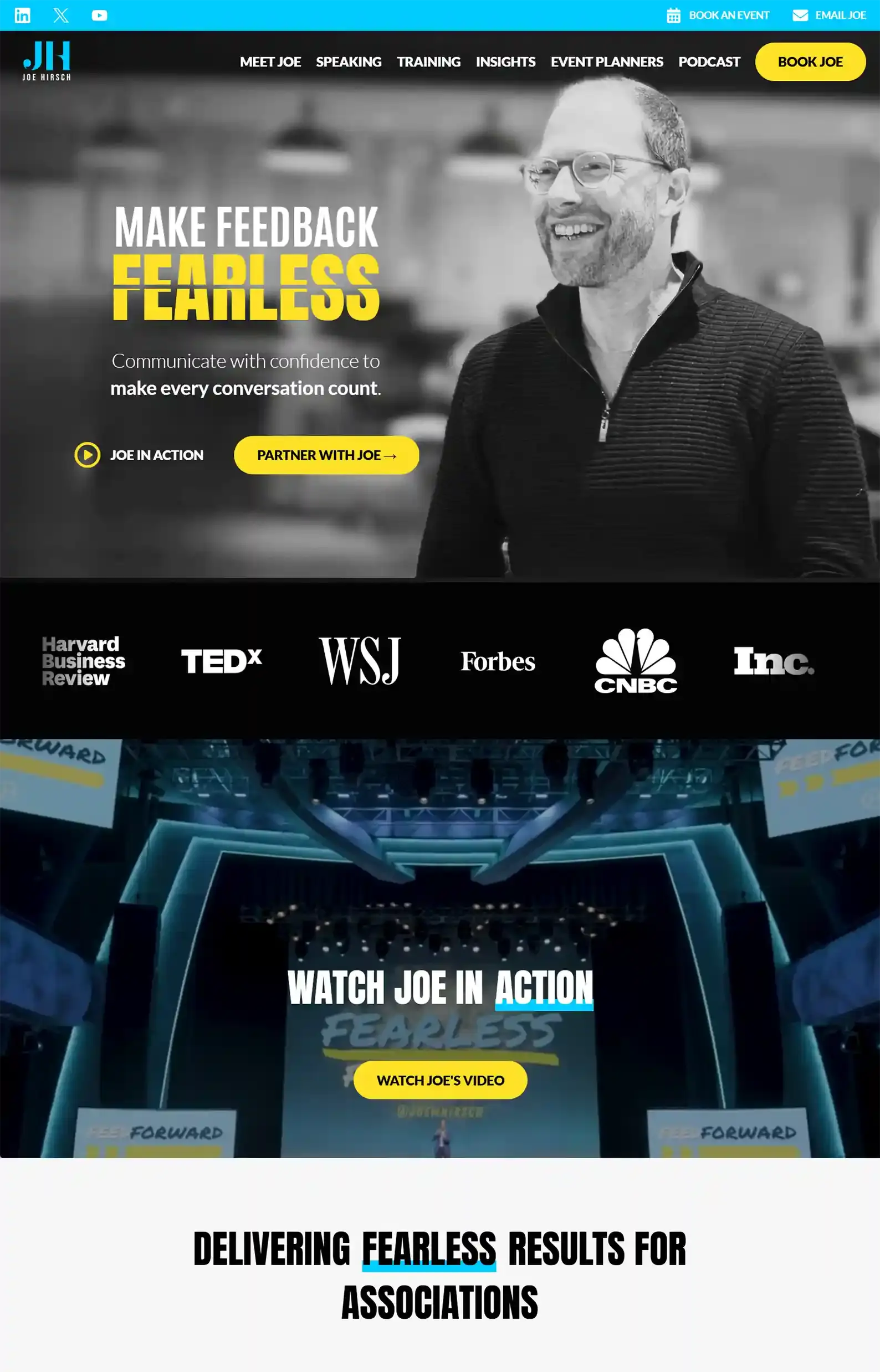
6. Joe Hirsch’s Website
First Impressions:
- Filled to the brim with content and information, yet it never feels overwhelming.
- Bold color choices and sharp copy make the site pop.
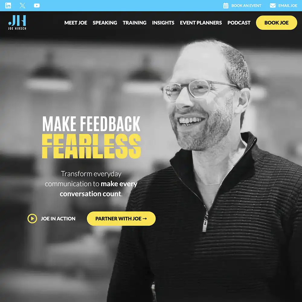
Joe Hirsch is a feedback expert skilled in communication, and his website makes that abundantly clear.
From design elements that highlight powerful words to well-crafted one-liners, this site embodies good communication.
And I’m not just saying that because my team designed it!
Each page has a clear focus and uses the author’s authority to build trust with the visitor.
In my opinion, this is a great example of how you should showcase your core message while capturing attention.
Want to see more of our website designs?
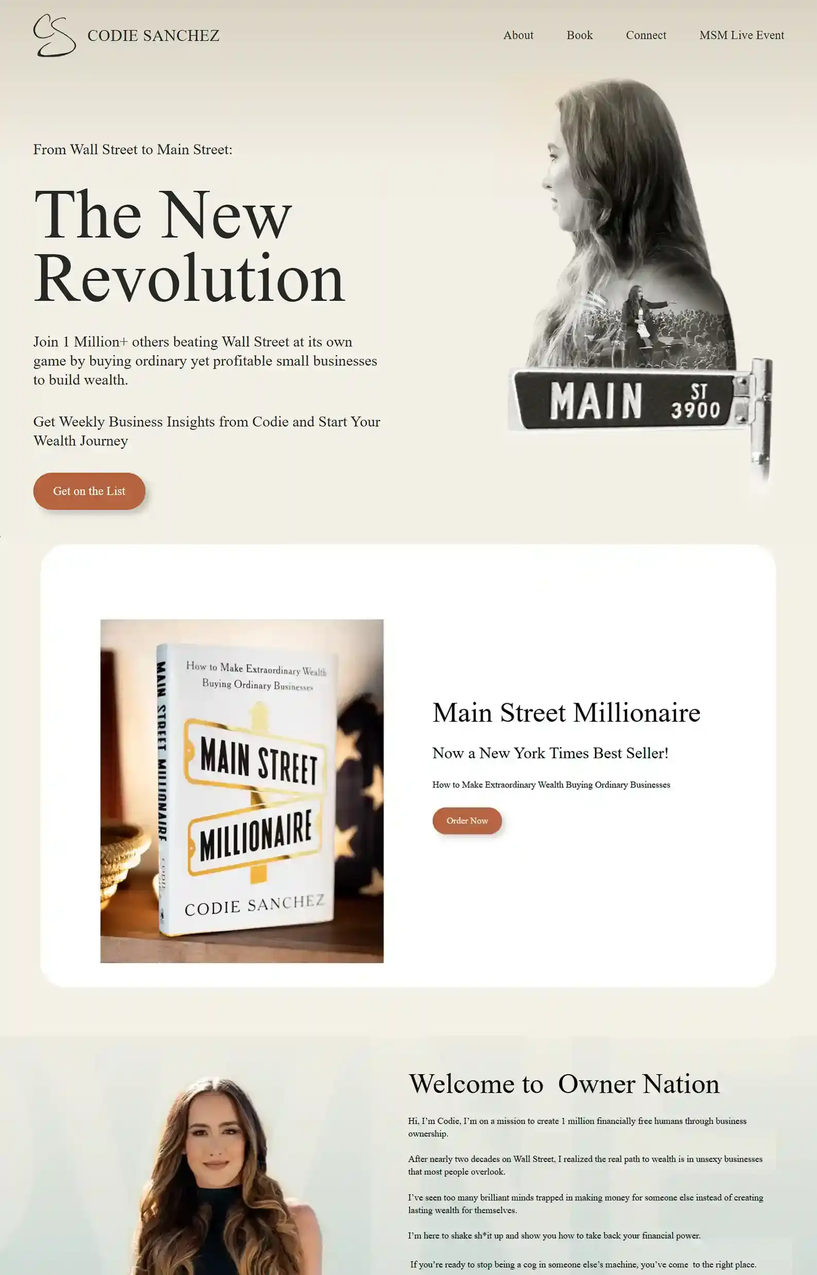
7. Codie Sanchez’s Website
First Impressions:
- Authority and brand-driven design that uses white space to keep content easy to navigate.
- Warm, gentle colors make the copy stand out.
Codie Sanchez’s website is a prime example of doing “simple” in a sophisticated, impactful way.
The site is focused and intentional. She gives visitors a logical next step with every scroll using bold CTAs and value-rich content.
For example, she entices her audience to stay in touch with “Be Part of the Movement” above her social links.
And she then bolsters her efforts with authority-building visuals and messaging that show her in her element.
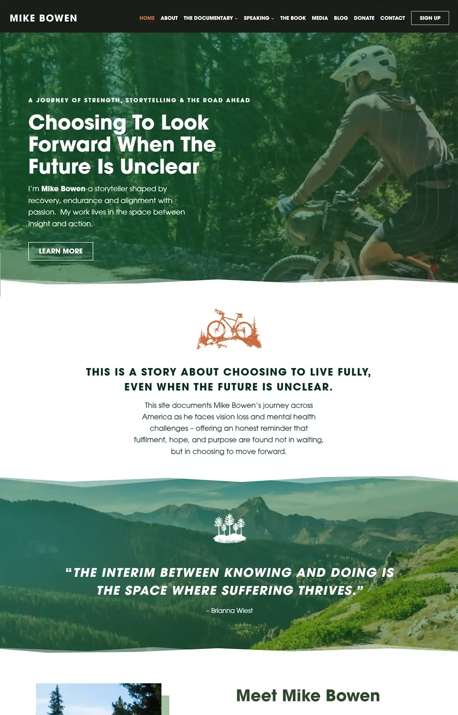
8. Mike Bowen’s Website
First Impressions:
- An adventurous intro featuring Mike in nature, paired with gripping text, quickly communicates his powerful story.
- Bold typography, the earthy color scheme, and imagery help maintain an outdoorsy feel while keeping focus on the empowering content.
Mike Bowen’s story is inspirational to say the least. And we were honored to help represent him online through website design.
My favorite page is the Documentary tab, where you can learn more about his race against time (literally), as he cycles across America.
You can also find details about his three trips so far, along with a Donate page to help support the film’s production!
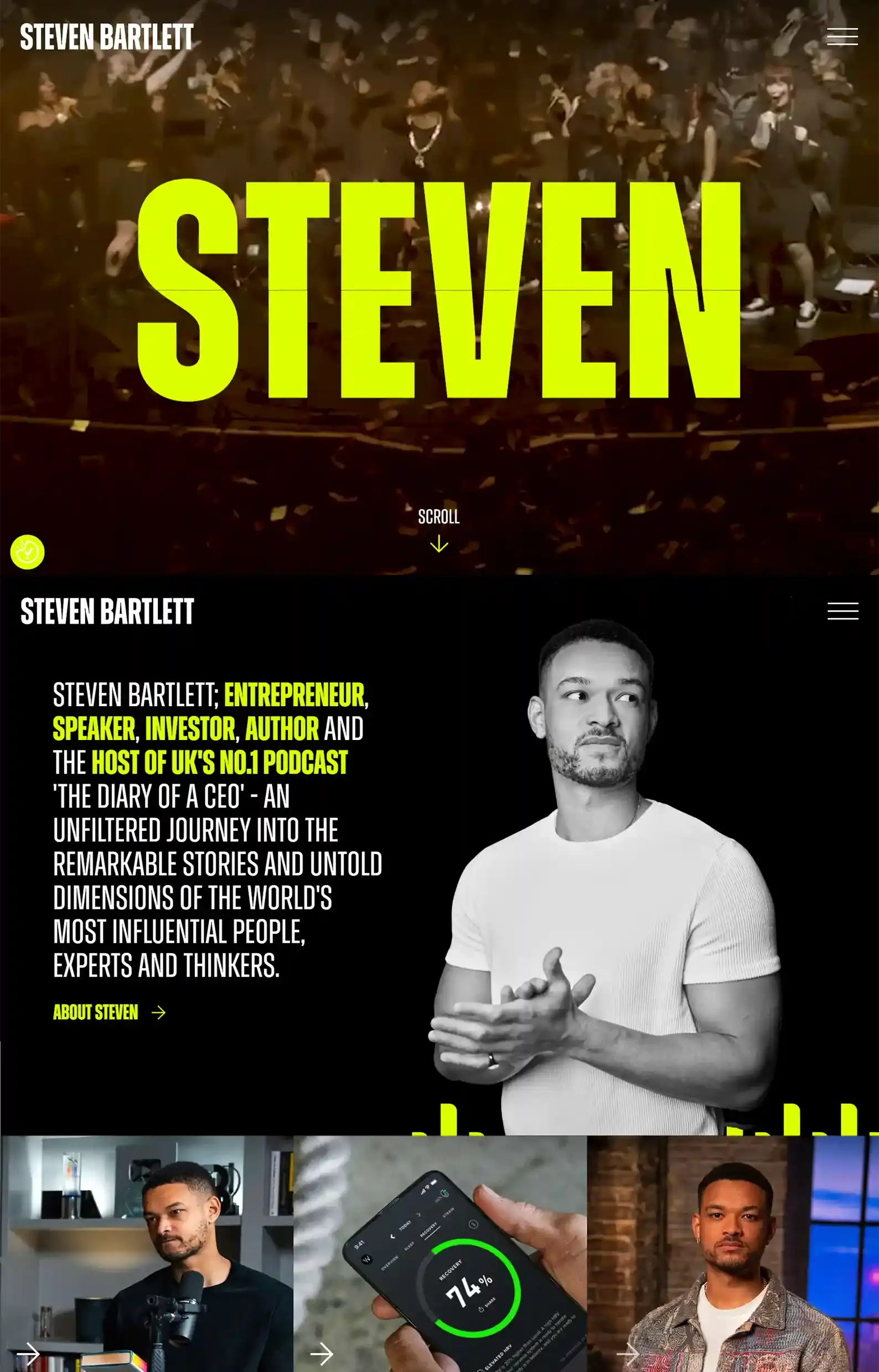
9. Steven Bartlett’s Website
First Impressions:
- Creative placement of sections and imagery creates an exciting experience.
- Pops of color on top of videos and dark backgrounds are eye-catching.
This is one of the most entertaining websites on the list.
As you browse, elements shift into place and reveal themselves. I love the interactive element of discovering content as you hover and scroll.
This approach showcases Steven Bartlett’s brand effectively, making it fun to get to know him and his work.
Despite its creativity, the site still follows strong design fundamentals, balancing professionalism and entertainment.
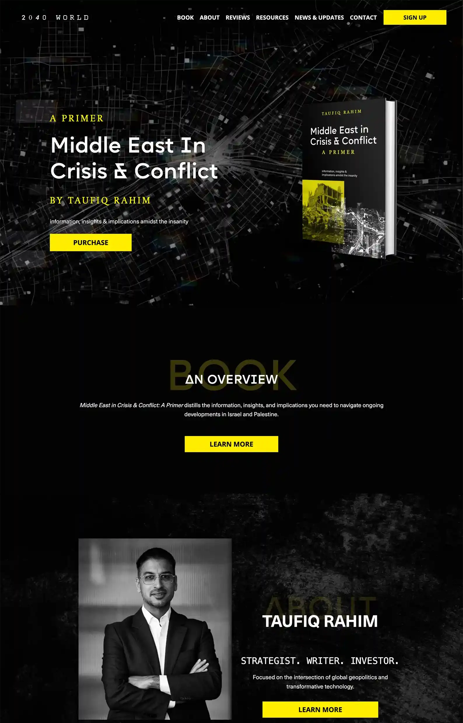
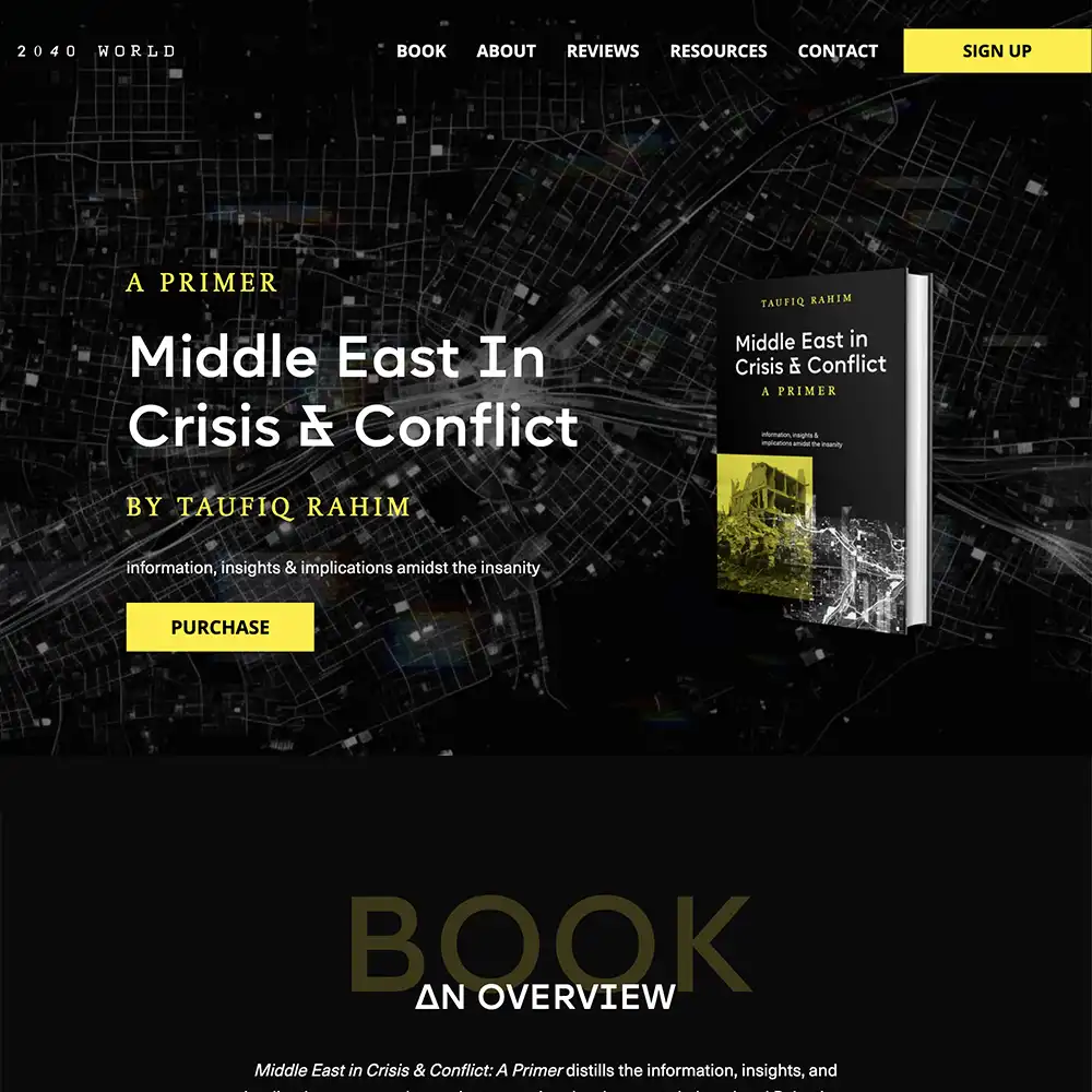
10. Taufiq Rahim’s Website
First Impressions:
- A sophisticated design that thoughtfully handles a serious topic.
- A contrasting color palette draws attention to key content.
When my team designed this website (yes, this is another Rocket Original!), we used unique heading fonts and impactful imagery to make each section stand out.
The content gets to the point with clear copy that establishes authority, which is crucial given the nature of the author’s core message.
On a lighter note, I think the coolest element can be found at the bottom of every page.
The letters of his name cycle through to reveal different styles. It’s a small yet impactful touch.
Want to see more of our website designs? Check them out:
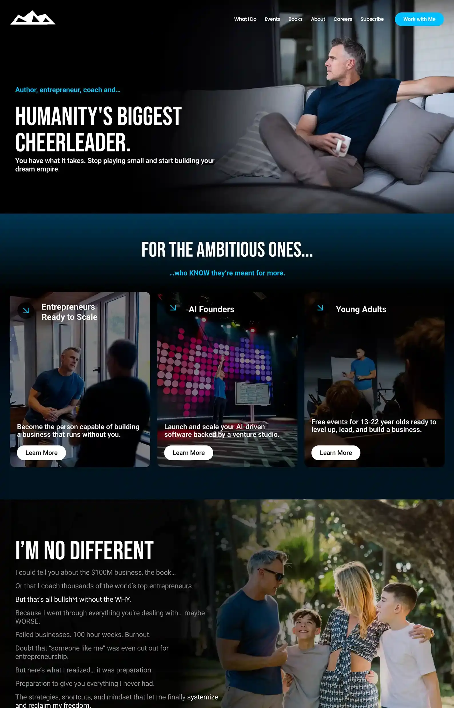
11. Dan Martell’s Website
First Impressions:
- Sleek, professional design that blends sections and images well (even the clothes he wears in each shot match the site’s design).
- Personable copy and imagery help build trust.
This non-fiction website is a strong example of how to project your brand voice clearly and confidently.
You can easily “hear” Dan Martell’s voice through the content. He’s brutally honest and to the point.
And he backs it up with social proof and clear value.
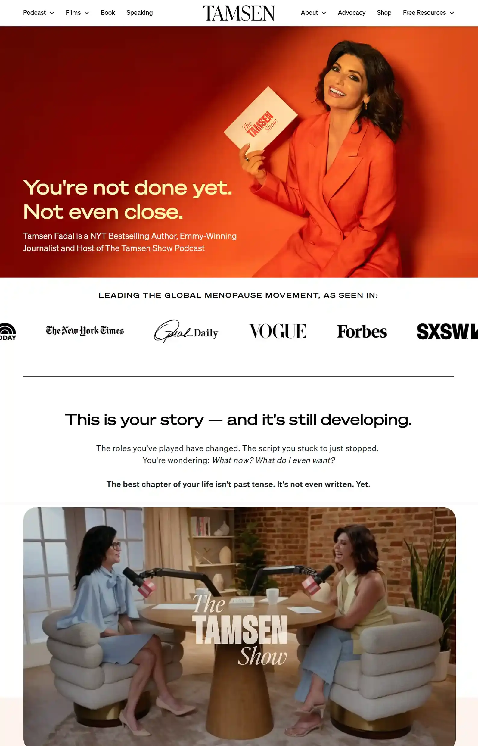
12. Tamsen Fadal’s Website
First Impressions:
- Content-rich site that functions as a resource hub instead of a media personality site, which works for the brand.
- Laser-specific niche positioning that attracts her audience from the jump.
Tamsen’s site is warm and supportive, using conversational tones to convey her message.
Her navigation reflects a deep understanding of her audience’s needs.
The authority building done here is backed up by expertise, social proof, and her personal experience.
So, the information distribution is honest and real, making it feel like her audience is learning from a friend.
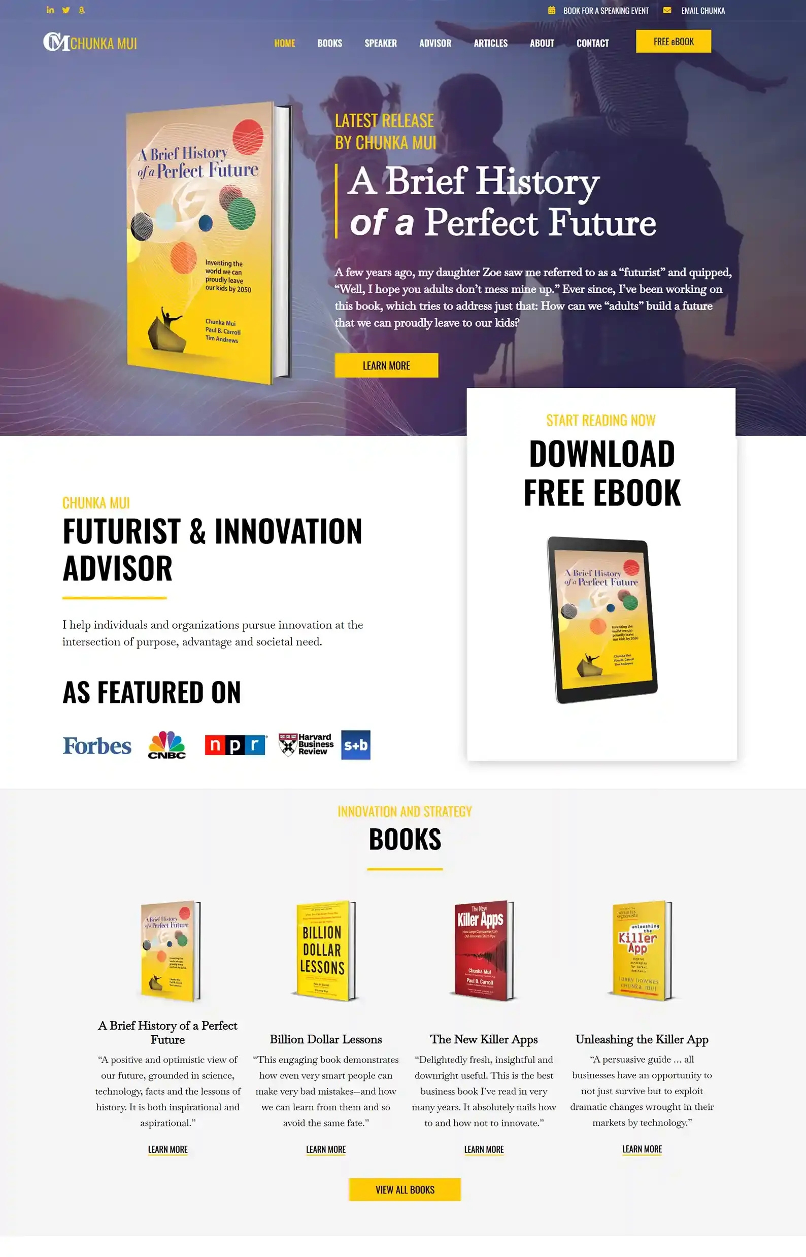
13. Chunka Mui’s Website
First Impressions:
- An optimistic, futuristic atmosphere is woven into each page, perfectly matching the author’s book branding.
- Great use of space creates a clear focus on content.
My team had the pleasure of building this website for Chunka, and we truly believe it showcases his platform perfectly. Not that my opinion is biased or anything…
What really stands out is the bold use of color contrasted with clean white space.
The website strikes a balance between innovation and professionalism.
It emphasizes both the author’s brand and the content itself.
There is plenty of useful, creative, and groundbreaking content to sift through and see what catches your eye.
Want to see more of our non-fiction websites?
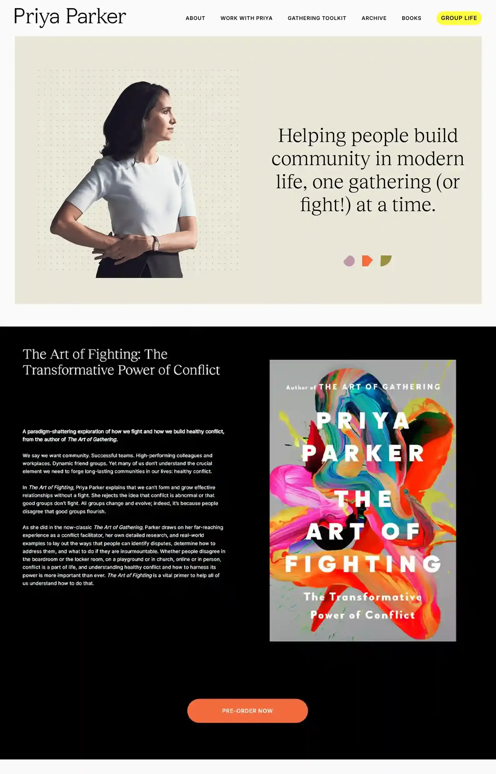
14. Priya Parker’s Website
First Impressions:
- Strong content hierarchy with the use of strategic headings and clear sections.
- Clean typography supports strong, clear messaging.
I love how the site is both skimmable and reflective. The structure is clear, but the language used is introductory and thoughtful.
Her site is also built on a very precise concept and message, instead of being solely personality-based.
Priya Parker centers her content on her work’s value proposition, which she’s well known for, instead of herself.
If you want a website that prioritizes your audience experience over just focusing solely on you, this website is a great guide on how to go about it.
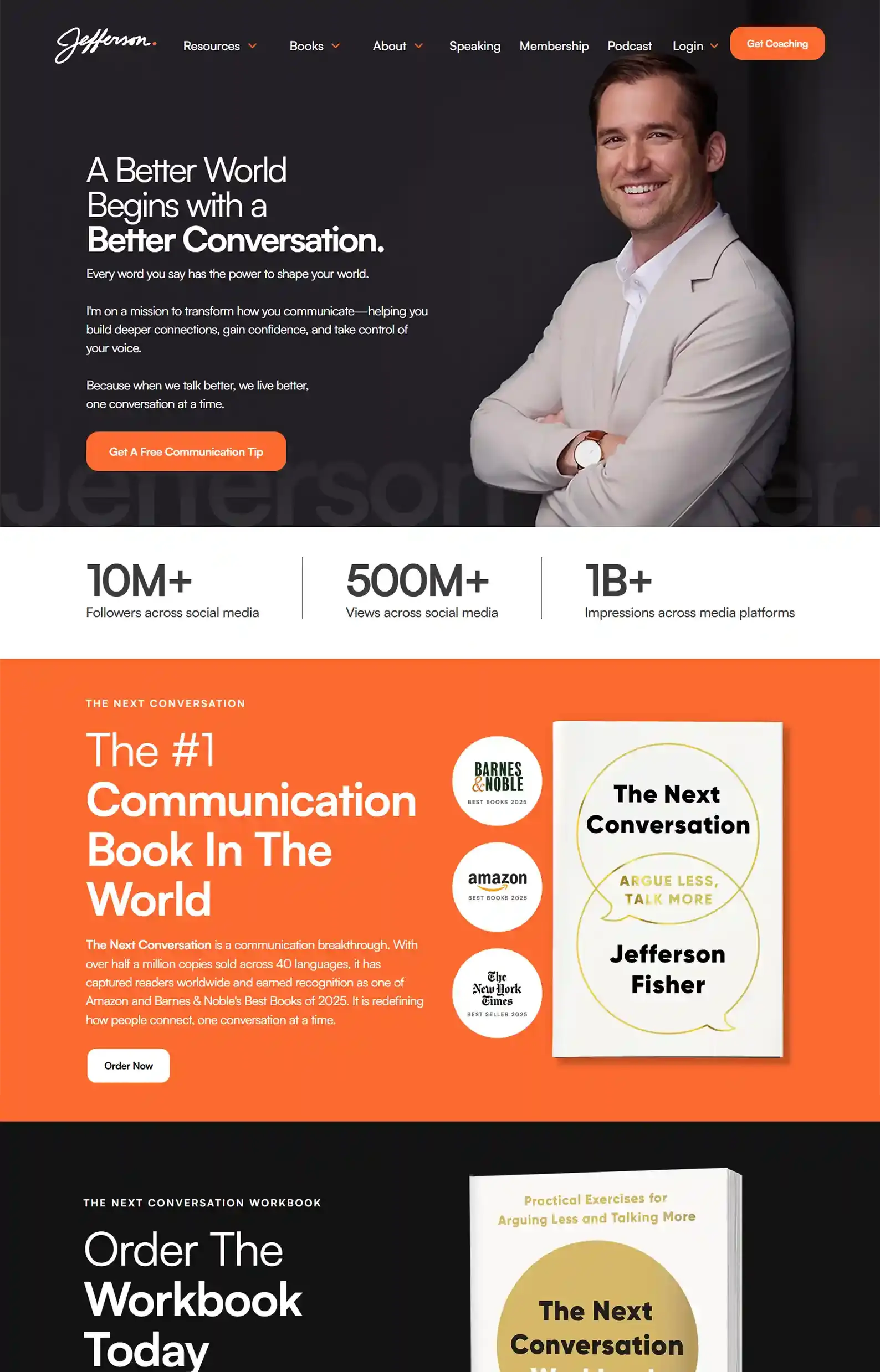
15. Jefferson Fisher’s Website
First Impressions:
- An emotional hook in the intro immediately grabs attention.
- Straightforward navigation with bold headings and value-driven content.
Clear niche positioning goes a long way. Jefferson Fisher executes this well on his site.
Value is in every seam of every page. He uses powerful language and clear pathways, making it easy for his audience to take action.
His content is sharp, concise, and practical, just like his brand and work, providing you with a window view of what you can get out of his offerings.
This website is built for conversion, but in my opinion could use a bit more emotional storytelling to help the audience engage. Otherwise, it’s an impactful non-fiction website.
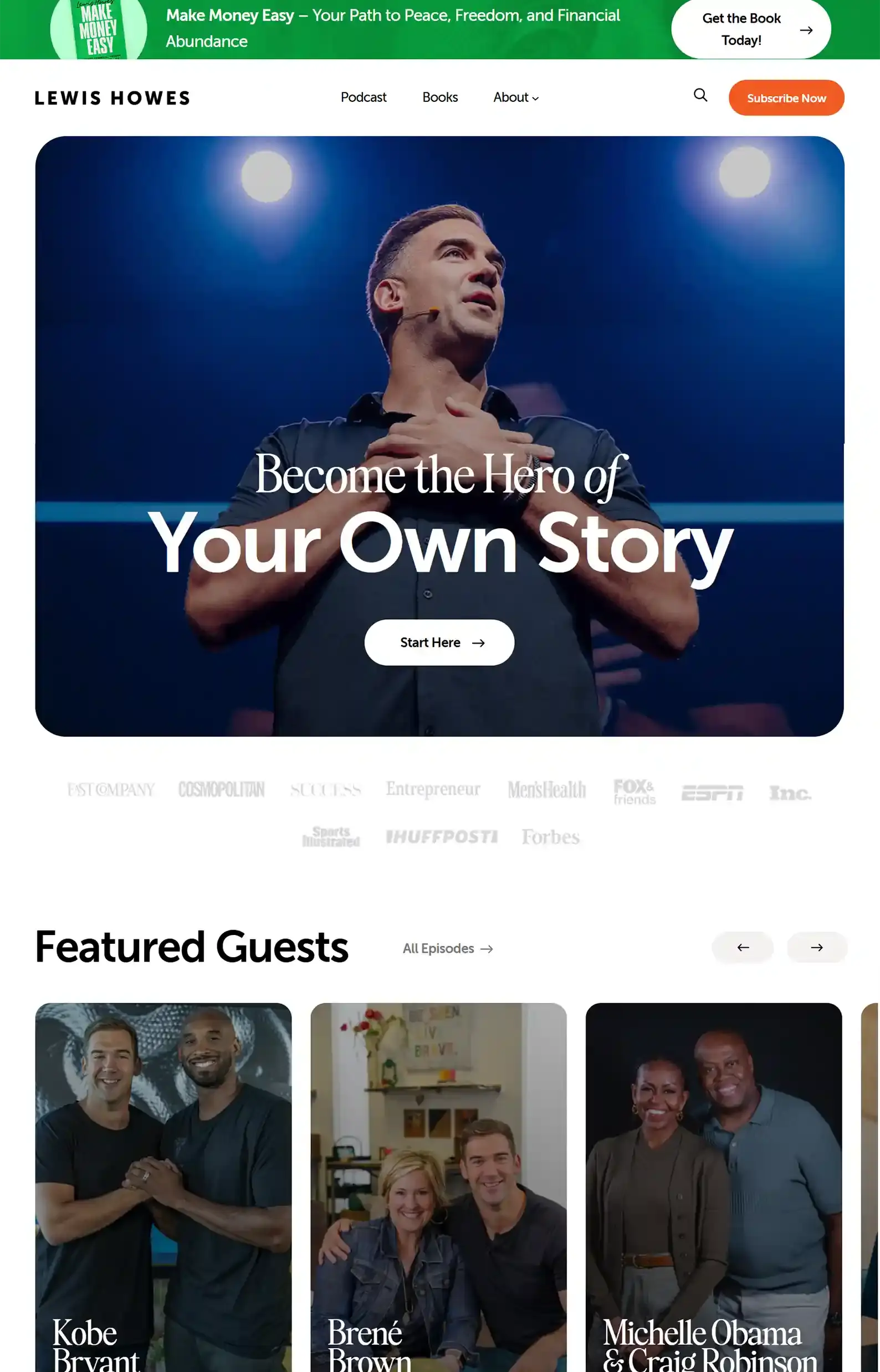
16. Lewis Howes’s Website
First Impressions:
- Trust and authority building is done immediately, seamlessly connecting his brand with his work.
- Simple navigation to create clear pathways for visitors.
This non-fiction site has a whole ecosystem within it. And Lewis Howes’s podcast is the main attraction.
He does a great job of showcasing why his multiple points of entry feed into each other.
Bold, emotionally driven messaging communicates value, and his social proof cements it.
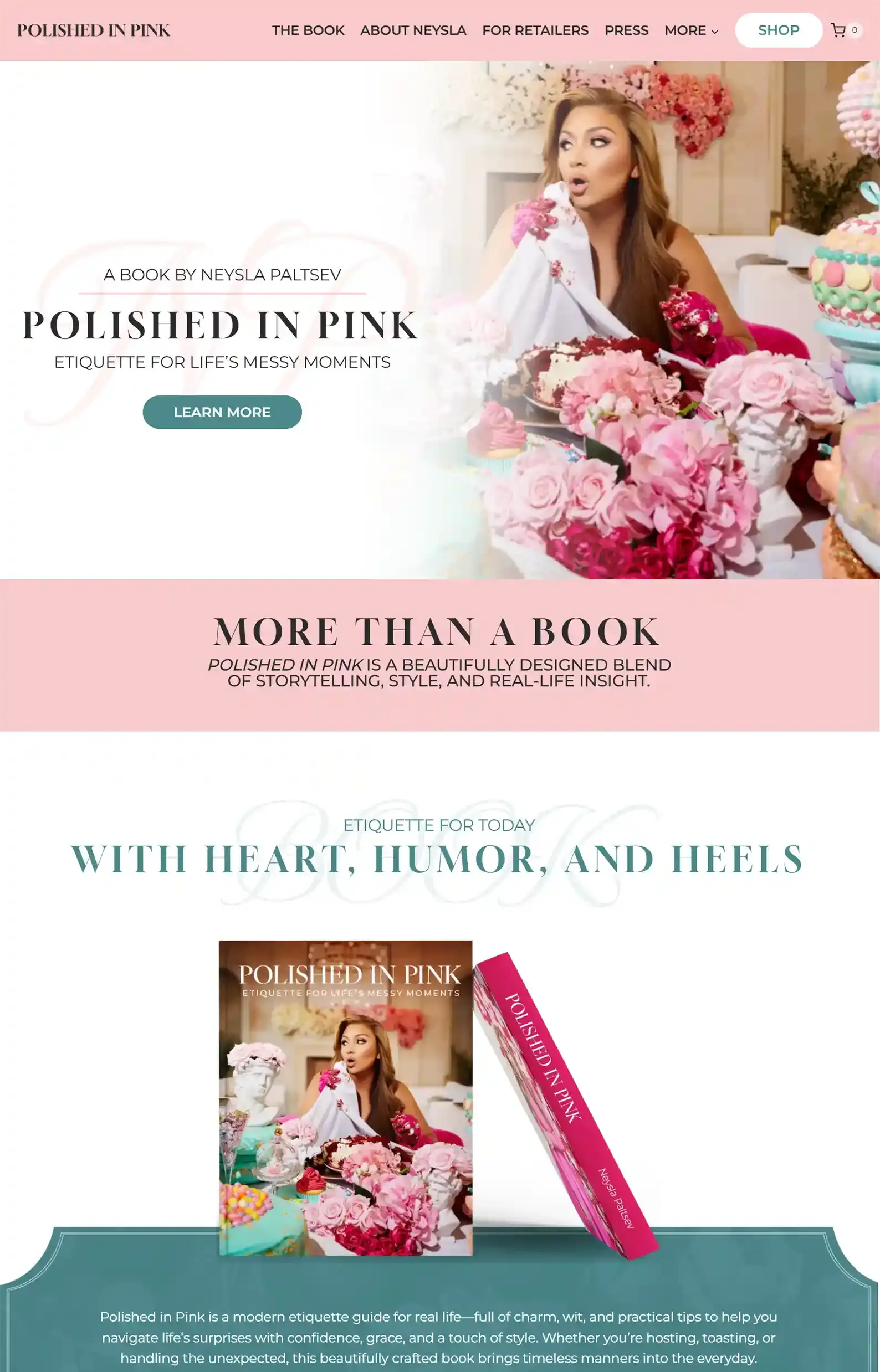
17. Neysla Paltsev’s Website
First Impressions:
- A strong author voice comes through on every page with the ultimate combo of personal and professional.
- Consistent design that’s not just pretty but impactful as it matches the book seamlessly.
Here’s another creation from my team.
Neysla Paltsev’s non-fiction site is all style, all substance, with all the online etiquette you’d expect.
Her concept and brand are intertwined and I think my team did a pretty good job with ingraining that into the design.
Polished and pristine, we kept the vibrant design from her book cover while using white space to provide relief for the eye.
Friendly copy and a bit of authority building makes delving into her world enjoyable and engaging.
Want to see more professional author websites made by yours truly?
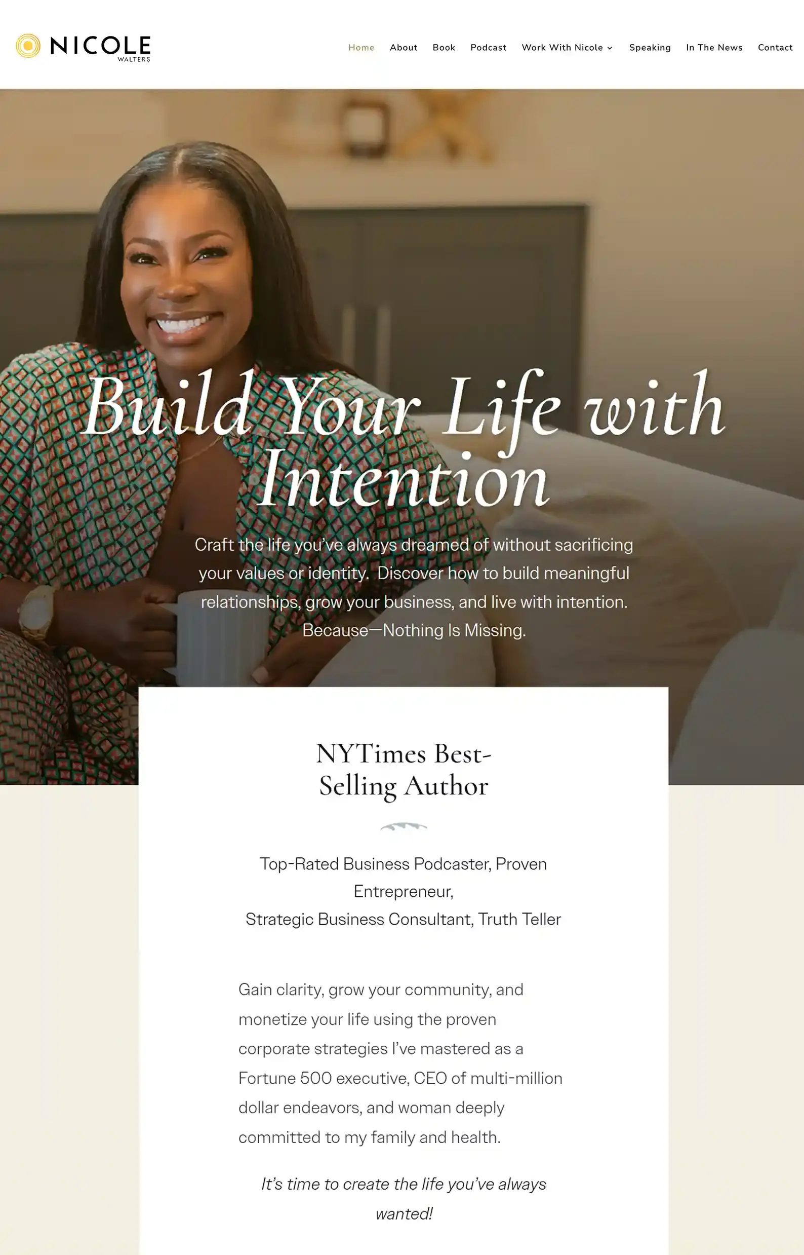
18. Nicole Walters’s Website
First Impressions:
- Warm, earthy tones comfort the reader as soon as they land on the site.
- The book page goes beyond the blurb and retailers as it dives into her experiences, uses action-driven CTAs, includes authority sections, and clearly outlines who the book is for.
Nicole Walters does a great job of conveying growth through friendly imagery and warm, inviting copy.
She has many services and ventures to explore, but everything feels purposeful and connected, reinforced by strong authority sections.
I love the flow of her site and how it provides the visitor with actionable steps and a clear path forward.
19. Ramit Sethi’s Website
First Impressions:
- A brand built on a concept, done well (the name of his book and Netflix show is also the URL of his site).
- Evocative imagery and videos are used to break up content and make visitors pause to learn more.
This is a simple and neutral site that is filled with a ton of resources.
Having a lot of value-added resources increases the time people spend on your site and helps them get to know you.
And when someone feels like they’ve gained valuable information on your site, they are most likely to sign up for your email newsletter and come back to get more.
A smart feature he has is the clear categorization of content, making it easier for readers to find exactly what they need.
Your Turn To Take Action
Phew! That was an extensive list.
My team and I loved putting this list together, and I hope it gave you some ideas for your own site.
Because when a nonfiction website is done right, it’s not just a place to land.
It’s a hub that actively supports your books, your brand, and your opportunities.
If you want a hub that does exactly that, we’d love to help!
What We Can Do For You
Want to see more websites we’ve designed? Check out our Portfolio.
We’ve built 150+ high-performing author websites across genres that help authors sell more books, grow their email lists, and build thriving fanbases.
👉See what our website team has designed.
Want to design your own website? Let’s chat.
I’ll chat with you about your books, your goals, and whether we’re the right fit.
Then we’ll compile that data and design a free homepage concept so you know what you’re getting into.


