There’s something universally magical about falling in love. If there are aliens out there, I’m pretty sure they love love stories too!
That being said, I don’t love every romance author website I come across.
And even if I did, sometimes love alone is not enough. A good author website needs to help build your online presence, grow your readership, and sell more books, of course.
My team and I build custom websites for authors (well over 150 built at this point). We’ve worked with debut authors, NYT and USA Today bestsellers, TEDx speakers, and even Amazon Top 10 Bestsellers.
Put simply, we know what it takes to make a good, professional website. So, when we made this romance author website list, we made sure to put our absolute favorite romance websites that tick all the boxes:
- Easy to navigate.
- Thoughtfully structured.
- And showcases the author and their books with clarity and confidence.
(Check out our author website design portfolio)
If you’re looking for romance author website examples that tick these boxes and inspire you, keep reading.
1. Ana Huang’s Website
First Impressions:
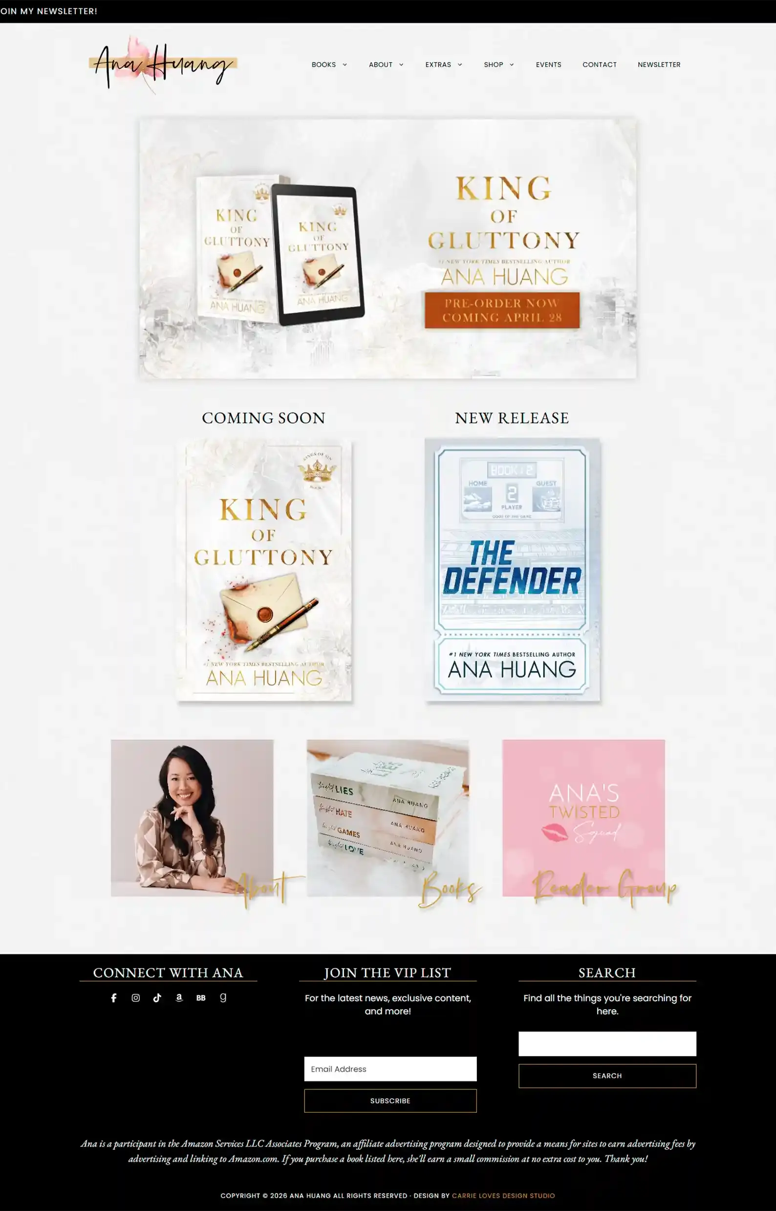
- Classy minimalism design that perfectly fits Ana’s books.
- User-friendly navigation that makes things easy to find, even on a site with lots of content.
Anything a reader or industry professional would need is right here on Ana’s site.
She has many options under the dropdowns in her menu, separating content effectively without overwhelming the reader with choices.
Something I truly appreciate is the detail she goes into on her Special Editions page. You know exactly what you’re getting before spending a dime, which readers will surely appreciate!
Ana Huang doesn’t stop there; she also has moodboards and playlists for her series, and even some bonus scenes and signed books on her Shop page.
2. Lyla Sage’s Website
First Impressions:
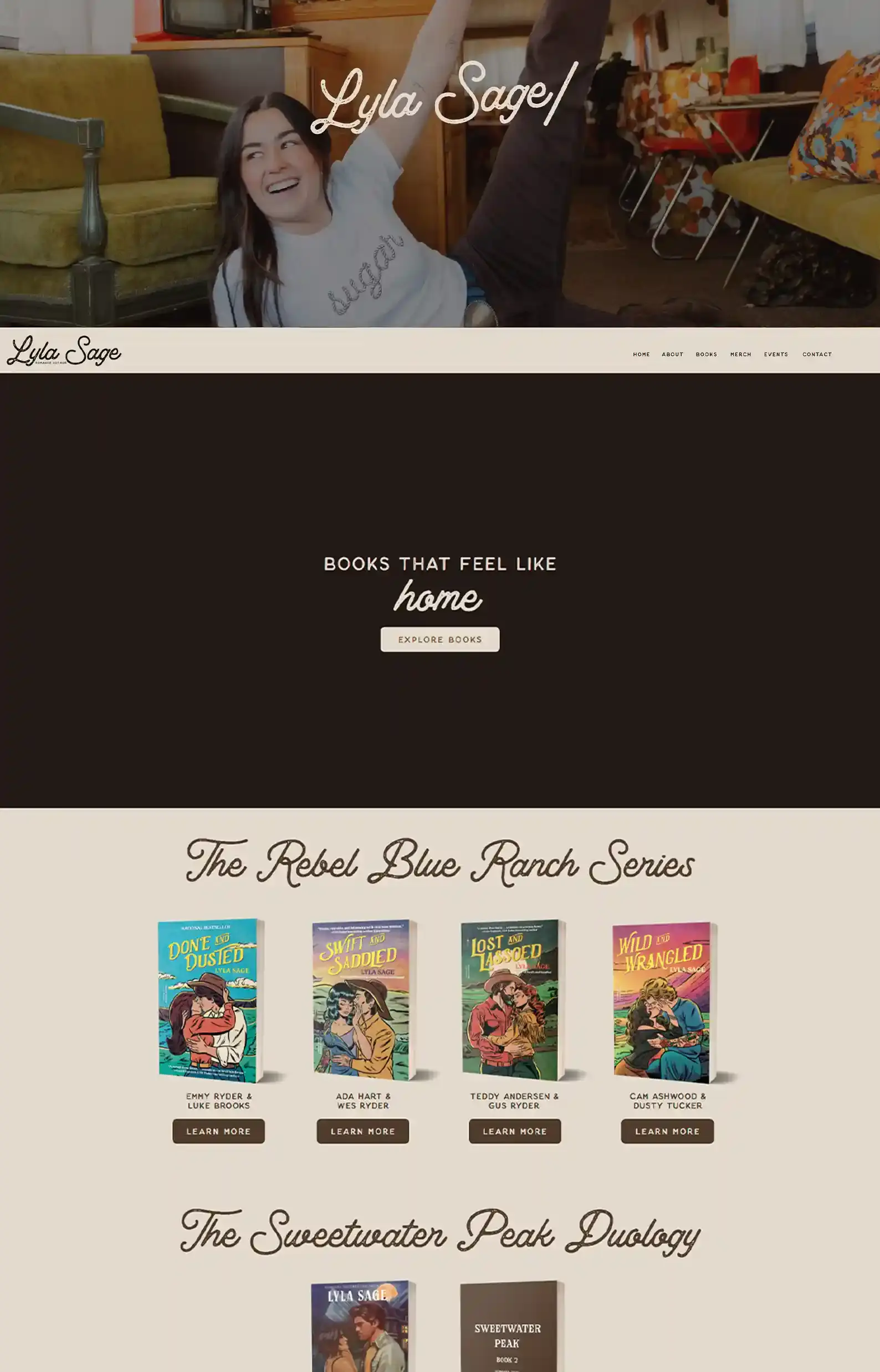
- Interesting intro that focuses on the author before you scroll and discover the menu and layout.
- The design gives farmhouse core vibes in the best way, which perfectly fits her romance subgenre.
While I can be a bit picky about menu design and homepage design, I really don’t think Lyla Sage commits any design crimes with her unique intro and placement of the menu.
It’s generally recommended to have your menu clearly visible as soon as you arrive, and it may not be obvious to all to scroll down, but I think users will quickly catch on.
Her site aligns well with her brand, and that’s just furthered by a personable online presence here. Cursive fonts don’t just look pretty; they almost look like someone wrote it.
Her Book page layout puts a spotlight on book 1 of her popular series, followed by her book for pre-order. This is a good general rule: feature the books you most want to promote next.
But Lyla knows where her money is: with her hit series. So, she let readers discover her through that.
3. Melanie Moreland’s Website
Check Out Melanie Moreland’s Website
What Melanie Said About Working With Us
“Rocket Expansion built a beautiful website giving consideration to our genre needs. Great communication resulted in an awesome outcome! Pictures speak a thousand words so go check out the website to see what they can do for you!
The team at Rocket Expansion built a beautiful website giving consideration to my business needs. They went above and beyond expectations!”
First Impressions:
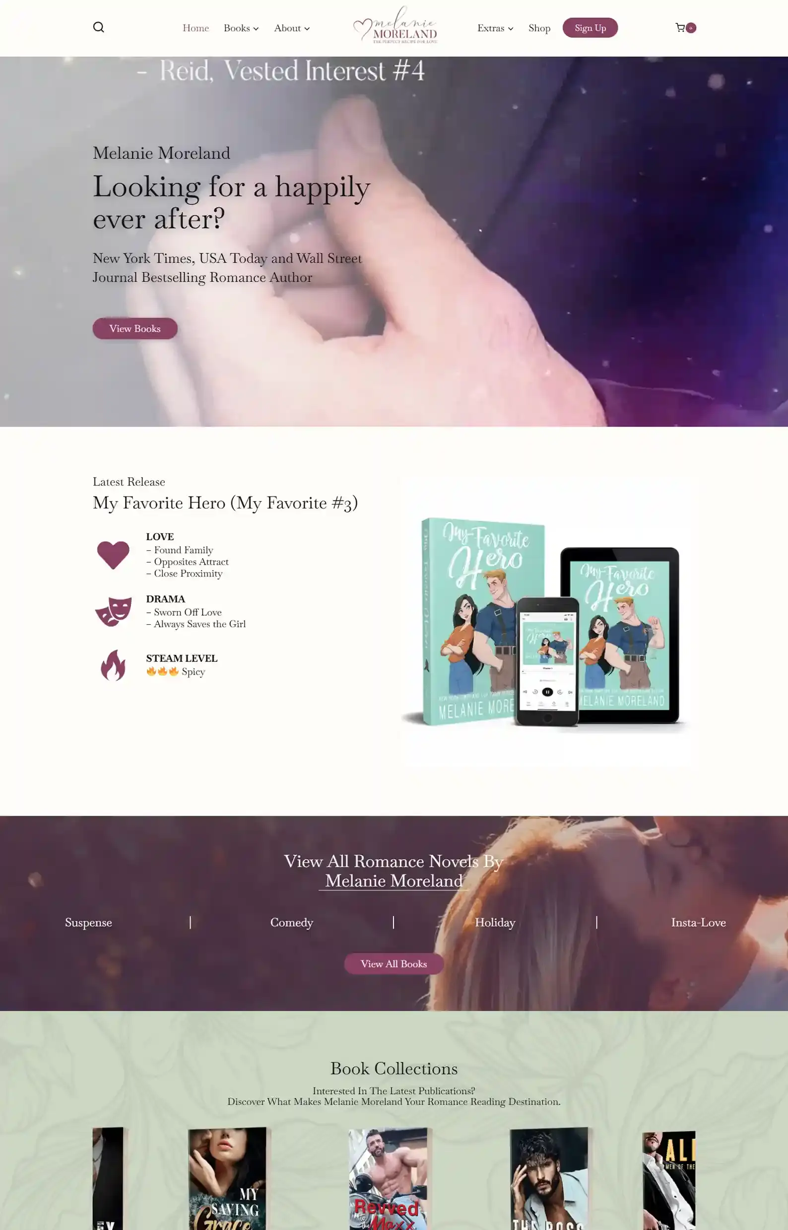
- Swoon-worthy design with dreamy banners and a stellar intro video.
- An enticing sign-up page offering a free ebook for joining the author’s email list.
This is one of my favorite websites on this list. Not only because it has a lovely intro video, but because my team designed it!
Melanie Moreland’s website clearly puts readers first.
When she promotes her latest release, she includes tropes and steam level, which is something every romance reader wants to know when checking out a book. She continues a similar layout on each book page, too, making sure readers are clued in.
The fan service doesn’t stop there. Readers can find plenty of juicy Extras under Fan Suggestions.
Want to see what my team can do? 👉 Here’s our romance portfolio.
4. Kat Singleton’s Website
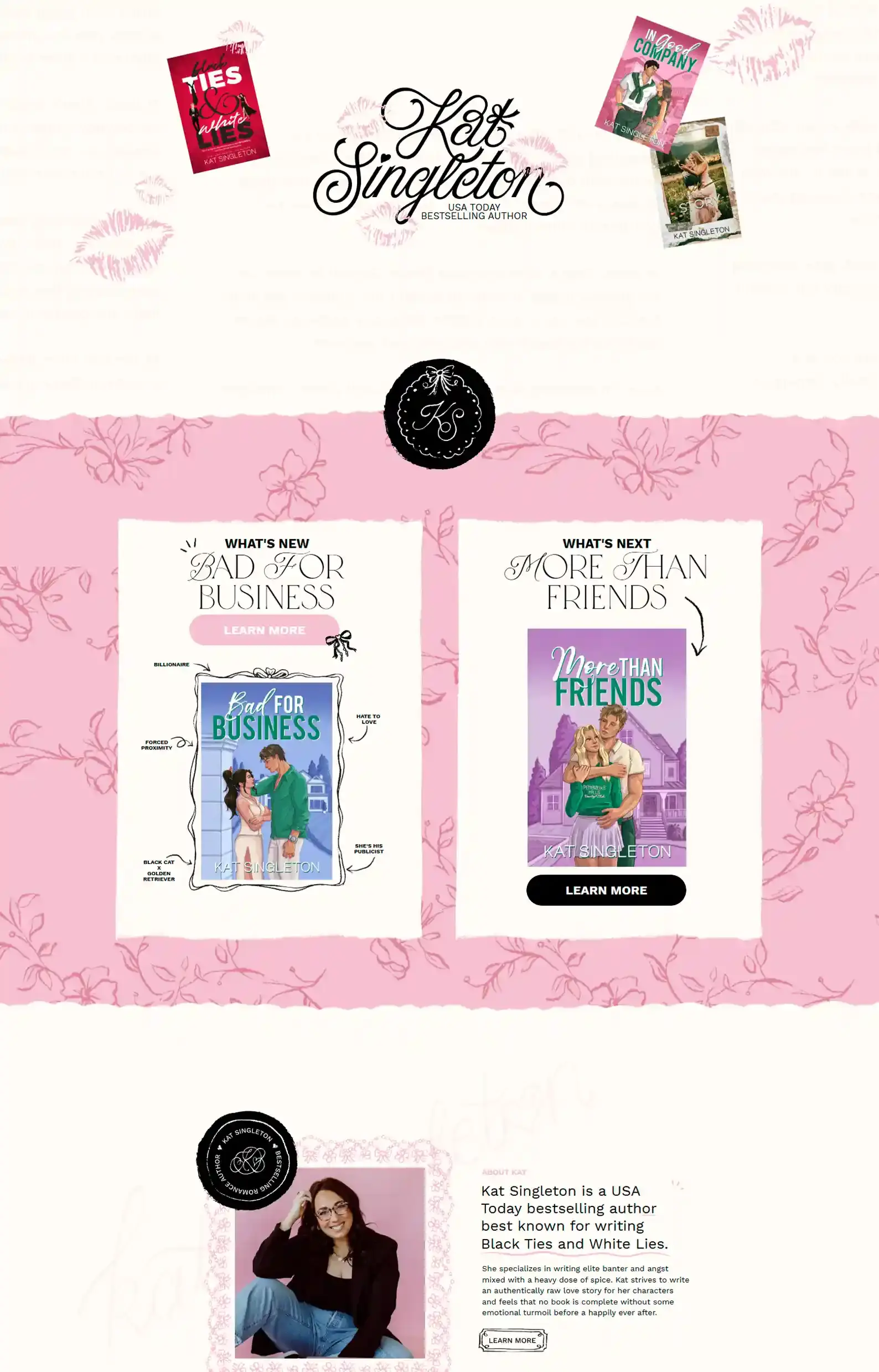
Check Out Kat Singleton’s Website
First Impressions:
- Super cute, frilly designs and placements that make this site eye-catching and personal, like opening someone’s well-crafted diary.
- The labeling on the For Readers Extras page suits the genre and branding impeccably.
With this many unique designs on each page, a site like this could look overdone and busy. Which is why I think it’s quite a feat that it looks this stylish and sleek.
The menu has adorable little underlines, squiggles, and circling, and this reoccurs on her About page.
To top it off, there’s even a timeline from the past 2 years showing what she’s done by month. Her ‘What’s Next’ page reinforces this design choice by laying out new books, upcoming releases, and newly released books.
I love the design choice mixed with the layout used, since it allows enough space given for content and the design to shine equally.
5. Callie Hart’s Website
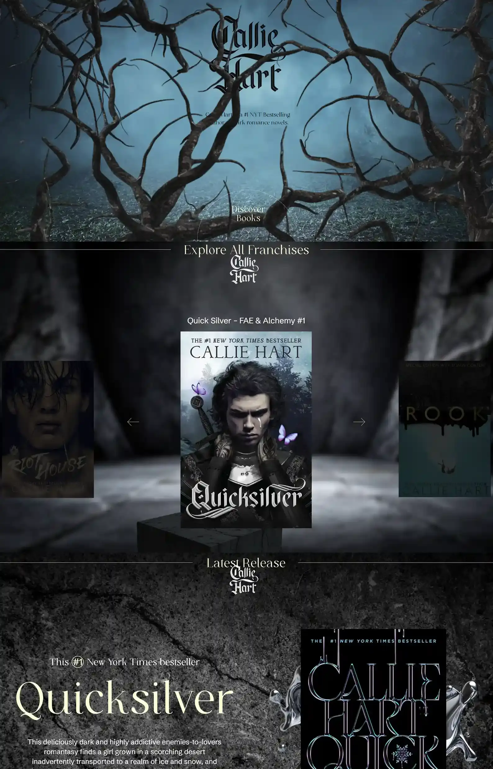
Check Out Callie Hart’s Website
First Impressions:
- A unique website experience, with each scroll changing the scene.
- Bold text helps focus the experience, catching the reader’s eye, despite the scenery.
I will say, you only get the full effect of the background on desktop. Because whenever I move my mouse on the intro, puffs of smoke swirl about.
Other than that, the mobile experience is polished.
Every page feels like a gallery viewing with a matching atmosphere, but different imagery.
Even with all of this, Callie Hart’s tone is still evident on the site through the copy, and it provides a really complete experience.
One suggestion I would make is to have the sign-up for the newsletter on the site instead of on a separate page that’s a little hard to find.
6. Alexis Hall’s Website
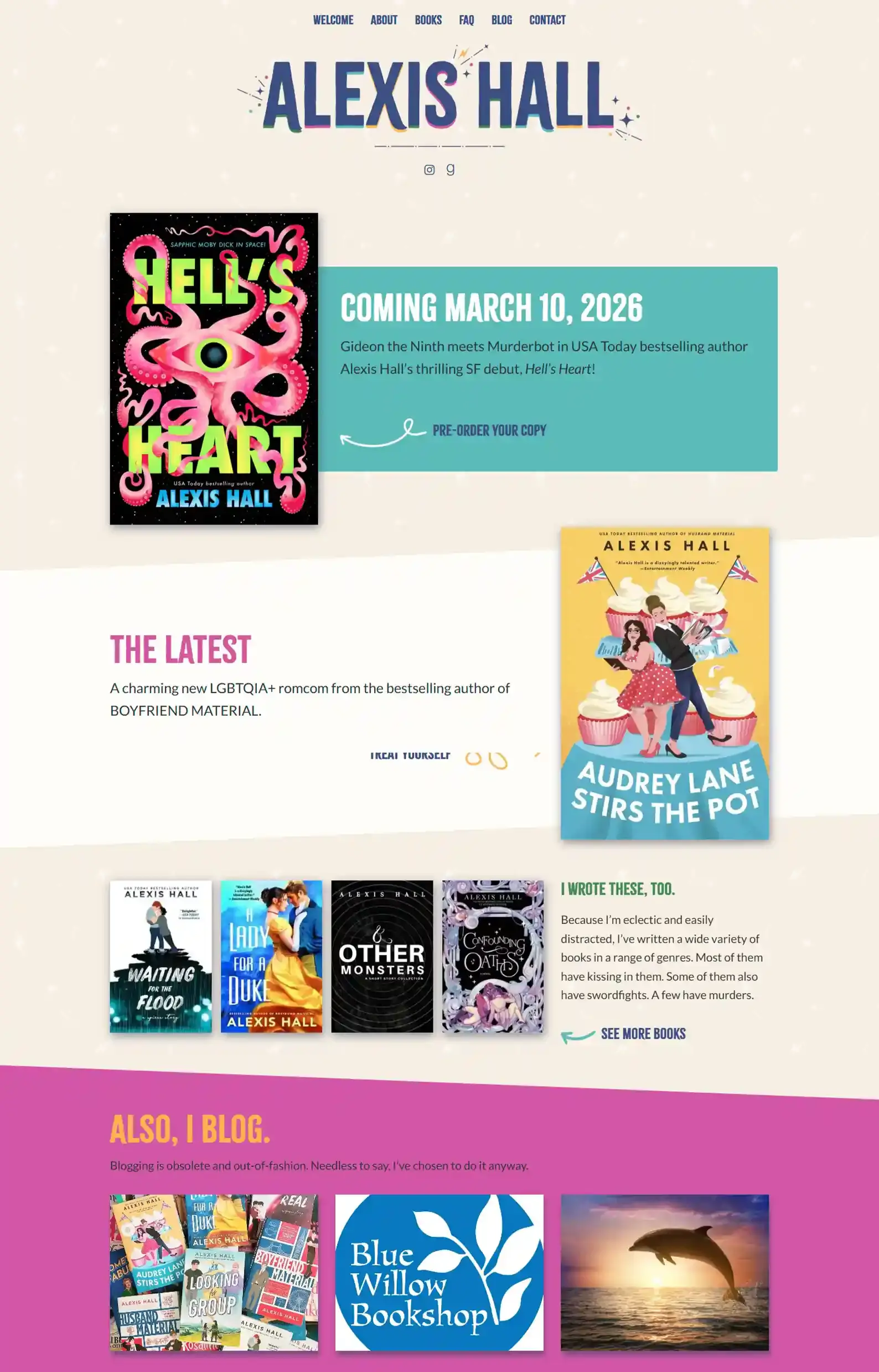
Check Out Alexis Hall’s Website
First Impressions:
- The site funnels the readers towards books effectively.
- The design and copy combine to provide a vibrant site full of personality.
For an author who values their privacy, Alexis Hall sure knows how to display branding loud and proud here.
I love the design of this site, because it’s anything but simple. It’s dynamic with moving elements and fun decorations.
My two favorite pages after a bit of scrolling? Definitely the About page and FAQ page.
It emphasizes the brand further as you can almost hear the author’s voice as you read.
Especially since his FAQ section isn’t shy about answering some pretty juicy questions like, ‘Why won’t you engage with my criticism of your work?’
7. Brittainy Cherry’s Website
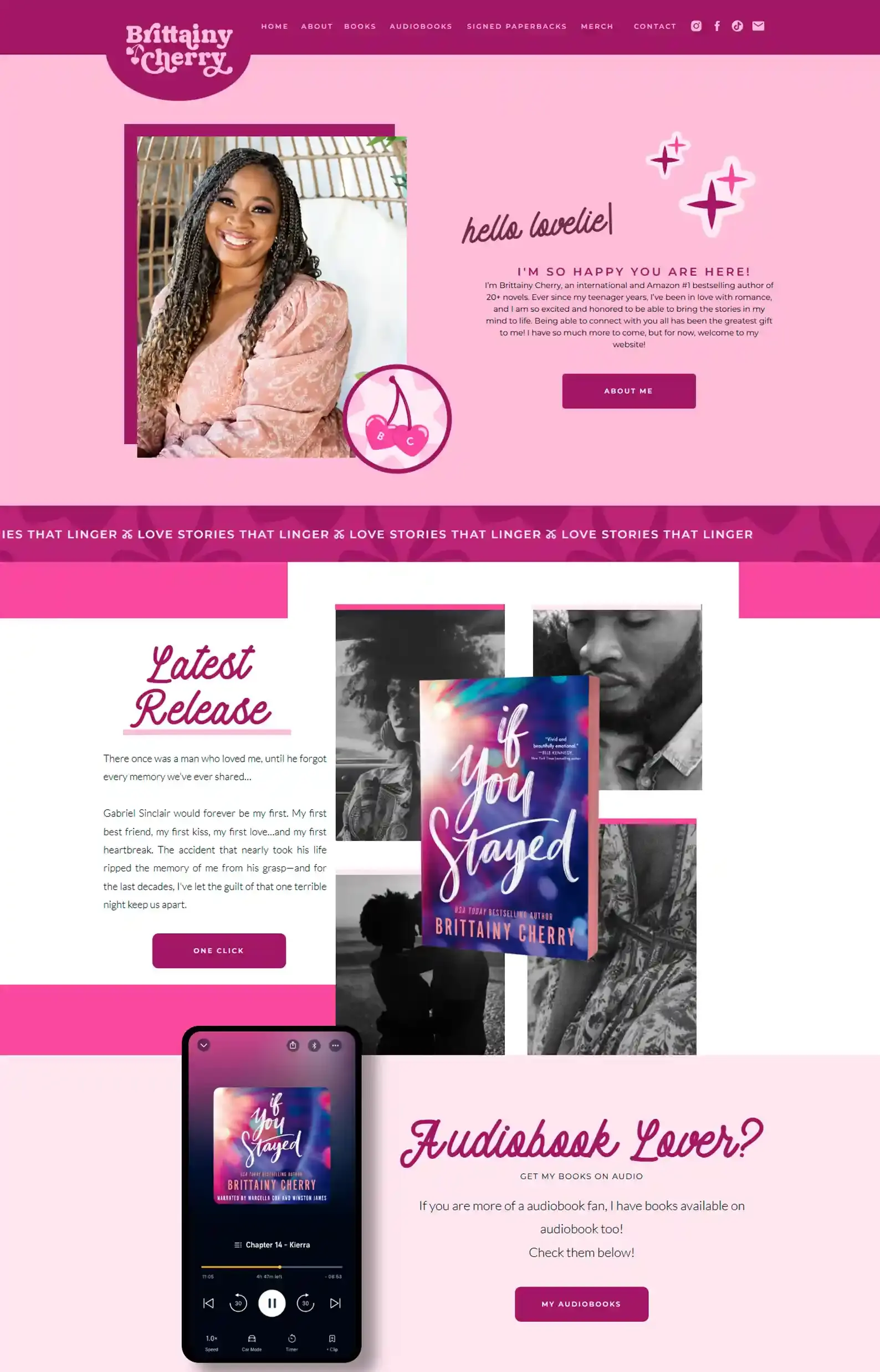
Check Out Brittainy Cherry’s Website
First Impressions:
- Upgrades the concept of “pretty in pink” without overdoing it.
- Super easy-to-browse Merch Shop with categories and product information displayed under each item.
Ever thought of basing your brand on your name? Well, you should take a page out of Brittainy Cherry’s book.
The color scheme and design elements bring her site to life, while respecting white space where content needs to shine.
I like how her book page flows, categorized by series. Each series has a little note from the author, advocating for why it should be your next read.
8. Hannah Grace’s Website
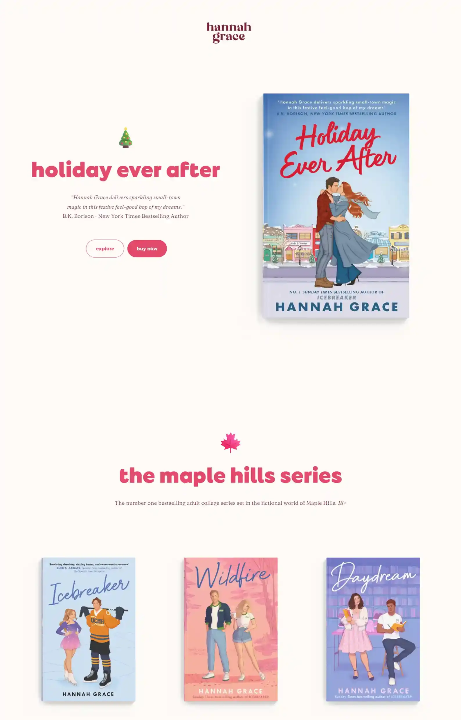
Check Out Hannah Grace’s Website
First Impressions:
- Simple, clean design accented by bright pink and maroon on top of a cute cream color.
- A focus on her books and links to where to buy the editions you want.
Hannah’s site has a calming feel due to the color choice and lowercase heading text. It’s very subtle but effective.
The content warning section is displayed neatly, allowing the reader to view for each book.
I love that she called her community The Group Chat.
And if you want to access extra content, you’ll need to sign up to get a password, which is a smart way to get interested readers to engage with you and connect.
9. Talia Hibbert’s Website
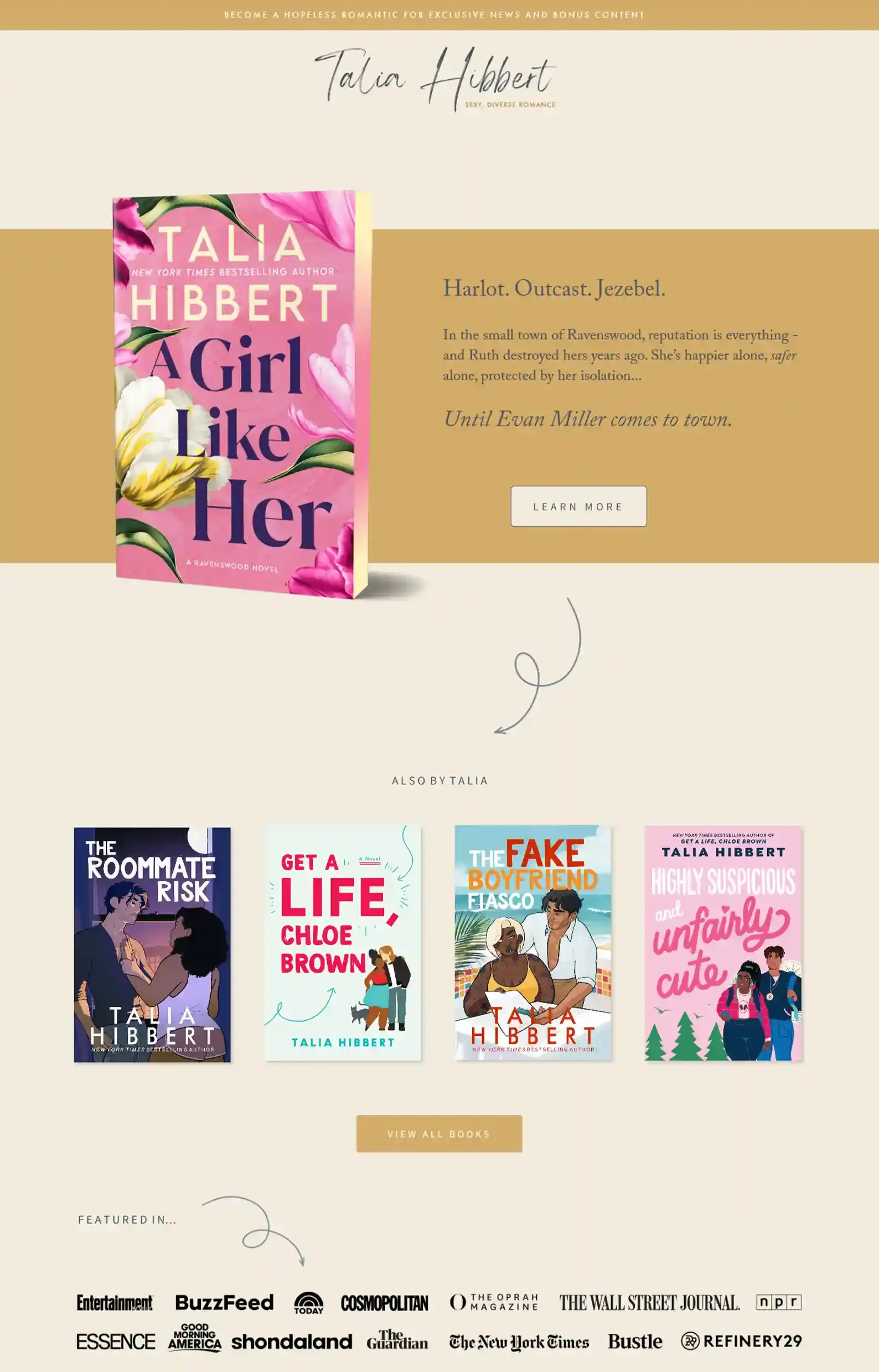
Check Out Talia Hibbert’s Website
First Impressions:
- The design is gentle and cozy, like you are being invited into her home, allowed to explore and get to know her.
- A comprehensive reading order that features key information on each book.
Talia’s website is playful and definitely represents her books and branding well.
Little star icons and gold text emphasize the romantic atmosphere, while drawing your eye to the content.
This romance author website was actually on my previous version of this list, and I kept it on this one because she had an update!
She now has an FAQ section. I personally think having an FAQ section can be a great trust builder.
Any reader who sees it knows this author values their relationship with fans enough to answer their questions. Super personable element.
10. K.C. Ale’s Website
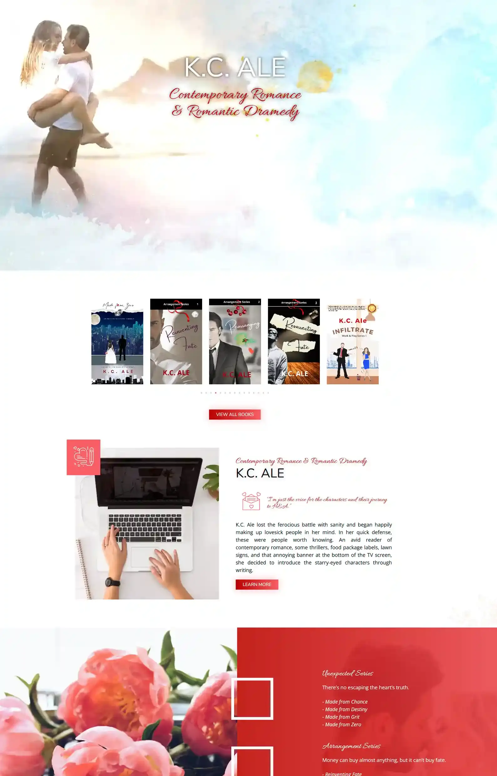
What K.C. Ale Said About Working With Us
“Rocket Expansion rocks! Matt and Sonja strategized, designed, and launched my website, regularly checking in with me and easily accommodating my quirks without batting an eye, offering suggestions that kicked it up several notches.
Creative, prompt, and steadfast. The team was an absolute joy to work with from the start, and I wouldn’t hesitate to collaborate with Rocket Expansion again.”
First Impressions:
- Charming intro that grips attention but also tempts you to explore the website.
- Well-placed CTAs and menus make for seamless navigation.
My team and I are really proud of this one.
From the little quotes of text from her work in the intro video to the sleek images and romantic colors, we accurately weaved K.C. Ale’s brand into each page on the website.
Her fun author voice is clear and friendly, making it easy for readers to engage with her content and explore.
And she rewards her readers for staying on her site with Fun Footnotes about the earlier stages of her books and bonus scenes from her work.
One aspect I love is under About. After reading her quirky bio, you’ll find a list of her favorites. It’s a unique way for readers to get to know you.
👉 You can find more of my team’s romance website designs in our portfolio.
11. Lauren Asher’s Website
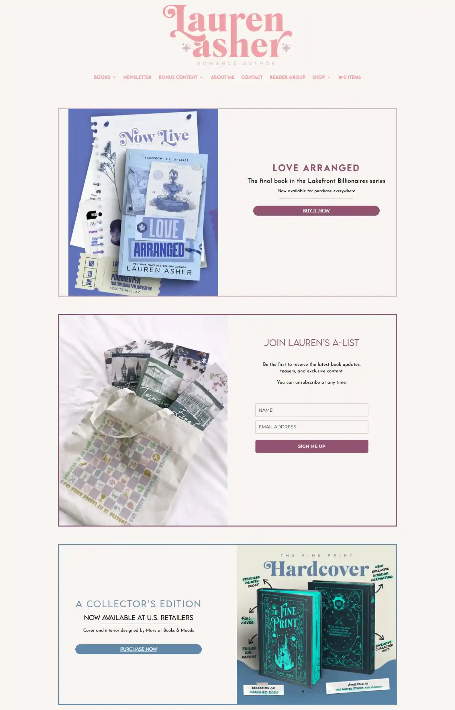
Check Out Lauren Asher’s Website
First Impressions:
- Colorful elements and aesthetic images set the branding and tone seamlessly.
- Simple layout that keeps distinct separation between content, making it easy to navigate.
While the intro style isn’t my favorite, the flow makes sense and points to 3 important next points before introducing other content.
Other than the intro, I love the bubbly atmosphere. Definitely romance genre appropriate.
Her shop is surprisingly large! And every item is clearly designed to cater to her fans. There are plenty of cute magnetic bookmarks, clothes, mugs, character cards, and more.
Another nice touch is that the Book Playlists page is embedded with the actual Spotify lists with an option to add them to your Spotify.
12. Susan Lee’s Website
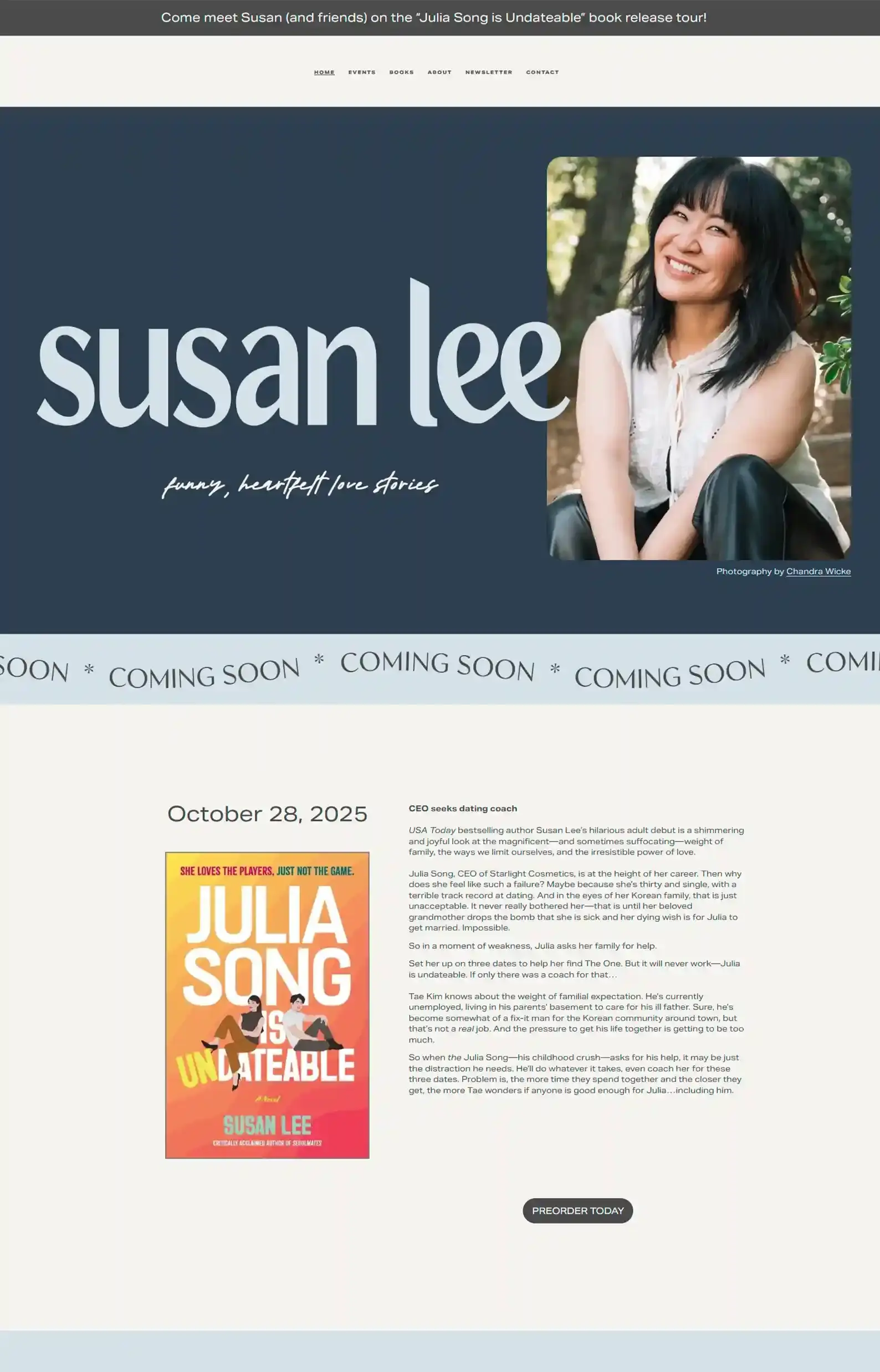
First Impressions:
- Soft, calming design elements that set the reader at ease when browsing her website.
- Who doesn’t love cute pets? Her diva chihuahua (her words) under the About page might be my favorite personal picture ever featured in a bio.
Well, isn’t this a breath of fresh air! This website balances professional and playful so well, in my opinion.
For example, some banners on Susan Lee’s website help draw attention as they flow continuously from right to left, while some are just static.
But what truly makes this website stand out is Susan Lee herself. Pictures of her are placed around the site, all smiley and warm. It puts a face to the brand and welcomes the reader into her world.
13. Laura Pavlov’s Website
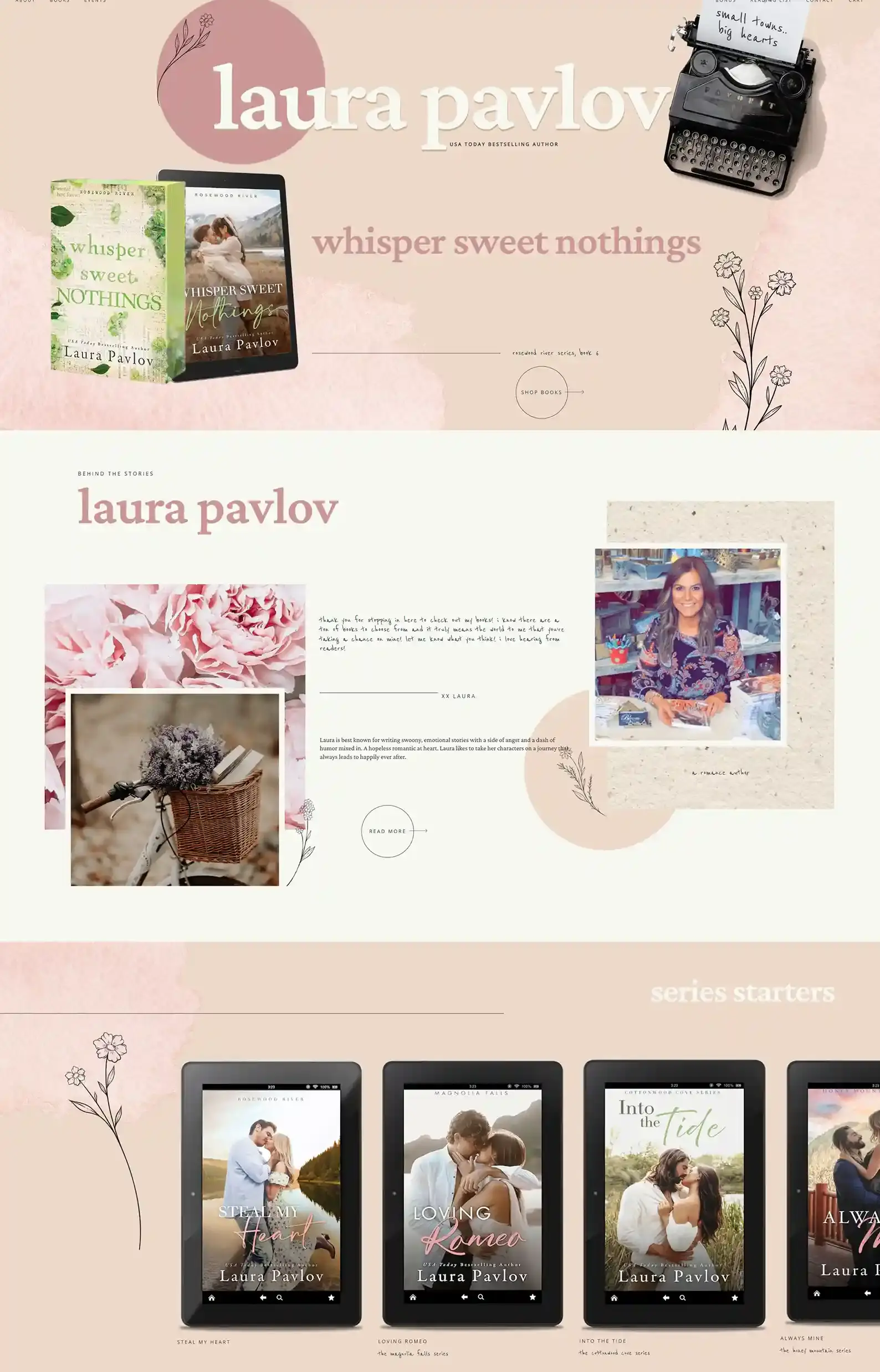
Check Out Laura Pavlov’s Website
First Impressions:
- This website design screams spring and growth in the best way.
- The layout feels like an adorable scrapbook with overlapping pictures and placement of text and imagery.
This is a great example of a super personable romance website. With cute cursive fonts and lower-case text, it feels like Laura is sending personal notes.
Each page is consistent with this style, but I do think the elements could be reduced in size a bit, or maybe using fewer pops of color and illustrations could keep things a bit more streamlined, as there’s a lot of space on some pages.
Otherwise, this is a very cozy site.
14. BK Borison’s Website
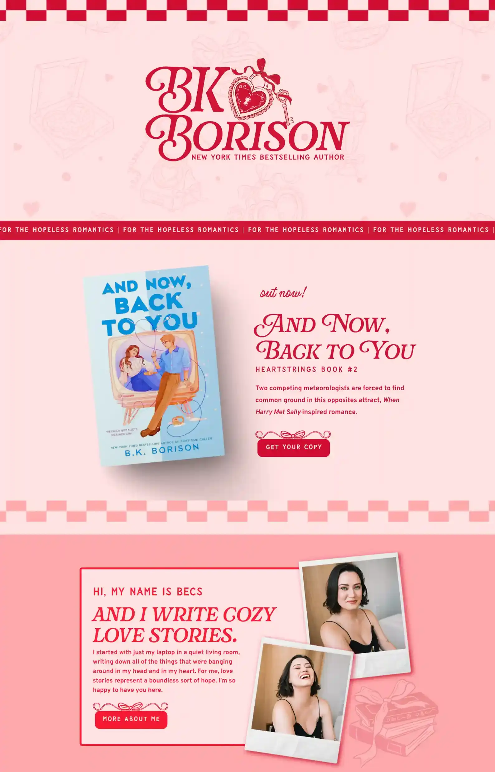
Check Out B.K. Borison’s Website
First Impressions:
- The balance of pink and red makes for a very playful site.
- Icons highlight, tilt, float, or shake, bringing the site to life (there’s also a heart pizza and cake – yum!).
In terms of pages used, this website design is quite straightforward. But instead of keeping things simple, B.K. Borison decided to spike every page with spunk and personality.
With checkered borders and cute icons, the website has a nostalgic feeling to it. Almost like a super cute diner.
All her books are on the homepage, making sure to promote those above everything else.
15. Elin Kind’s Website
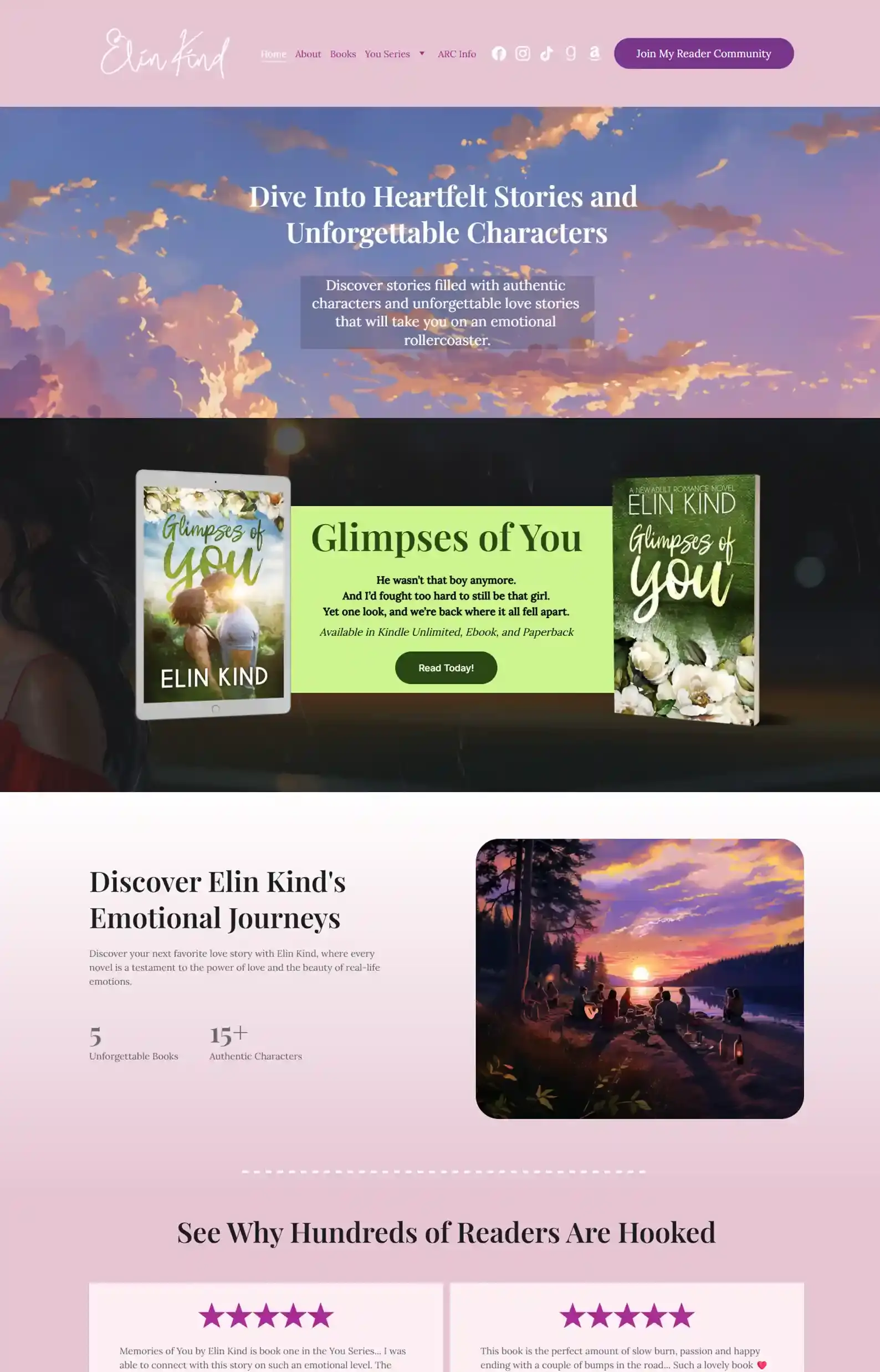
First Impressions:
- The dreamy design is perfect for the romance genre.
- Good flow of the homepage with books and reviews, trying to entice readers to read the author’s most popular series
This site is very reader-centric and stylish. I love the choice to have the banners on the book page match each book cover. Really appealing to the eye.
The rest of the site follows suit with design and layout, but one page I wanted to highlight was the ARC Info page.
It’s super detailed and instructive, and a great example for any romance authors who want a simple page to encourage ARC readers to help with reviews before a book release.
16. Jennifer Hartmann’s Website
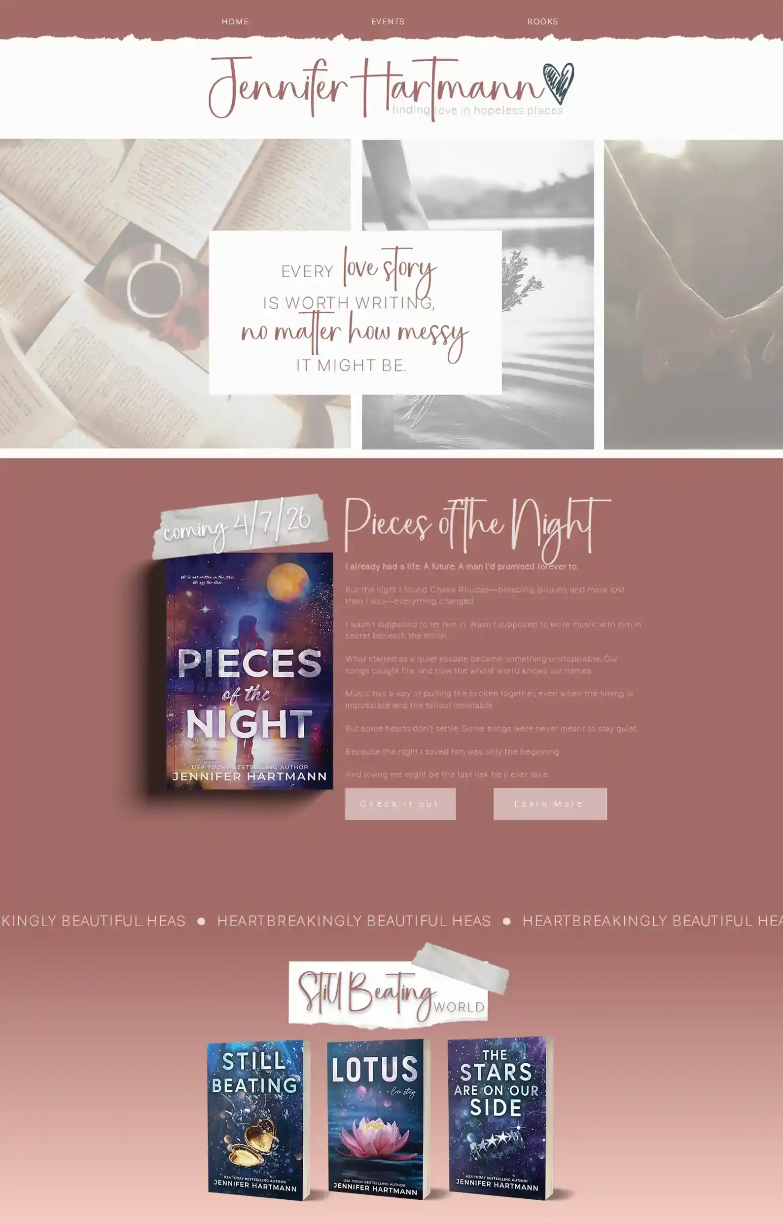
Check Out Jennifer Hartmann’s Website
First Impressions:
- The design is professional yet super friendly with the use of ‘taped on’ headings and torn page elements.
- The speech bubbles are a cute way of showing reviews.
The first page feels like you’re stepping into a cafe on an autumn day with a book in hand. Super comfy!
Clear focus is given to the author’s books on the homepage, with her latest release drawing attention first, followed by her other books.
Her book page is divided into different categories, making it easy for readers to browse. But my favorite page is the events page, where content sits inside cute cards.
It doesn’t just look cute; it makes it easy to read and find out where you can catch Jennifer Harmann next!
Happily Ever After?
My team and I loved making this list. Yes, when we’re not building websites, we’re looking at other websites – we’re kind of obsessed like that.
We just hope it sparked some inspo for you.
Want to see some more author website examples?
👉 Check out our author website portfolio.
Or if you’re ready to bring your website to life
👉 You can book a Zoom with me.
I’ll chat with you about your books, your goals, and whether we’re the right fit.
Then we’ll compile that data and design a free homepage concept so you know what you’re getting into.
We do custom designs, so you decide how you want your HEA to look online. You write your books, we build. Kind of the perfect set-up, right?


