As a keynote speaker, you want to command attention and deliver your message so that it hits home.
Your website should do the exact same thing.
Here’s an in-depth rundown of some of the best professional speaker websites online. We’ll highlight why we chose each one and the key takeaways you can use for your own speaker website.
But why trust us?
At Rocket Expansion, we’ve built 100+ high-performing author websites that do more than just look good—they help authors sell more books, grow their email lists, and build thriving fanbases. We work with fiction and nonfiction authors across genres, optimising their sites for discoverability, conversions, and long-term success.
If you’re looking for a custom, done-for-you website, let’s build one together.
Simon Sinek

This is a great example of a clear and concise website with a functional layout. The desired pages and subsections are easy to find & very navigable. Wording and pictures stand out well with the choice of color and positioning.
The key takeaways from this would be the very specific, separate pages and the choice of where they are placed. Social media buttons are on the perimeter and don’t take away from the focus of the page, but rather complement it. The contrasted color combination works well and information comes across effectively – which is ultimately the goal!
Chunka Mui
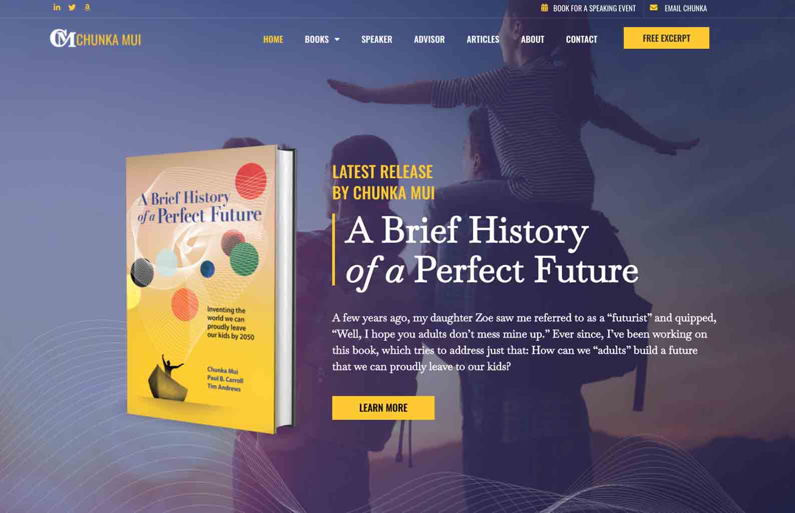
We built this website for business futurist speaker, Chunka Mui.
Sleek, effective, and balanced – this website gives the user exactly what they’re looking for without overwhelming them. The contrast of bright yellow with the more mellow purple stands well together and holds attention successfully. The calls to action throughout the site are clear and effective, making navigation easy and the overall user experience a breeze.
A key takeaway here is the thoughtful but effortless use of color that simply wows without being too much. This is definitely a make-or-break factor when it comes to your website and will ultimately distinguish a great experience from a mediocre one just from the combination of colors you choose.
Tony Robbins

Tony’s website embodies his brand well throughout. Focusing on his presence, social proof, and what he has to offer, a wide variety of options are presented. Users are able to easily find what they are looking for and move from section to section with ease.
Something that works really well here is how clean the layout is at first glance, but how in-depth the drop downs become upon hovering or clicking on something. There is a great balance between Tony as an individual and his work, and then other influential people, his followers, and engaging user content – an example of a well-balanced website!
Kindra Hall
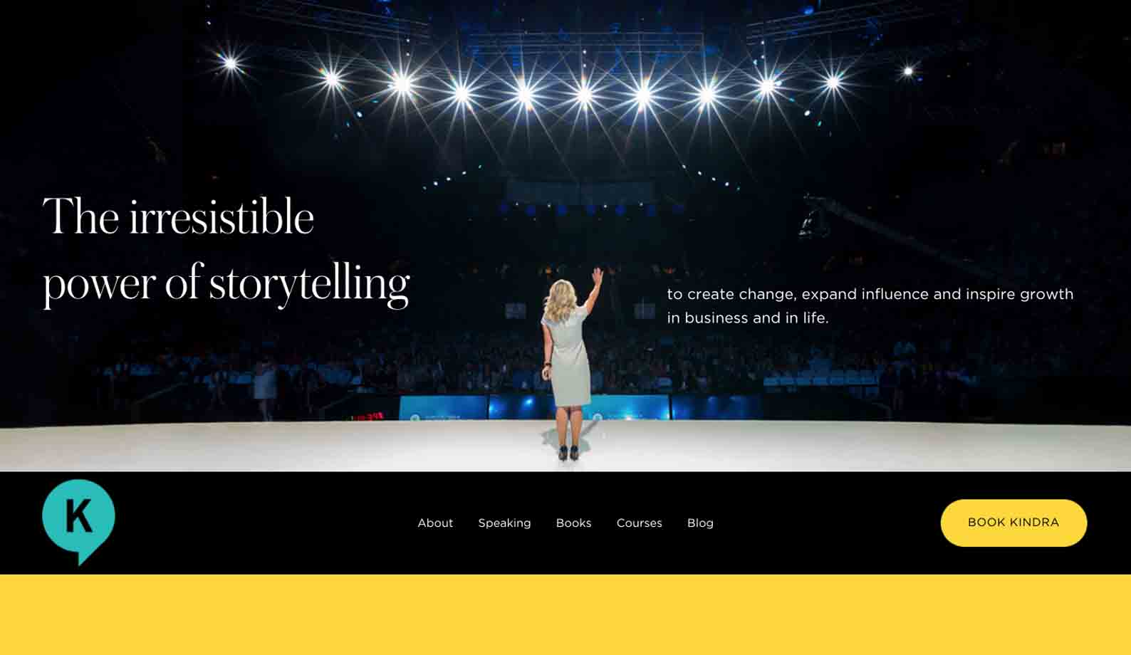
As a user lands on Kindra’s website there are a few options presented which doesn’t overwhelm and allow for easy navigation. This is further complemented by a seamless booking page to convert visitors into customers effortlessly.
The choice of color is bold but not overstated and stays consistent with Kindra’s brand. Her logo is a great contrast too and stands out well. All in all, it holds a great balance between what is on offer, her work, and how to get in touch.
Joe Hirsch
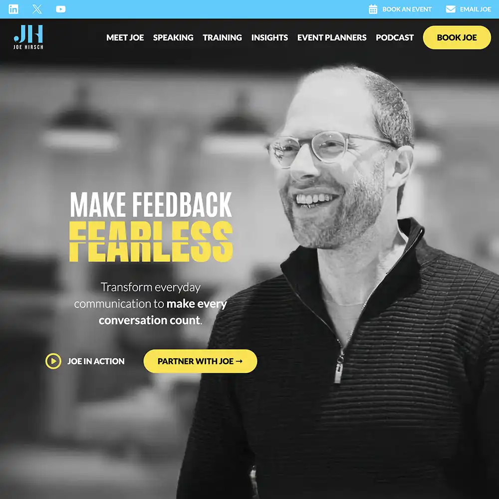
If you have a lot to offer as a speaker and need to display it all without confusing the site visitor – this speaker website is an example on how to achieve that.
We may be tooting our own horn, since we designed this, but every page, every heading, and every sentence is so carefully curated to convey Joe’s core message with simplicity.
Let’s break it down. Since Joe Hirsch is a Feedback Expert, and skilled in communication, the design elements we used place emphasis on impact words, drawing the visitor’s eyes to important information.
Bold, bright colors are used to contrast video banners and darker sections to give the content space to breathe. It’s important to use the space wisely so as to not overwhelm the visitor with too much information at once.
From the blogs under Insights, FAQs under Event Planners, a Podcast page, to the information under Training…we’re really proud of how this turned out!
Simon Bailey

Incredible use of color to grab attention and keep a consistent brand message going throughout. A positive opening line that reflects Simon as a person and how he aims to come across through his work. The use of video is incorporated into the landing page, but it is to be clicked on and doesn’t lap automatically. This is good as it doesn’t distract from the other content, nor does it work against or clash with the bright colors.
The site is engaging and great to navigate. The user takes a journey to come across Simon’s offers, testimonials, social proof, awards and simple but effective calls to action. Keep things simple but effective like this and you can’t go wrong.
Eric Thomas

An ideal example of unfolding a story as you scroll, this speaker’s website moves the user along a journey to deliberately show a range of offers. The first look is very eye-catching with a contrasted background that reveals imagery through an ombreing red to black. This draws users in.
The subtle incorporation of Eric’s high-profile catalog of organizations he has collaborated with effectively solidifies his standing without overstating anything. This is a great way to highlight affiliation, social proof or testimonials without leading to overkill. This is a great sense of credibility!
Matterhorn Business Development
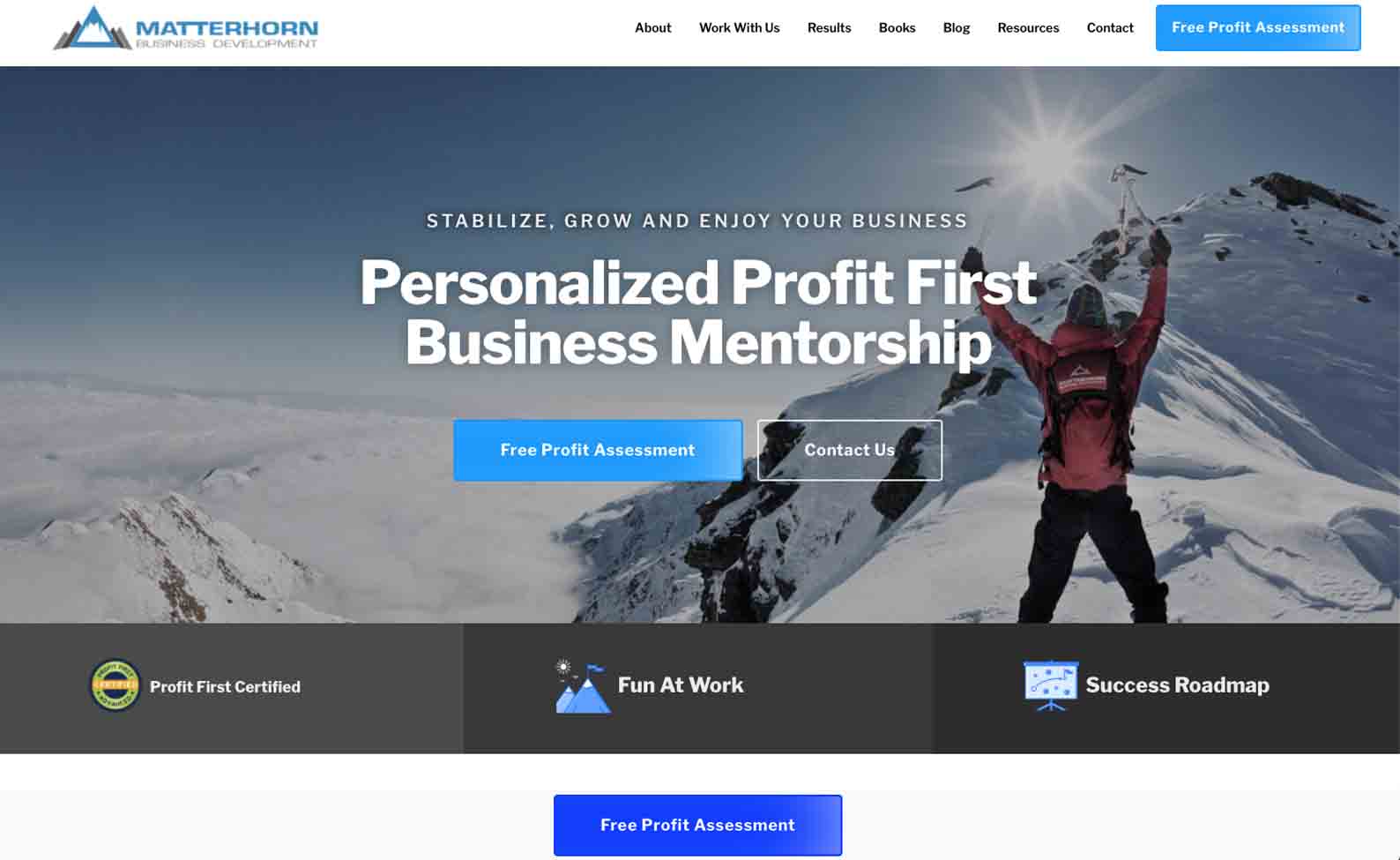
We built this website for speaker Greg Winteregg’s consulting business.
In terms of a well-balanced website, this achieves just that. Pages are outlined and easily followed, with obvious calls to action incorporated here and there. The colors work well together and keep a theme subtly running throughout.
Here, less is definitely more as a user does not end up feeling overwhelmed with information trying to navigate the site. Complimentary colors stand out and information is well received, this encourages a user to scroll further, stay longer, and want to see more. Keeping things simple is sometimes the way to go and could be best to achieve your goals.
Josh Sundquist
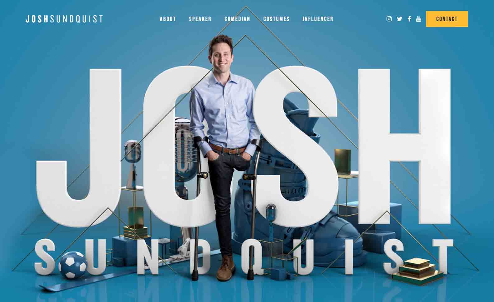
Josh’s speaker website allows his authenticity to speak for itself and every page carries his uniqueness through. The incorporation of true stories, personal pictures, and ‘Josh-centric’ content creates a feel that can only be found on this site and compels users to read more.
This example holds clear and accessible calls to action that guide visitors to do exactly that, take action! We love this site as it serves as proof to be the most authentic version of yourself and the rest will follow, something extremely important with a great speaker website.
Mel Robbins

This website is such a great example of a great user journey from the onset throughout. The text and color from Mel’s book are consistently translated through to her website, which is key in terms of branding!
Mel’s website has a sleek layout that aims to not oversaturate each page, but rather have extra options appear when needed as menus and drop downs. This is a great way of making sure just enough information is provided to engage and not overload visitors.
Brené Brown
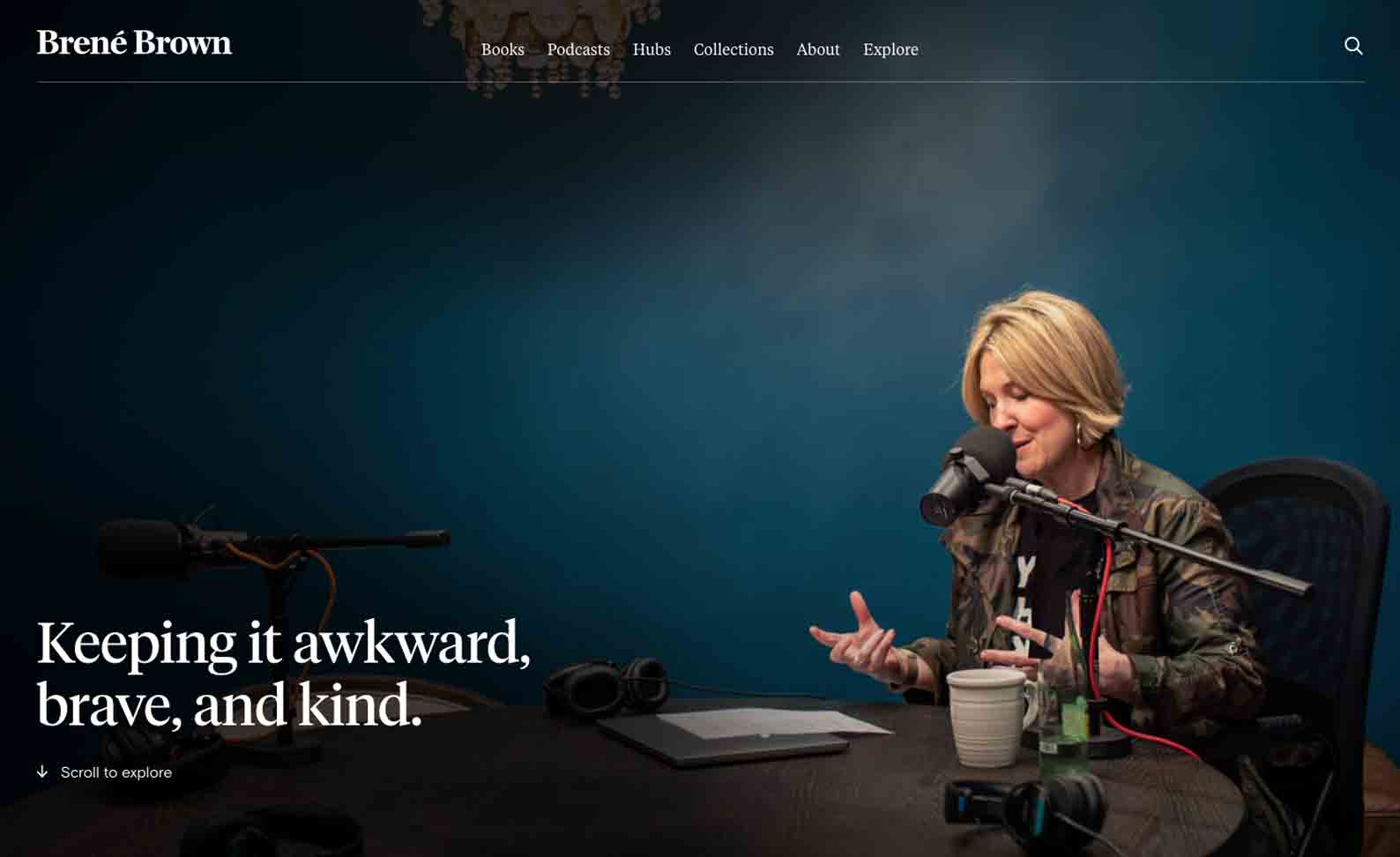
Brené’s website is a great show of what effective use of negative space can achieve. Through the positioning of text, selected open spaces, and great placement of buttons, the user experience is rather unique. A very sleek feel is kept with dropdowns that allow the expansion of streamlined menus, keeping the site minimalistic and not overloading each page.
The flow of this website is fresh and clear, which gives a great feel overall as users navigate through it. This is something very important to implement as it ultimately results in visitors coming back to visit the site again as well as keeping users moving through instead of clicking out of it.
Eckhart Tolle

Eckhart achieves a harmonious balance through the use of pictures and color schemes throughout his site, translating his topic well. Pages see a mix of his presence, tranquil city skylines, and contrasting shots of nature all working together. This website conveys the essence of the brand and ethos of the speaker in a concise, seamless way.
The key takeaway here is staying true to your brand; don’t overdo it. This is embodied fully with all the content working together to immerse users into the platform. Another great feature is the easy-to-use layout of the website which further complements the feel as users explore the site.
T. Harv Eker
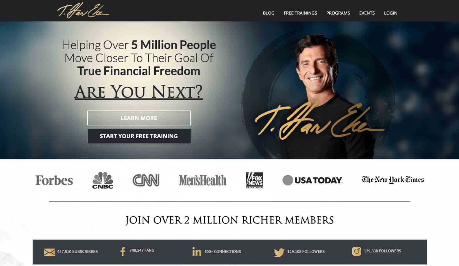
This website is a show of credibility at its best, however without it being too much which is the goal. Social proof, statistical values, and social media insights are great ways to build and showcase reputability within the field and it’s clear this site does it well.
The key takeaways here would be carrying oneself with conviction and confidence but smoothly incorporating everything. The color scheme of neutral tones met with muted shades works well together and is also carried through with bold, contrasting fonts to draw and hold attention. Keep it constant!
Cassandra Worthy
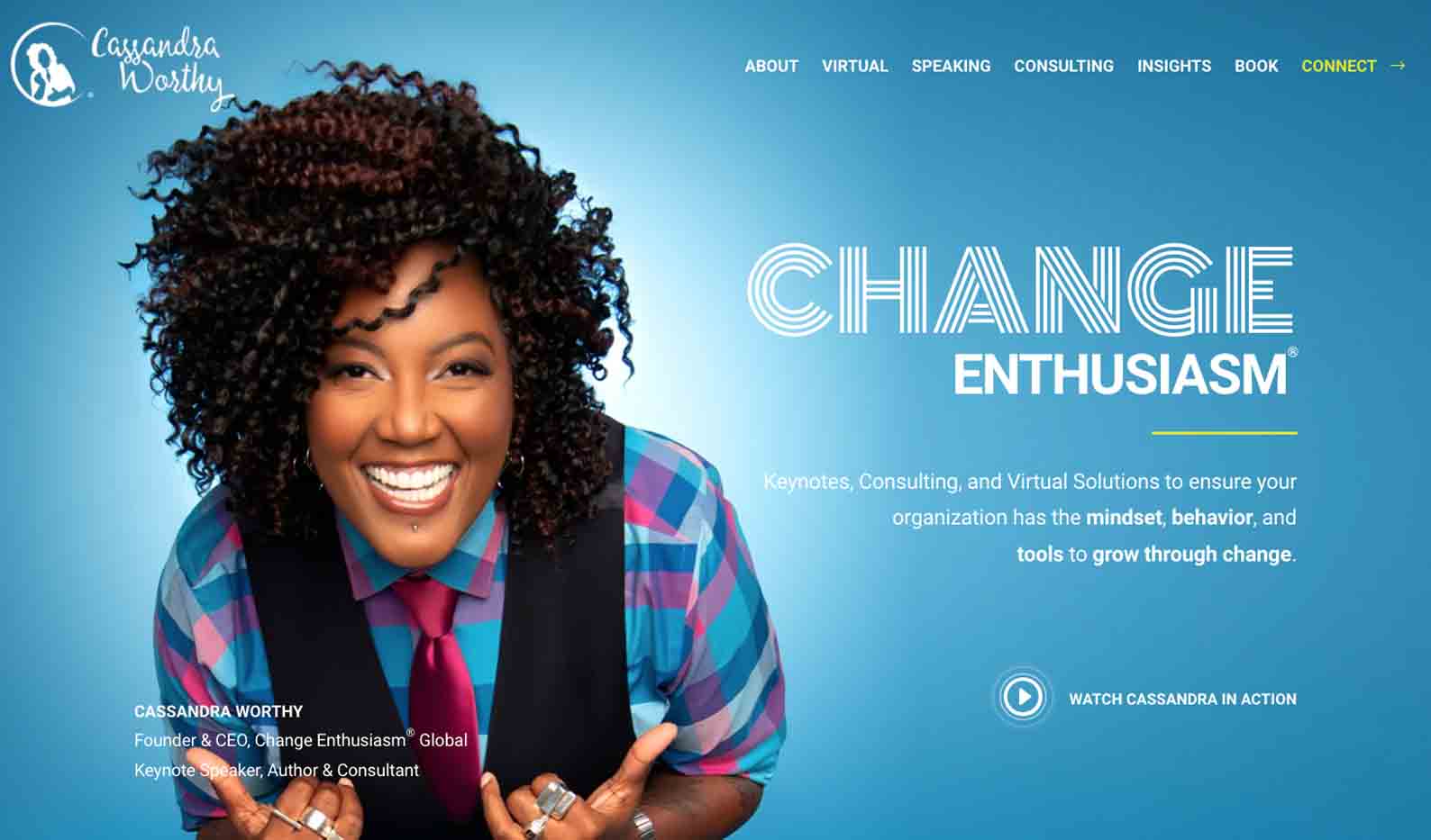
Bold and bright is the first thing we think of when we come across a website like this. Even with such an in-your-face color choice on some pages, consistency is maintained through certain fonts and minimalistic dropdowns & buttons. This balance allows a user to engage in a clear, streamlined way without feeling put off and needing to leave the site.
A key takeaway from Cassandra’s website is the ease of booking a consultation directly with her, which adds a very personal touch to the speaker site. This is great to incorporate as users already feel like a barrier has been dropped and will be more likely to engage and initiate contact – convenience is prime!
Erin King

If your brand has bold colors and you want to use them in an effective way, this is the perfect example of exactly that. The use of whitespace is so effective in balancing out the neon tones that encompass Erin’s brand and works hand-in-hand with her well-known branding in a teal shade.
The website balances buttons, menus, and content well which is a key point to be noted. Keep the most important options front and center that you want users to engage with, any secondary stuff can be found as they navigate and discover all the different sections on your site. Here, website flow is the big factor!
Mike Michalowicz

Do people know you best from the work you’ve put out there? Well then this is the example for you! Straight away we’re made aware of the variety of books Mike Michalowicz has written, which is clearly the aim behind it. From there, users are able to navigate his website and explore more. However, this journey has a few pit stops along the way in the form of pop-ups that either offer something or ask for information to join a newsletter. This technique can be a more aggressive way of acquiring leads, however, for some speakers, this works best.
The most noteworthy element here? How different the layout is. Regardless of his intense lead generation system in place, Mike simplifies things on the other hand when it comes to his pages. Unlike the other websites we’ve seen, there isn’t a row of pages listed out – instead, users click on a clear dropdown menu to navigate page by page and find what they’re looking for. This is important to counteract a more intense strategy with more subtle elements, such as the menu here.
Chad Mathew
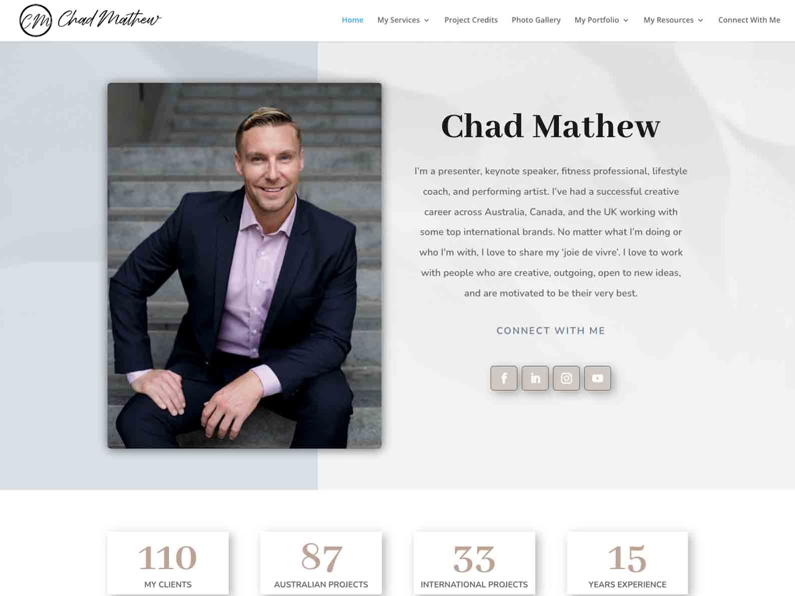
Chad’s speaker website has a very strategic layout aiming to act as a portfolio and put the best aspects on display. This drives home credibility through quantified results, a wide variety of topics and offers, as well as direct social media links.
Notice how here the social media buttons don’t take away from the website itself but are seamlessly embedded within it in an accessible way due to layout and color choice. If social media platforms are your main source of communication and engagement, this is a great way to include them whilst still making the actual website the focus!
Daymond John

This example is a perfect case of a speaker well and truly being the entirety of the brand. Daymond is present on all of the first few initial slides as one scrolls through, this can be slight overkill however, here it seems to hold more relevance than an undesired overkill of his presence.
We see social media content has been embedded within the first page users would most likely land on. This can be very bombarding and suffocate the rest of the content on the page, so definitely something to watch out for.
However, Daymond’s site is still very compelling and is a show of how personal branding can be a super valuable tool as users connect with the person directly.
Dan Thurmon
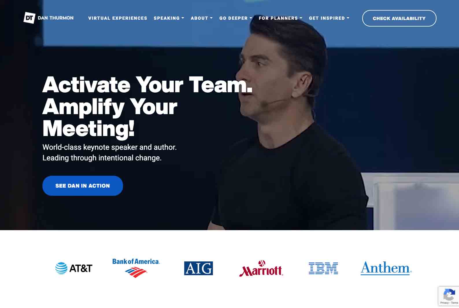
If there’s anyone who knows how to make a lasting impression, it’s Dan Thurmon. Not only on stage but translating through to his website with an energy-loaded opening video as someone lands on his page – the epitome of using your uniqueness to its full potential.
Of course, if you can’t do backflips as an entrance don’t attempt these tricks, walking in is just fine!
In terms of any key takeaways for a great speaker website, this is the best example of using video to your advantage! Dan allows his unique edge to manifest through physical presence in the form of his entertainment.
If your best qualities can be showcased through epic videos, pictures, or the inclusion of any other type of media, this is a great way of grabbing attention and showing people what you’re all about.
George Weigel
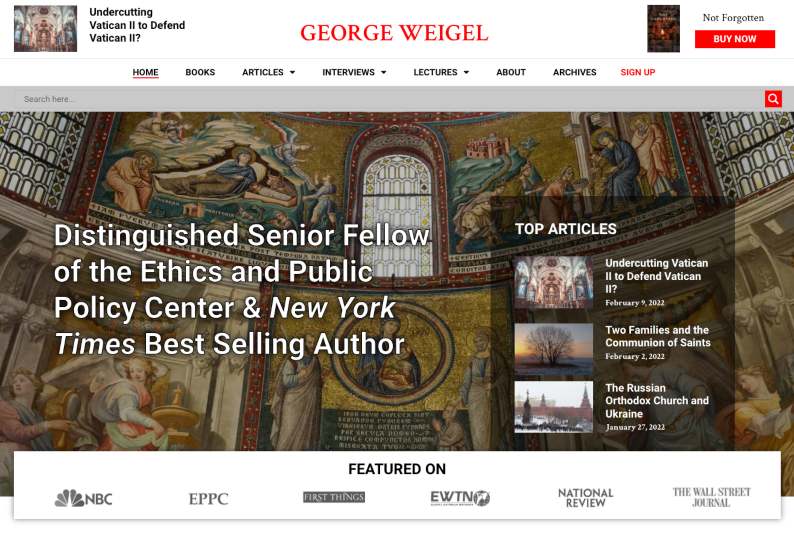
Representing the niche and field of work very well, this website is a great example of an authentic, well-rounded site. The choice of images and layout complement each other very well and work together to create an easy-to-navigate flow.
All the pages are clearly identifiable and are distinguished quite well, allowing users to find what they’re looking for easily.
George Weigel’s website is another one we’ve designed and created. If there’s anything to take from this example, it’s more definitely to keep things simple but use featured key elements. This is exactly what makes it so effective as users are not bombarded with information or images.
John C Maxwell

John’s website is on the simpler side of things, but nonetheless includes a fantastic user journey in a guided way and encompasses all the key points someone would look out for and need on the page. His calls to action are very to the point, which if implemented correctly can be super effective and not overly pushy.
The biggest point to keep in mind from this example is most definitely the seamless incorporation of an e-commerce platform onto the website itself. This makes it easy for readers to get access to all their favorite books and discover more along the way.
Very effective to have on your own platform as opposed to being featured on another as users know exactly where to find you directly.
Darren Hardy
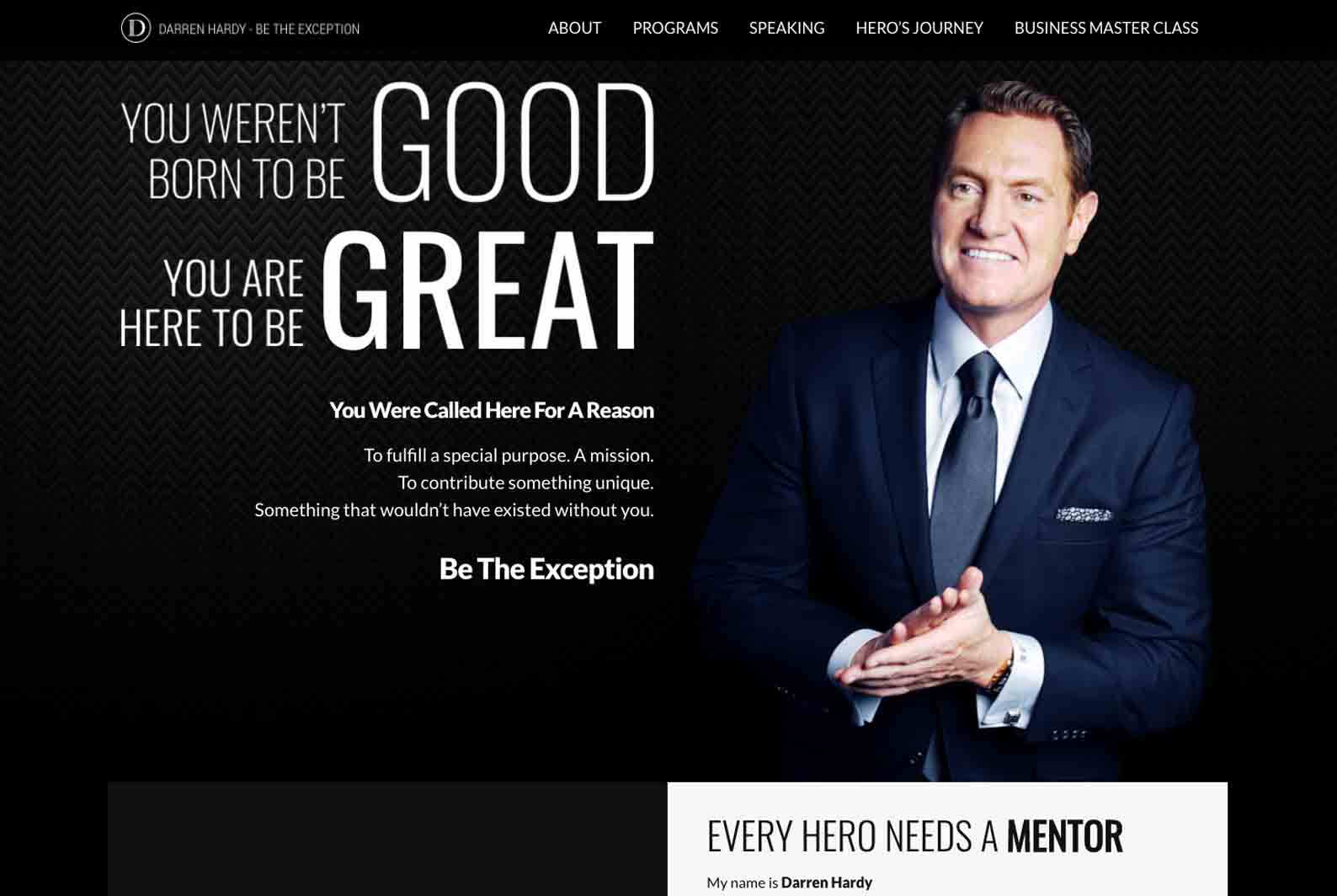
Confidence and conviction cannot be better encapsulated than how Darren Hardy manages to do it, and in this line of work, it’s not only needed it’s essential. However, the line between boasting and confidence is a fine one and is to be navigated wisely. Notice how throughout his website, the user is uplifted instead of just having the focus be on himself. Yes, include all the accomplishments, accolades, and achievements to showcase your success, but in a way through which an offer is presented to the user of what they can gain.
Transparency is key when it comes to credibility as people need trust to take any sort of step towards you. This is key here and is what should be emulated when it comes to crafting an awesome speaker website that wows your audience long-term and not just on a superficial level.
John Nepper
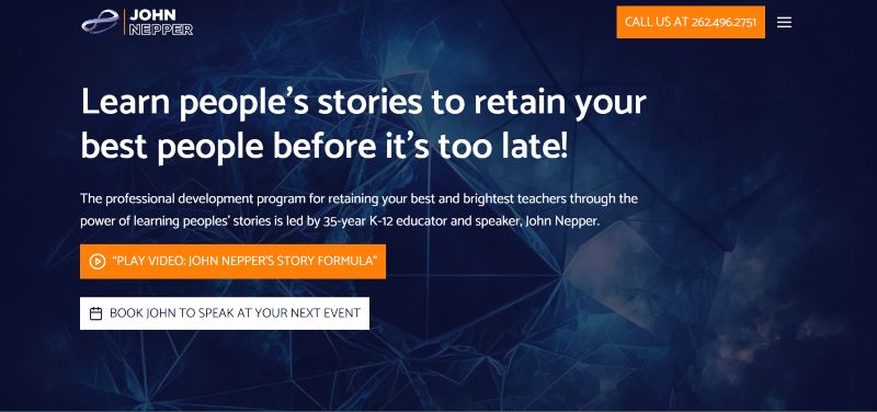
Sometimes simple is best. That’s exactly what we went for in designing John Nepper’s speaker website!
The straight-to-the-point branding is effective and grabs attention. We did this using bold colors and clear, bold fonts to let the content shine.
John has tons of blogs, vlogs, interviews, and video resources for website visitors to discover more about him.
His website has a professional yet personal touch that represents his author branding well.
Jay Baer

If bookings are your main priority and what you’re after on your website, this is a good example of a very to-the-point way of having it front and center. It may be a bit too aggressive for some users, however, if you find a balance of aligning your calls to action with how your brand is showcased, you’ll get a winning combo.
In a more subtly focused way, this streamlined booking setup can be found on a dedicated page as a simple, convenient way to have users book without it being the main element that is pushed as a first impression.
Notice the choice of wording, even on a call to action as focused and definite as a booking button: “Check Jay’s Availability” as opposed to “Book Now”. This little change can end up going a very long way as even if it’s a more aggressive placement of a button, the expression of it is more inviting.
Justin Forsett
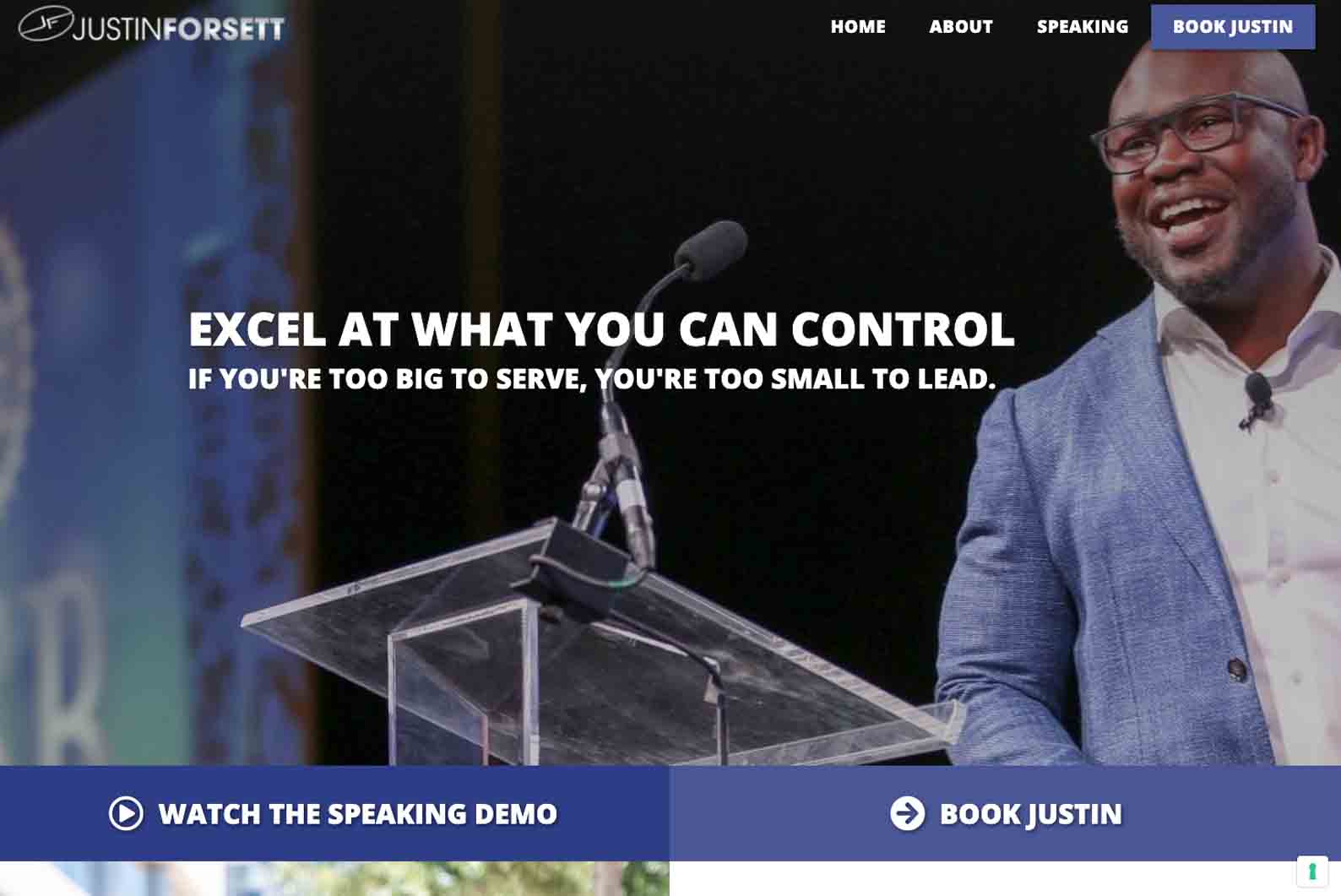
Why does a website like this work as well as it does? Simply put, because less is more. Here we have a harmonious color palette that sets the tone for a minimalistic layout of only essential features as users arrive on the website. By streamlining the flow, users are taken to exactly where they need to be efficient, which can ultimately lead to a better retention rate and an increase in bookings.
Food for thought from Justin’s website is the convenience of its layout. Everything that is included works together in an effortless way and is present for a reason, this no-frills approach will obviously depend on case to case but here it is a phenomenal example of when it’s done just right.
Lisa Nichols
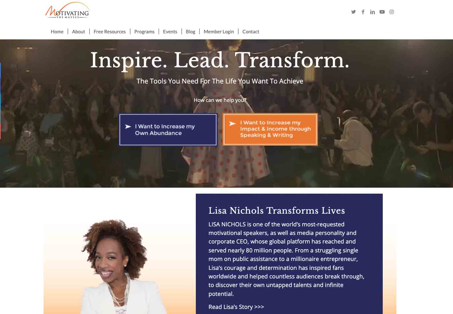
This example of a speaker website holds a great range of content and is best suited to individuals within the field with a wide variety of skills, offers, and channels. Lisa Nichols and her brand span a wide range of avenues which is clear from her website. The choice of content is essential in not only distinguishing and promoting each area of focus but also making it appealing.
The key takeaway here is incorporating clear pages on the navigation bar with a smooth flow to get to each of them and unpack all the available content.
Grant Cardone

Grant has a balance of a bit of everything throughout his website. This is a great setup for a speaker that spans many social media platforms, has a variety of clients/collaborators, and wants to showcase other alleys of business, not just speaking.
If done incorrectly, the website can be overloaded however this is the perfect example of it done right – even including embedded podcasts!
If there’s anything to take from this website, it’s the consistency of the branding throughout. Dropped in here and there both subtly and more obviously, it stays in alignment with what his brand is and how it’s communicated.
This drives home his message and what he has to offer in an authentic way and allows truth to come across and engage users.
Suze Orman
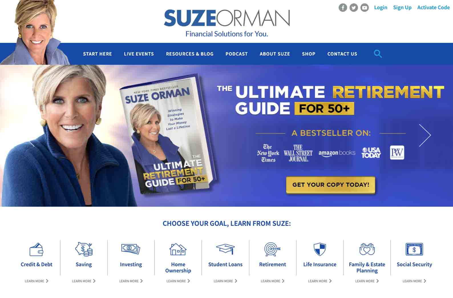
Why it works? Firstly – color, color, color! Undoubtedly the first thing that will draw and grab attention, this color combination works wonders and makes a statement. Suze’s website keeps this consistency throughout, with occasional bright feature colors being thrown in.
The key point to note and apply here is how consistent Suze’s presence and branding is. Each section of the website flows from the previous part into the next one. This is important as users will have a more concrete understanding of the what, who, how, and where, without being thrown off by inconsistencies.
Brendon Burchard
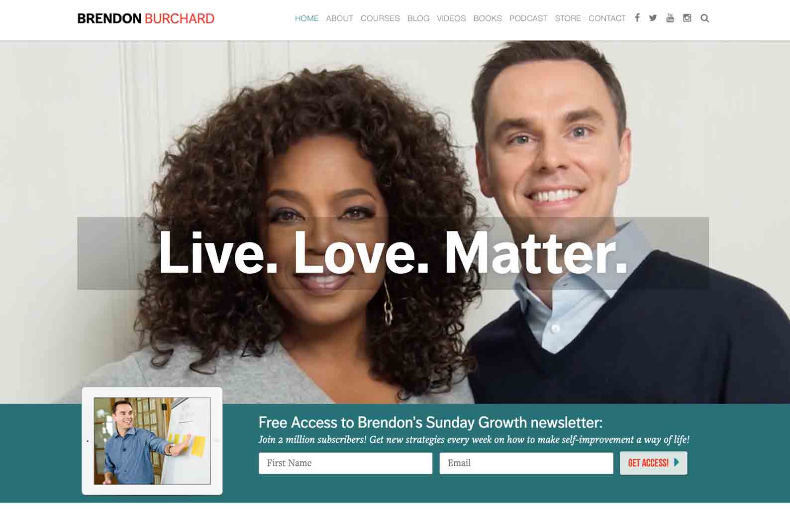
Brendon’s opening video immediately draws users in with the inclusion of noteworthy achievements and influential people that will straight away set the tone and allow users to understand the caliber of Brendon and his work.
Notice how detailed but concise the website and its layout is. It includes everything that would be of interest without overwhelming visitors or leaving them with insufficient information. It’s important to find this balance as it means user experience will be ideal and visitors will be encouraged to keep scrolling, clicking, and reading.
Katrina Cravy
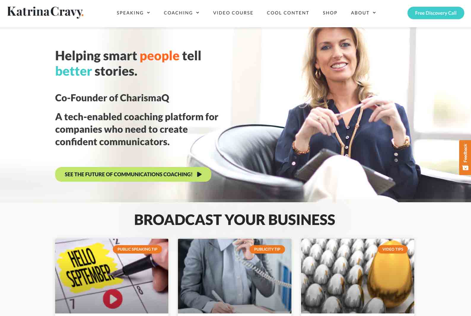
The layout of this type of website works well as it presents the most important features first. With selected pages offered, encouraging calls to action as well as recent blogs of interest, users find a wide variety of content to interact with. This streamlined view suggests points of interest to visitors and doesn’t just focus on the speaker themself but provides more about what they do.
We love the use of whitespace on this site. This is extremely effective in guiding the focus of visitors and frames the content very well!
Michael Bernard Beckwith

Michael’s website is focused on laying out all his activities spaciously. There are essential buttons included, with social media platform links on the sideline as a means of including them without being the main focus.
The layout compliments the user journey with the unraveling of a story as you scroll.
Besides the sleek layout of the website, the color scheme really has a zen feel to it and the content is very smartly placed. It makes navigating enjoyable.
Jacob Green
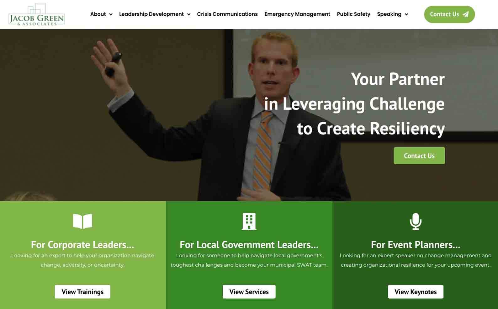
This is a very professional speaker site with a layout that would most definitely appeal to its target audience and assist them in finding exactly what they’re after. Due to the nature of this type of offer and work, the inclusion of testimonials, clients, or collaborators is essential. We love how effortless it is within this site, featured in a sleek and simple way with a reel of logos on display.
We’d say this is the biggest takeaway in conjunction with its effective booking system integrated within. This will encourage clients to book after having the credibility of the brand presented to them and being guided along to a convenient portal to complete the action.
Libby Gill
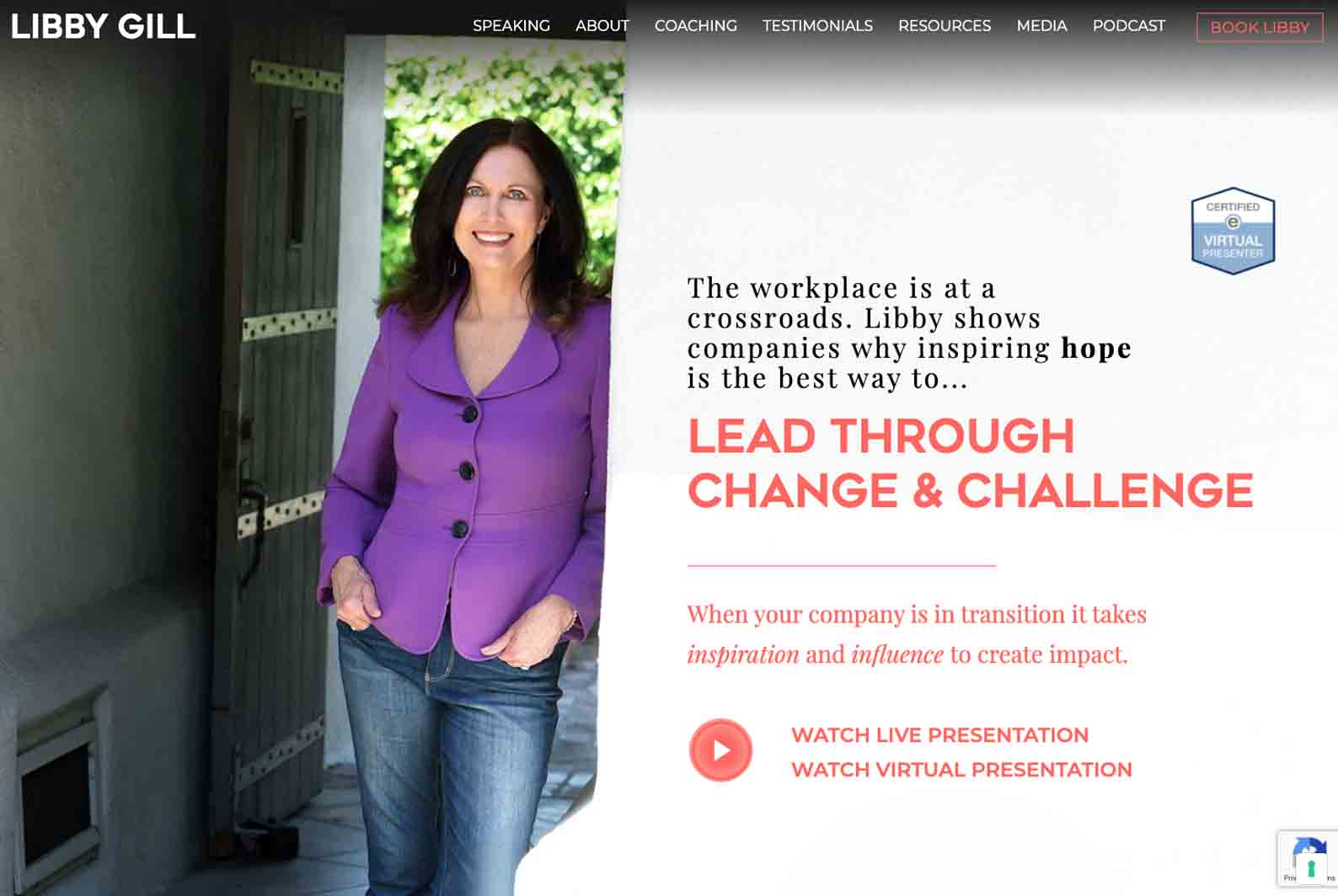
Libby’s website promotes her e-speaker services, which as of recently has been gaining momentum and is a booming focus within the industry. With this being the main focus, her calls to action are clear and share a color. This is all complemented further by accompanying text and pictures to present her and her brand authentically.
A great feature of the site is the clear navigation bar. This presents the website in a user-friendly manner and ensures a focused flow of intent by the users. The balanced layout that is used to create such clear navigation is a great element that should be noted – super clean and sleek!
Josh Shipp
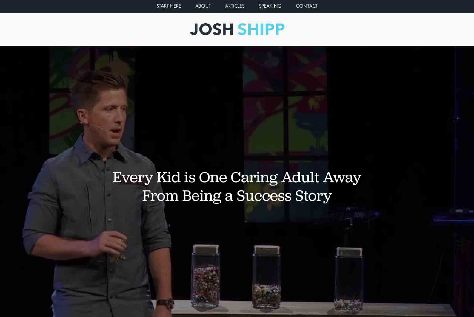
Josh’s focus is a very niche area of speaking, working from his own childhood and experience which he turned into his platform. This is clear on his site and is shown in an authentic, motivational way. Staying as true to yourself as possible and allowing your authenticity to speak for itself is an underrated trick of the trade. Here, less is most definitely more and will allow the audience to engage with you and your work on a more personal level.
Trust is the first thing needed when it comes to making a sale or even acquiring a reliable lead, especially in this line of work. Staying as truthful and real as possible will be most beneficial long term and is undeniably the route to take when creating your personal message and feel on a website. Josh does this in such an effective way and is a great example to take notes from!
Debra Benton
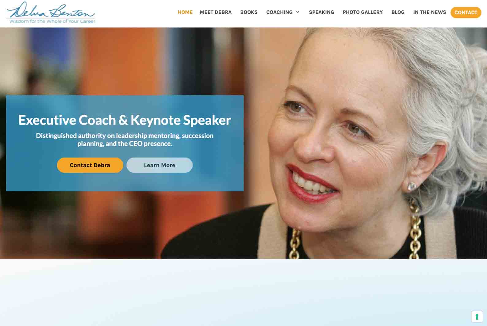
This example is another website with a simple but effective design. Debra’s layout is balanced and achieves a great flow throughout. There is a certain authenticity that comes across and is successfully achieved. Perhaps it comes down to the choice of content that has been included as well as the placement of her offers, skills, and clients, along with other supporting content.
The key takeaway here would be the value of simplicity when it comes to layout, design, and color choice. Don’t be afraid to choose more lowkey elements, colors, and ways of getting content across. Sometimes this is more effective than the very in-your-face, over-the-top styles that can actually end up being too much and not working well at all.
Chris Gardner
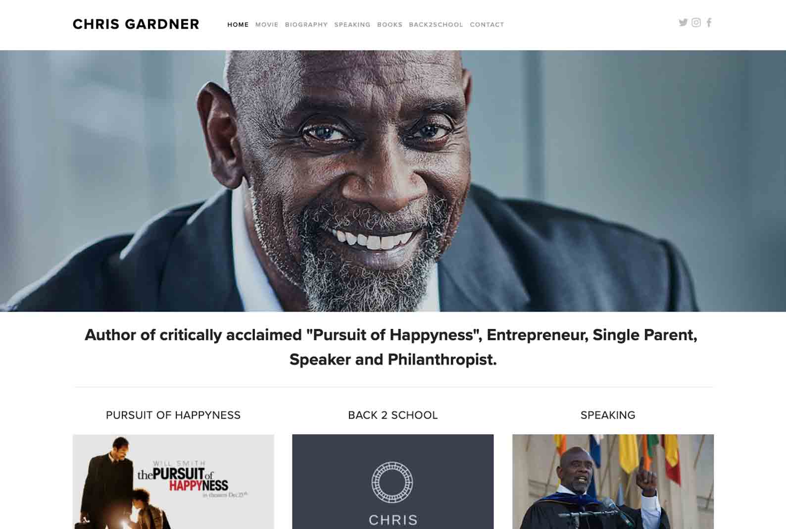
Another incredible speaker whose motivational work is founded on their story, experience, and past hardships is Chris Gardner. His website provides users with his backstory as well as his best work and current events, all laid out on white backgrounds to focus solely on the content and its meaning.
This is the best example of allowing your work to speak for itself and having the focus more on the content rather than the design and aesthetic side of things. Both have a time and place, but sometimes one is more needed than the other as this goes to show!
Robyn Benincasa

Here, we see confidence and conviction in an undisputable form. Robyn’s website has a range of content, from personal achievements to speaker work that has put her on the map – everything works together to create the flow of her authentic message and experience. Her content relies heavily on the use of pictures, which in this case tend to tell a story alone.
Finding a balance between the type of content on a website is key, at times pictures may be more needed than words. It’s a great way of testing out which works best for your work personally and also seeing what appeals most to your audience. Every case is going to be different and both forms hold immense potential!
Robin Sharma
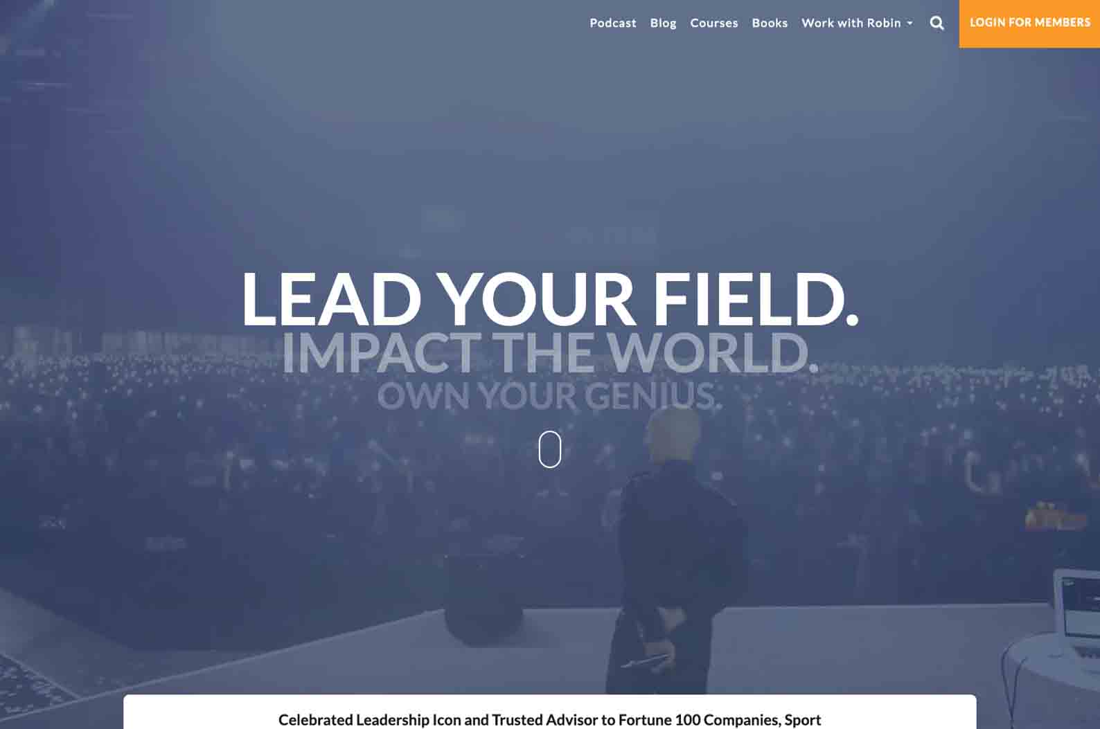
Robin’s speaker website focuses on making the user feel immersed within his community. Either through giving more information about himself, offering free content to get up to speed with his work or simply giving visitors the option to become members. This is driven home by the inclusion of ‘snippets’ of his community through images of his events, social proof from previous clients, and focused drop-down menus.
This is a great way to have effective lead capturing in place as users feel the urge to become part of the community and not miss any future content yet to come. It definitely needs to be achieved in a suggestive but not overly pushy way. This can be achieved mainly through the choice of wording and the inclusion of strategic buttons, menus, and calls to action. If done correctly, this will be worth a ton in the long run.
Iyanla Vanzant

Iyanla as a person is her authentic and unique self, which not only translates into the work she does but clearly her website too! Achieved through image choice and the combination of fonts with colors, this site drives home her message, purpose, and presence perfectly.
Users are presented with many options, which ultimately guide navigation and get them to where they want to be seamlessly.
A great takeaway here would be that consistency is key, whether in terms of design or presence, staying constant is extremely important as it drives home a shared message and allows users to connect with you and your brand on a more established level.
Nick Vujicic
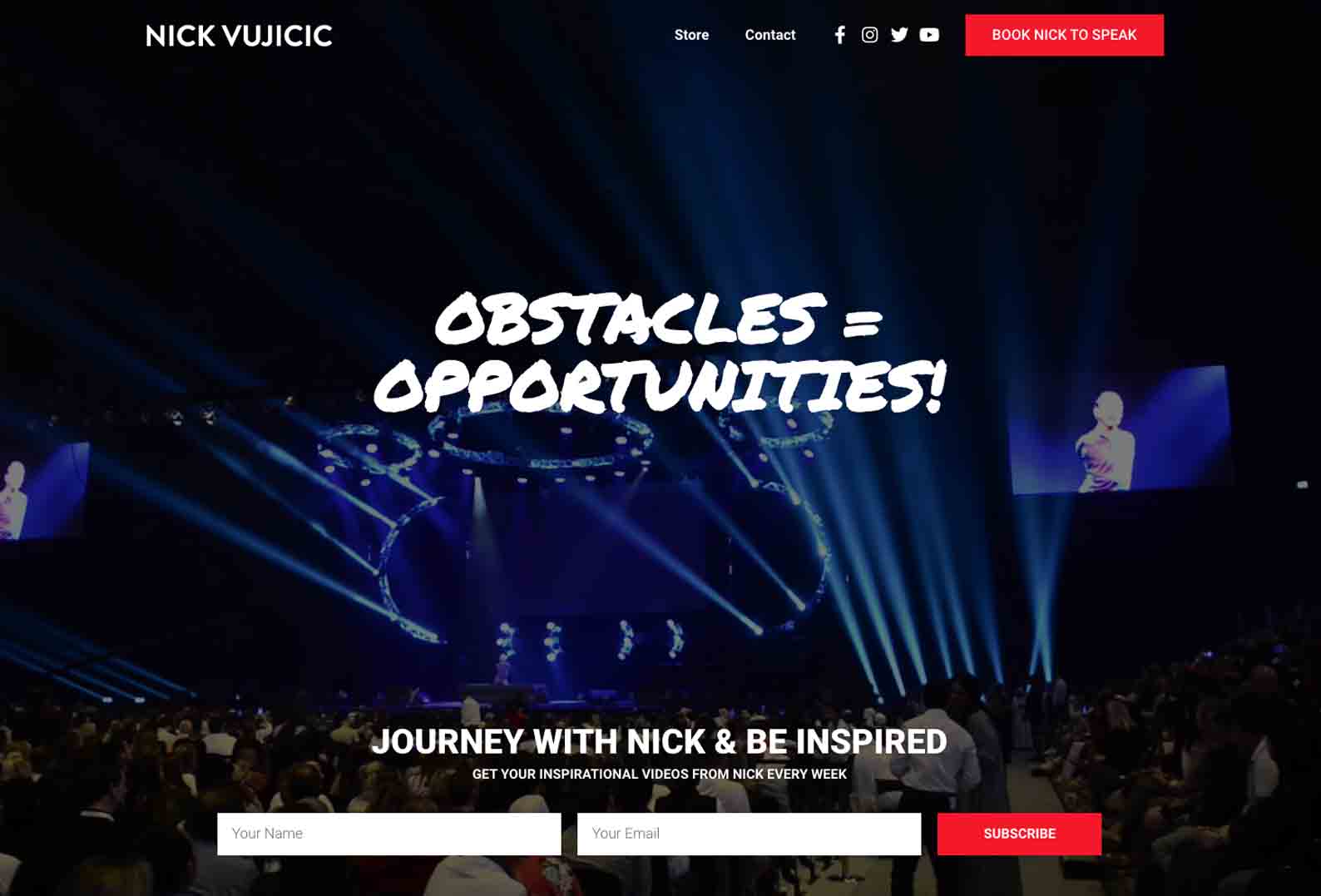
Another great example of a speaker is the entire presence of the brand, here we have Nick Vujicic. Embodying the very essence of what it means to be a motivational speaker, his events and speaking make an impact and change lives. This is the message driven home on his website which is definitely the aim. With a simple but effective layout, the focus is on certain content and obvious calls to action which successfully guide the user along their visit.
If anything is to be noted from this example, it’s how streamlined everything is. Any friction that would distract potential users has been minimized and the overall flow & layout is sleek and minimal. There are only two focused pages besides the home page, accompanied by social media buttons and certain calls to action to get users from A to B without any fuss.
Jack Canfield
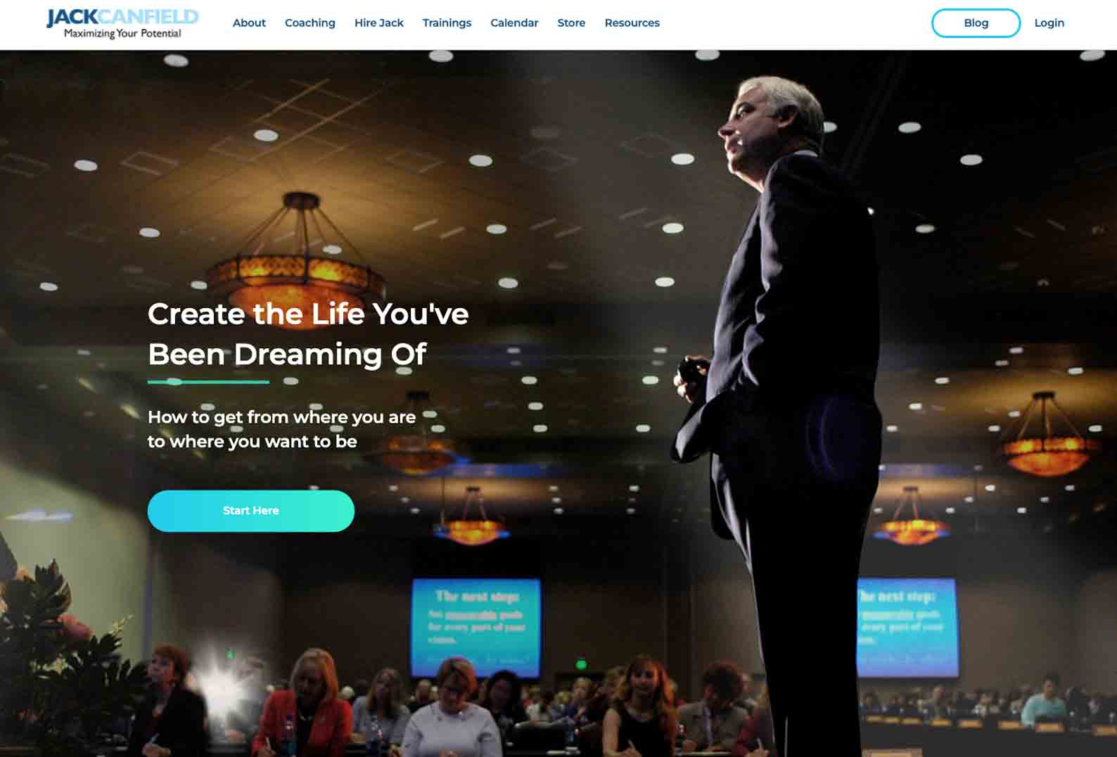
This is a very user-friendly website. Visitors will find this style of site easy to navigate and find exactly what they’re looking for. The theme is kept constant throughout and the different shades of blue complement the content and features on the pages. This menu is focused but detailed in terms of the different pages available, which is super handy and helpful for visitors to use.
Biggest takeaways here? The manner of balancing all aspects of work is now more than ever with the emergence of virtual work. Jack’s events (and types thereof) can be followed and tracked, allowing users to stay in the loop and plan accordingly – perhaps making them more likely to join or at least sparking further interest.
Gary Vaynerchuk

Straight off the bat, this website knows how to focus attention. Throughout the site content is balanced through the use of effective headings, images, and layouts working together to create an awesome flow. Another great show of social proof in an integrated way, making it stand out but not be the focus in an oversaturated way.
Pages are highly focused in this example and the presence of calls to action isn’t as obvious as on some other websites, however, each is effective in its own way. The focus here is on the founding story, what is happening now, and what’s happened between that can hold credibility. It’s important to have this variety of work from previous, current, and future projects or events.
This will help solidify trust within you as a brand as well as more of a genuine connection as users know a bit more and understand not only where things are going but where they started.
Dave Ramsey

This website works so well as a loaded but sleek layout. The use of whitespace with bright, contrasting colors goes hand in hand to create eye-catching pages. Driving home the mission of the company as well as its offers, users are engaged and presented with options.
A key takeaway with a site like this is the format of the menus, which are particularly full in this example. This could be a downfall for certain sites, however, Ramsey manages to include a lot under each dropdown menu and still make it work.
Understanding what works best in order to have all the necessary options without making the menus unappealing isn’t always super easy, but when you find what works best for your site and your audience, stick with that!
David Goggins

This example is prime for the gist of what the message of a speaker’s website should be. Holding engagement throughout, the site uses words and images to draw attention and have users click on the next steps. The clear colors and fonts are strategic and help hold the attention of visitors on each page.
Without the distraction of extra colors and fonts, one is able to easily find what they’re looking for and navigate the site with ease. The pages on the navigation bar are descriptive and simple, allowing the user to find exactly what they’re looking for.
Use a sleek design like this as a means of streamlining the flow of where users go and how easily they find what they’re looking for.
Brian Tracy
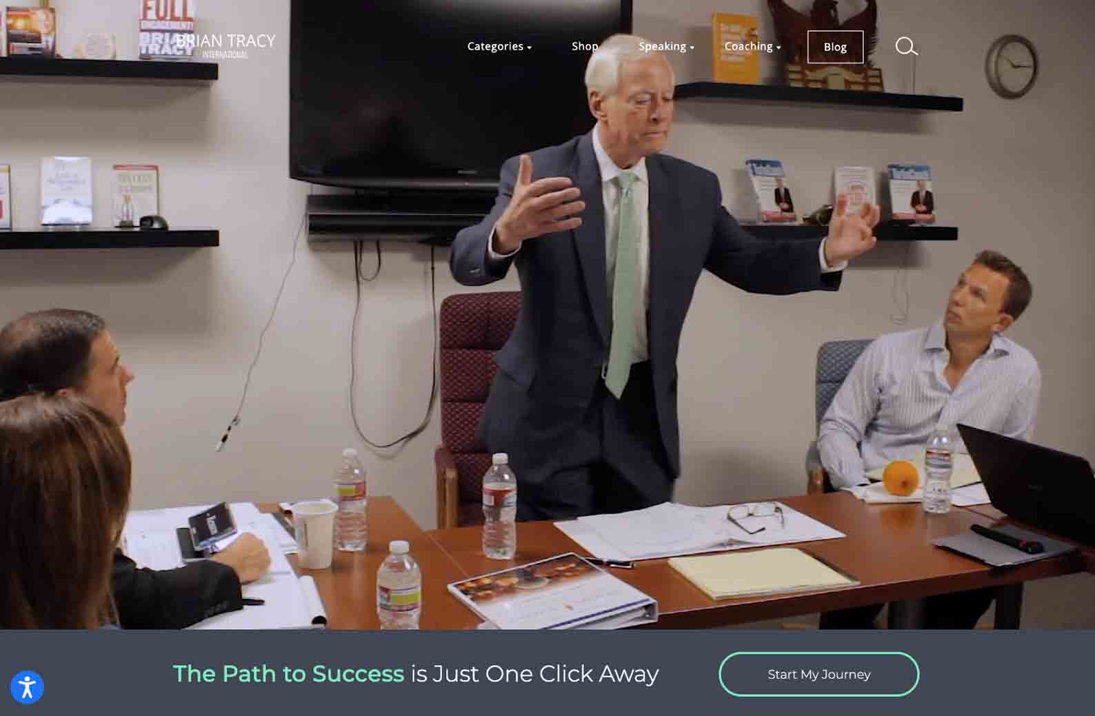
Brian’s website is a good example of a classic speaker website, holding everything that would be needed accompanied with content and calls to action. By starting with a video, it brings another element into play and stops the user from scrolling for a bit.
Something to take from this example is the layout and placement of the calls to action. Found in either strategic places or in eye-catching colors, users are prompted to click on them and take the next step. This is important to note as there is a big difference between an effective call to action and a mediocre one.
Bob Proctor
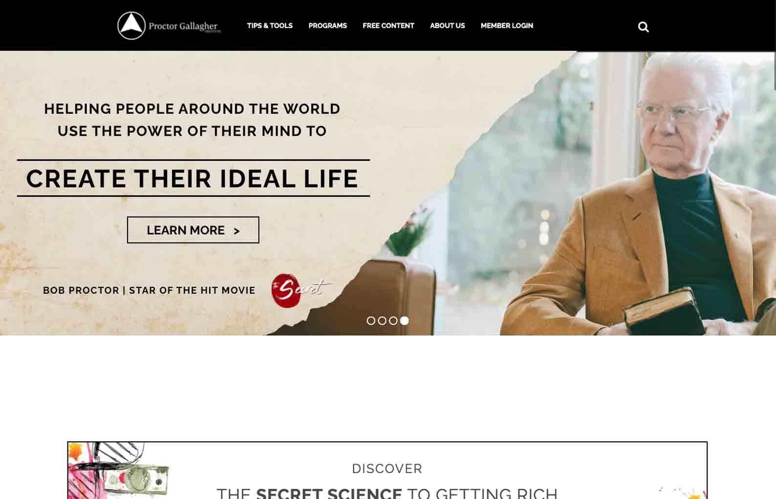
This website translates a very authentic persona of the speaker across as one navigates through it. The choice of aesthetics and design play a huge role, but this is amplified by the presence of Bob himself as well as ‘words of wisdom’ that suit him well scattered throughout.
When allowing such an authentic approach to come across, keep things simple everywhere else as it allows the user to focus on where you want them to without distracting them.
Magic Johnson
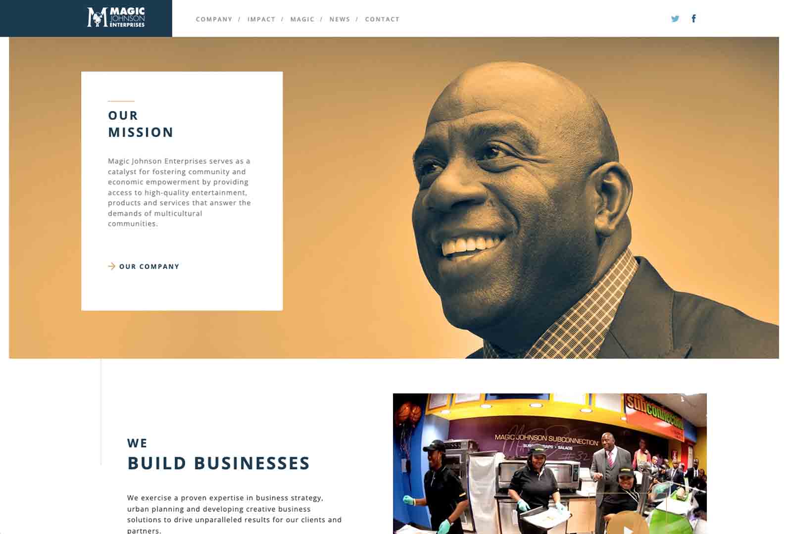
We absolutely love the feel of this site as it not only implements color theory to its advantage but also keeps things uniform but effortless. The consistency between images, themes, and layout makes the user journey a breeze as visitors are encouraged to move along and scroll, not feeling overwhelmed along the way.
Notice how there are not crazy obvious calls to action here, there, and everywhere. With a website like this, where the focus is more lowkey and not obviously on events, books, or other offers, calls to action don’t necessarily have to be scattered throughout.
Include them where need be but use discretion and keep it simple.
There you go, a roundup of the best speaker websites!
At the end of the day, it comes down to finding what works best for you and represents your brand most uniquely & effectively.
If you would like to find out more you should check out our mega article on author websites.
Want to be added to the list? If you’re looking to get a new speaker author website reach out and we’ll be in touch to help you with your author website design!


