Fantasy author websites play a main character role in your book marketing playbook. They should immerse readers in your world, guide them to your books, and turn curious visitors into real fans.
At Rocket Expansion, we’ve designed 150+ author websites for debut authors and multiple million-selling authors alike. We’ve worked with NYT bestsellers, USA Today bestsellers, Amazon Overall Top 10 authors, and TEDx speakers. Through all that work, we’ve learned what separates websites that work from ones that “just look nice”.
My team and I carefully hand-picked 20 fantasy author websites that transport their visitors to new worlds and dimensions. Some nail world-building visuals. Others captivate through character and story. And all of them have one thing in common: They’re built for their readers.
If you’re building a fantasy author site, you’ll find real inspiration here, and learn exactly what works in each example and why.
Here are My Top 20 Fantasy Author Websites:
(in no particular order)
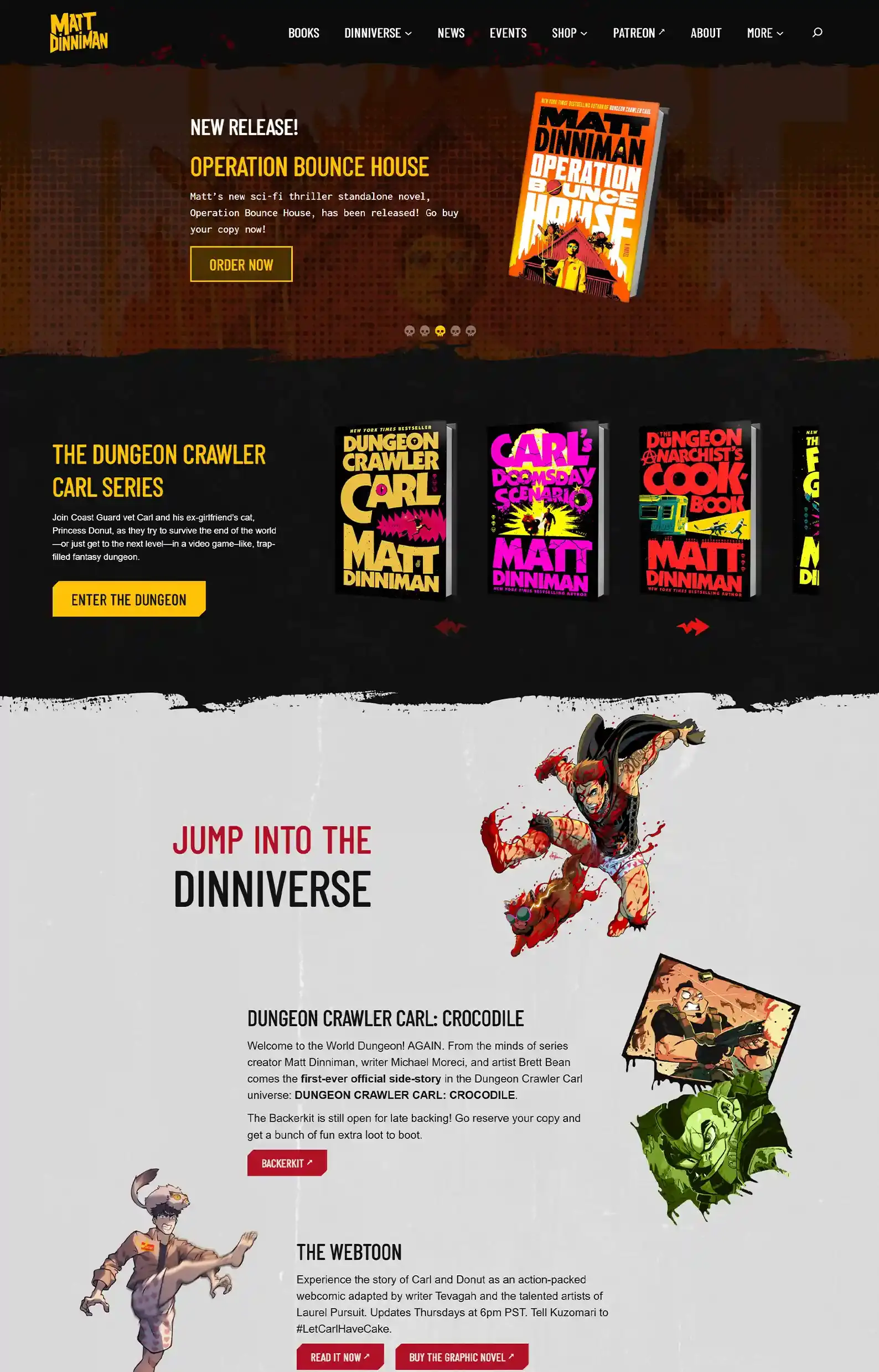
1. Matt Dinniman’s Website
First Impressions:
- Awesome icons and graphics that perfectly fit the theme of the author’s hit book series.
- A seamless ecosystem of the author’s universe that feeds back into itself, providing a good user experience.
Four words came out of my mouth immediately when I saw this fantasy site:
“Whoa, this is cool.”
If you’re a fantasy lover, you’ll be no stranger to Dungeon Crawler Carl. What started out as a cult following has since blown up to a viral craze—for good reason, too.
Only fitting that the website matches the source material, right?
Besides this fantasy author website looking absolutely incredible, it’s super focused. Straightforward funneling makes it easy for readers to find the webtoons, graphic novels, and Patreon.
I loved this website so much that it made it onto my ultimate list of author websites. And if you know me, you know I’m picky about websites.
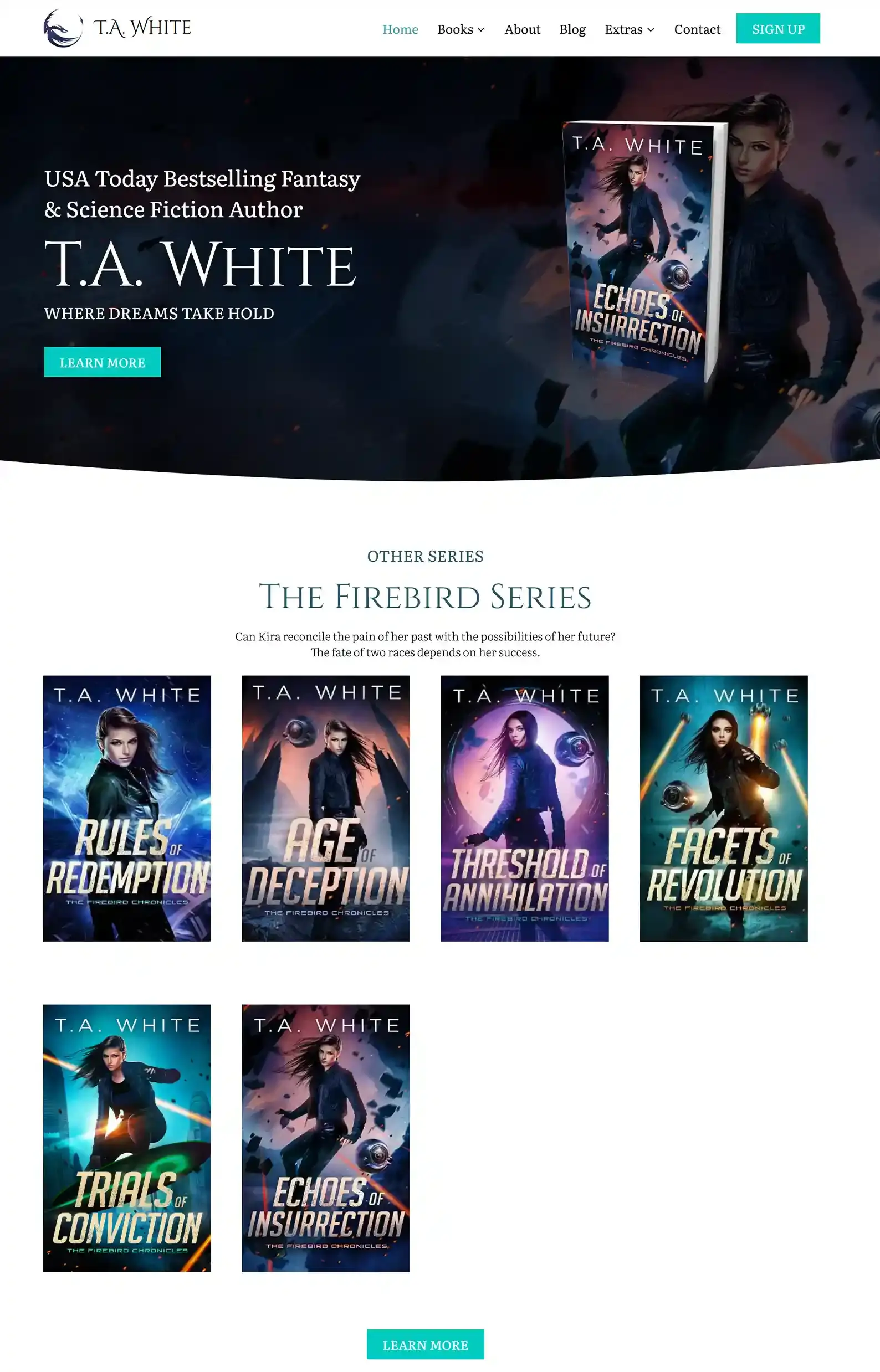
2. T.A. White’s Website
First Impressions:
- Modern, professional design with clear structure.
- Plenty of extras for fans to dive into.
We really enjoyed designing this fantasy author website for T.A. White.
She needed a sleek design that engaged users as they browsed the website, blending fantasy and sci-fi — her two major genres.
We did this through simple white space paired with interesting background images that complement their respective sections.
T.A. White is an author who knows how to keep her fans happy. She gives her fans unseen stories in the form of deleted scenes from her books.
Like this website? We can help you with your own.
Book a Zoom with me, Matt Ziranek, and I’ll see how my team can help you.
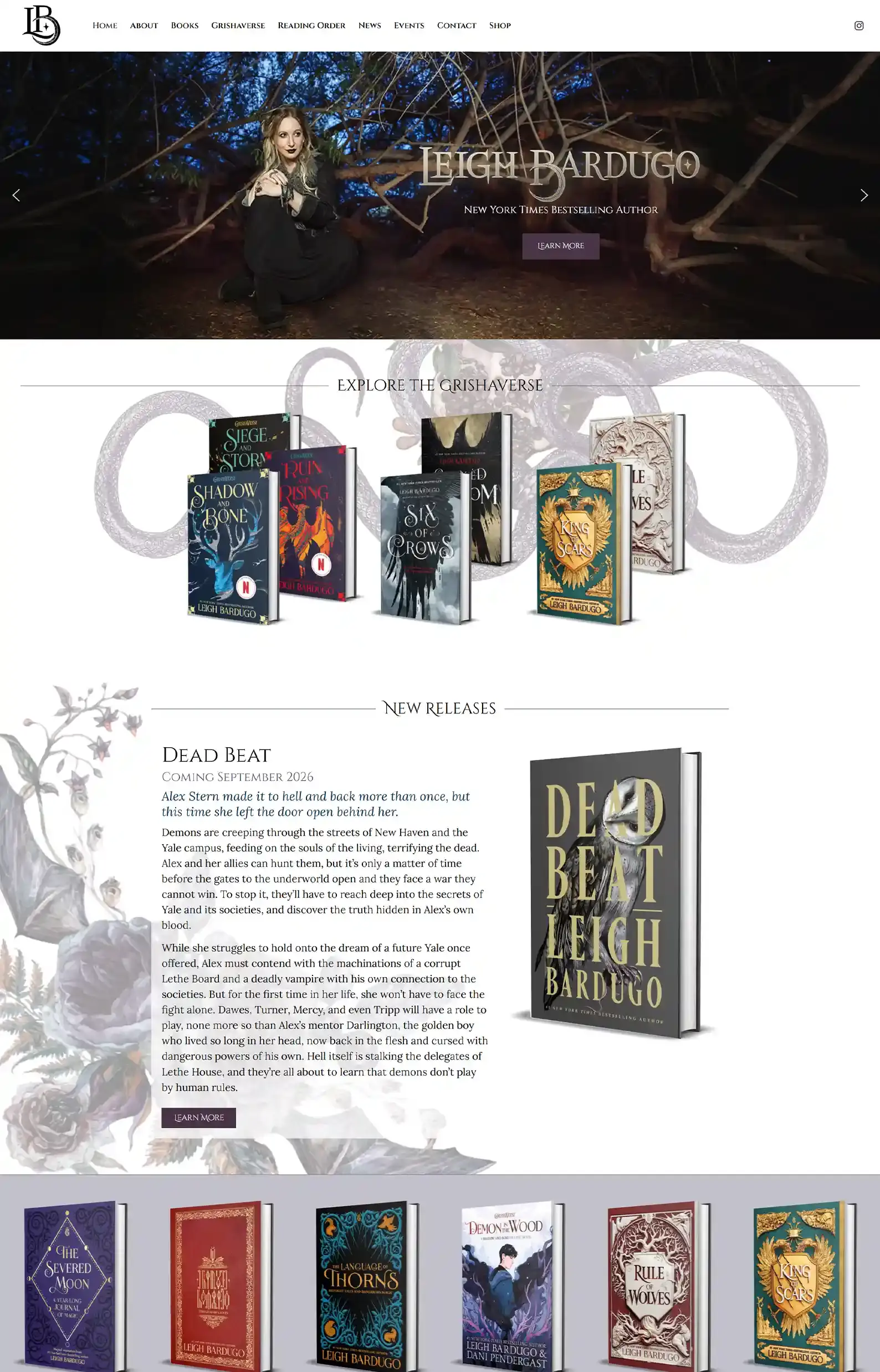
3. Leigh Bardugo’s Website
First Impressions:
- Rich, graphic novel-type feel with illustrations behind content.
- Sleek, navigable pages that make discovering content a joy.
Leigh Bardugo’s site is stylish, with illustrations, textures, and decorative fonts.
In combination, they complement her edgy fantasy brand that fans know her for.
She’s included engaging fan resources, including a reading order to help new readers navigate her catalogue, encouraging them to jump on board and become fans.
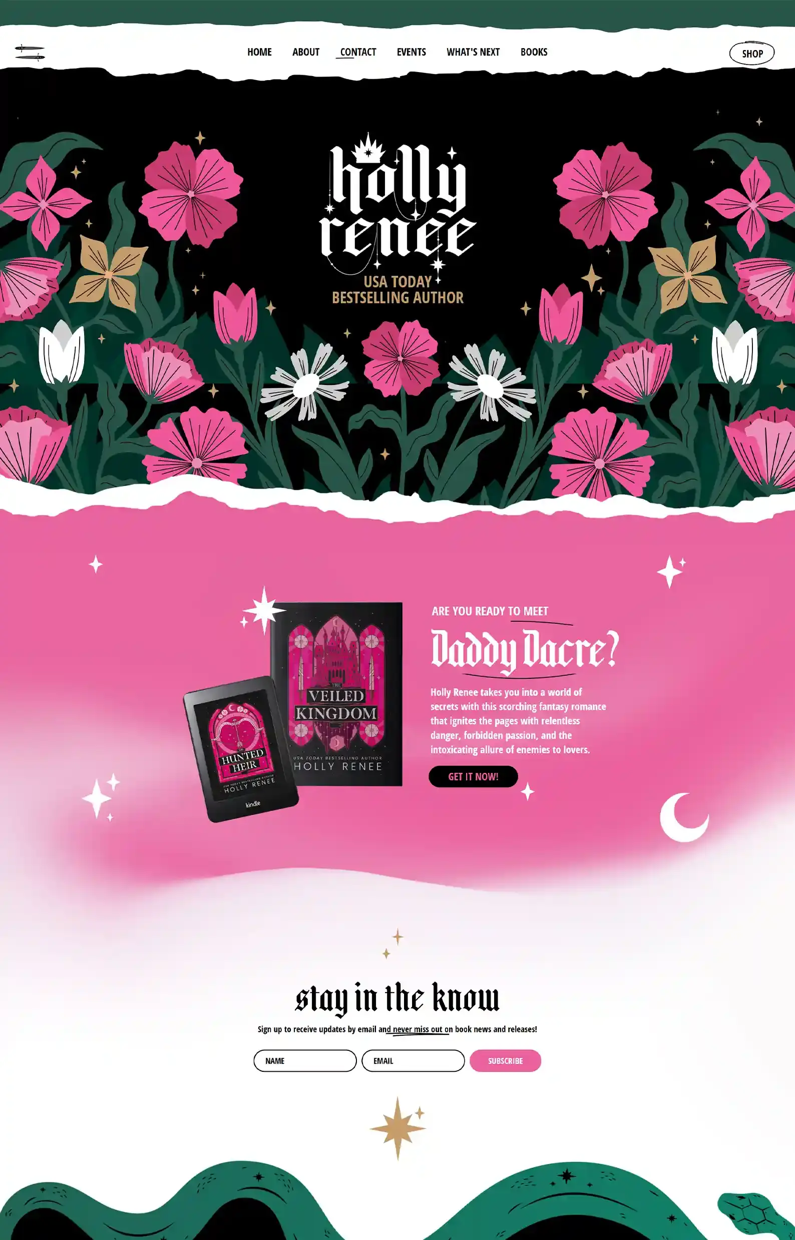
4. Holly Renee’s Website
First Impressions:
- Bright garden-esque theme with a cycling logo makes for the perfect fantasy intro for Holly’s audience.
- Illustrative design and fun fonts make everything pop.
This one is full of personality and sparkle. The design is bold and definitely stands out, but the content still feels friendly and down-to-earth.
Flowers move, stars pulse, and some words are circled and underlined — and all I wanted to do was keep exploring to see more.
Holly Renee’s About page is my favorite one on this fantasy site. She presents herself in a very fun way, which feels like the coolest diary.
5. Tom Elliot’s Website
First Impressions:
- Community hub that encourages reader engagement.
- His extras are everything both a new reader and a long-time fan will ever need, with an overview of his hit series, background lore, evolutionary charts of main characters, and a glossary.
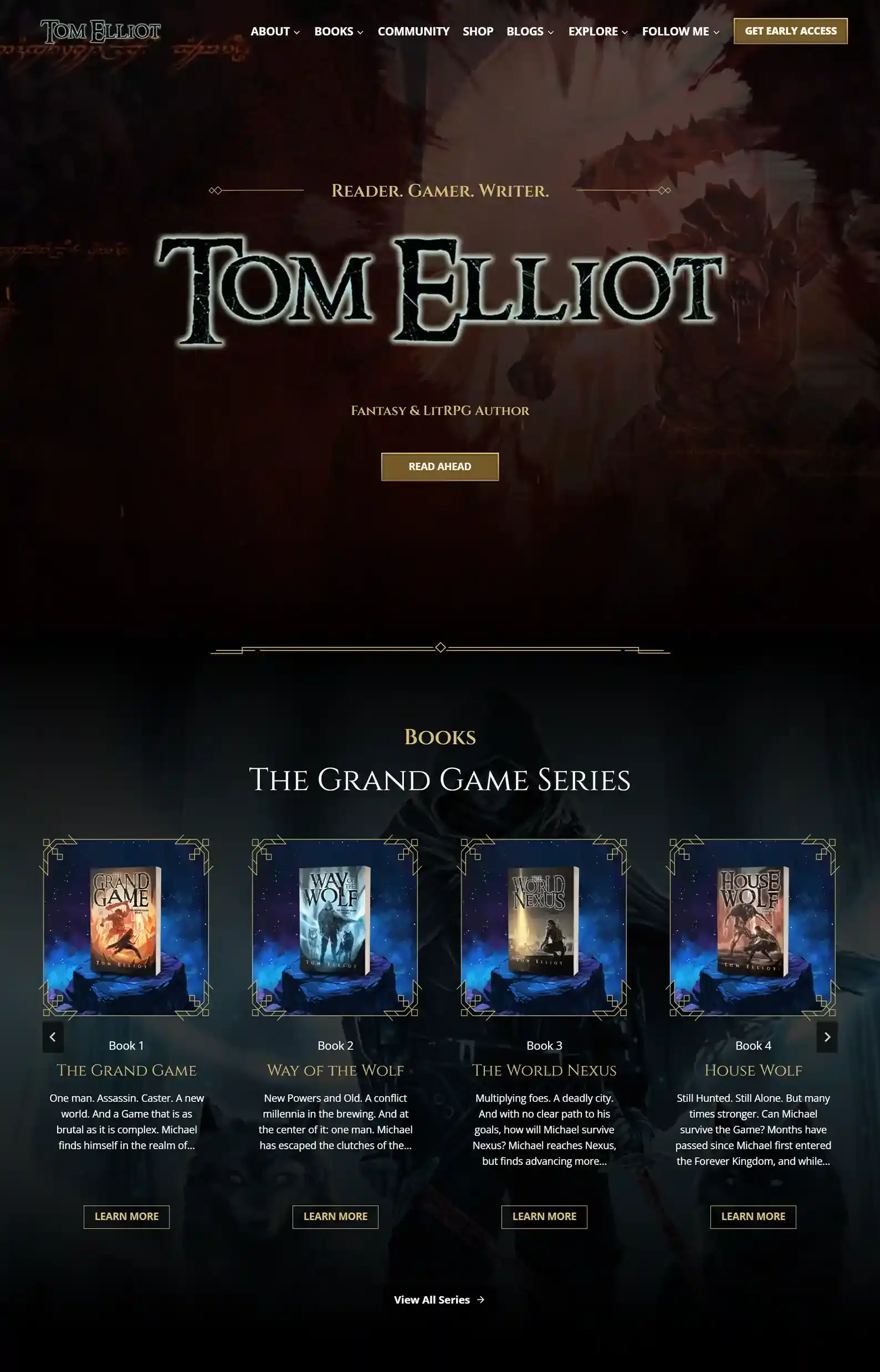
Here’s another one of my team’s designs, and it’s one of our favorites (we have a few gamers and fantasy lovers).
To complement the fantasy LitRPG genre, every element on the website is designed to feel grand.
For example, the book page has his series encased in gold framing while sitting upon what looks like magical rock. It almost looks like an item you need to collect in a game.
The site is clearly made for his fans. Tom frequently updates his website to keep his readers in the loop.
He has communities over on Patreon, Discord, and Facebook, for fans to interact and receive early access content.
We’ve made quite a few fantasy author websites, so if you want to see more, check out our portfolio.
6. Seth Ring’s Website
First Impressions:
- Epic intro that grips the reader.
- A codex-like design aided by simple CTAs and cool elements like Story Statistics under the book pages.
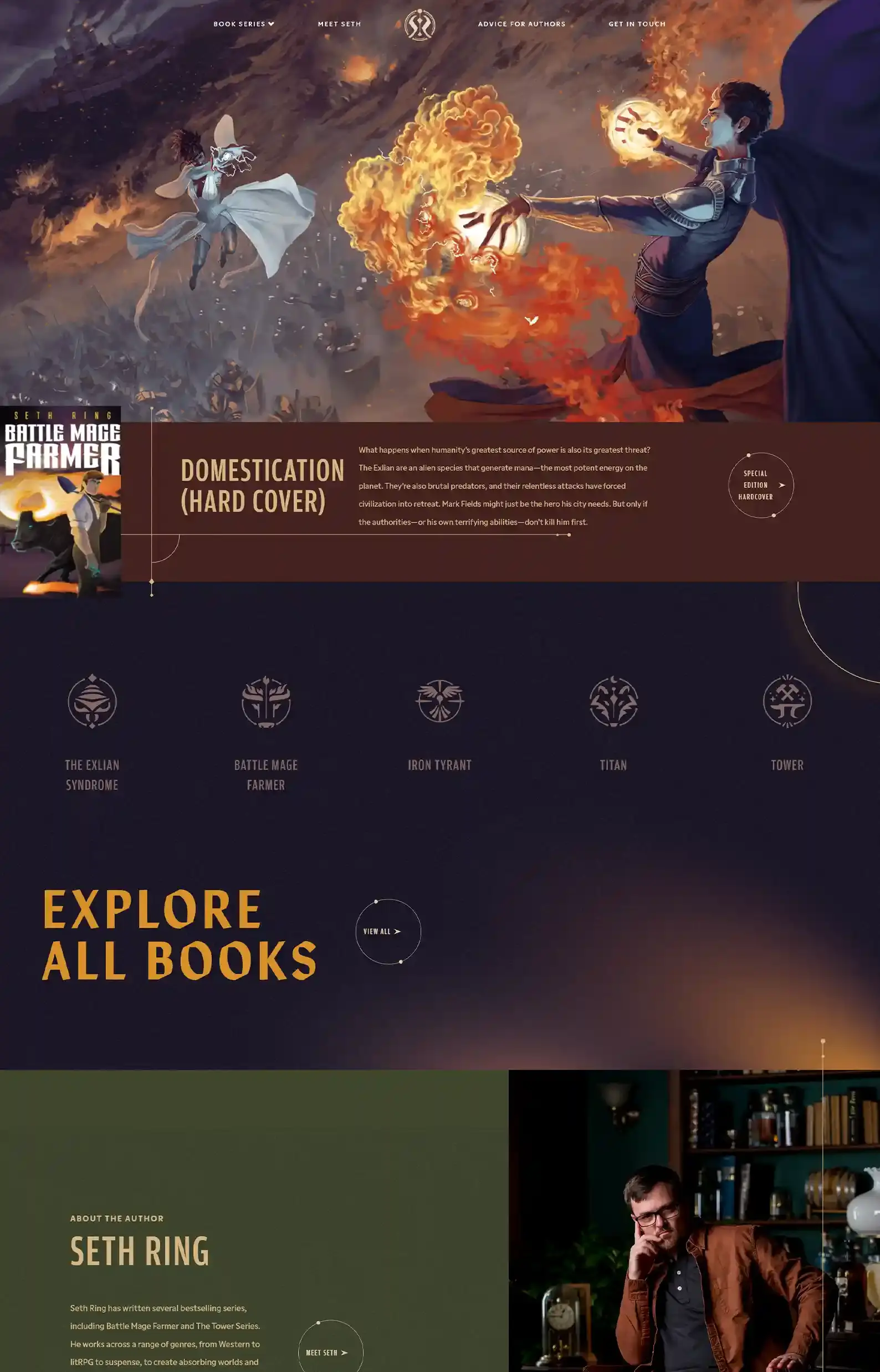
From the intro down to the small orbit-like elements around CTAs, the site feels alive and in motion.
All of it suits the author’s brand with earthy tones and gold embellishments that aren’t over the top but still grand.
This design is grounded in streamlined navigation. The menu only has a few options, and there are CTAs scattered throughout the site.
See something interesting? Here’s a clear CTA taking you there. Perfect for fantasy fans.
7. Rebecca Yarros’s Website
First Impressions:
- A blend of genres with contrasting black, white, and pink banners, catering to all of her fans.
- Professional page layout.
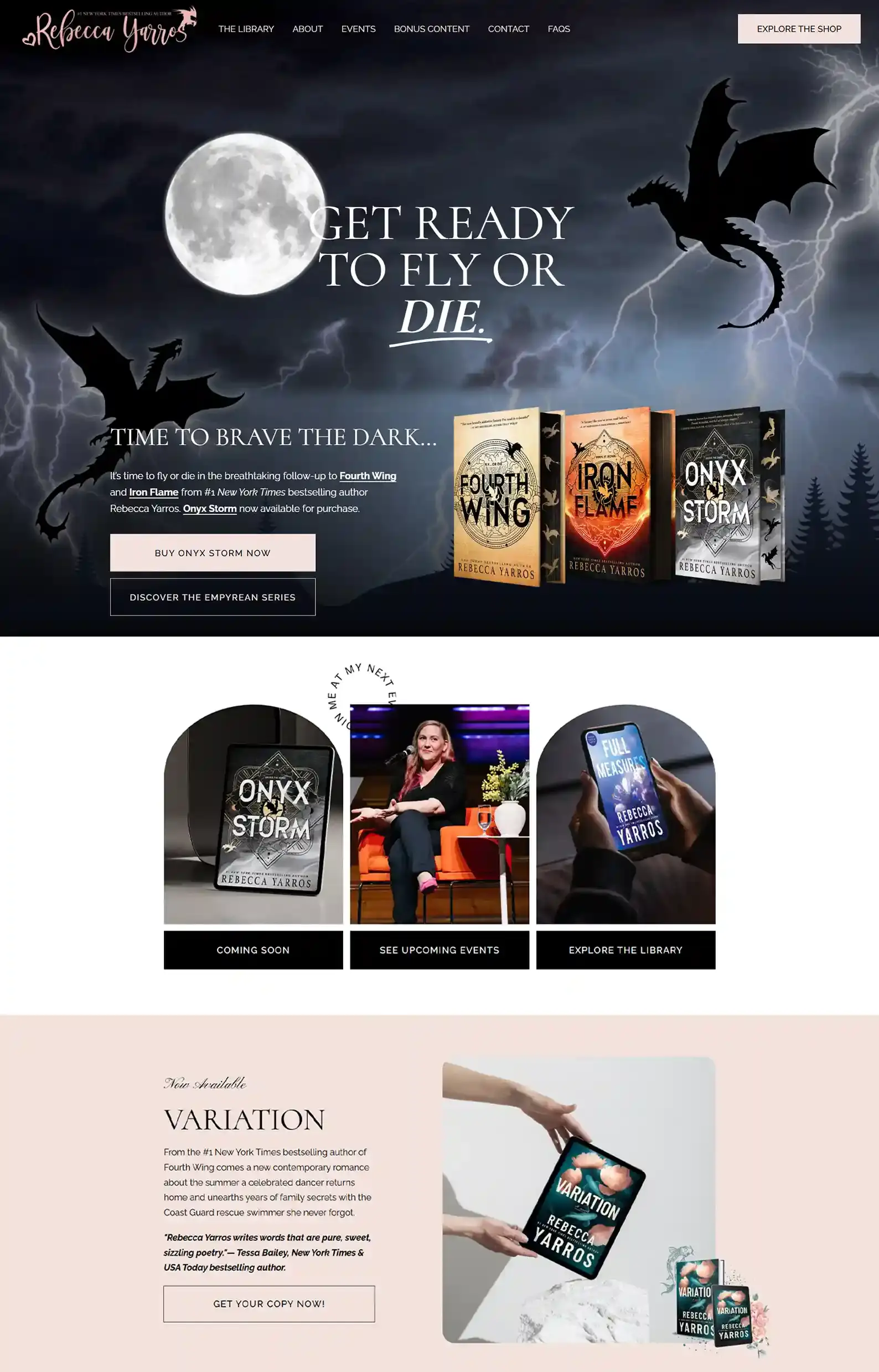
Rebecca Yarros writes across a couple of genres. Besides her viral Empyrean series, she has plenty of romance books for readers to browse.
This makes it a good example of how to approach a multi-genre site. Most elements complement her branding, while others maintain focus on her biggest series.
It can be tricky to pull off, but I think the way it’s segmented while still flowing side by side is what makes it work.
8. Gregory Kontaxis’s Website
First Impressions:
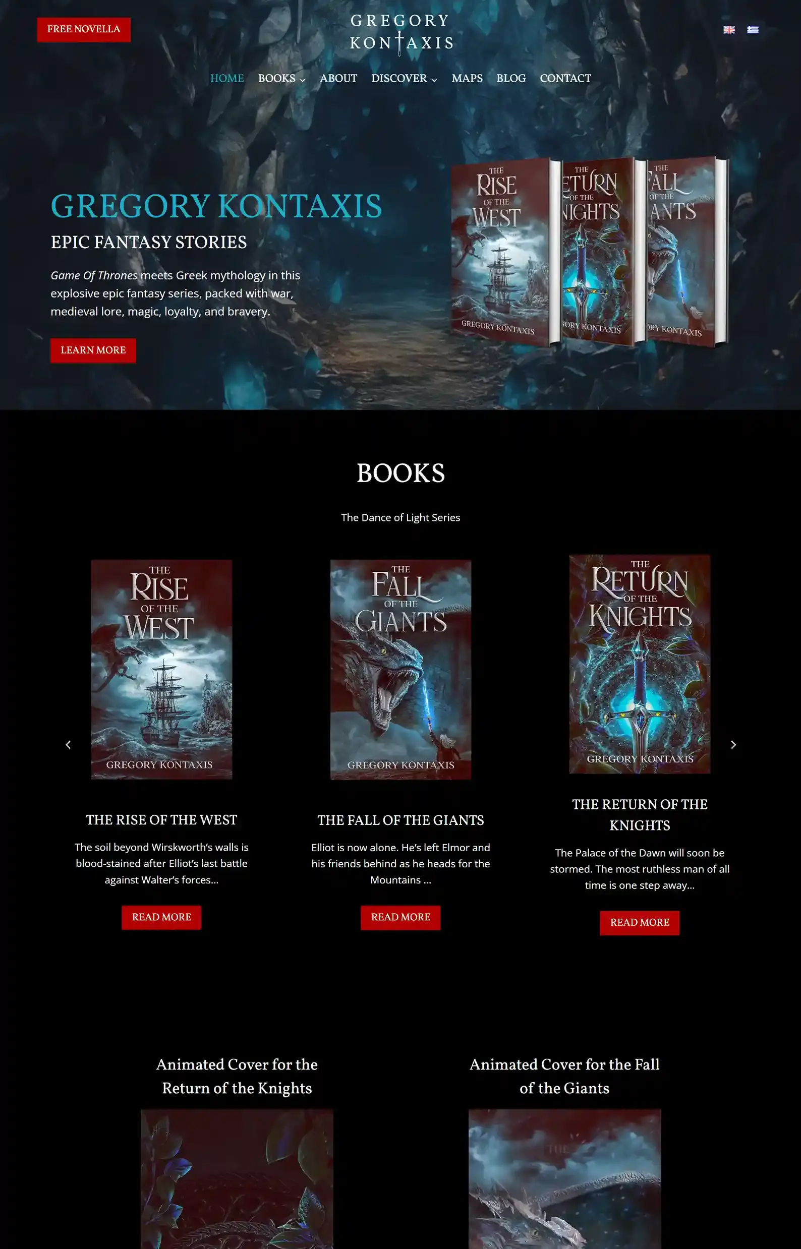
- Landing on the site makes you feel like you’ve stumbled onto an enchanting cave, begging to be explored.
- The reader magnet at the top left can’t be missed, and the wording, ‘Free Novella’ makes it so enticing — because who wouldn’t want a free book?
We built this epic fantasy author website for Gregory — emphasis on the epic.
The mystical atmosphere is supported by moody backgrounds and elements that suit this genre perfectly.
But our favorite part of this website is the ability to change the language to Greek.
By clicking the Greece Flag at the top right, the site transforms, Greek lettering and a stunning variation of the feature book’s cover appear.
The author’s background and branding are prioritized here. And it’s done in style.
Like what you see? We could do something similar for you.
Check out our author website portfolio for more examples.
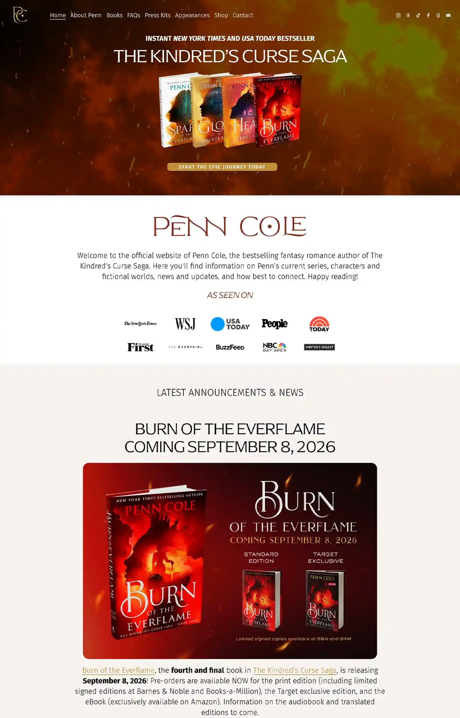
9. Penn Cole’s Website
First Impressions:
- Sizzling intro design, where the backdrop emphasizes the main book series.
- Sleek page layouts that use white space to organize content and draw attention to copy.
Penn Cole’s big series was her debut, and she puts that front and center, directing readers to it consistently.
Her authority and accolades further entice readers to take the leap and buy her book.
And her fans are catered to, with updates, announcements on book cover editions and events, FAQs, and a page dedicated to expanding on the lore of her book under Enter Emarion — plus more!
This site walks the line between atmosphere and professionalism easily.
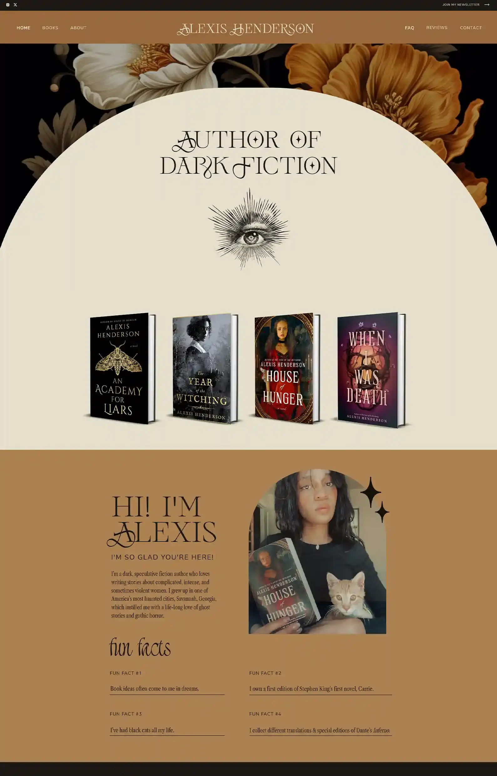
10. Alexis Henderson’s Website
First Impressions:
- Witchy fonts and design elements with earthy colors set an impeccable atmosphere that readers will love.
- One-page website with a unique use of ‘white’ space to segment content and grab attention.
This fantasy website is the ultimate combination of personal and genre ambience, and it happens on one page.
The colors feel almost vintage and mythical, drawing the reader in. Once they’re engaged, they slip into Alexis Henderson’s world.
She introduces herself after the intro, even sharing some fun facts about herself. You can also find an FAQ section where she answers common reader questions.
Probably one of the more comprehensive one-page author websites I’ve seen, showcasing brand and books really well.
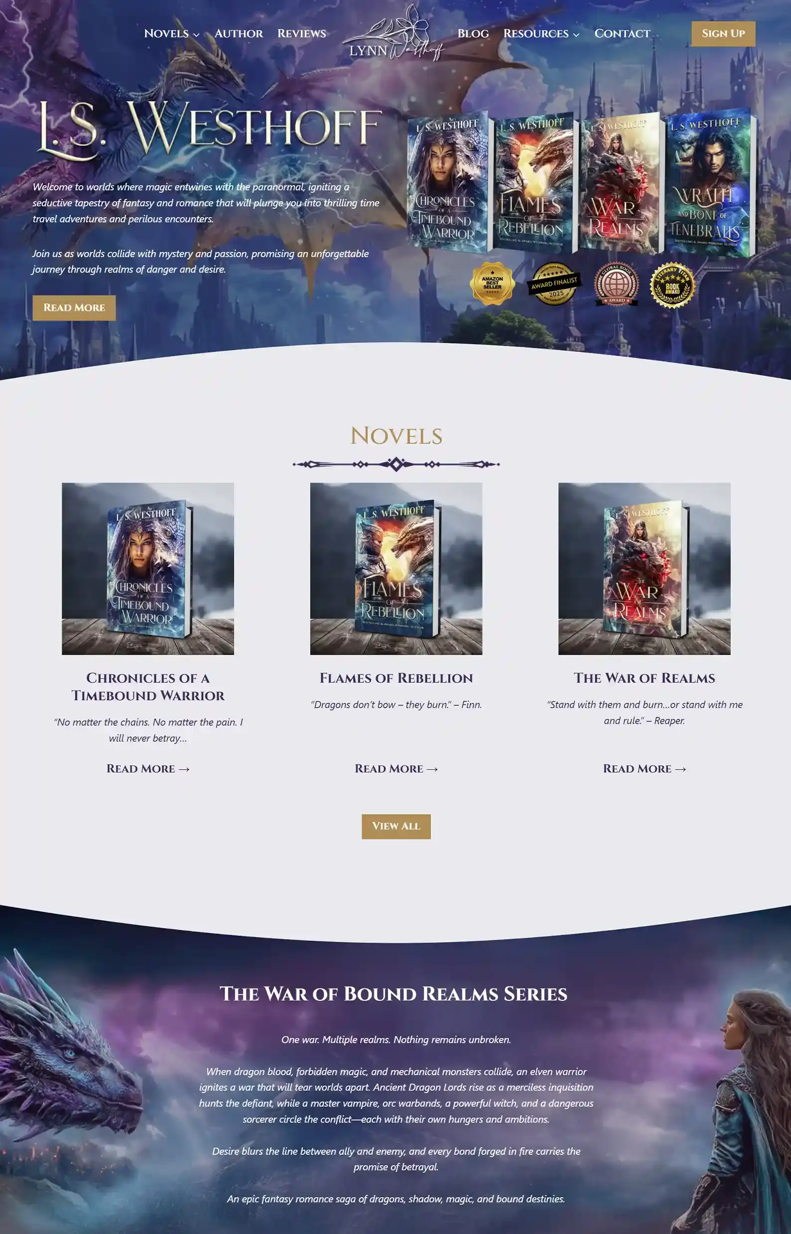
11. Lynn Westhoff’s Website
First Impressions:
- Vibrant colors and eye-catching imagery steep this site in magical energy.
- Clear reader pathways and navigable pages streamline the reader journey.
Fantasy author websites work best when they immediately transport the reader into their realm – and this one does it effortlessly.
Well, not effortlessly, since my team really put their best into this one.
This site is steeped in magical atmosphere with gold embellishments, electric imagery, and genre-specific copy.
And we make sure to reward readers who explore with easy-to-find, fun extras, like excerpts, character details, videos, etc.
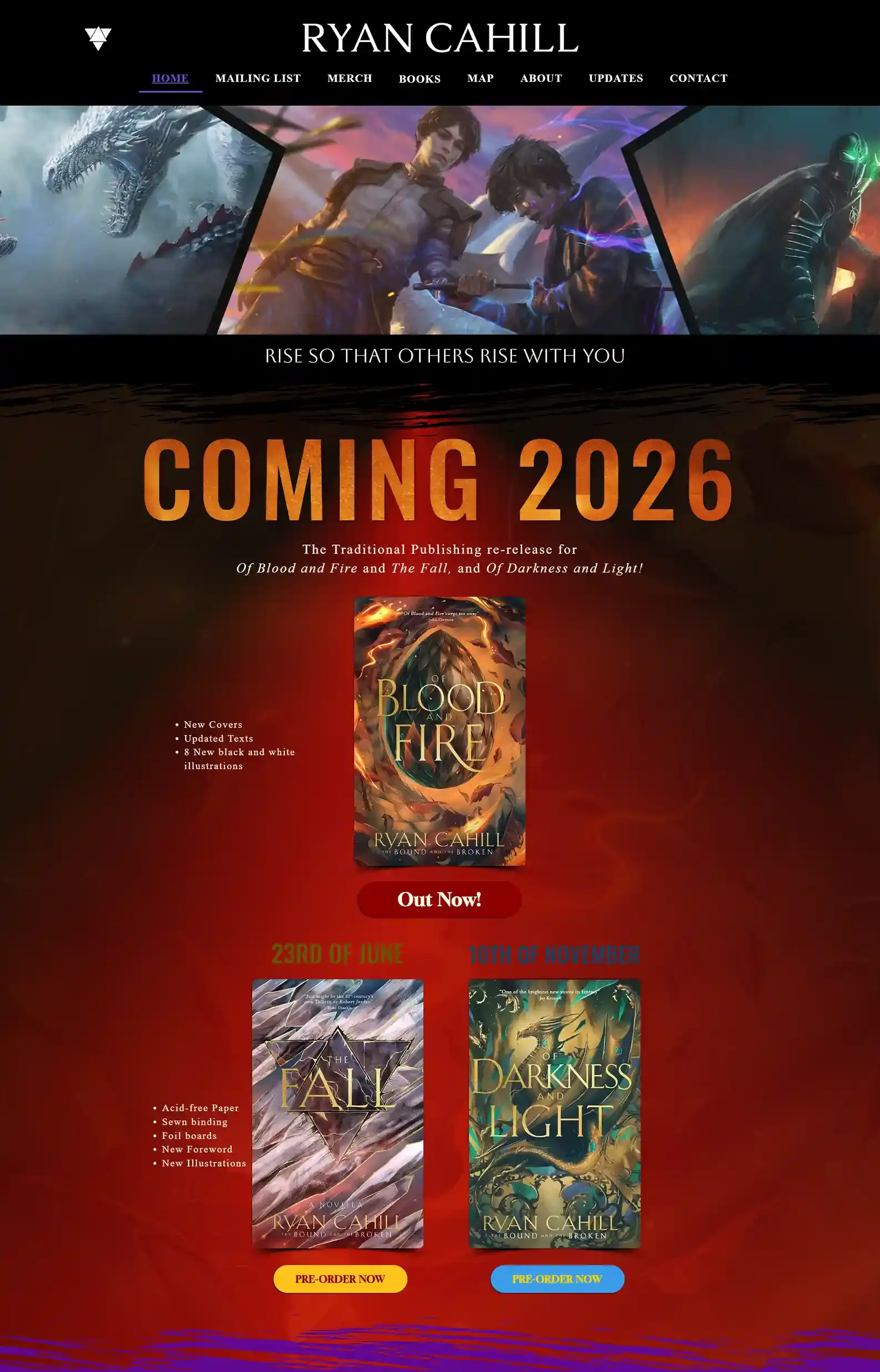
12. Ryan Cahill’s Website
First Impressions:
- Community-focused content showcasing the author’s relationship with fans.
- Strong imagery gives readers different glimpses of what they can expect from the author.
Little details like “breathing” books, waves of colors behind headings, and the author’s progress bars give it life.
And it’s easy to connect with forms and get to know the author through an engaging bio.
The atmosphere really does entice you to keep browsing.
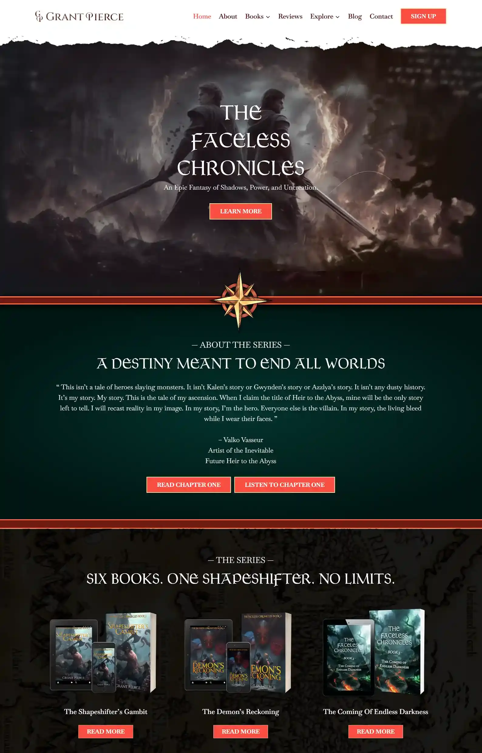
13. Grant Pierce’s Website
First Impressions:
- A world-shaking intro with powerful, stunning imagery and videos that glide onto the screen.
- The author has extra content for readers that not only explores the lore of his worlds but also gives background on how the story came to be.
Dragons, blades, and world-ending tales… Ah, yes! The perfect recipe for an epic fantasy.
And my team had a hand in those ingredients.
It was a pleasure creating something so grand, yet full of the author’s voice and brand.
Each page maintains a consistent design, with epic illustrations and clear yet decorative fonts adorning the headings.
His dedicated Reviews page and FAQ section under About help establish credibility, build trust, and show readers what his books offer.
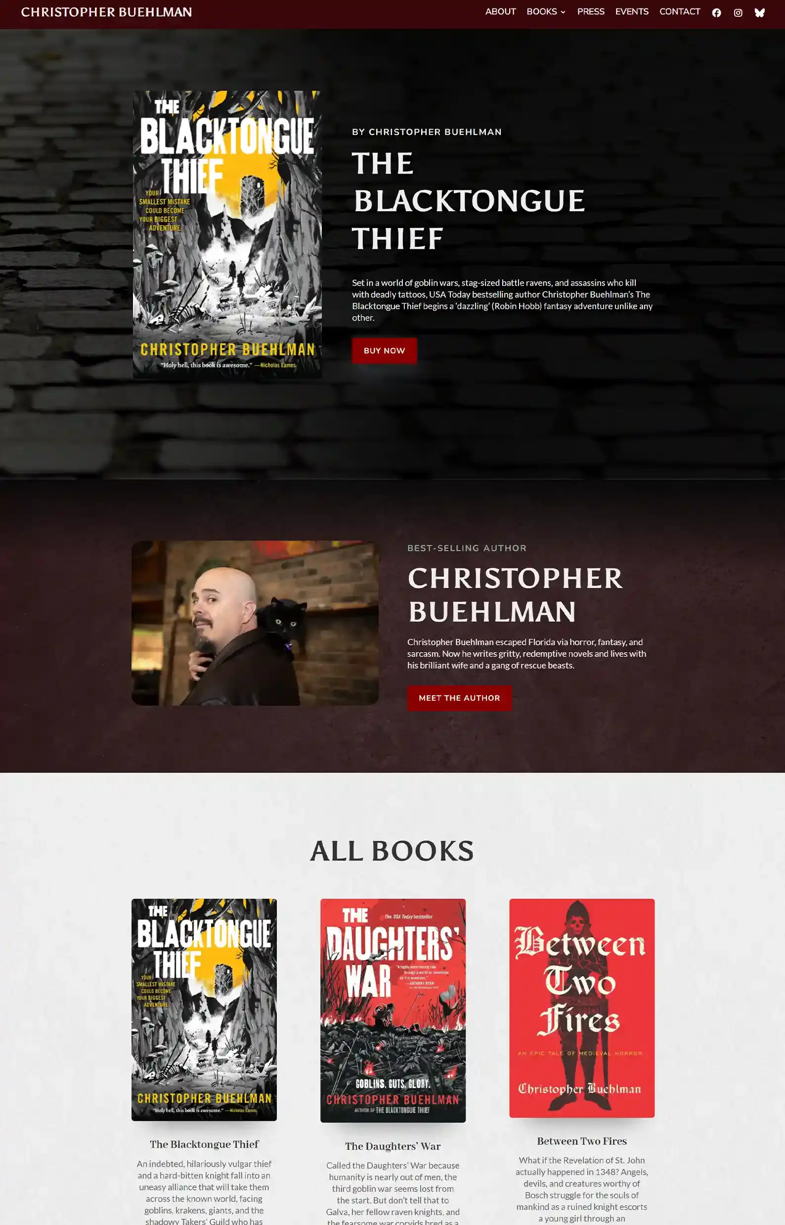
14. Christopher Buehlman’s Website
First Impressions:
- Atmospheric layout with dark imagery, banners, and bold typography.
- Clear branding with witty copy that intrigues.
Entering this website feels like stepping into the shadows – in a good way!
The site keeps things simple with textured backgrounds and seamless navigation, while packing tone into every page.
His gutsy design and witty text culminate in something mystical yet highly professional.
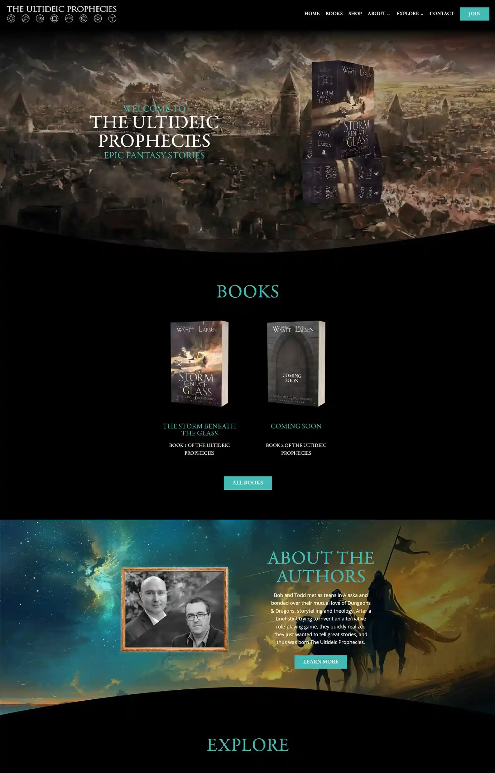
15. The Ultideic Prophecies’ Website
First Impressions:
- The intro fits the book perfectly, with a view of the architecture and world.
- Rich, earthy tones and ethereal hues set the tone, immersing the reader in the website.
My team was behind this website design, and I think it screams epic fantasy.
The stand-out feature of this website is the Explore page. Fans can browse through the comprehensive wiki with everything from characters to culture and brush up on the world’s lore.
Under Explore, readers can also find a map to scroll through different areas, plus a glossary page with fun images.
Fantasy is one of the most fun genres to build websites for, and we’ve done quite a few!
Check them out here if you want to see what else we can do.
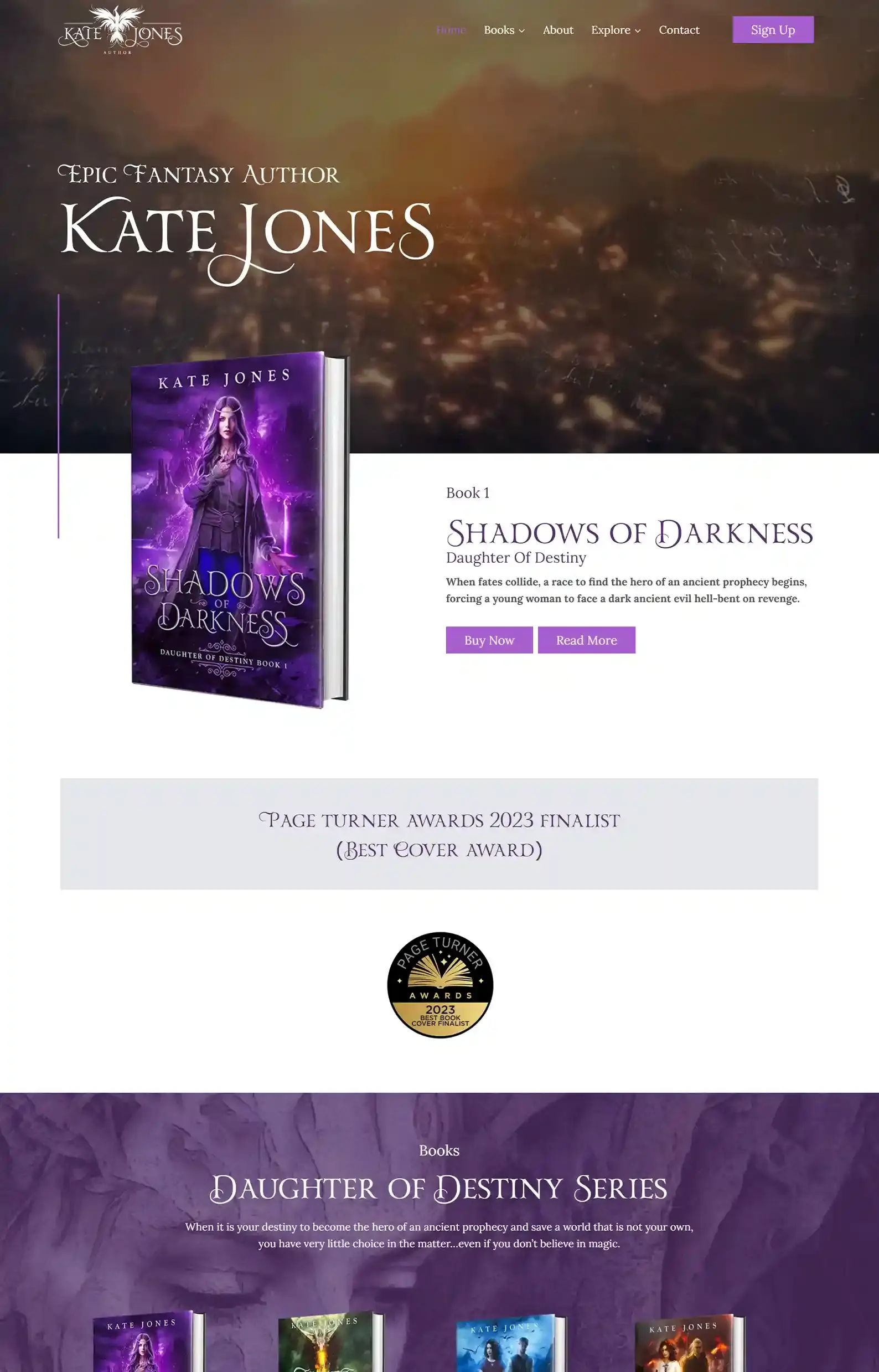
16. Kate Jones’s Website
First Impressions:
- Intro video is gripping, showing readers exactly what they’re in for.
- Sleek, navigable pages with clear CTAs that guide readers to the next step.
This is another one of my team’s handiworks.
Full of mystical energy, the pops of purple and green in headings and backgrounds set the tone while letting the content shine.
There are tons of extras for fans, but one of my favorite sections has to be the characters page.
It’s so unique to have well-known characters from Kate’s books tell you about themselves from their perspective.
It’s unique to have well-known characters from Kate’s books introduce themselves from their own perspective.
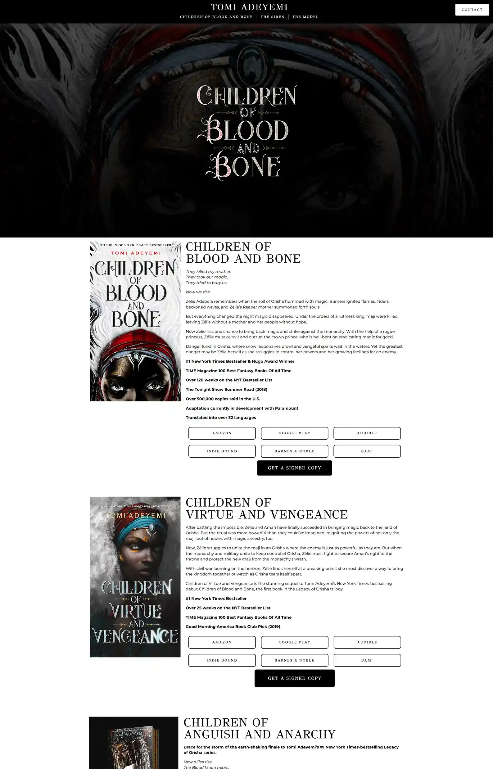
17. Tomi Adeyemi’s Website
First Impressions:
- The intro is interactive, revealing more copy as you scroll, giving you a sense of the world the author created.
- It’s a very focused site full of atmosphere, where each page has a specific function.
The dark design sets the tone immediately when you enter Tomi’s site. And her credibility is established once you land on her reviews, praising her popular series.
Then, at the bottom of the page are her books with amazing animated art on the covers – the cherry on top of the cake.
This page is not over the top but has embellishments that give this website character without going overboard on the theme.
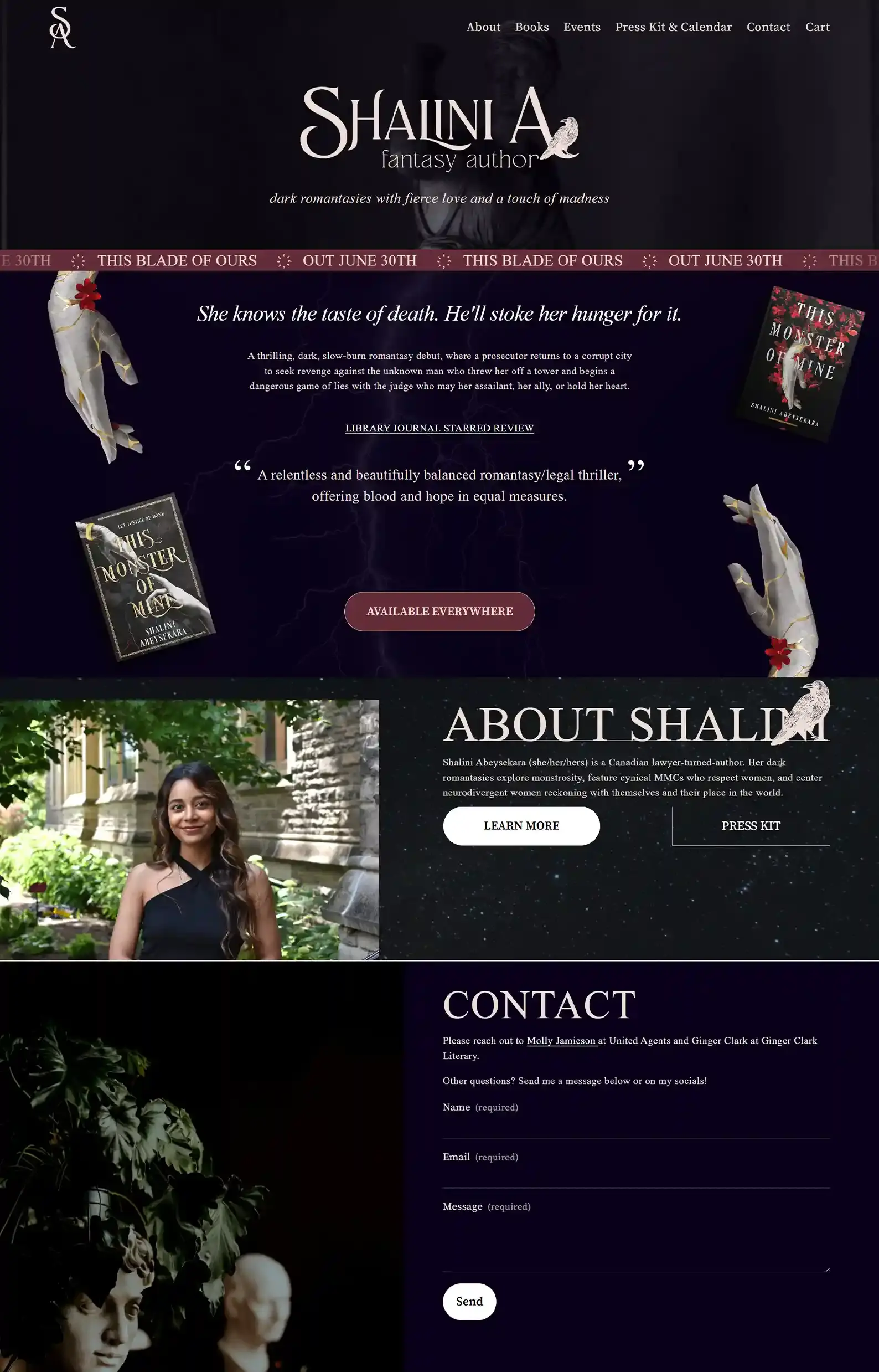
18. Shalini Abeysekara’s Website
First Impressions:
- Strong imagery sets the tone.
- Clear, navigable sections make the user journey seamless.
Tropes and compelling copy are two things the author nails here.
Readers will land here and know exactly what’s on offer, and from there can get to know the author and why it’s worth falling into her world.
The author’s bio is different, trying to connect on interests with the reader, which actually works great for her audience.
I will say, the intro layout isn’t my favorite, as it’s a bit busy and could use some space, but otherwise I think it hits all the right benchmarks.
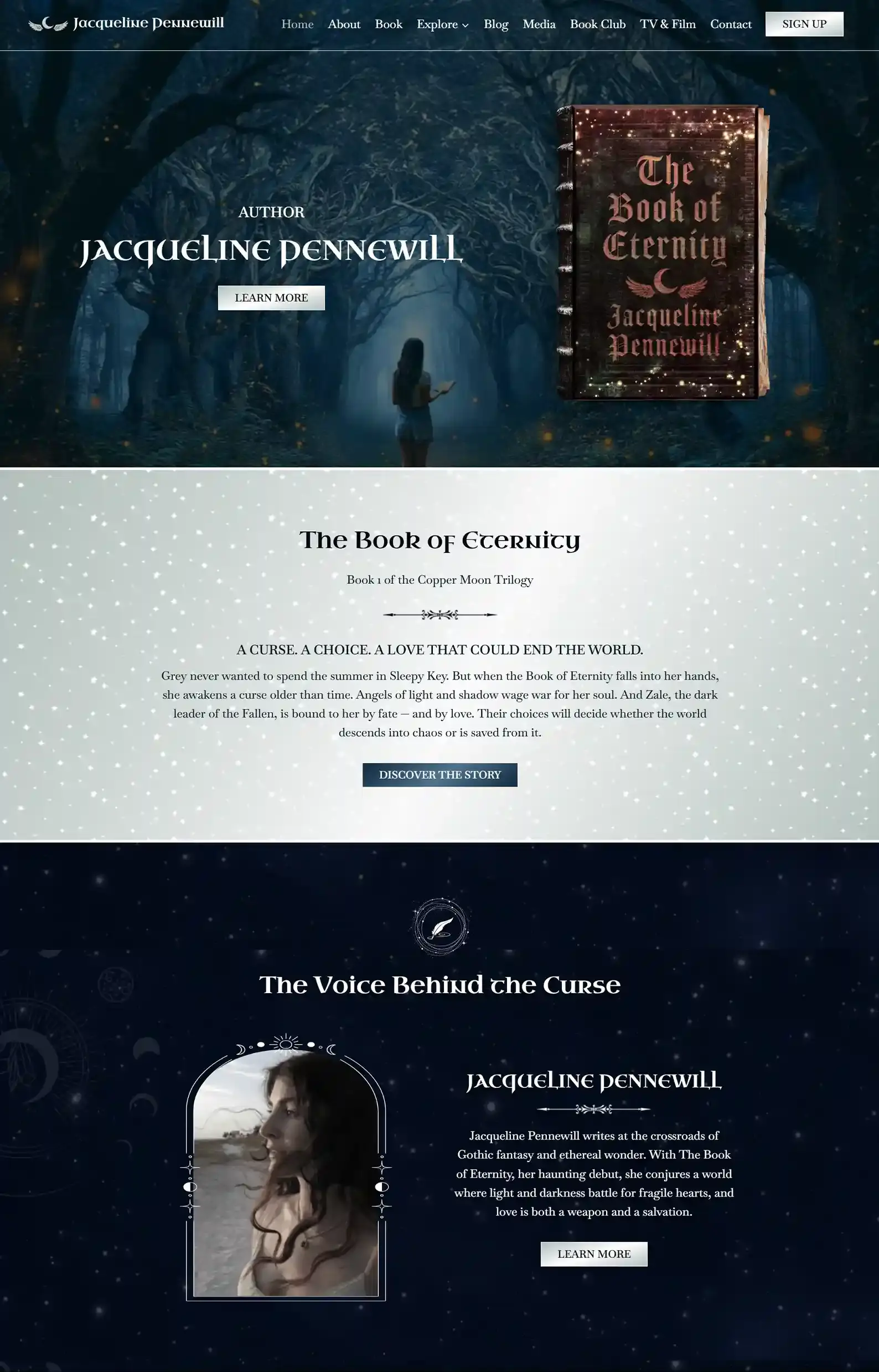
19. Jacqueline Pennewill’s Website
First Impressions:
- Greys and blacks enhance the atmosphere with shimmers and celestial imagery.
- Bold fonts and poignant copy highlight the gothic fantasy genre.
My team really put their eerie, mystical tools to the test with this one, and I love the result.
You get an otherworldly vibe when exploring this site, with a balance of light and dark on every page.
The copy also contributes to this energy while really giving the reader a glimpse of the author’s style of writing.
Readers can further immerse themselves in Jaqueline’s world through extras under Explore, essays and podcast episodes under Media, access to a community under Book Club, and more.
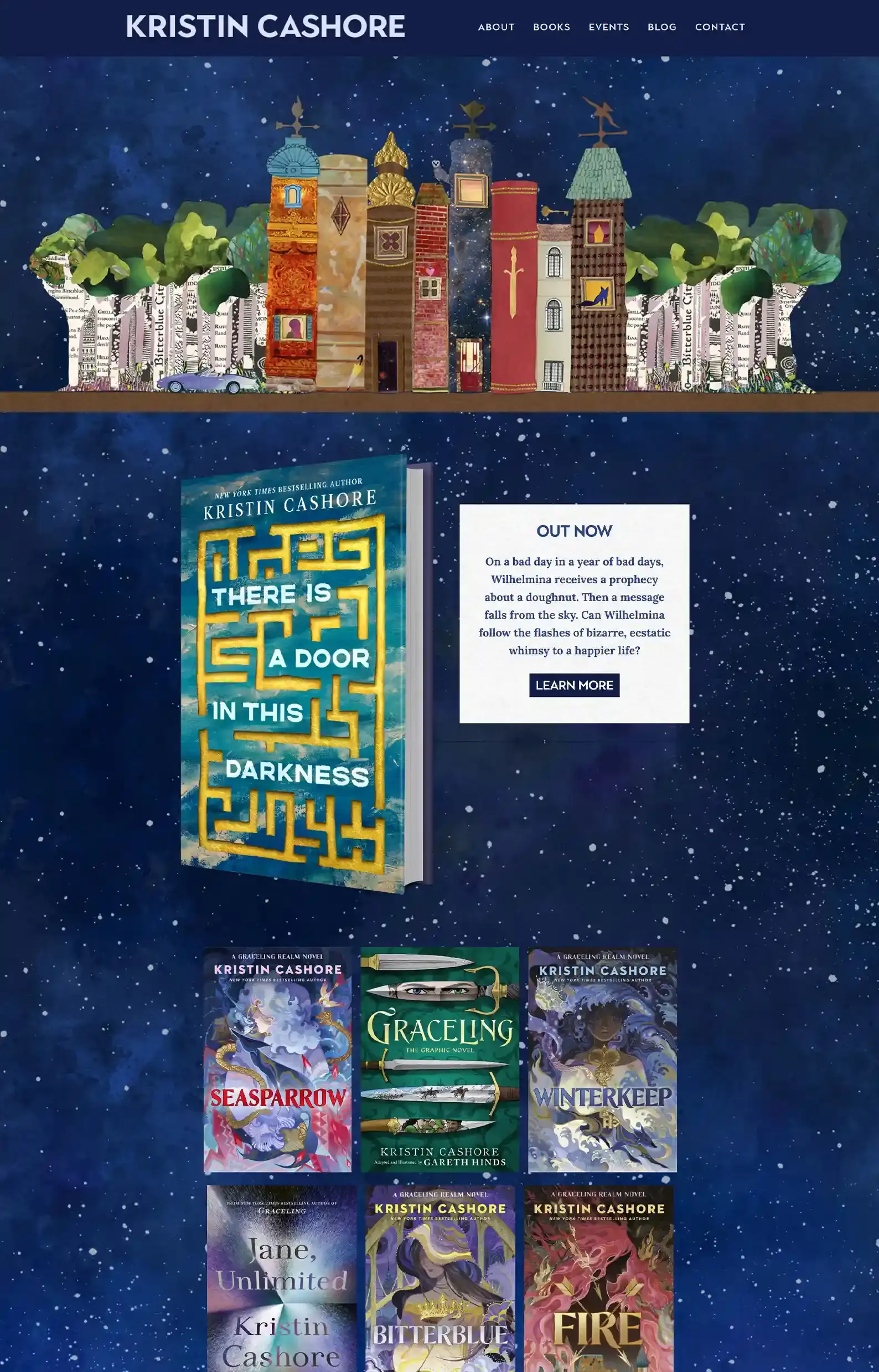
20. Kristin Cashore’s Website
First Impressions:
- Crafty design that sets it apart from other fantasy websites.
- Personable copy that showcases the author’s voice.
Last but not least! The quirkiest fantasy author website on the list.
The design is consistent and a bit quirky. The background is a starry night, and the design elements look either painted or paper-like.
It would be overwhelming, but the navigation is kept straightforward. Everything points towards her books, creating clear pathways for readers.
Your Path Is Laid
If you’ve made it this far, I must commend you, traveler.
I hope seeing this list has given you some ideas you can apply to your own site. Although I know it’s hard, because even if there are similarities, fantasy worlds can be very different.
And if you want something that caters to your world, your readers, and your brand, we can help. Custom is what we do best.
What We Can Do For You
Want to see more websites we’ve designed? Check out our Portfolio.
We’ve built 150+ high-performing author websites across genres that help authors sell more books, grow their email lists, and build thriving fanbases.
👉 See what our website team has designed.
Want to design your own website? Let’s chat.
I’ll chat with you about your books, your goals, and whether we’re the right fit.
Then we’ll compile that data and design a free homepage concept so you know what you’re getting into.


