We LOVE building websites for science fiction authors.
It’s not just anyone who can create a new universe in which believable characters do daring and incredible things and push their readers’ imaginations to their limits. But all too often, the author website that is supposed to support their work is a horrible let-down.
My team and I, with our experience building hundreds of author websites, combed the internet to find the ones that met our high standards and delivered an experience readers will love.
So, this post is a tribute to science fiction authors in general as well as a showcase of some of the best science fiction author websites I was able to find online.
And if you want help building a sci-fi author website of your own, reach out and let’s chat.
Science Fiction Author Websites:
1. Daniel Gibbs’s Website
Out-of-This-World Design
What Daniel Said About Working With Us
“To say they did a good job, is the understatement of the century. From start to finish, Matt and Sonya were complete professionals, and bring a real X factor to web design.
I would put the finished product up against any independently published author’s site, and many trade published author’s sites as well.
Finally, since cost is important, when I selected Rocket, I accepted bids from six different website design firms. Accounting for what they did in terms of work (a few companies proposed making a template and then having me fill it in, but Rocket did /everything/), art design and overall coolness factor – they beat out everyone else during the bid phase by leaps and bounds.
I would recommend them to anyone looking for an outstanding website.”
First Impressions:
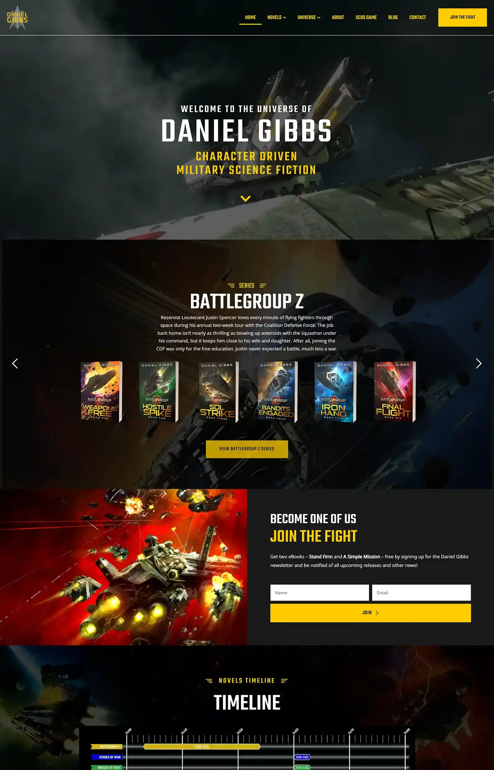
- An action-packed intro video of spaceships battling in space immediately drops the reader into the author’s grand universe.
- The author’s well-organized Books tab includes a graphic showing the timelines for each book series (you can find this on the homepage, too).
Ok, I’m leading with a great one, and one that my own agency created, but if you only view one sci-fi author website, you should definitely check out this one.
My team took Gibb’s various amazing creative assets, from recruitment posters and ship models to star maps and awesome visuals, and then turned them into dedicated pages that live in an interactive online experience his fans can get seriously lost in.
He has an interactive star map page, interactive ship schematic pages, a very detailed timeline page, and even a full-blown universe encyclopedia, which he’s still adding entries to!
The second notable thing about this website is the strong call to action to join the mailing list and the author funnel journey.
The bright yellow “Join The Fight” button at the top right takes you to a striking sign-up landing page that you kind of feel compelled to join if you’re a military sci-fi nut. There is also the same sign-up section on most pages of the website.
His sign-up rates dramatically spiked to a whole new level since we launched this website for him.
2. James Maxwell’s Website
Rich, Imaginative Beast
What James Said About Working With Us
“I can’t praise the team at Rocket Expansion enough. Throughout a complete overhaul involving a new website, change in hosting, email templates, and more, my experience was of a passionate, dedicated group with technical brilliance and artistic flair. I felt like I was in safe hands, and still do, and I look forward to working with the team in the future.”
First Impressions:
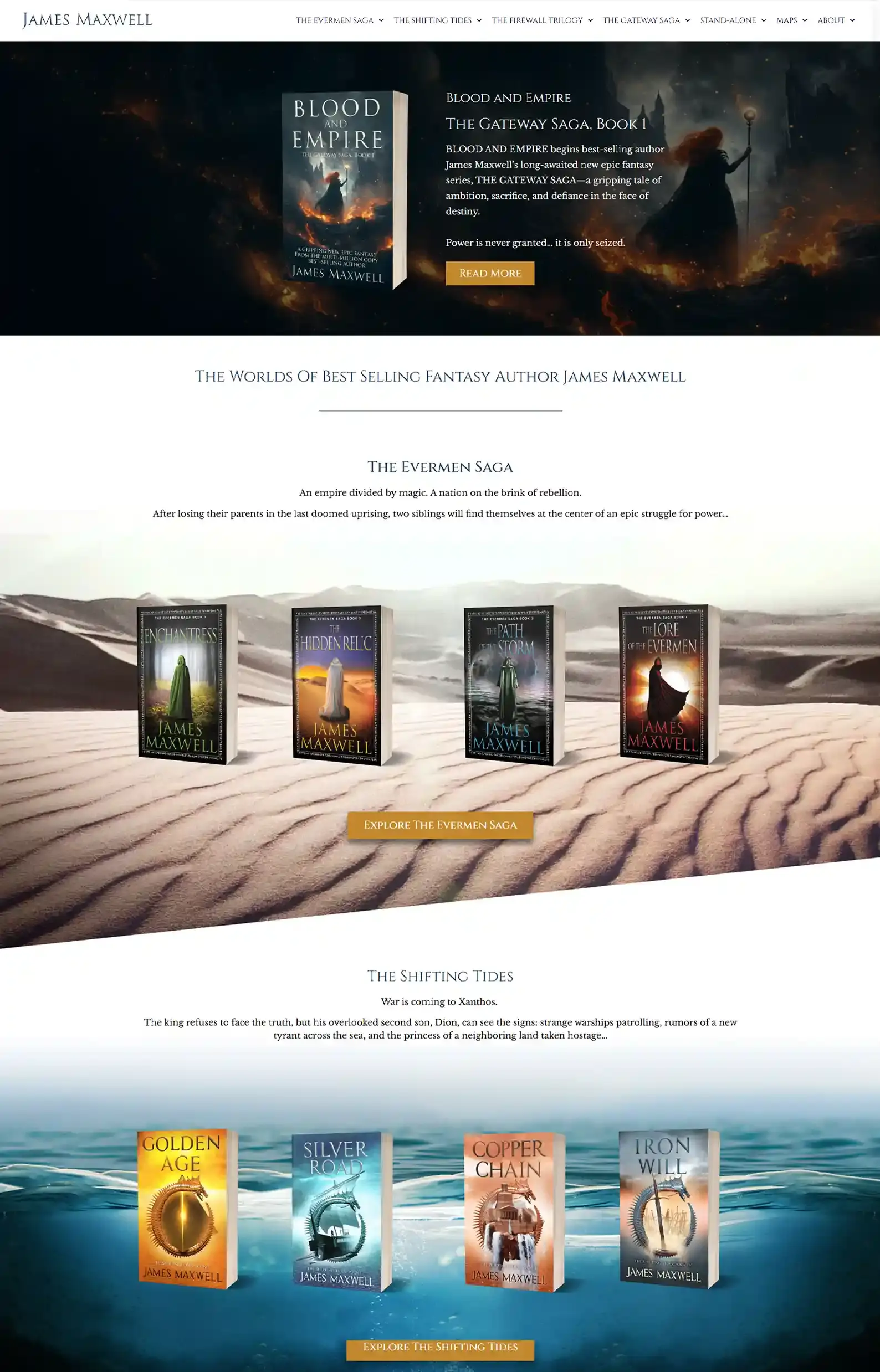
- A mystical intro highlighting James Maxwell’s newest release.
- Since he crosses between fantasy and sci-fi, sleek fonts and design elements help balance the genres and magical visuals.
My team had a lot of fun creating this online extension of Maxwell’s world.
James is very much a reclusive author who likes to write and let his publisher do the heavy lifting when it comes to marketing.
Understanding this, we made his website mostly about showcasing his different series in an aesthetic and engaging way and giving him a solid home online for his many fans to enjoy.
Besides browsing through his many books, you can explore to find his magnetic bio under About and his beautifully illustrated Maps.
James Maxwell’s agent (who represents some huge names) even mentioned that this was one of the best author websites he had ever seen (and he’s seen a lot!).
3. Lauren Beukes’s Website
Swimming in Social Proof
First Impressions:
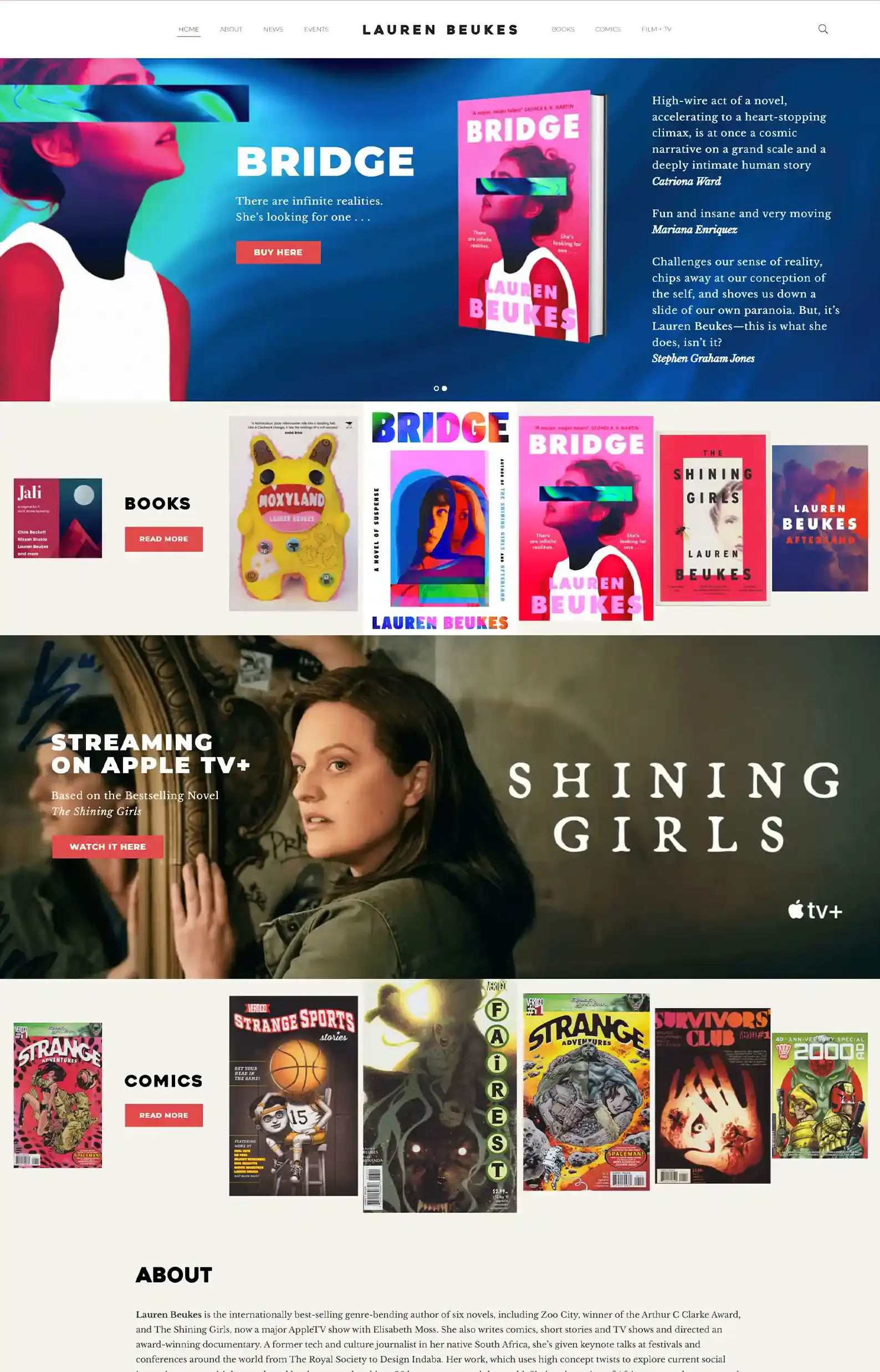
- Techno-color intro that uses the bright hues of Lauren’s covers to grip the reader as they enter.
- Interactive book carousels for her novels and comic books that emphasize the book that’s settled front and centre.
Lauren Beukes is a genre hopper, making her sleek author website design appropriate for her brand.
White space, clean typography, and streamlined navigation keep things professional and focused as you explore.
But the standout feature is how the site displays her reviews and accolades generously.
From the intro down to her books page, her social proof takes centre stage, showing the reader how well received her work is and why they should give it a try.
4. T.A. White’s Website
Ultimate Series Display
What T.A. White Said About Working With Us
“I couldn’t be happier with what the team at Rocket Expansion created for my author website. Working with them was easy and they captured my vision perfectly. The best part is the whole thing came together quickly, and it was a painless experience all around. I would definitely recommend them to others and use them again in the future.”
First Impressions:
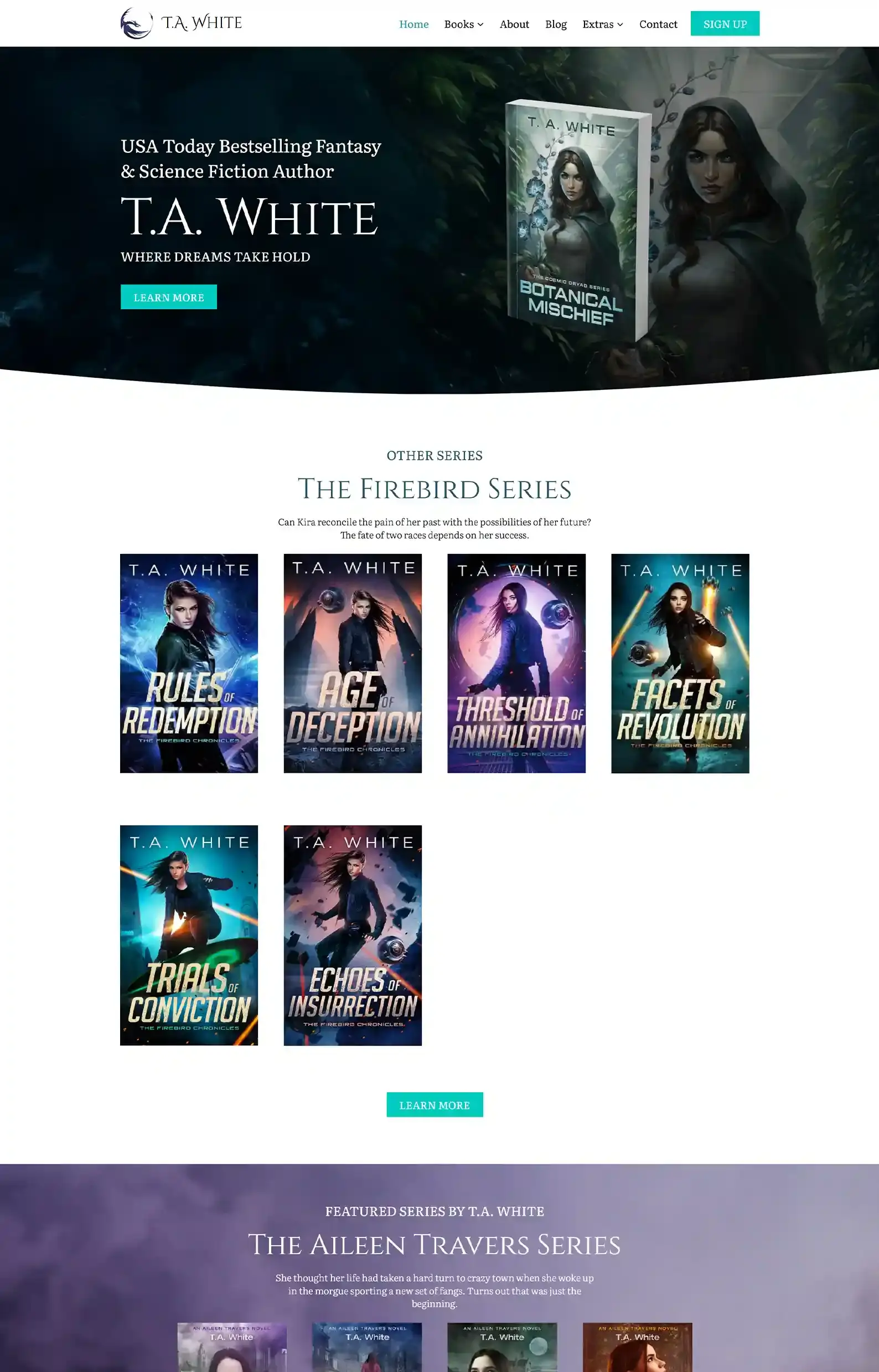
- Modern, professional design with clear structure.
- Plenty of extras for fans to dive into.
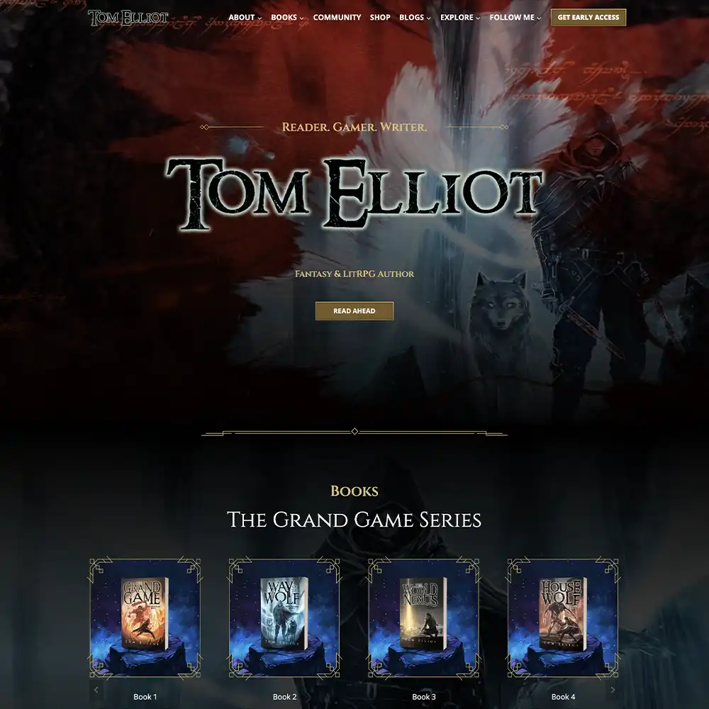
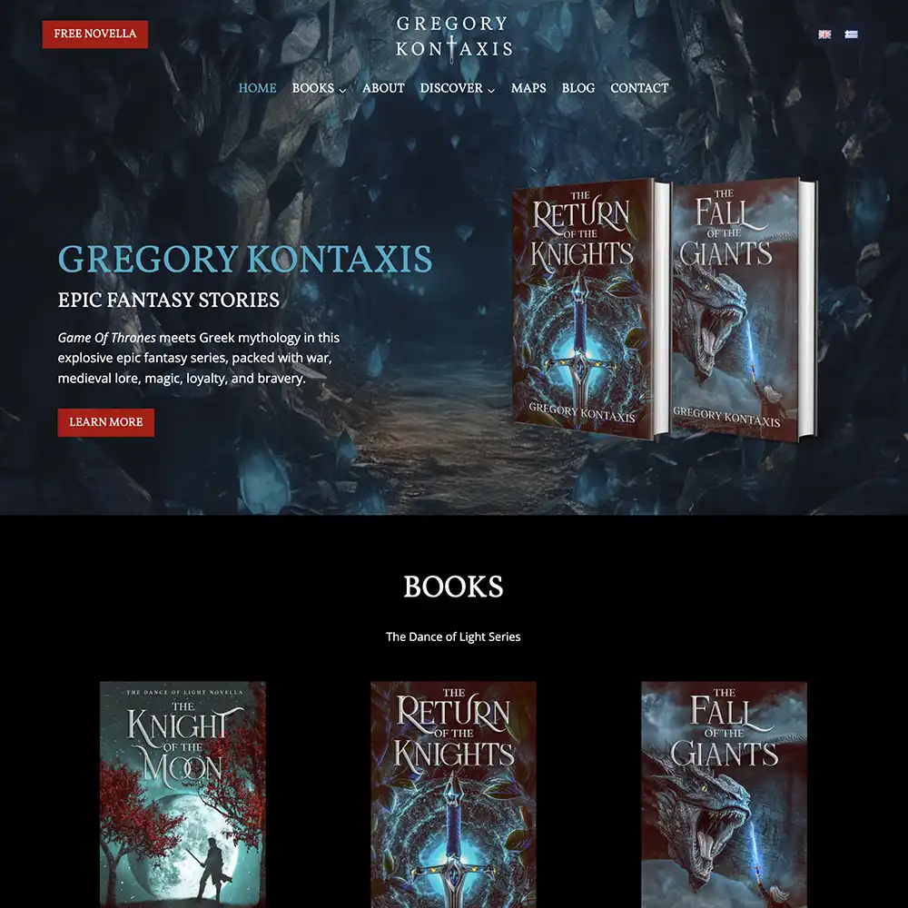
We really enjoyed designing this fantasy author website for T.A. White.
She needed a sleek design that engaged users as they browsed the website, blending fantasy and sci-fi — her two major genres.
We did this through simple white space paired with interesting background images that complement their respective sections.
T.A. White is an author who knows how to keep her fans happy. She gives her fans unseen stories in the form of deleted scenes from her books and gets tons of engagement on her active blog.

5. Ariel Sullivan’s Website
Lunar Luxury
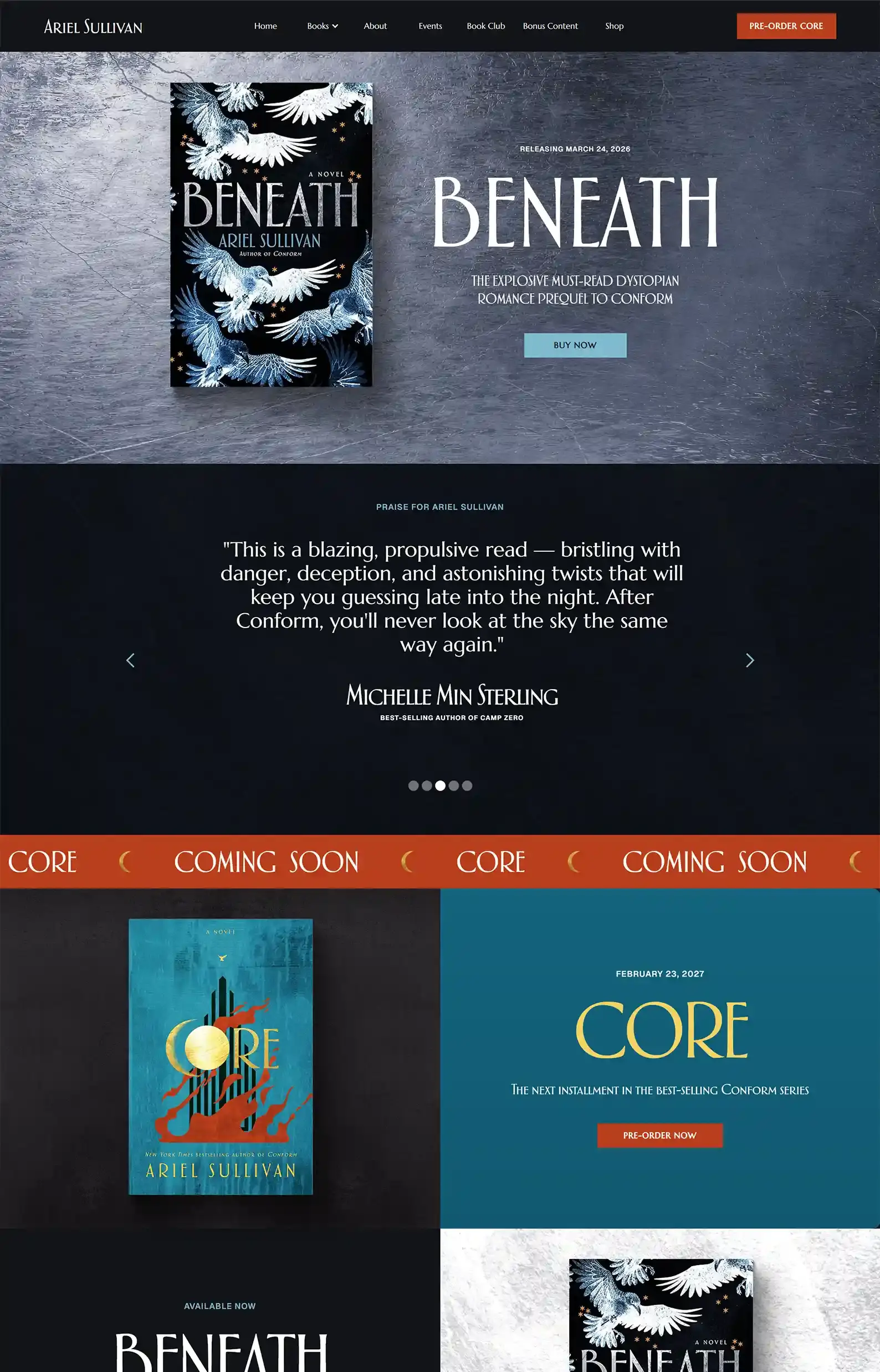
First Impressions:
- Eye-catching intro highlighting the author’s latest release atop a banner that fits the cover without distracting from it.
- Bold copy that’s usually capitalized and has an oblong shape to fit the author’s branding.
Ariel Sullivan’s science fiction author website has a distinct style that leans on deep hues and lunar elements found on her book covers to set it apart.
I like how the site uses white space to give the design a chance to breathe and makes browsing enjoyable.
And as you explore, you’ll find a well-structured Events page, bonus content, and a community-building extra – a book club tab.
You can use the relevant tabs for whichever book your club is reading to request that the author visit your group!
I don’t think I’ve seen any other authors do this, and it truly is a special opportunity to develop an unbreakable bond with readers.
6. J.Z. York’s Website
Electric Experience
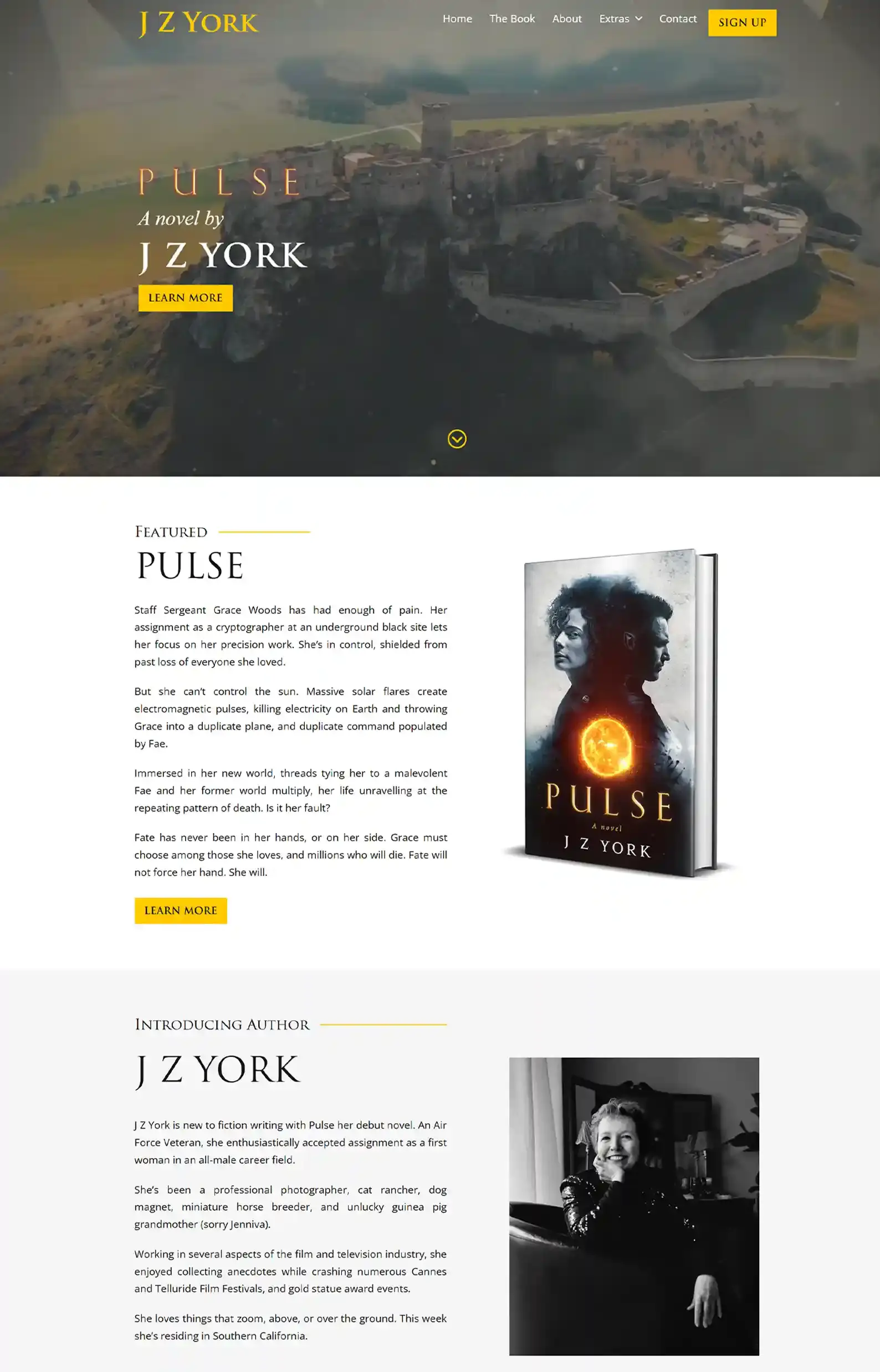
First Impressions:
- A pulsating video blazes across the intro, capturing the author’s action-packed featured book.
- Extensive extras tab with a detailed glossary, entertaining Q&A, and sleek map.
Sometimes your book’s concepts are epic enough to carry the entire website’s theme. That’s what we did with JZ York’s website!
The intro video is super engaging and striking! The rest of the website has a classic look that’s polished and content-forward.
The yellows highlight the Pulse theme, and the black in some banners echoes the sci-fi feel really well.
7. B.V. Larson’s Website
Hyperspace Design
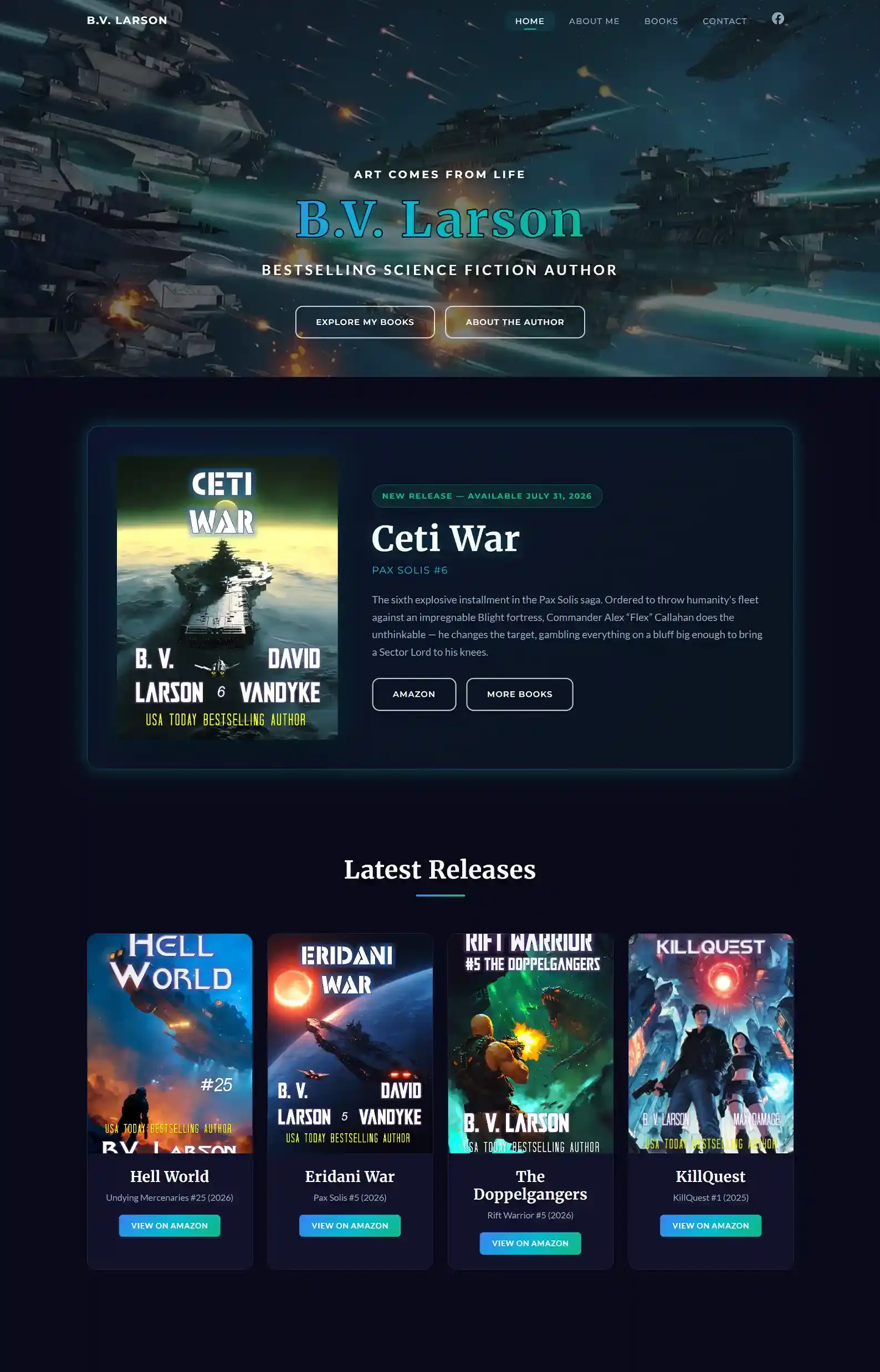
First Impressions:
- Commanding intro with shooting spaceships beneath CTAs that show readers where to go next.
- Clean navigation that provides the reader with a clear path.
This sci-fi author website is atmospheric yet simple in layout and structure.
If you want a site that shows off the genre but doesn’t go too hard on extra elements, I’d say this is a good way to go about it.
The colors, fonts, and icons have a futuristic quality.
8. Austin Dragon’s Website
Professional Genre Bender
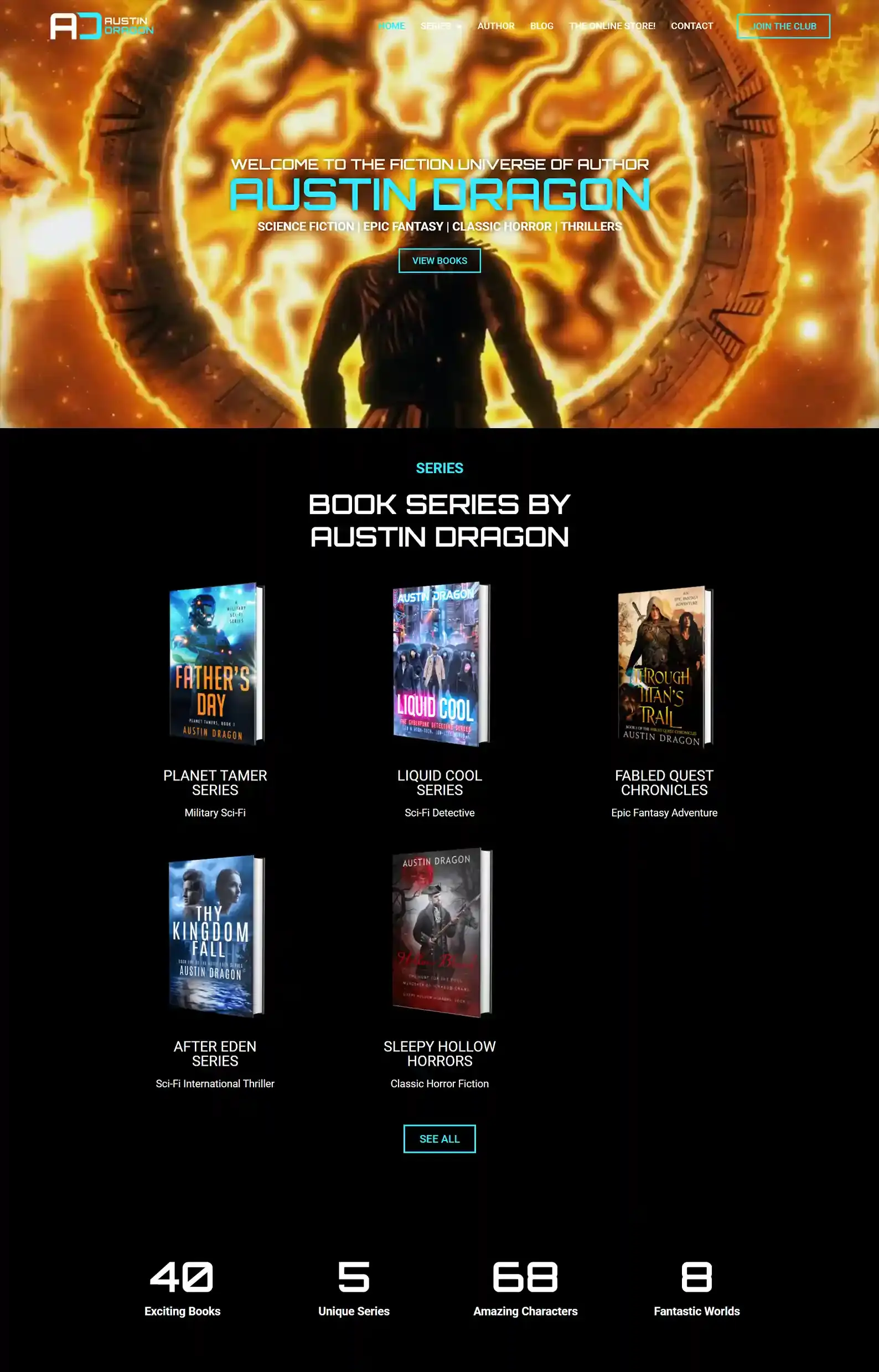
First Impressions:
- Genre-twisting intro video that expertly balances the author’s many themes and atmospheres.
- Easy-to-use shop with various editions and some cool merch.
Here’s a website that’s as cool as the author’s name.
Austin’s website is on brand, atmospheric, and just downright awesome to look at. And we’re not saying that just because we designed it!
The epic intro video grabs your attention immediately and sets the tempo for the rest of the website.
The futuristic theme is enhanced by the color scheme and the font style. And to grab readers’ attention, he offers four free books in exchange for joining his newsletter. That value up front will definitely warm readers up to his work.
A website that is entertaining but still professional!
Want one like this? Check out our portfolio.
9. Matt Dinniman’s Website
Definition of ‘Cool’
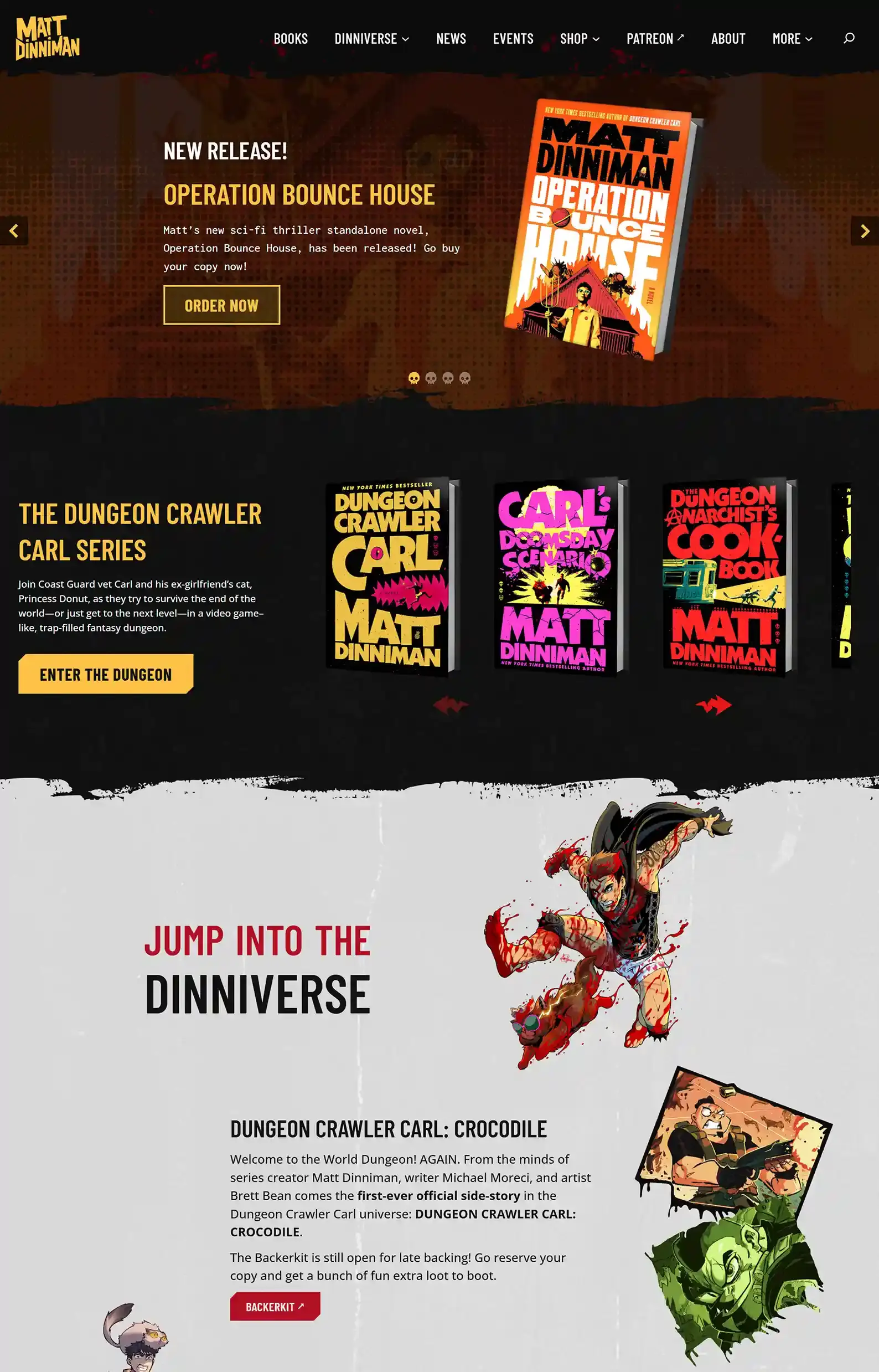
First Impressions:
- Awesome icons and graphics that perfectly fit the theme of the author’s hit book series.
- A seamless ecosystem of the author’s universe that feeds back into itself, providing a good user experience.
Four words came out of my mouth immediately when I saw this fantasy site:
“Whoa, this is cool.”
If you love speculative fiction, you’ll be no stranger to Dungeon Crawler Carl. What started out as a cult following has since blown up to a viral craze—for good reason, too.
It’s only fitting that the website matches the source material, right?
Besides this sci-fi author website looking absolutely incredible, it’s super focused. Straightforward funneling makes it easy for readers to find the webtoons, graphic novels, and Patreon.
10. Front Line Publishing’s Website
Full-Throttle Community Hub
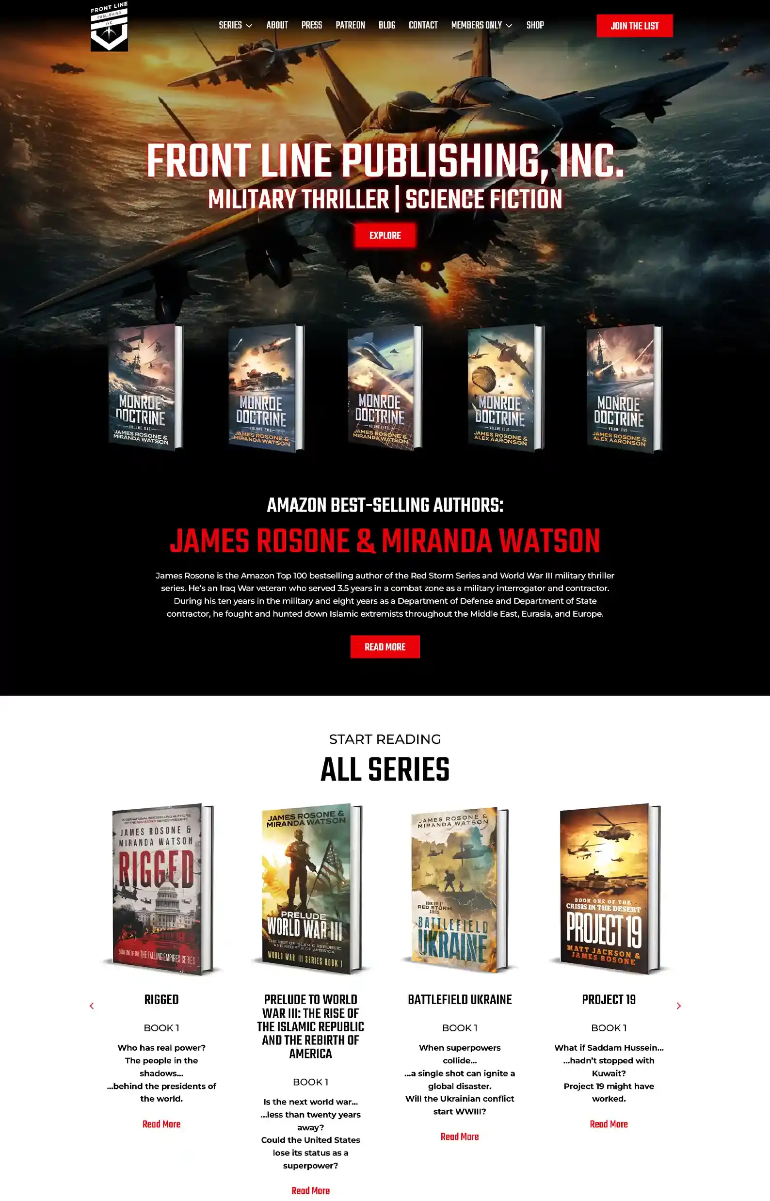
First Impressions:
- Heart-pounding visuals mixed with gritty colors grip you from the intro and never let you go.
- Although packed with content, the sleek menu makes it easy to browse.
This author website is thriller sci-fi at its best. And I’ll try not to sound too biased since my team designed this one.
Between the thrilling imagery, you’ll find a plethora of content to discover, from the informational Blog and About pages to the in-depth Press page.
And some of our favorite sections we built are the Patreon and Members Only pages.
If you want to unlock more content, you can sign up for member access, but you can also view some samples to get a taste of what’s to come.
Plus, you can sign up for their newsletter to receive special deals and get a chance to name characters in future books, which is especially enticing for eager fans!
11. Eilis Muir’s Website
Quantum-level Design
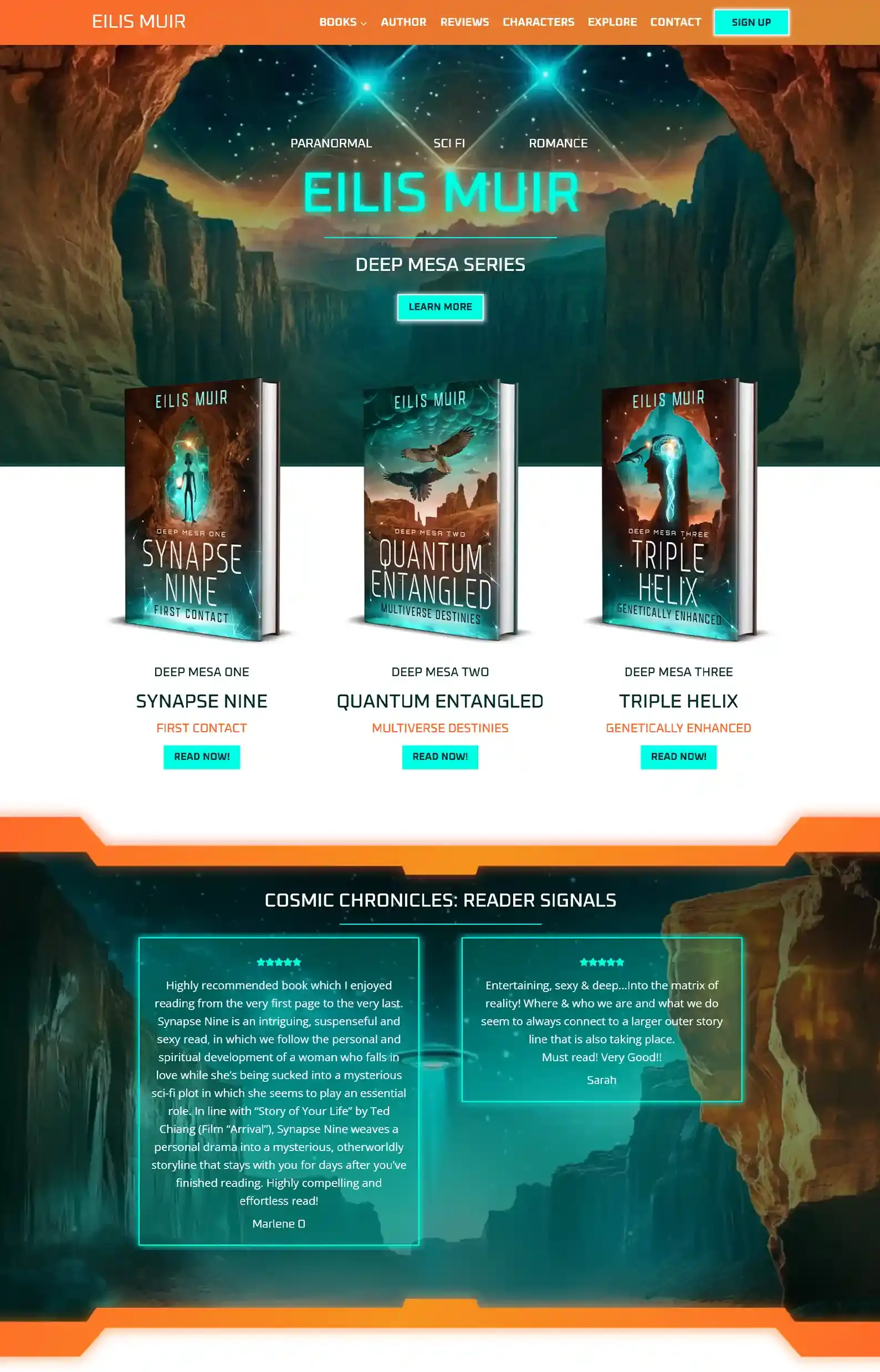
What Eilis Said About Working With Us
“Rocket Expansion Web Design services were outstanding every step of the way. They offered a startup front page that was already in line with what I was looking for and made it easy to comment on and follow a vision better than I could imagine. They answered my questions and exceeded my expectations at every turn. The team helped me through technical glitches, newsletters, and emails, and offered creative alternatives. Communication was always timely and courteous.”
First Impressions:
- An out-of-this-world intro showcases the genres of the author’s main series, accompanied by an eye-catching image that aptly fits her work.
- Futuristic colors in neons and deep hues truly give off that Sci-Fi vibe.
Here’s another otherworldly design from my talented team.
We wrapped the site in sci-fi packaging through futuristic fonts and genre-specific copy. For example, the Author page delves into Eilis’ background as if she’s a character from her books (click the dropdowns for even more information on her!).
But my favorite section is under the Explore tab, which readers will love, but it’s displayed quite uniquely. Click on a topic, and you’ll find a pop-up with intriguing details that tease the story as if you were in Eilis’ universe.
12. Astrid Cole’s Website
Lesson in Simplicity
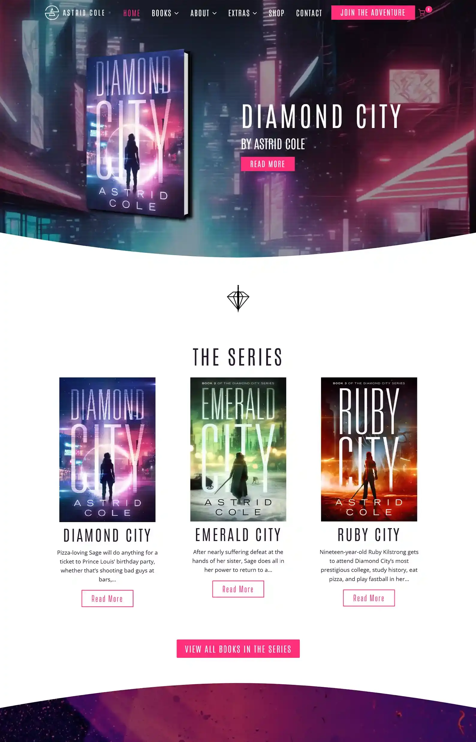
What Astrid Said About Working With Us
“Rocket Expansion has made my author dreams come true. As a first-time author, I had no idea what I was doing when it came to creating a website. Wix is good for a lot of people, but when I tell you I had no experience, I mean I didn’t know the first thing about even changing the colors or themes on a page.
If you’re in the same boat as me, and you want peace of mind at night when it comes to techy stuff, look no further. Rocket Expansion is incredible.”
First Impressions:
- Sleek design that reflects the author’s featured series and book covers.
- Clear, navigable layout that makes exploring a breeze.
This polished sci-fi author website was designed by my team.
Keeping things streamlined, the design uses generous white space mixed with galactic colors to guide the reader to the author’s books, reviews, and lovely extras.
Astrid has an elegant, simple shop filled with regular editions of her books as well as special editions, and fun merch for fans.
If you’re looking for something simple yet classy that represents your brand and genre, this is a great example of how to do it.
13. Vince Murdock’s Website
Where Interdimensional Worlds Collide.
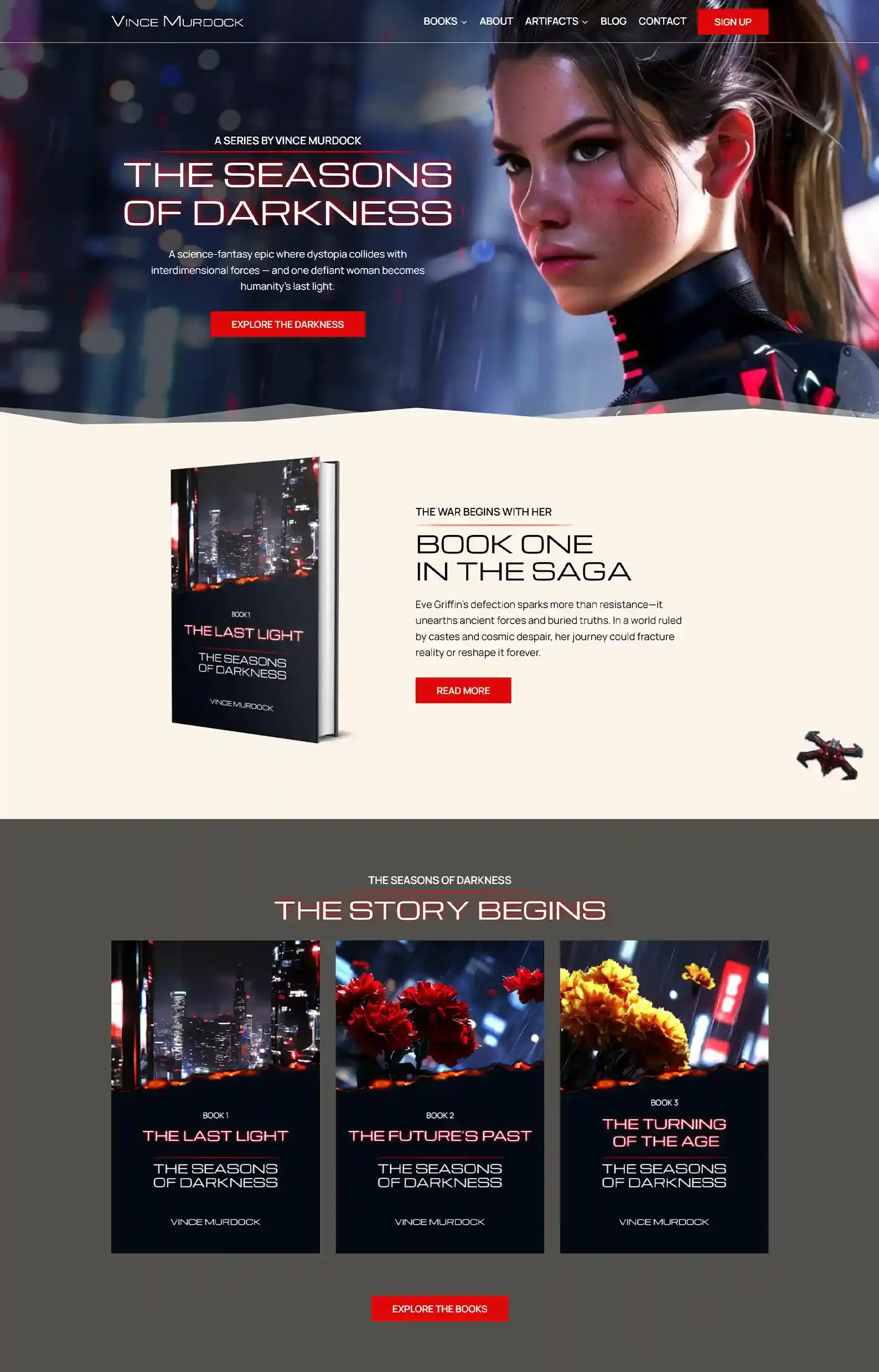
What Vince Said About Working With Us
“I searched high and low for an author website service that felt like the right fit. There was a little too much forestcore out there for my taste – I wanted something bold that would grab attention right away. Then I found Rocket Expansion. After speaking to their team and seeing their creative vision for my site, I knew I was in the right hands. From start to finish, it was a wonderful experience – patient, professional, and incredibly talented. I’m already looking forward to the day I get to work with them again on my next website!”
First Impressions:
- An eye-catching intro with bold, on-genre copy that depicts the main character and the name of the author’s featured series.
- Vince’s magnetic brand shines on the Book, Blog, and About pages through engaging descriptions of his writing journey and informative FAQs.
My team had tons of fun with this design, and I think it shows.
The design elements pay homage to Vince’s blending of genres within the sci-fi realm, from buttons that darken when you hover over them to artifacts that glow red.
Supporting the tense atmosphere are deep, dark color choices and striking typography with copy that would leave sci-fi fans on the edge of their seats.
To cap it off, he engages fans of sci-fi with an enticing email sign-up page, as well as descriptions of characters and lore.
Are You Ready For A New Frontier?
My team and I loved putting this list together, and we hope you found some inspiration for your own.
As you’ve probably noticed, quite a few of our own sites made it on the list, and you can decide if that was a biased choice or not.
But it truly was a bit of a task to find any others that wow’ed us. We’re kind of hard to please.
So, if you want your author website built by a team with super high standards and a passion for quality design that stuns readers, we’re that team.
Book a call with me, Matt, and we’ll talk about your goals for your career and see if we can help you achieve that. And we’ll also throw in a free homepage concept so you can see the direction of your website without paying a penny.