Want to know what can keep children busy for longer than 2 minutes at a time? Or maybe even how to make the most entertaining children’s author website on the internet?
Look no further, here are some examples of our favorite children’s author websites!
But why trust us?
At Rocket Expansion, we’ve built 100+ high-performing author websites that do more than just look good—they help authors sell more books, grow their email lists, and build thriving fanbases. We work with fiction and nonfiction authors across genres, optimising their sites for discoverability, conversions, and long-term success.
If you’re looking for a custom, done-for-you website, let’s build one together.
Eric Carle
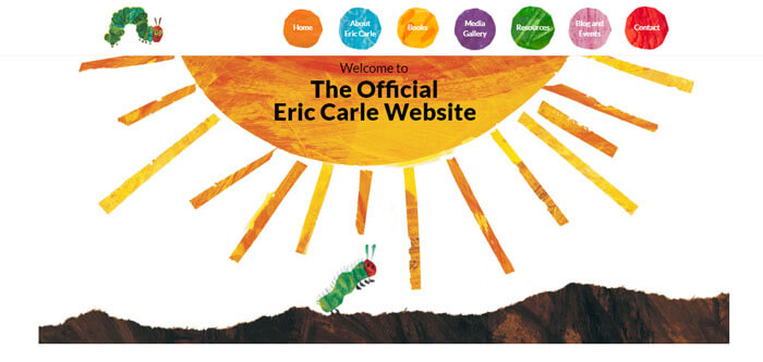
Eric’s website does a wonderful job of using the right colors & font without being too overwhelming and in your face. The use of his trademark illustrations, mainly the famous hungry caterpillar, fits in perfectly with his books.
The choice he made of using watercolors and not bright, in-your-face colors adds a calming element to the site and makes it feel easy to navigate.
Something to learn from Eric’s site is to incorporate your beautiful illustrations where you can. As a children’s author, you should make sure your artwork (and book cover art especially) is eye-catching and engaging. You can then use this on your website as well!
Karen McDonald
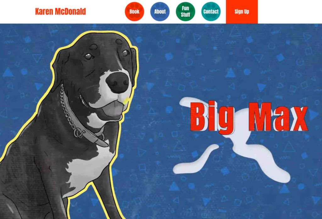
This example encapsulates an author allowing their work to speak for itself in the best and most authentic way. From the get-go, without having even read the book visitors will know who the star of the show is and what the book is going to be about – Big Max!
The adorable design elements, animations, and layout make this website one of our favorites and we’re sure this little furry companion will steal the hearts of everyone who comes across him. The ‘fun stuff’ will have kids busy for ages with the cool and fresh downloads and activities available. The attention to detail is impeccable with an engaging intro video and elements such as the paw prints on the navigation bar.
We love this one! (and not just because we designed it, we promise)
David Walliams
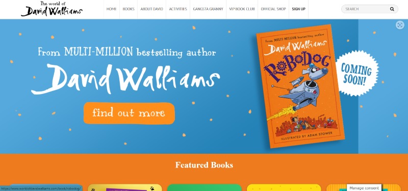
David’s website is something anyone would love as a kid. There are some really fun elements, like big buttons to push (do yourself a favor and push the “do not press” button… you won’t regret it).
He also makes use of fun and bright colors that pop and stand out, grabbing the attention of his target audience. He has a lot of books on offer, which he showcases well. His filter navigation is an elegant way to help visitors quickly find what they are looking for.
Neeps & Tattie – Amy Johnson & Diane Madden
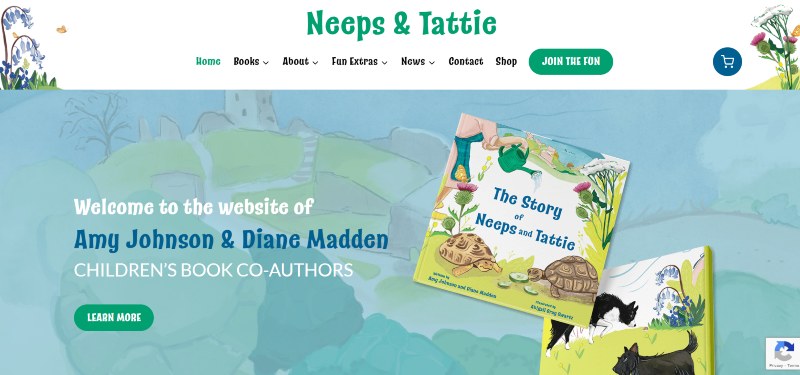
Here’s another Rocket Expansion author website design for you! This website is cozy and welcoming. It feels like you’re stepping into someone’s well-tended garden.
The watercolor artwork that adorns each page shows off the illustrations you’ll see in the books. One of our favorite sections is the ‘Meet the Characters’ banner on the home page. It has framed pictures of the characters, making it feel like you’re looking at a feature wall in someone’s home.
There are so many activities to keep kids busy on this website. There are mazes, coloring pages, and even tips for teachers and parents to make the reading experience even more entertaining for the children.
Roald Dahl
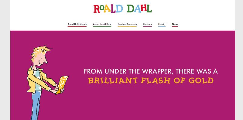
Dahl’s website brings the essence of his books to life, with the illustrations, characters, and stories we all love. This is an iconic backing to have as an author, to be so recognizable from just a few elements of your work.
The layout is simple and clean to navigate, but also fun & fresh with the colors, font, and overall design. There are also some great downloads available, as well as current events at museums and other locations.
Jennifer Ballow

It was so fun creating Jennifer Ballow’s website.
Cute videos of the book’s characters greet you as you land on the home page. Instead of a simple sliding to the next image, a wave takes you to the next animation. Cute!
This playful slideshow gives a glimpse into the world of the author’s featured book and all the interesting situations you could experience with the book.
The website is accented by dreamy nighttime colors which accompany the simplistic white layouts and playful fonts. There are bountiful extras like coloring pages mazes and word finds to keep kids occupied and engaged in the author’s world.
Robert Munsch
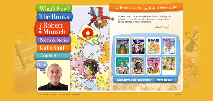
Munsch’s website, although it’s old and it can be hard to see pictures or read some text, is fun for kids. The layout is very different from other children’s author websites. He uses book spines as the navigation to different areas of the website, which we thought was very creative!
He also includes a lot of content from and for his readers on his site, which is a great way to include them in the community. Robert incorporates poems that he writes for fans based on emails that he gets sent, pictures of him visiting classes, and a whole section where he posts the letters and drawings he’s been sent.
This makes it fun and engaging for his readers as they feel like maybe he’ll include them, leading them to join the mailing list.
Jacqui Shepherd
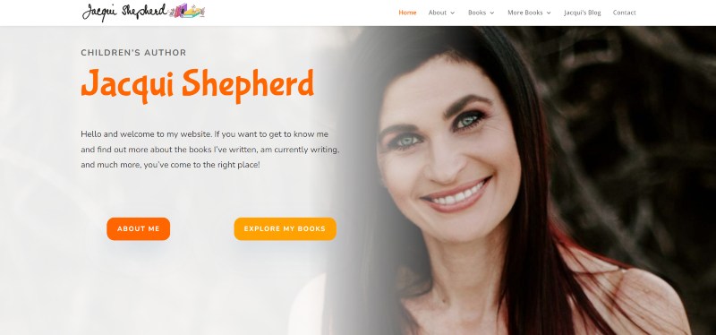
We built this website for Jacqui and brought across her illustrations to guide the users with something recognizable. This is great as it brings a sense of familiarity to the website that will keep users scrolling and seeing who’s going to appear next and what they’re showing them.
Jacqui offers downloadable coloring-in pages for kids to interact with her characters, and a regularly updated blog to share recent news.
Kevin Henkes
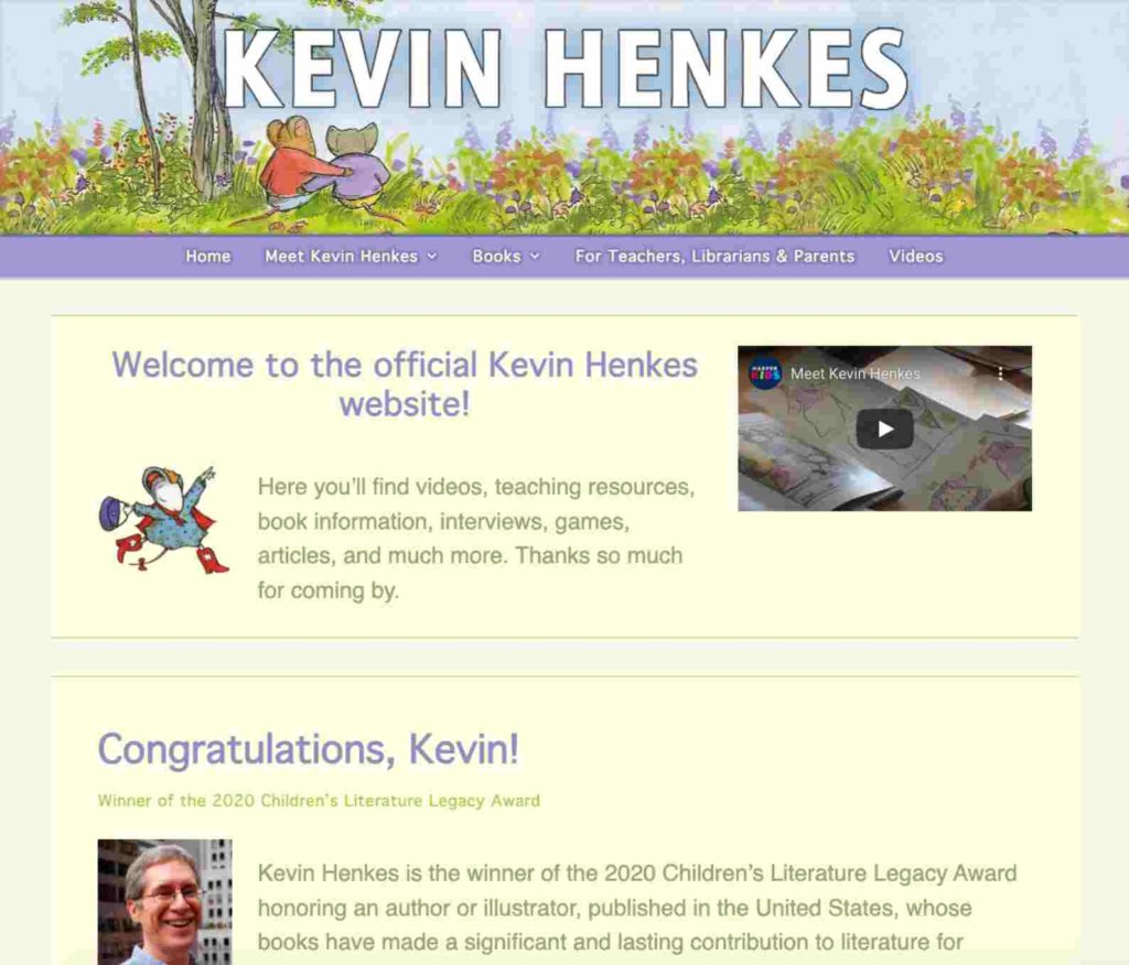
Kevin’s website has some great pages and is a good example of a simple but useful website that users will really like. There’s a very cute ‘meet the mice’ section that introduces the characters and gives them a profile that users can engage with and know more about them from the books they’ve read.
Overall the layout could be more engaging and fun, but the colors reflect Kevin’s work perfectly and bring it to life in a different, more subtle way. There’s a detailed contact section which is great and allows readers to know exactly how to get in touch for each potential reason or inquiry.
Kelly Starling Lyons
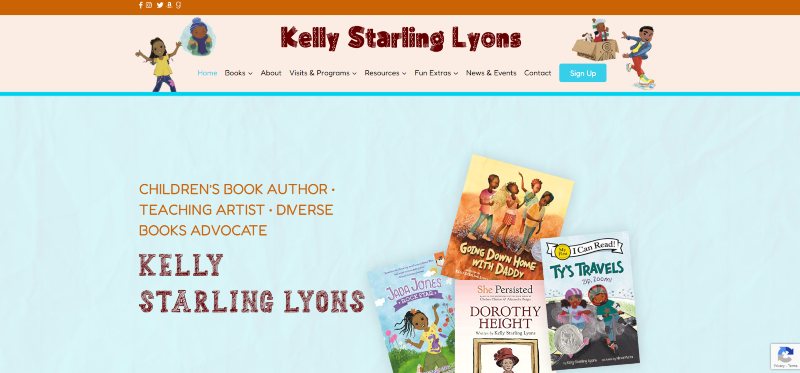
When designing Kelly’s website, we wanted it to be eye-catching, but content focused.
The content has space to take center stage and it quickly engages the user without overwhelming them!
The website’s colors suit Kelly’s book covers and enhance her branding. We also get to see the characters sit atop the pages’ banners, which brings the site to life.
There’s also plenty to see and do on this website. We especially love the Extra’s page. There are word searches, loads of coloring pages related to the books, and more activity sheets for kids to enjoy.
Judy Moody
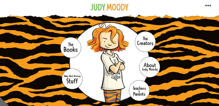
Children’s author Megan McDonald’s website was definitely built with kids in mind, which makes it all the more fun and easy to navigate! Her funky background and colors work well together and make for an engaging site that kids will spend a bit of time on!
Her “way not boring stuff” is a cool page filled with games, tips, and Judy Moody themed party ideas! Something young kids would most definitely be into.
You can take a page out of Megan’s book and create a wealth of fun resources for kids, parents, and teachers to fall in love with your work.
Tonya Flores
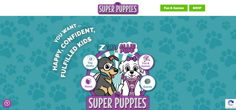
A website designed for fun-loving kids. Designed by yours truly!
We lifted this Children’s author website to new heights with a menu design that surrounds adorable puppies to cement what you’re in for. Cute superhero puppies!
Text bounces into view above the canine heroes already showcasing what Super Puppies stands for.
Tonya’s books playfully use the virtues of Aristotle to teach children confidence and happiness. And her website conveys this aptly. If you subscribe to her email list you get awesome stuff that supports these virtues like fun crafts, recipes, and coloring sheets.
And speaking of her sign-up section! At the bottom of each page, the illustrated first reward for signing up does a little wave when you arrive on the pane. Beckoning users to hop on board for Tonya’s teachings of Aristotle’s virtues.
Beverly Cleary
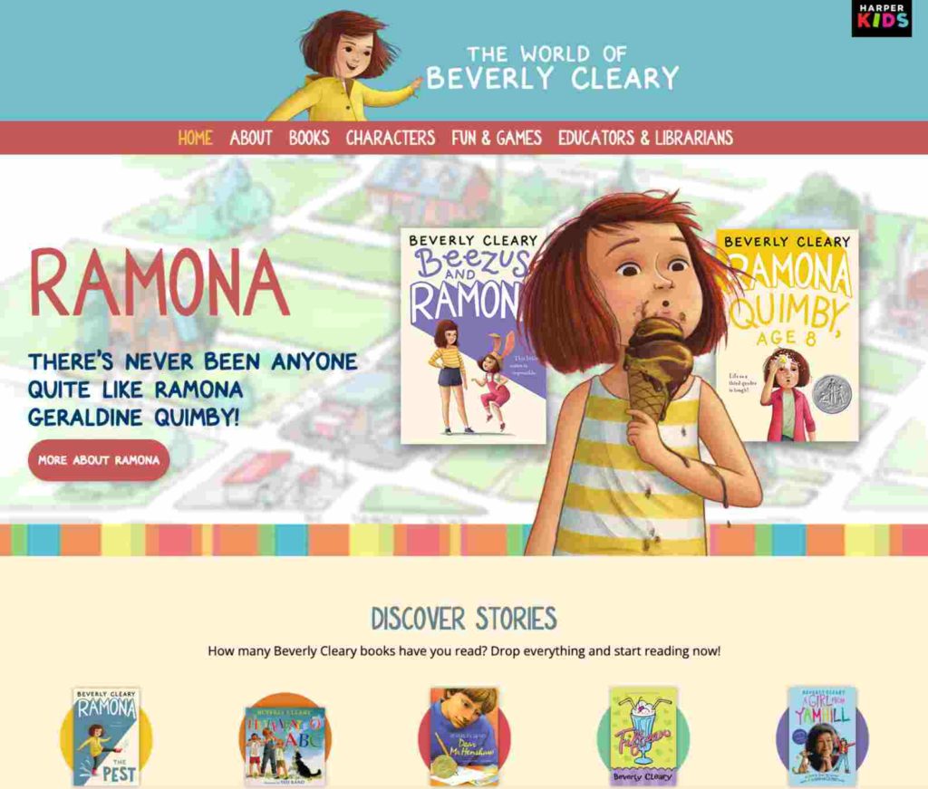
This website is such a great one for many reasons, definitely something children and adults alike will love! The cute illustrations carry a theme throughout, all complemented by the soft pastel tones of the color scheme. The presence of the author is featured here and there, but the main focus is undoubtedly Beverly’s work and the books that allow her legacy to transcend time.
There are also some great inclusions for users to enjoy such as the ‘fun & games’ tab that has events kits and quizzes for users to print. Overall, such a well-rounded website with a bit of everything!
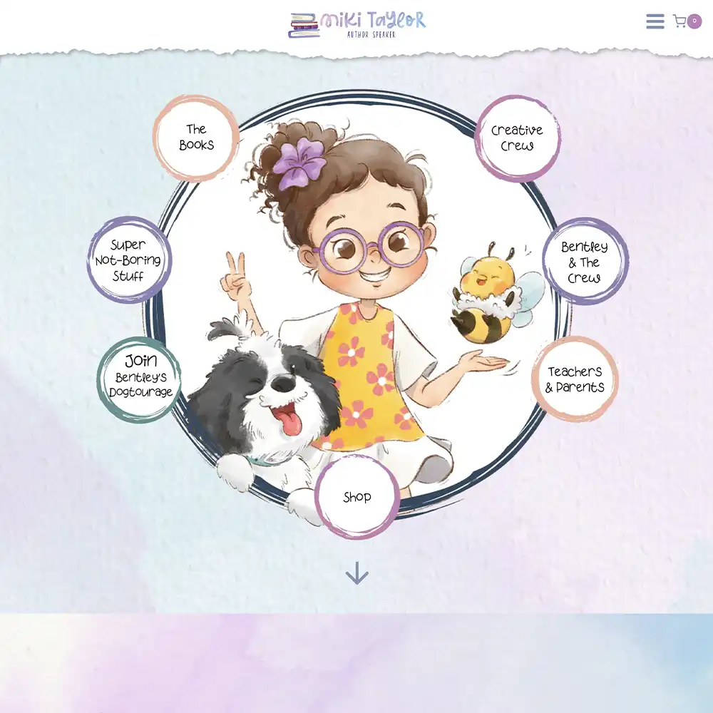
Miki Taylor
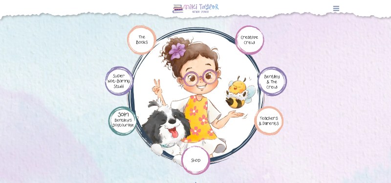
Here’s another watercolor-themed website, and it’s designed by us too!
Even though the colors are striking in nature, it has a calming effect that makes the user feel at ease and joyful.
The intro image is delightful to look at and lets the menu style shine. Little, colorful bubbles surround an adorable illustration!
Besides the wonderful colors and playful fonts, there’s lots of content to see. What we love the most are the paragraphs before you download an activity. There’s a mini story to help engage kids and give meaning behind what would be simple coloring pages.
Jon Scieszka
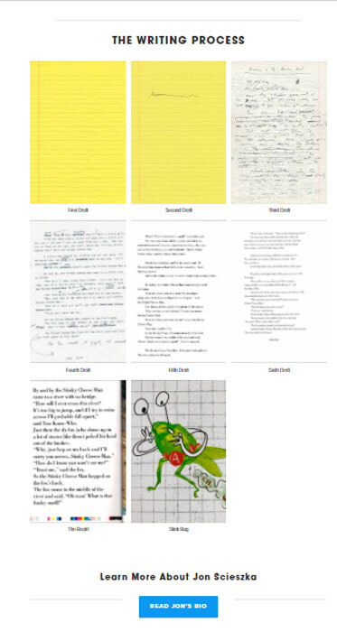
Jon’s website has one feature that stands out to us from the rest and that’s his writing process page. A lot of kids who like to read and write often want to eventually become authors themselves, but they have no idea where or how to start.
This is what makes Jon’s idea so great. He shows his process, how he starts, and how he gets an end product, which is basically giving kids advice and showing them how it’s done. A clever addition that can end up making a huge difference!
Beatrix Potter
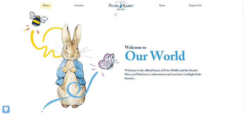
Beatrix’s website is absolutely beautiful. From the colors to the pictures and the small drawings all over the site, the user finds themself in the world of Peter Rabbit!
The minute you arrive on the homepage you feel welcome and calm as if you’ve just arrived at your gran’s house in time for tea! It is very wholesome overall and will be something children and adults will love.
Her website also includes recipes and fun things for kids to do, with a lot of information about her legacy as a well-known legend in children’s fiction.
Valencia Weaver
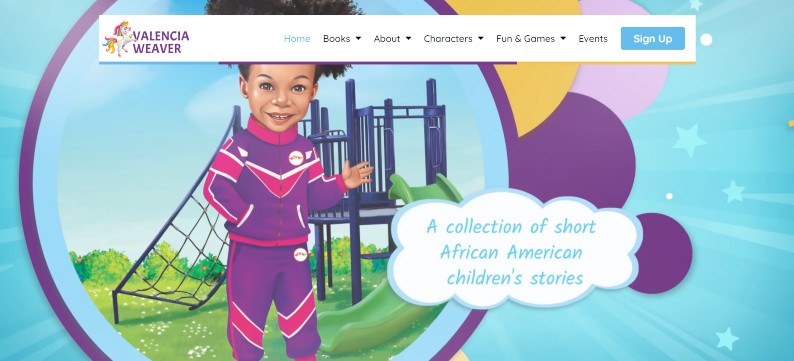
We loved designing Valencia’s website. From the playful colors, down to the energetic animations!
A series of fun videos play on the home screen, welcoming you to the world of the Winter Skye books. The imagery gives an outstanding sneak peek into the Winter Skye series.
Valencia’s books are here to teach lessons to children and her website reflects that. The animations used on the website capture this spirit expertly. It’s like being in the mind of a child…but way more organized.
The Fun & Games section highlights this brilliantly! You can download puzzles and pictures to color in. We love this aspect of the website because, at the end of the day, this is for children! They should get the most entertainment out of this, and Valencia delivers.
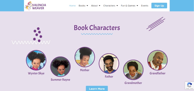
Another awesome mention would be the characters tab. Valencia’s characters are so lively that they get their own tab! This gives users a better idea of what they can look forward to in Valencia’s world.
Even though the website is vibrant and playful, it is still super easy to navigate! And let’s not brush over that ultra-enticing lead magnet. Blogs, news, AND a free eBook? What a steal!
Doreen Cronin
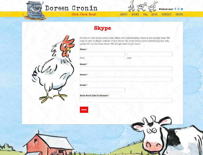
Doreen Cronin makes use of a very interesting tool on her website and one that is not often seen – a Skype button! This is especially important and underrated during the times of a pandemic when contact is reduced. When you click this button a form comes up that allows you to request a Skype call with her – genius! This is different and allows readers to feel more connected to the author and want to engage further.
She lets teachers organize Skype calls with her so she can directly interact with school kids who are fans of her work.
Her website couples cute drawings of farm animals characters with bright, yet gentle colors throughout.
Mo Willems
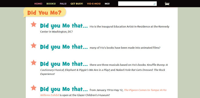
Mo Willems’s defining feature is the way he creatively incorporates his name into his website. His FAQ is phrased as “Did you Mo that …”. This is a small detail that will go a long way in entertaining kids and teens, and a clever play on words that doubles as branding.
The fun pun combined with the cartoon of Mo that his head is edited onto shows that he is a child at heart and children would get along with him!
He also features animations that you can interact with and some awesome downloads that will keep children busy for hours!
Traci Swain
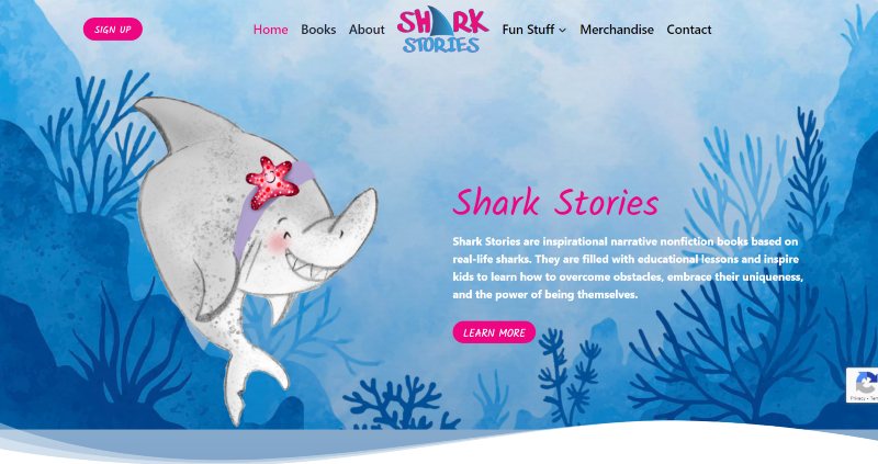
Sharks are scary, right?
Wrong!
Fears are immediately put at ease when entering this website as the user is warmly introduced to a charming shark.
The rest of the website continues this lovable aquatic adventure with illustrations of different sharks and underwater design elements.
There are some fun activities for kids to enjoy too (and more will be added soon!).
We had a shark-tacular time creating this utterly adorable website.
Dr. Seuss
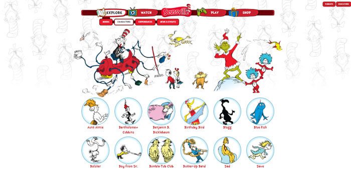
Who doesn’t love Dr. Seuss? The Cat In The Hat, The Lorax, The Who’s, and The Grinch! There isn’t a kid we know who doesn’t know of or love Dr. Seuss.
Dr. Seuss’ website allows everyone to meet his characters and see who’s who. When you enter the characters’ page on the website you can click on any Dr. Seuss character ever created and learn more about them.
The website then takes you to a page that shows all the books and movies that the character is in and even a fun rhyme about the character.
The site has a lot of pages and things to do on it, which is great for immersing readers into the world of Dr. Seuss. This could be overwhelming or confusing but this problem is solved by a breadcrumb navigation system that clearly shows you how different pages connect with each other.
The site also warns you if you’re clicking a link that leaves the website, in case you want to stay and play for longer.
Paddington

Another classic children’s book that has an amazing website to match is none other than author Michael Bond’s Paddington!
We love Paddington’s website for several reasons, but our favorite feature comes down to the attention to detail of certain things like the navigation bar having Paddington’s paw as the cursor. Little things like that can make a huge difference and augment the user experience that much more!
Other features such as online games and a tab for events, exhibitions, and shows get users excited for more and fully engaging with the website and all it has to offer. An inclusion of the backstory of the real, original Paddington Bear as well as pictures make the site very personal and something kids (and adults) will love.
Amelia Bedelia
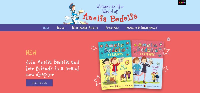
Amelia Bedelia’s website is one of the few children’s websites we have seen where she focuses on growing her mailing list. As an author, this is one of your most powerful marketing tools so it makes sense to do this on your website if you can.
On each page, there is a banner for the reader magnet that asks you to type in your email, which will allow the unlocking of certain benefits such as exclusive offers and special sneak peeks!
This is a great feature for a kid’s website to get more leads and generate more traffic on the site. This is solidified by the awesome downloads the site offers which kids will absolutely love!
Alexis Deacon
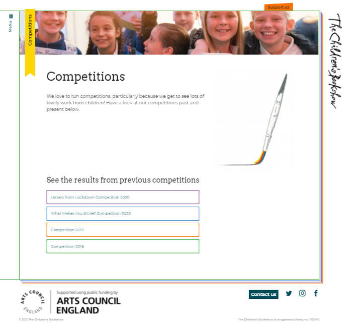
Alexis Deacon has a very creative feature in the way you move around the site. His website feels like a book’s pages turning, which is a way of grabbing attention and detail that users will love as it’s so different.
Each tab you click on changes the page of the book, something innovative and interesting to see.
Quentin Blakes
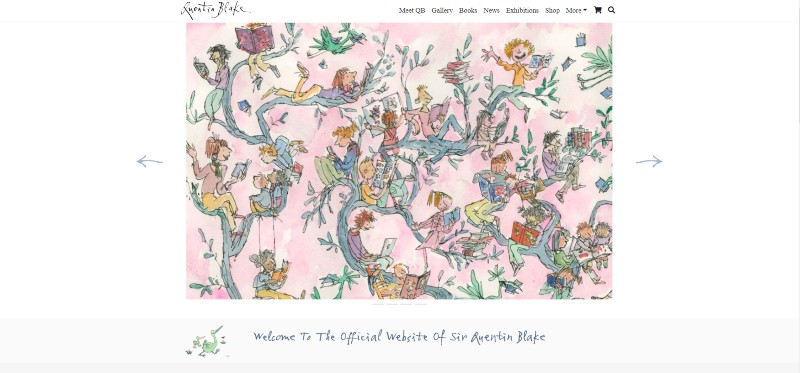
Quentin’s website does a great job of helping you understand his process as an illustrator. If you’re an illustrator and author this can be a great way to make your website more engaging.
It feels cozy yet dense with illustrations and other content that can keep you busy for hours!
The illustrations that don’t make it to the books find themselves and we love it! It allows you into his space and ultimately into his writing and drawing brain, which is so fascinating to see.
Dick King-Smith
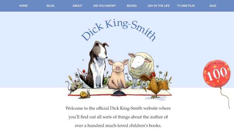
Dick King-Smith’s website is a beautiful site with very cute illustrations and animations included. It features a unique “day in the life” section and allows users to get to know more about the author on a personal level.
His daughter writes about what would typically happen during his day in detail – from the thoughts that go through his head to what his wife cooks him for dinner, which is very wholesome. This is complemented by some fun facts about the Dick and some old photographs on other pages.
Little Morwenna
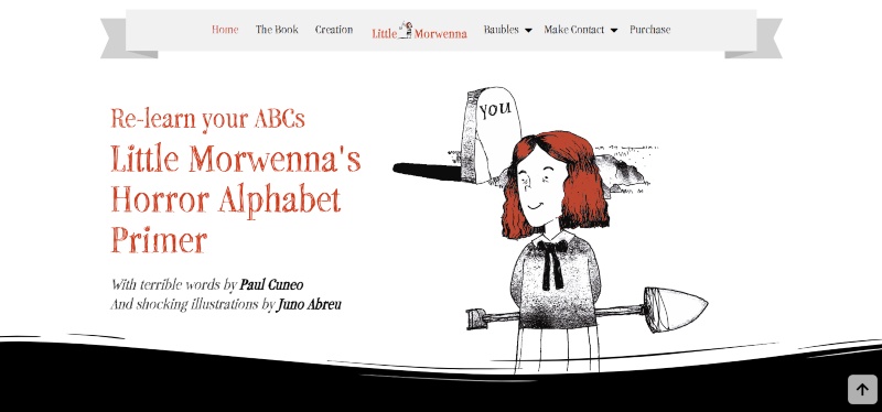
This website was designed to show off what happens when Paul Cuneo and Juno Abreu collaborate…we get the creepy, yet adorable, Little Morwenna.
Little Morwenna is suitable for adults too, making the draw to this website unique. We may be a bit biased because we actually built this website.
But once you see the creative concept around the character and how it’s presented in website format, we know you’d agree.
This twist on a children’s author website is definitely one to see.
Shel Silverstien
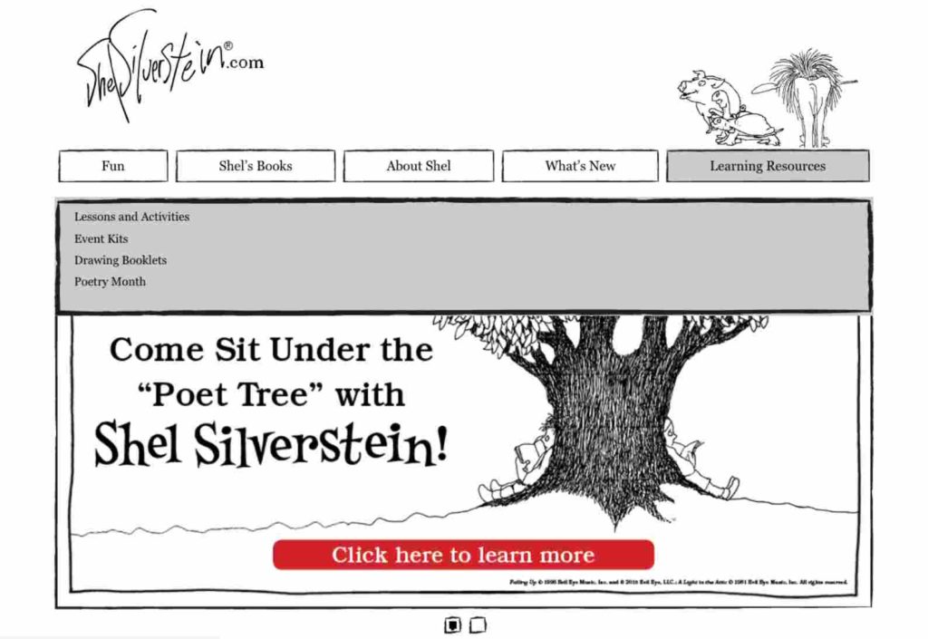
Shel Silverstein’s website is another interactive one. It looks as though it’s a doodle in a notebook, something a lot of kids can relate to, but the doodles come alive as you move through the navigation bar.
Each time you hover over a tab a new doodle pops up above the tab. It’s fun and keeps users excited to see what will pop up next.
Your author website
Do you want to update or create your own fun and entertaining website? Maybe we can add it to this list?
We’re here to help! Get in touch with us today to create a fun and exciting website that keeps kids busy for hours!
If you’d like to learn more about author websites in general and see a ton more examples check out this extensive post on author websites.


