Looking for scary, shocking, and nightmarish features to add to your author’s website? Or do you want to start the scariest author’s website on the internet?
Here are some of our favorite horror author websites to inspire you.
But why trust us?
At Rocket Expansion, we’ve built 100+ high-performing author websites that do more than just look good—they help authors sell more books, grow their email lists, and build thriving fanbases. We work with fiction and nonfiction authors across genres, optimising their sites for discoverability, conversions, and long-term success.
If you’re looking for a custom, done-for-you site, let’s build your author website together.
1 – Alma Katsu

Alma Katsu’s website has a podcast tab, unlike the others I’ve seen before.
Her podcast isn’t used to read her books or advertise, but rather to discuss the history behind her books.
I find this incredibly interesting and I feel her audience would be interested in as well as they get to learn more about the story in a more real way.
2 – Little Morwenna
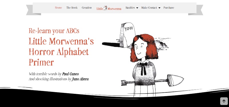
Terror meets kind of adorable on this Horror Author Website. Paul Cuneo and Juno Abreu collaborate to give us Little Morwenna.
Little Morwenna is creepy in all the right ways. Illustrations of her are featured throughout the website. But just like any good book, it’s the words that bring her to life.
Witty, creepy content is found in every corner of the website, from The Book page down to the Creation page.
The uniqueness keeps you on the website and the extras offered add more value to your stay.
Classic designs accompany the unorthodox concept to create an awesome Horror Author website that both children and adults will love. And we’re not just saying that because we built it!
This horror Author Website Design stands out from the crowd for sure.
3 – James Kain
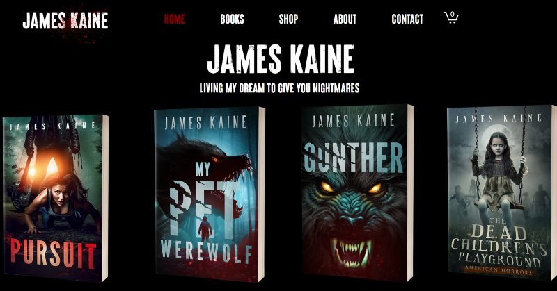
This website is downright spooky in the best ways possible. The fonts, the colors, and the animations create a spin-chilling experience. This will have horror readers excited to buy his books.
The imagery used on each page keeps the creeps going. Our favorite use of this is on the Books’ pages. Each book has a themed background video that loops.
The Dead Children’s Playground, for example, has a closeup of a lone swing swaying back and forth. Once you check out one book, you want to check out all to see what unnerving design you’ll find.
The site takes a little while to load some pages, and it could use some finesse to help with fitting the designs in the right spaces. Otherwise, we love this website.
4 – Tananarive Due
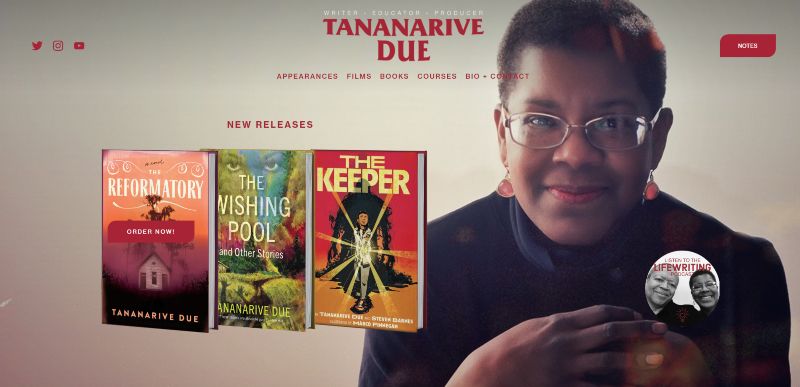
Tananarive Due’s website is very clear about what the 3 most important elements are:
- Her newest books
- The films she’s worked on
- Her courses
It’s easy to explore as the layout is different for each section. This is all tied together with bold reds and blacks which creates an atmosphere horror fans will recognize.
5 – Christopher Golden
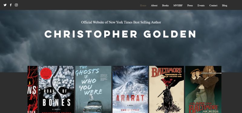
Christopher Golden’s website has a gloomy intro of moving grey clouds. It sets an ominous tone that’s supported by the contrasting cork-like color, the almost dark gold and dark greys.
He uses his website to market his events, email list, and himself with the spacious review section on the home page.
The content is given room to shine and font styles and sizes really make it easy to stay engaged.
6 – Joe Hill
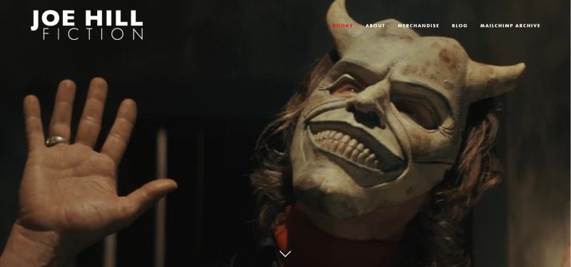
The best part of Joe Hill’s website is his blog.
He uses the blog section of his website to let his audience know when and where his meetups are, unlike the normal authors’ blogs where they have completely different topics to their books or them in general.
The other great stand-out part of Joe’s blog is how honest he is, he even writes about how he forgot he had a blog in the first place. This openness and honesty show viewers that he is a genuine person and not somebody who’s just trying to get people to read his writing or visit his website.
7 – Adam LG Nevill
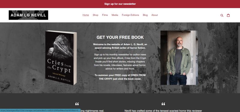
When you have epic book cover art, you shouldn’t let your website distract from it. That’s what Adam LG Nevill does here.
His website is very content forward and we appreciate that his blog is active, and he posts pretty frequently.
The website has contrasting colors, jumping from light to dark in different sections. It may not be very unique colors, but it gives the website texture and helps highlight the content.
One thing that could be improved is the reader magnet. The button for sign-up is right at the top of the pages but it isn’t accompanied by the lead magnet that gets viewers to join.
Otherwise, it’s an eerie, modern website.
8 – Michelle Richmond
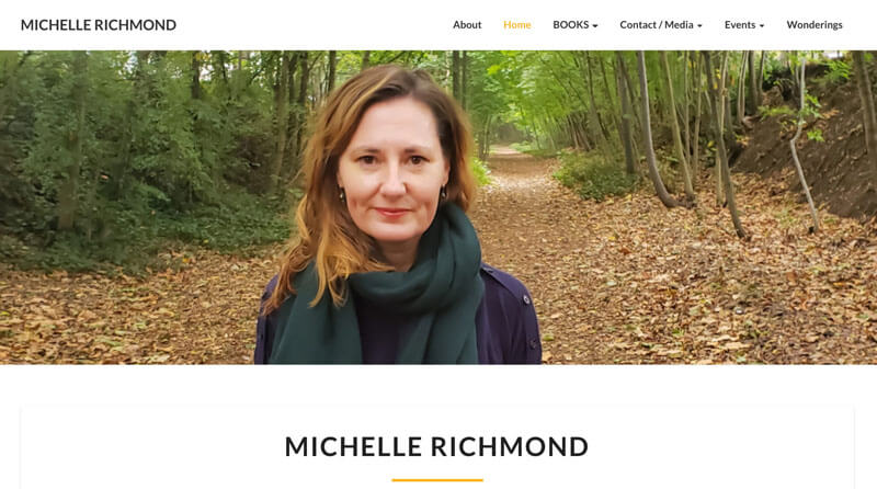
The smart thing about Richmond’s website is her blog.
It’s not a normal blog where you just click on the piece and read it, the difference is that she gives you a snippet of her writing, leading you to want to read more and when you click to read more you get asked to enter your email address.
This is a great lead magnet to get people on the mailing list because you are giving them something they want in return for something small, like an email address.
9 – Benjamin Percy
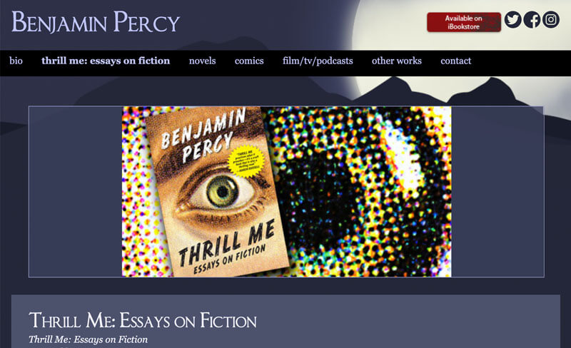
The standout part of Benjamin Percy’s website is the amount that he offers on the website.
The reason this is so great is that there is something for everyone and it allows for him to have a much broader audience without trying too hard.
10 – Jennifer Hillier
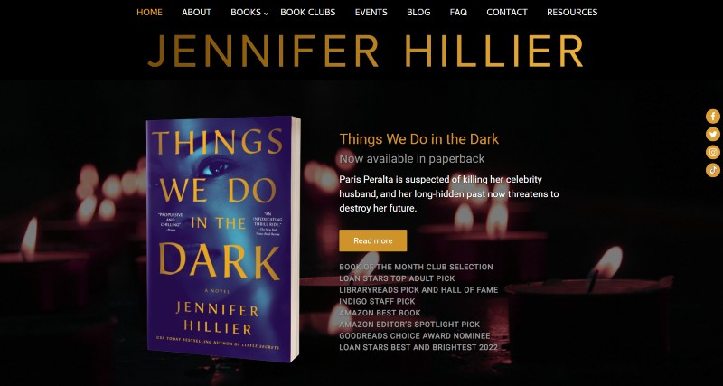
Jennifer’s horror author website is a great example of how a streamlined design can be very impactful.
The website is dark and moody, credit to the candle backgrounds in some sections. Other banners are in greyscale with one element being highlighted. These images are not flashy or shocking but they still manage to continue the moody atmosphere successfully.
We love the Book Club page in particular on this website. Jennifer has provided book club questions for each of her books. This is a great way to start conversations about your book.
A nice touch is her Resources page with websites and phone number hotlines for those who struggle with the topics in her books. The horror genre often has these topics that can be traumatic for real people, it’s nice to see the author acknowledge these effects and even offer assistance.
11- Nick Medina
Sleek, minimalistic and easy to navigate. That’s exactly how we’d describe this horror author website.
When it comes to Thrillers, you have to intrigue users and keep them on their toes. This is why the home page works so well.
When scrolling through this page, you’ll find epic graphics of Nick’s book covers being created. You can’t help but stop and watch as the full cover comes into view.
The tone of the website is emphasized by stark contrasts of black, white and red while never distracting from the cool covers.
12 – Your Horror Author Website
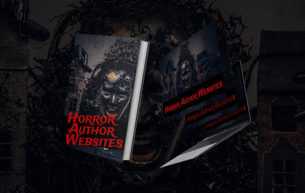
Do you want your own spine-chilling horror author website?
Get in touch with us today and we can make you the scariest and most shocking website you could imagine.
It’ll also help you grow your email list, sell more books, and establish your online presence as an author (which is really what a website should do, right?)
There’s a list of the scariest horror author websites!
If you would like to find out more, you should check out our mega article on author websites
And if you’re looking to get a new horror author website worthy of being added to the list, reach out and we’ll be in touch to help you with your website!


