Your book is ready for readers but you’re missing a crucial piece of the publishing and marketing pie: a website!
It’s simply a must-have tool for professional authors who want staying power in the industry. But it’s hard to get right and it takes a ton of effort to design and build – but that’s what we’re here for!
We design websites for authors for a living, so we know all there is to know on the topic. Meaning if there’s an author website template you should follow, it’s ours.
In this blog, you can find the various sections of a website with examples to follow (along with a few extra examples), plus 2 official templates any author can use to build an epic home page.
But why trust us?
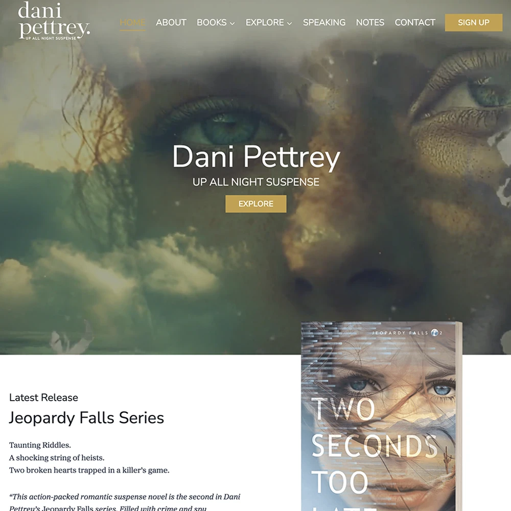
At Rocket Expansion, we’ve built 100+ high-performing author websites that do more than just look good—they help authors sell more books, grow their email lists, and build thriving fanbases. We work with fiction and nonfiction authors across genres, optimising their sites for discoverability, conversions, and long-term success.
If you’re looking for a custom, done-for-you website, let’s build one together.
Note: All the examples were designed by yours truly, so we may be a bit biased on how amazing they are, but we’re sure once you check them out, you’ll agree with us.
Why You Need A Website As An Author
When it comes to garnering a reader audience, social media isn’t all it’s cracked up to be. From platform updates to algorithm changes, you never know how you could be impacted.
A website makes it easy for readers to find you with a simple Google search. It helps you stand out online, and the best part is you control the narrative.
What does a website do for you, you ask?
- Online hub: Come rain or sunshine, your website will always be online 24/7 for readers to find (just make sure to do maintenance so information is up to date!)
- Display books: Every book or series you’ve published is easy to find and dive into.
- Grow email list: An email list is a great way to find new readers as well as build a strong community of fans.
- Branding and credibility: A professional website shows you mean business, and it also shows exactly what you’re all about! This is your chance to curate your brand so that when the right reader comes along, they’re instantly hooked.
All those benefits sound pretty good, right? But they could be extremely hard to achieve if you go about your website the wrong way. We’re going to teach you the right way with examples and templates below.
Author Website Templates You Can Use Right Now
We’re going to go in-depth and break down 2 very vital templates for creating your website, one for fiction, and one for non-fiction.
Fiction Author Website Template
When it comes to your home page, it should be an overview of every main section that you’ll find in the menu. The content on the home page serves as an invitation to explore each section in the form of links or buttons.
If the reader likes what they see in that section, they can jump into each section on a dedicated page to learn more.
This is how you can lay it out for fiction websites:

Non-Fiction Author Website Template
The story you tell as a non-fiction author is one different from fiction. With fiction, the focus is on the books and the world built by the author. For non-fiction, the focus is on you and the world you want to pull people into as the curator of your core message.
The sections you’re inviting site visitors to explore will be your services and other niche works like podcasts, and events. Your credibility and authority need to be well represented in order to grip your audience.
This is how you can lay out your content for non-fiction websites:

Author Website Template Examples
We’re breaking down the examples by sections with explanations for each to help you recreate it. We hope these examples and author website templates inspire you!
Home Page
Your home page is the first thing your reader sees, so it has to grab attention. It may seem easy to pick pretty pictures and hope the reader gets impressed by shiny things, but it’s never that simple.
Your home page is supposed to tell a story in a short timeframe so the reader not only stays on the site but wants to keep exploring to find out more.
We’re going to show you 2 very different examples of home pages:
Static Intro Image Template Example: C.S Lakin
As a non-fiction author, you are your biggest selling point. You have to hit 3 key aspects to reach the right audience. C.S. Lakin does this in the first few panels:
- Audience needs: Lakin asks the reader a direct question and essentially says she has the answers.
- Branding: An about section gives you Lakin’s highlights, still speaking to the reader’s needs while doing it in a friendly tone that makes it easy to trust her.
- Credibility: Tons of glowing reviews follow, giving her insane social proof.
- Value: After she’s gained some of your trust, she delves into her services, breaking them down further as you browse.
Why It Works
- Her conversational, bubbly branding is reflected in every ounce of copy on her website.
- Plenty of space is given between banners of services to help give focus to the content and not overwhelm the site visitor.
- In every section, C.S. Lakin pulls the focus back to her credibility and how it can provide the reader with value.
- Varying banners and section sizes keep the page flowing and uncluttered.
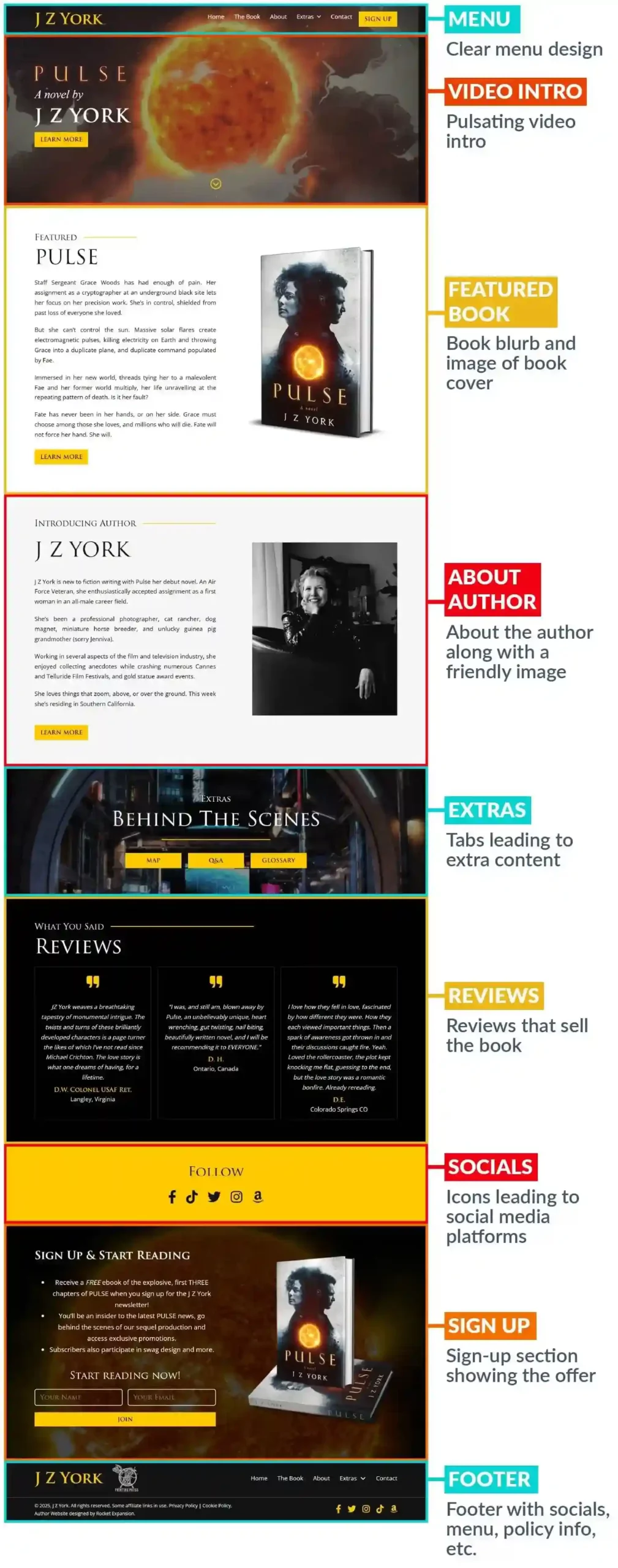
Video Intro Template Example: J.Z. York
Sometimes using something flashy to grab attention is absolutely the move. Instead of a shiny picture, we designed a gripping intro video for J. Z. York’s home page using the featured book’s elements. These elements are the star of the show throughout the website too.
Since the author’s genre is sci-fi, there’s less focus on her in the first few panels and more on the book. But J.Z. York is quite an interesting lady, so of course her persona would be a good selling point further down the page.
Fiction is about building a world for your readers to dive into and never want to leave! This world can exist on your website, but you have to do a bit extra to keep a reader’s attention…with some extras.
Down the home page, you’ll find a section leading to a map page, a glossary page, and a Q&A page (you can also explore this tab from the menu).
Why It Works
- The pulsating combo of black, yellow, and white keeps the intensity high, setting the tone for her sci-fi-focused site.
- The focus always remains on the featured book, with copies, reviews, and her reader magnet.
- Speaking of! Her reader magnet offers 3 free chapters of the book which is a great way to get people to join her newsletter, as well as start reading the book.
Book Page
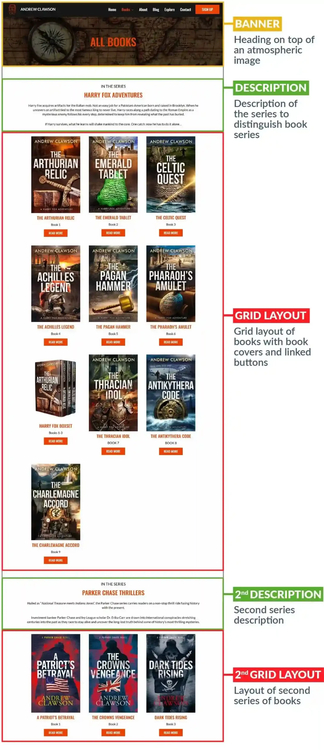
Template Example: Andrew Clawson
You might be thinking, “How hard can this page be?”
Yes, your book page should be simple and easy to browse through, but there are some considerations! We picked Andrew Clawson’s book page as an example since he has many series and books.
What’s important to note off the bat is that his book covers are not busy, but they do pull focus. To make sure the book stands out, a plain white background was chosen so there’s nothing to distract the reader.
Another important detail is the labeling. Each series is sectioned off with a description to learn more about the series, and underneath each book is a book number to make it easy to start the series or to jump in where you last left off.
Simplicity is key, but make sure to provide as much detail as you feel necessary.
Why It Works
- The typography is easy to read but not overpowering, letting the book covers grab attention first.
- A banner image keeps to the tone of the site while matching the books and their genre.
- Reviews at the bottom of the page reveal which book is being reviewed so readers gain more interest in those books.
- In the books menu, when you hover over the drop-down option, it shows each series so you don’t have to scroll to the one you want on that page if you already know what you’re looking for!
Blog Page
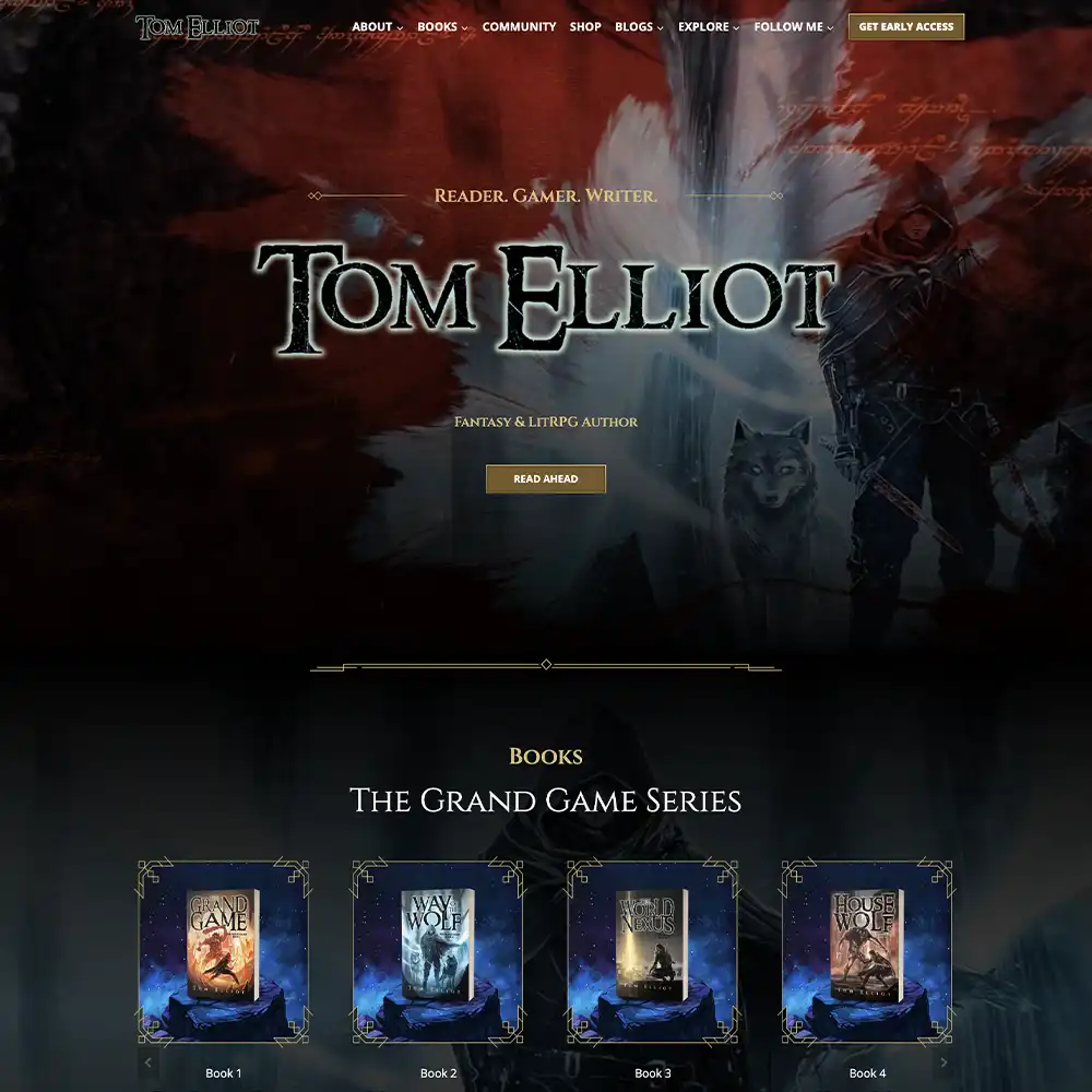
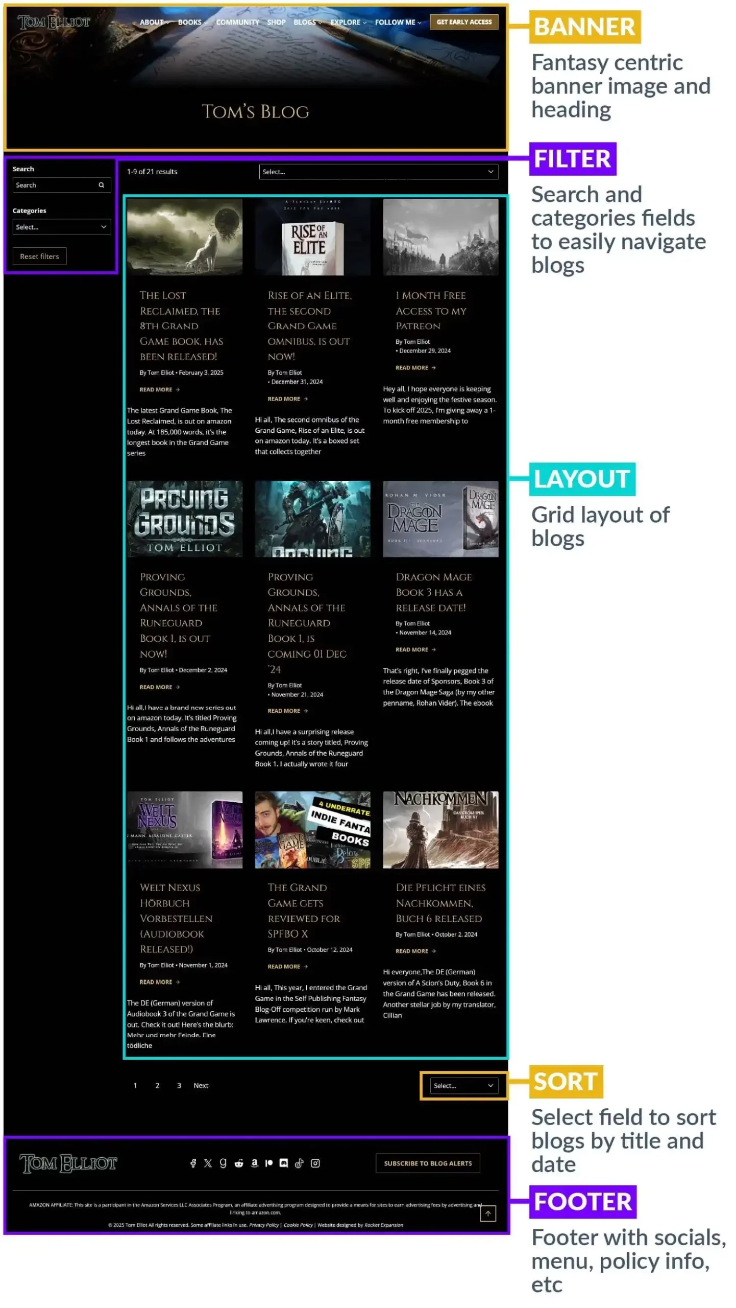
Template Example: Tom Elliot
We picked Tom’s out of all the websites we’ve designed for authors to demonstrate the blog page because of 2 things:
- There are so many blogs – it kind of feels like a vault of content!
- There are 2 sets of blogs, one being locked behind Patreon access.
Tom Elliot is good about using his blogs to update his readers on his books and his life as an author, so why not add something really special for the fans?
This is a masterclass in engaging your readers and doing something often enough that they visit your site frequently to keep up with it.
Now, let’s get to the design.
It’s simple like the Books page, laying out the content in a block-like fashion on a grid, with pages at the bottom to select and browse through, but it also has extra features. You can search, and sort by title, date, and category.
This applies to the Patreon Posts as well – that page gets a tag field to select too.

If you’re going to maintain your blog well, think about adding cool features like these to make navigating your content a breeze.
Why It Works
- Dark backgrounds accented by gold and blue design elements enhance the Fantasy & LitRPG atmosphere.
- Readers can gain early access to content through Tom’s Patreon, enticing them to stay engaged with his world.
- The fonts are large enough to read but spaced out, making it easy to read the headings and subheadings of blogs.
About The Author Page
Template Example: Davis Ashura
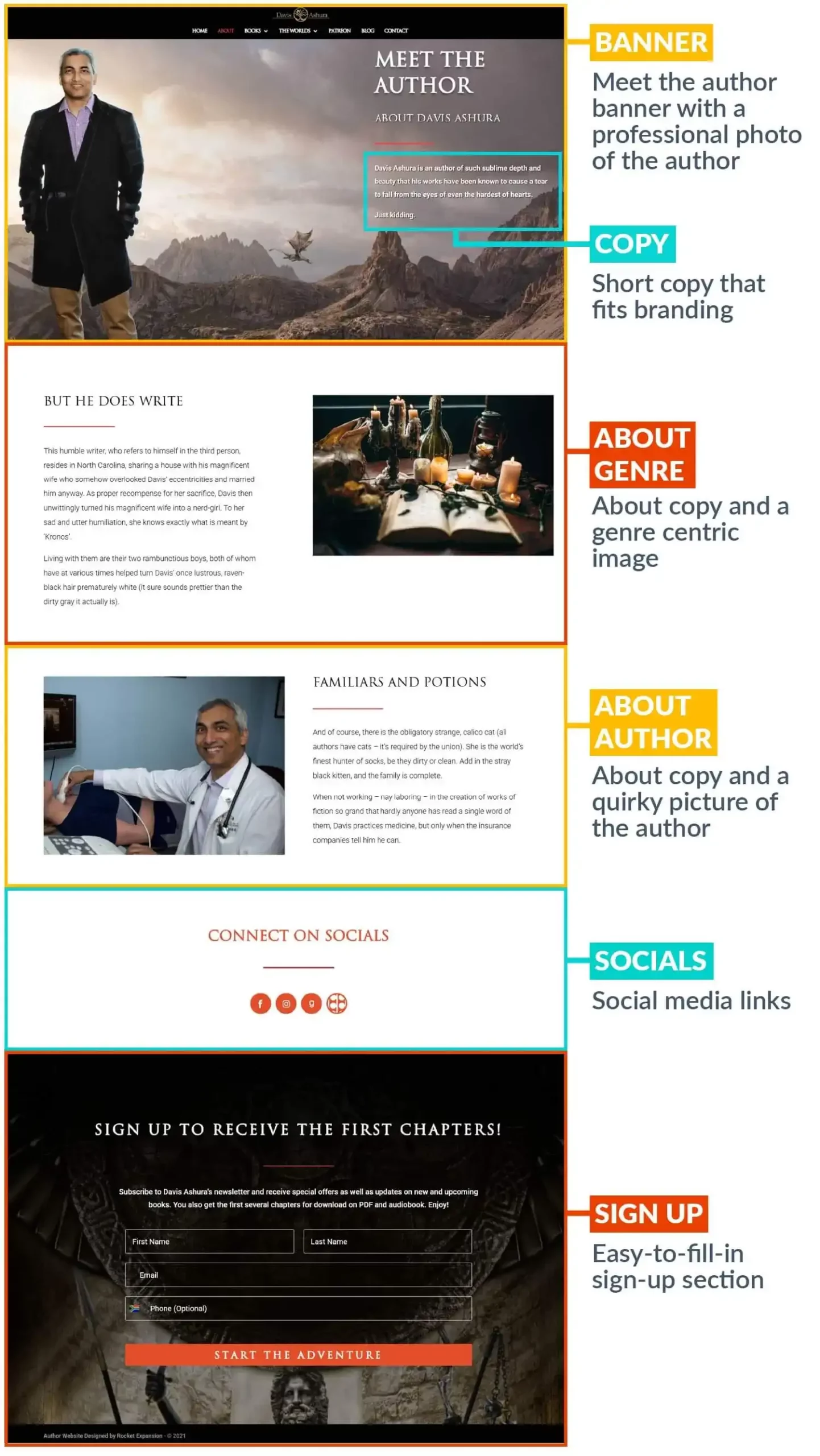
This is one of our favorite About pages we’ve ever done.
In the first banner, we get a picture of Davis Ashura on top of a mountain (a dragon flying in the background is standard procedure) and a highly flattering bio next to it that ends with “Just Kidding” to set up the quirky tone of the page.
What comes next is expertly done! The bio is split into 2 sections accompanied by a fitting picture – the second section’s picture changes to something just as fun and quirky as the intro banner!
The copy absolutely exudes Davis Ashura’s brand, both feeling larger than life like his epic fantasies and down to earth and humble as any regular human would be. The page ends off nicely with social media icons to connect with him.
Why It Works
- The bio reflects the author and his brand to a T.
- Imagery emphasizes the genre and his personal life, maintaining consistency with the rest of the website.
- The content is spread out in a way that leaves the reader excited to read the next piece of information.
Contact Page
Template Example: Bald Solomon
When you’re building an online platform, you want to be as reachable as possible to encourage readers and industry professionals to well, reach out!
That’s how you get opportunities, and how communities and fans are made! Well, this and email newsletters, but more on that in the next section.
We chose a simple contact page, because most of the time, that’s all you need. Fill in the form with your name, email address, and message and you’re done!
Along with the form is a picture of Bald Solomon, because you want to solidify that the reader is sending this message to you. Included are some social media links so readers can follow and engage with him there.
Why It Works
- The contact form is easy to fill in.
- Plenty of links are provided to engage with the author on other platforms
- The typography is easy to read and the fields are spaced out.
Sign-up Page
Template Example: Daniel Gibbs
Email marketing is one of the best tactics you can add to your arsenal to increase your book sales and grow your community. And if you want to tempt readers to join your email list, this is how you do it.
If you’re looking to make your own reader magnet, also known as a lead magnet, you can take a page out of Daniel Gibbs’ book. He provides a seriously enticing offer of 2 ebooks and audiobooks in exchange for your email address- who doesn’t love free books?
But what makes this sign-up page truly work is the arrangement of copy and the way it’s delivered. The reader magnet is in big bold letters, but it isn’t just some standard offer to join a newsletter. It’s to “Join The Fight.”
Everything about the page makes it feel like you’re about to step into something amazing. We also love the disclaimer informing the reader that only 2 emails per month will be sent and that they can unsubscribe at any time. That level of transparency will put the reader at ease.
Why It Works
- The reader magnet and copy lean on the genre, appealing to the right target audience.
- An intense image along with well-placed copy takes the reader on a journey through the information effectively.
- Only a name and email address are required to join the email list – the less information for them to provide, the better (some authors only ask for emails but that’s up to you!)
Extras Page
Template Example: Kate Jones
Not every author has Extras, but when they do, it makes all the difference. It may seem like a lot of work to put together, but the benefits work in your favor.
Let’s break down what each of these Extras does for Kate Jones:
- Reading order: If you make your books and series simple to navigate, new readers will find it much easier to start reading your work – especially if you have many books and series to choose from!
- Characters: Having official descriptions of your characters can immerse your readers into your rich world, bringing your story to life online.
- Reading list: You can use your extras section to share what you’re reading using reviews or just mentioning the books you’re reading that your readers would also love – it’s a great way to build trust and community.
- Maps: This is also a must for immersion, but it also serves as a marketing tactic. High-quality pictures, whether of maps or characters can be shared on social media, giving your work more traction online.
- Universe: Although this section is coming soon, adding bonus content gives your readers another reason to return to your website for more.
You can also add glossaries, timelines, guides to the magic system, behind-the-scenes content, deleted scenes, and any other guides that suit your type of field. For example, for non-fiction, you could provide checklists, worksheets, templates, interviews, quizzes, podcasts, etc.
Here’s what her Maps page looks like:

Why It Works
- Each extra piece of content has its own page to explore, all maintaining the tone of the site with color scheme, imagery, and cursive text.
- Since there are so many extras to explore, readers stay on the site longer, warming up to the author, and will be more likely to either sign up for the newsletter or buy a book.
- The quality of the extras is good. Fans will appreciate the effort put into the work.
Shop Page
Template Example: Charlie Cochet
Got more than books on offer? Consider getting a Store Page!
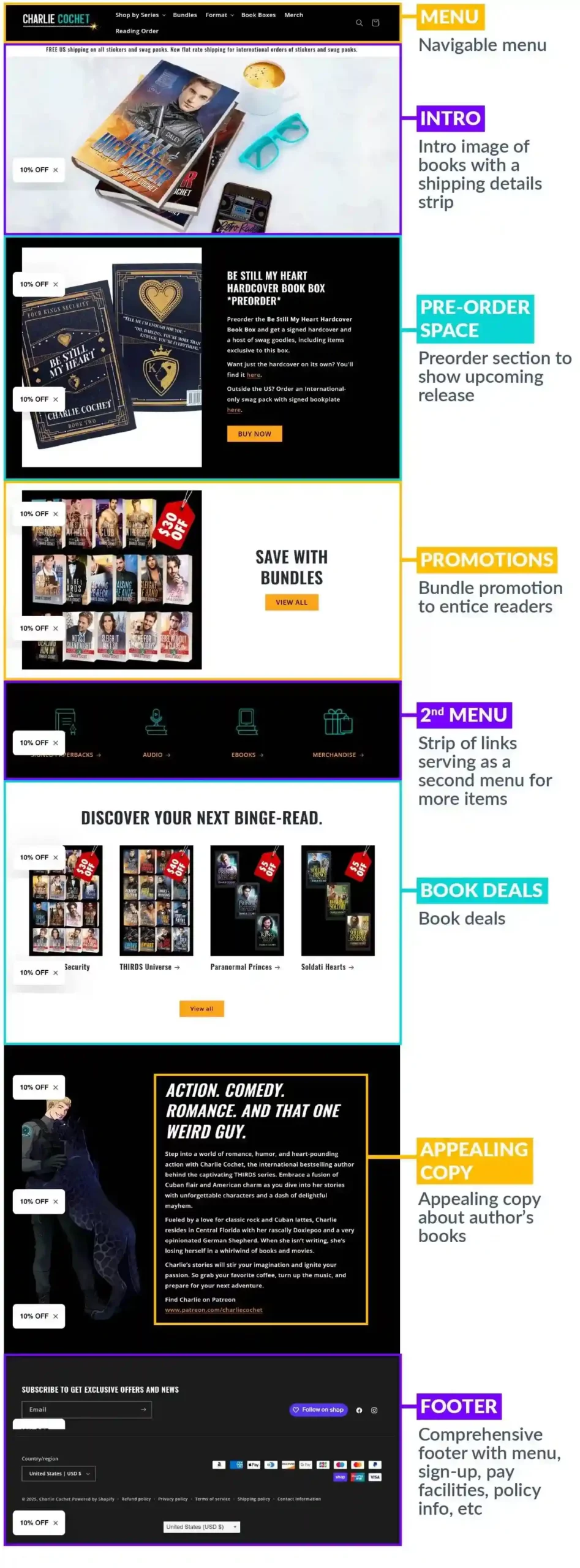
Many authors have found success with having a site to sell their books and merch because they retain more royalties, while some prefer to stick with other platforms for convenience.
Charlie Cochet falls in the former, with quite an extensive Shop page. You can get book boxes, books in different formats, bundles, and merch. This allows her to customize how she sells her work and how she interacts with her fans too, adding a level of personalization with purchases with thank you emails, etc.
This professional site is seamless to navigate, laying out each section based on what will appeal to readers the most. She showcases her bundles and discounts, tempting the reader to take the leap and add to cart.
To promote her work, she provides key information on the home page for her pre-orders as well as shipping details.
Why It Works
- Although it’s hosted on another site separate from her main site (which you don’t have to do!), it matches the main site perfectly with fonts and colors
- Her bundles and deals take up the home page while her special is running, but you can browse the menu for all her items efficiently.
- There’s a search feature for readers to find what they’re looking for.
Speaker Page
Template Example: Chunka Mui
If you’re a non-fiction author, you may be thinking about taking your field of discussion on the road. Or maybe you’re a speaker who’s looking to make themselves more respected in their field by publishing a book.
Either way, you’ll need a dedicated page on your website for your services.
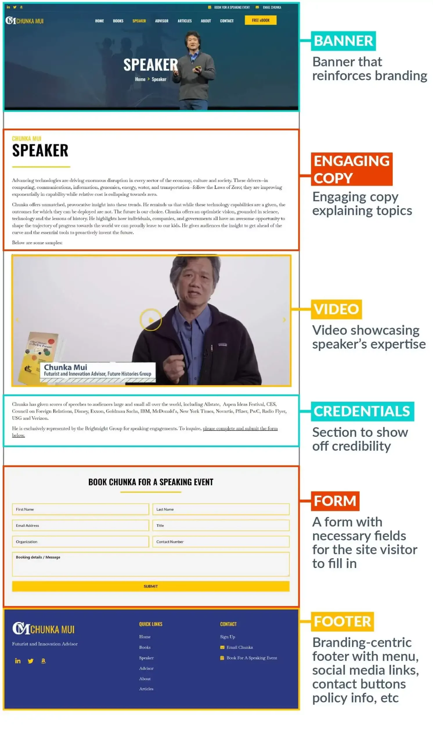
We chose Chunka Mui’s website for the Speaker page because it’s to the point and comprehensive. A few paragraphs explain his field of expertise, then you can watch a video of him breaking down important topics.
For a speaker, it’s imperative to have social proof that you know what you’re talking about, and that you’ve delivered your topic at reputable organizations. Chunka states the many companies he’s spoken at below his video and just above the form for interested parties to fill in.
Why It Works
- The imagery focuses on the author and speaker, as well as the featured book on the site.
- His booking feature is easy to use and requires minimal but important details before submitting.
- The copy is succinct as well as on brand with his topics and the video of Chunka does a great job of backing up his skill and expertise.
Extra Examples
We’re going to show you a few more examples of how to layout your website using different genres.
Fantasy/Sci-Fi Website: T.A. White
When you’re a fantasy, sci-fi author, the worlds you create are your biggest weapon. T.A. White uses it lethally on her website.
Another layout for your home page is to showcase all of your series under different sections to show readers your trademark work. Use the themes of your books where you can to make your site stand out.
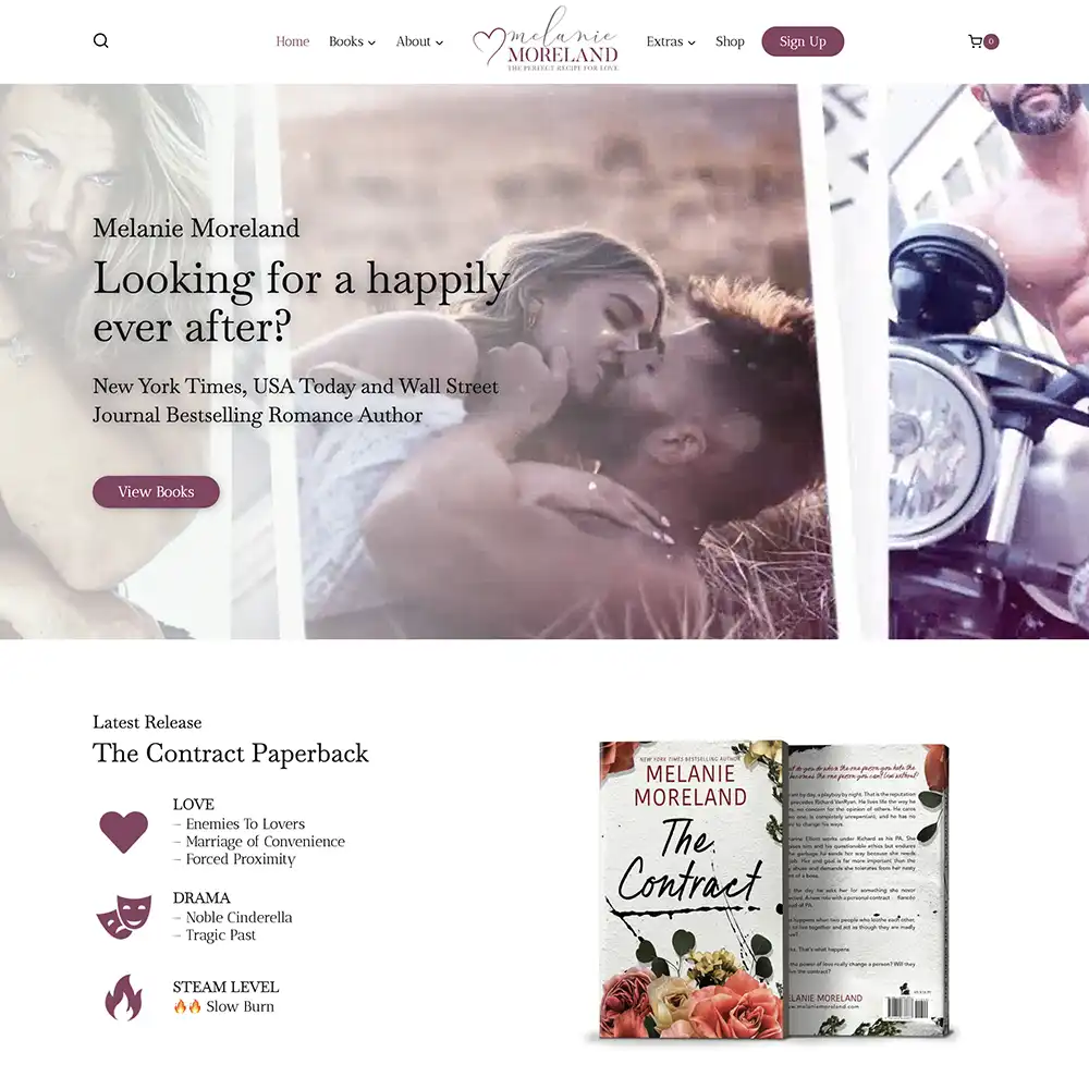
Romance Website: Melanie Moreland
If you’re a romance author, you know the value of mentioning your tropes to reel readers in. Melanie does this well on her website by revealing the tropes of her new release to pique their interest.
She even has the genres in which she writes romance splayed out below that in categories for readers to refine their search – a romance for every mood!
Horror/Thriller Website: Tim Sullivan
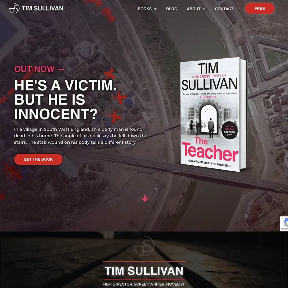
Every page, from the home page to the media kit page, oozes spooky, ominous energy on Tim’s thriller site.
The intro tees it up with an eerie video that makes your skin crawl, and the banners, imagery, and elements solidify it with their dark designs.
Unless you hate thrillers, you’ll stay on this site to browse every inch of it for blogs and other extra content.
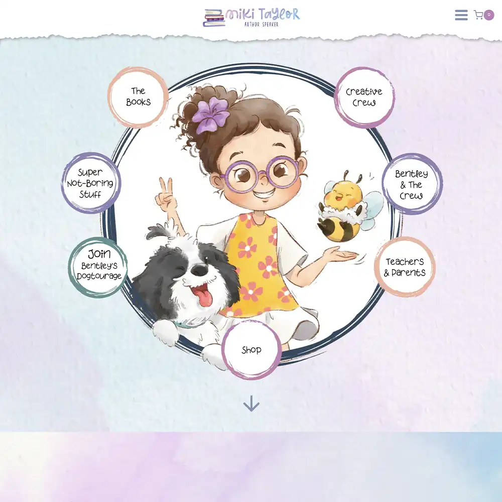
Children’s Website: Miki Taylor
On a much, much lighter note, here’s a children’s website to help you sleep better tonight!
Although kids have access to phones and tablets now, we don’t expect a 1-year-old to browse for authors and their books. Your site needs to be both adult and kid-friendly to match your branding as well as stand out to parents looking for their kid’s next obsession.
Miki’s website is absolutely stunning from top to bottom. The menu style is unique and playful to match the genre but it’s just as easy to navigate as a normal menu.
The pastel colors and book illustrations tie the whole site into a neat bow that any parent would love to see. And it’s all backed up by a grid of award badges on the home page to show how well-received the author is.
Multigenre Website: Austin Dragon
Many authors prefer to use different pen names for different genres, but sometimes it works to write in many genres and promote them all under one name.
Austin Dragon is a prime example. He dabbles in many genres, but the way he links it is with his branding. The site doesn’t stick to one sort of tone but rather lends itself to different ones as you scroll.
We made the site cohesive by grounding it in colors and fonts that could suit all of his genres.
One aspect that can’t be found on the other websites we’ve mentioned is a tally of his work above reviews. It shows the number of books, series, characters, and worlds that he’s created. It’s a small detail but it adds an extra edge and shows how prolific he is.
How To Build Your Website
Creating a website as an author will be hard work, but we hope these author website templates and examples help you make something professional that readers will love!
On the other hand, if you came away from this a little anxious over your next steps, we completely understand! It’s a daunting task and most authors are not IT students ready for the techy side of life. Building a website is no simple feat.
We would know! We build them all the time. And from personal experience, stunning websites aren’t built overnight. If you don’t feel like going the DIY route then we can help!
We’re a website design agency that specializes in working with authors. Fill in this inquiry form and take one step closer to your dream online presence.


