Dark romance readers aren’t looking for safe.
They want obsession, danger, morally grey characters, and books they can’t stop thinking about long after the epilogue.
Your website needs to deliver this feeling while showcasing your gorgeous book, immersing readers in your world, and making them want to come back for more.
At Rocket Expansion, we’re experts in designing author websites for fiction writers. We’ve built sites for million-book-selling authors, TEDx speakers, and writers across every romance subgenre. We put this list together based on what we know gets clicks from romance readers.
Here are 12 of our favorite dark romance author websites that drag readers kicking and screaming into their worlds, and why they work.
So, if you’re looking for deliciously dark inspiration for your own website, this is where you need to be.
Or if you’d prefer to have a team build it for you, get in touch, because we’d love to help.
1. Rina Kent’s Website
BookTok Sensation and She Knows It
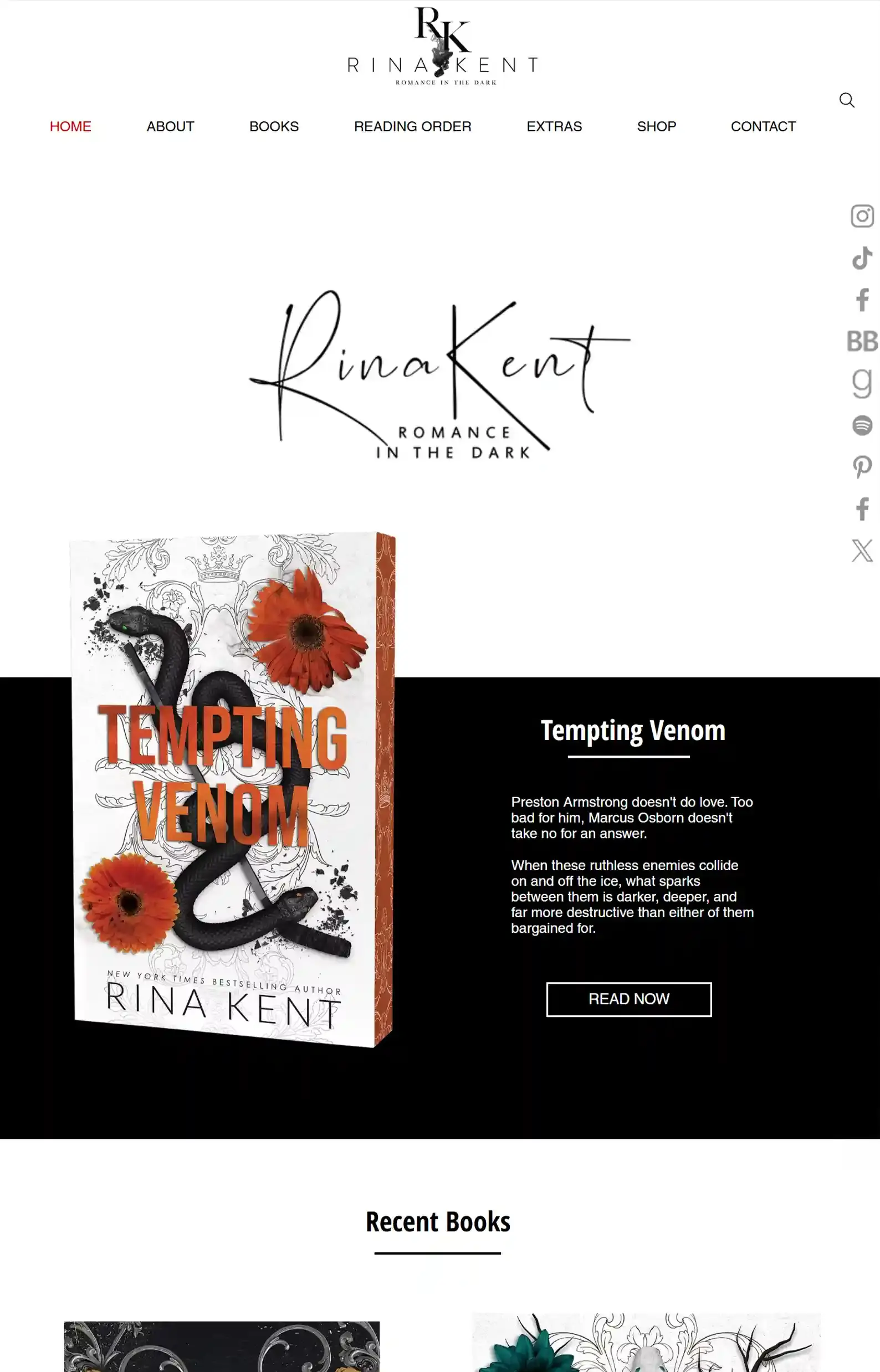
First Impressions:
- Clean and classy design that’s focused on her catalogue.
- Many links going out to her presence on other platforms, books on Amazon, her moodboards on Pinterest, Playlists, etc.
Rina Kent is a huge presence on the dark romance side of TikTok. If you read dark romance and found her website, you’ve probably heard of her books at least once (if not a few times).
And by her website design, she absolutely knows it. You probably got the social proof on TikTok or Instagram before getting here.
Therefore, her homepage focuses on her newest release, followed by more recent additions (she keeps busy).
But the simple design doesn’t mean she’s lacking content.
She has the hallmarks of a good romance website:
- Reading orders (yes, she has 2 to accommodate dark romance readers who want to start with mafia romance).
- A tropes list
- Book info like content warnings, translations, audiobooks, exclusives, etc.
- Delicious extras like moodboards, playlists, bonus scenes, and character art that you can filter by character, book, or series.
I think this sort of design can work for a debut author, too, because it has a clear goal and branding. Beginners can learn from this bold, purpose-driven layout.
2. Cate C. Wells’ Website
Website in Bloom
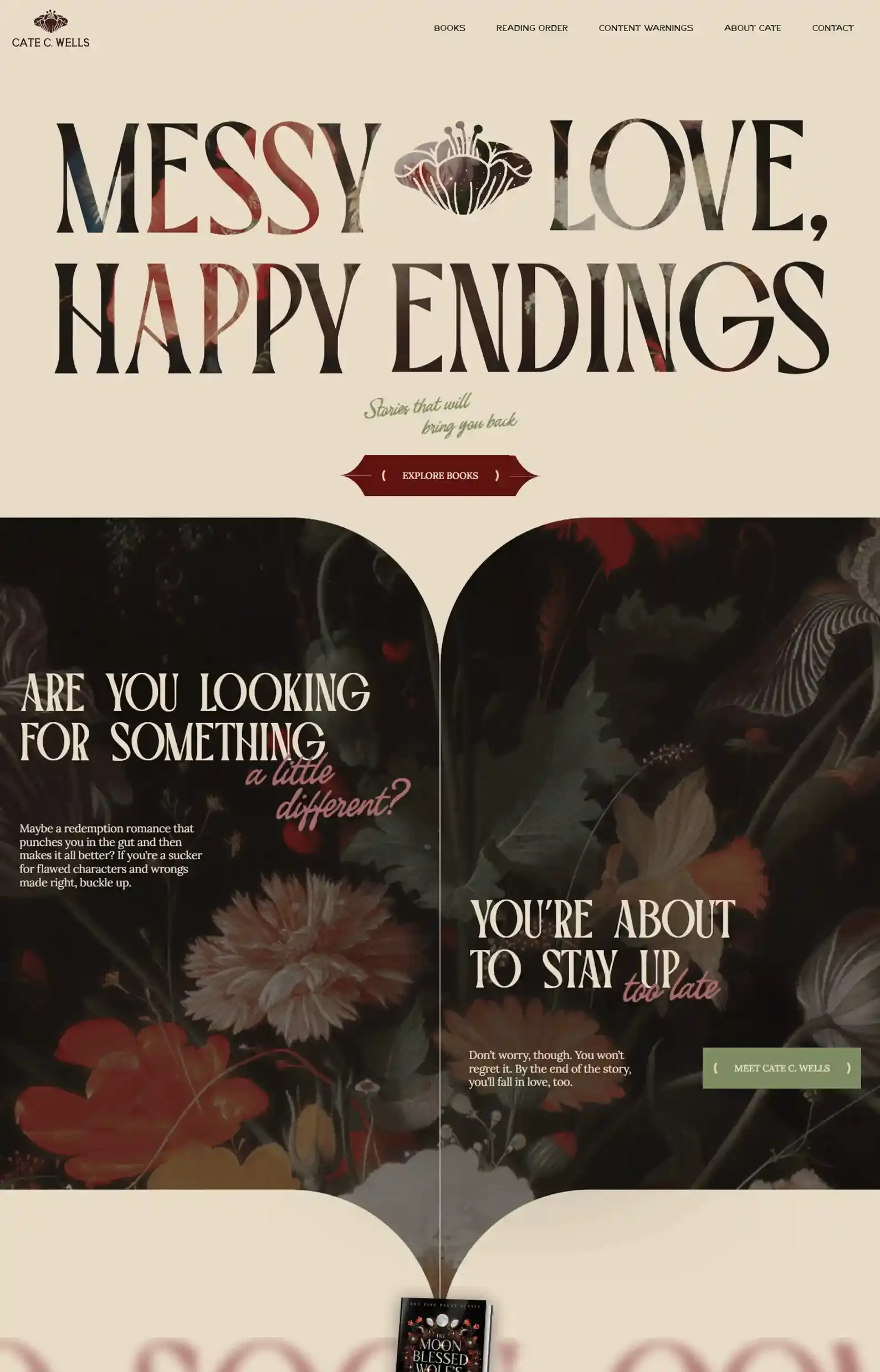
First Impressions:
- Simple, yet commanding intro that clearly communicates exactly what you’ll get from the author’s work.
- Evocative copy talks directly to the reader, creating a comforting feeling as you explore.
Floral imagery and moody atmospheres are a staple of many dark romance author websites (as you’ll see throughout this list). But this site might be one of my favorite blends of these elements.
Cate follows suit with other sites on this list by using her design to talk for her, but it’s her unique layouts and optimized navigation that impress me.
The styling makes an immediate impression on the reader, depicting her brand through coffee-colored banners, flowery illustrations and backgrounds, and friendly copy.
Every page is consistent with this classy layout, allowing readers to browse easily.
Lastly, this site also has one of my favorite reading order pages, containing a filter, order numbers, and extra details under each book for an even clearer understanding of her series.
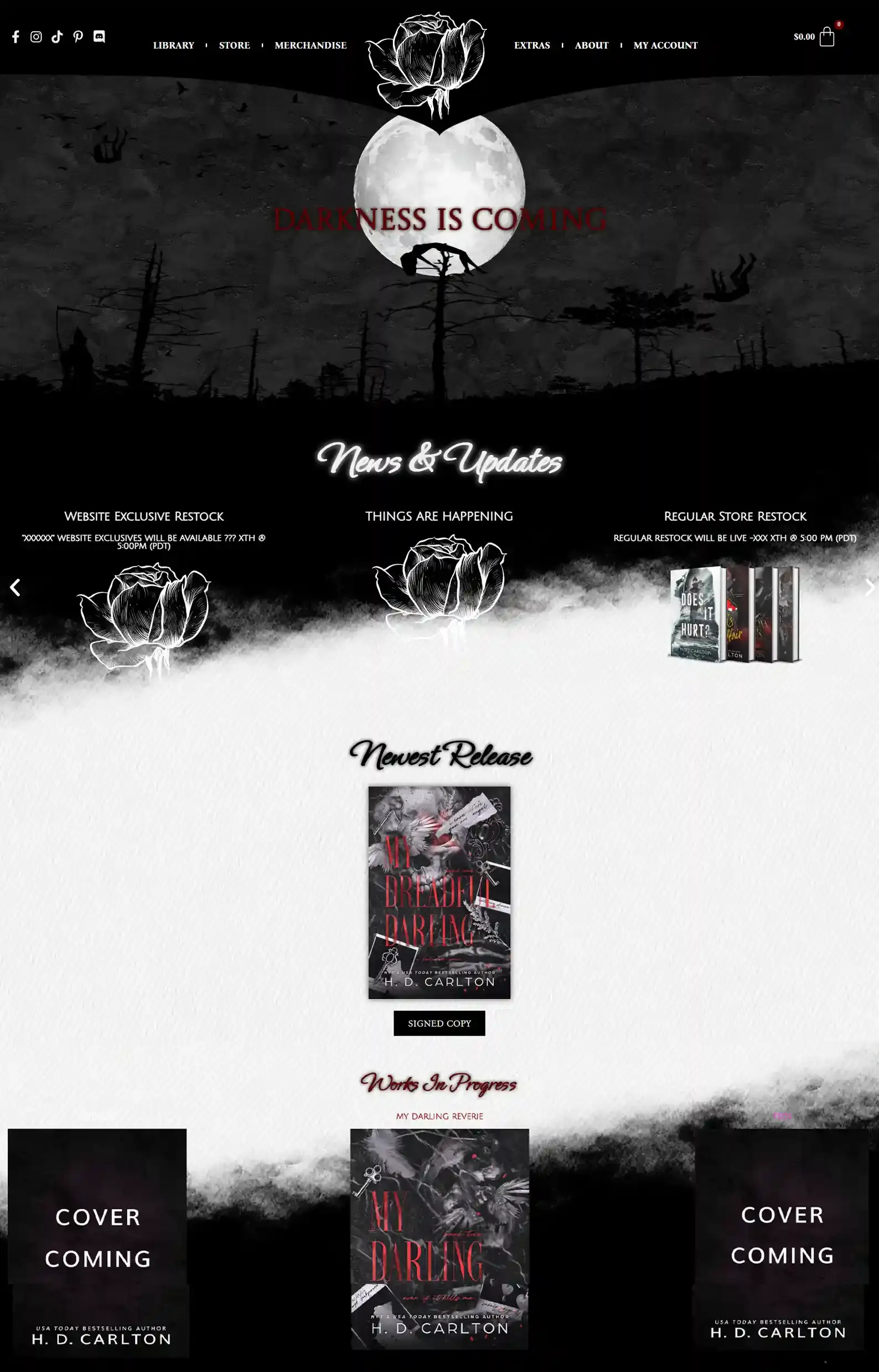
3. H.D. Carlton’s Website
‘Graveyard Love’ Design
First Impressions:
- Goosebump-raising animated intro, featuring bodies ascending and falling to the ground as you scroll, encapsulating the eerie vibe you can expect from the author.
- Generous white space allows the unique design and content plenty of room to stand out.
The aesthetic on H.D. Carlton’s dark romance author website is addictive and completely nails her branding and writing style.
But it’s the extra content that keeps readers coming back for more.
You can find progress bars for her works in progress, juicy bonus scenes, and a FAQ section answering questions readers are dying to know about her books.
And at the time of writing, she has this ominous Things Are Happening page (under News & Updates on the homepage), where readers can check back in to see the site’s signature rose reveal a puzzle piece, website-exclusive versions of her books, and more.
This is a great example of how you can keep readers intrigued and enraptured by your world.
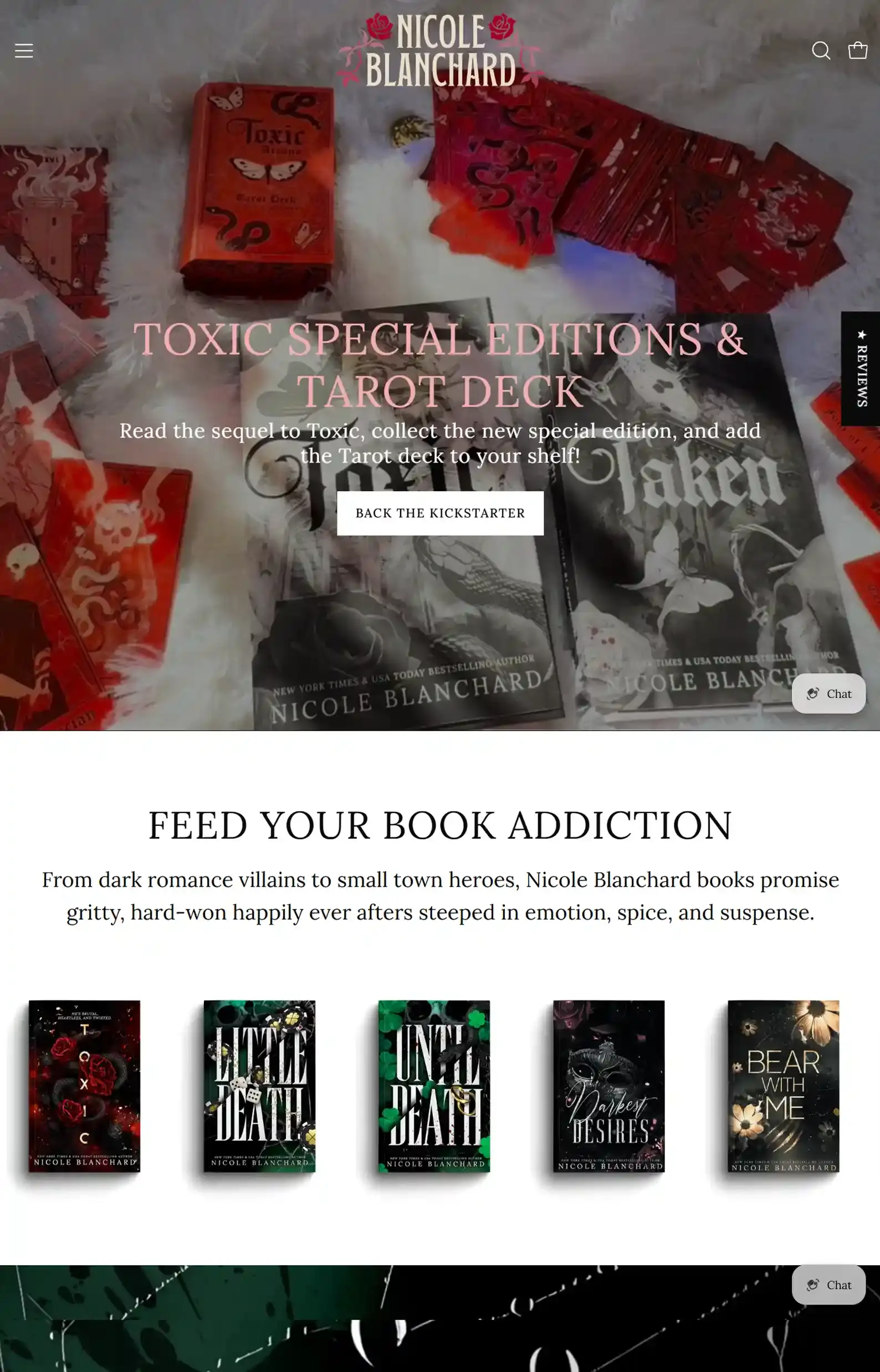
4. Nicole Blanchard’s Website
Beautiful Ecommerce Monster
First Impressions:
- Luscious intro video showing the author’s latest products available.
- Book lover aesthetic that uses the author’s stunning covers to draw readers’ eyes to pre-orders, series, bundles, and more.
Nicole Blanchard weaves social proof and e-commerce together excellently on her dark romance website.
Sleek and updated, she lays out her pre-orders, popular sellers, and newest signed prints on the home page.
What elevates the experience is fun extras like free ebook bundles, a reading order checklist, bonus chapters, and her Blind Date with a Book, all of which give readers perfect paths to their preferred rabbit hole.
From there, you’ll get a seamless shopping experience with helpful filters, a search function, and useful information on each product page, including reader reviews, trigger warnings, and, of course, a blurb — all designed to make browsing effortless.
5. Nikki St. Crowe’s Website
A Romance Reader’s Fulfilled Fantasy
First Impressions:
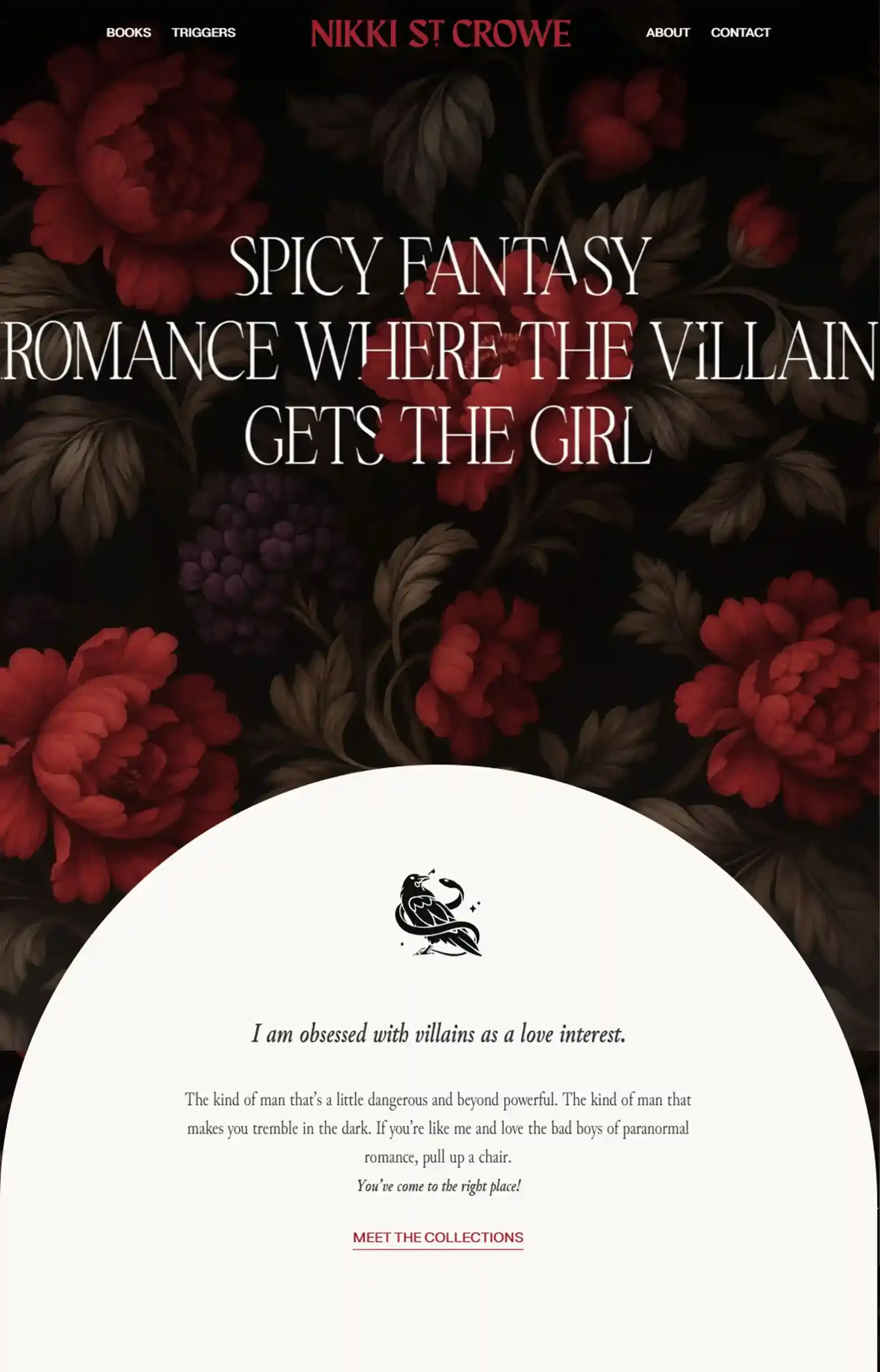
- An effective intro that calls out the type of books the author writes and leads into a brief message to the reader, further enticing them.
- Bold, direct copy and CTAs, along with clear, navigable pages, create a clear reader journey.
Clean, moody, and striking are how I’d describe Nikki’s dark romance author website.
The homepage is the star of the show, delivering on her themes through brooding boys and an immaculate use of white space to steer readers through the author’s work, social proof, and merchandise.
But the page I was surprised by was her About section. Her photo, decorated with flowers, is eye-catching; and so is her copy.
She connects with the reader expertly, expressing what inspires her (or rather which villains inspire her work) while offering a little peek into her personal life.
This is a great example of how to write a bio if you don’t have many details to discuss, while leaning heavily into your storytelling background.
6. Avina St. Graves’s Website
Illustrative Masterpiece
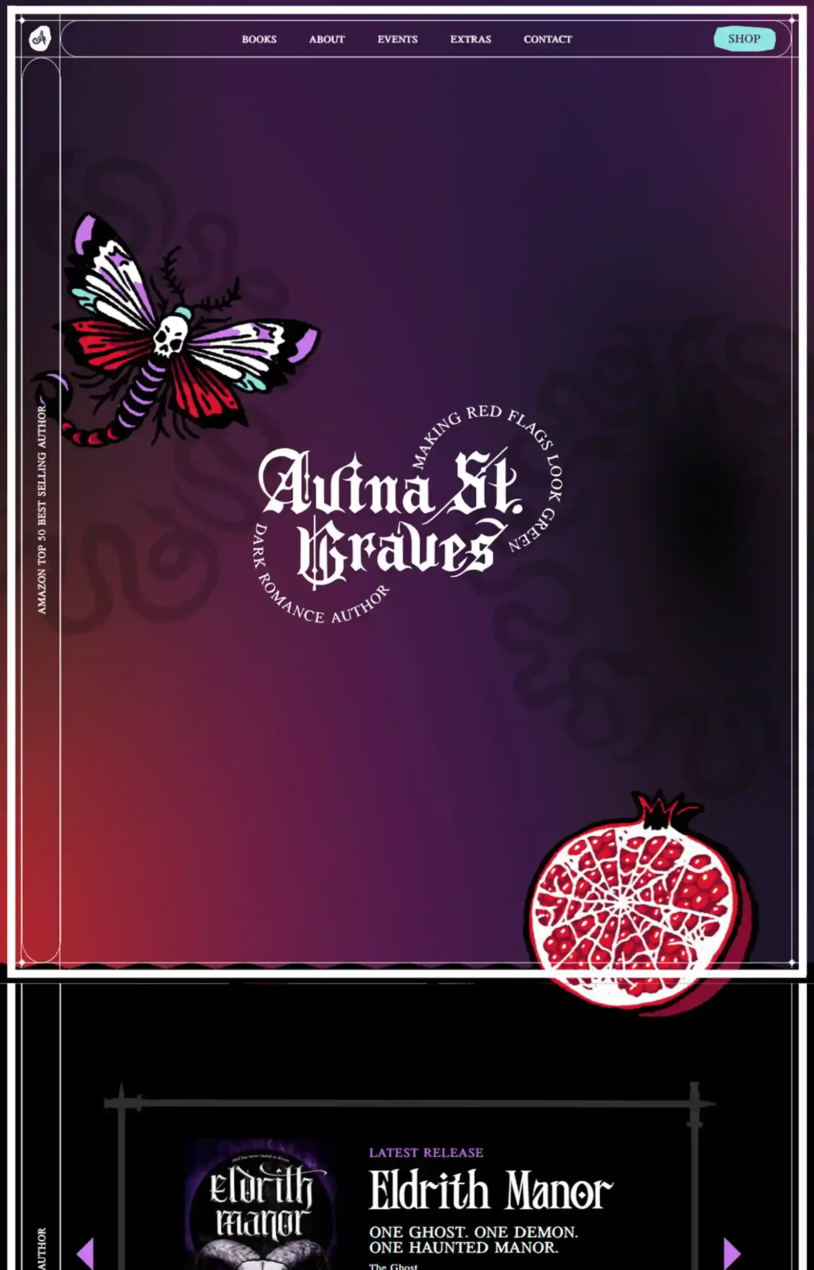
First Impressions:
- Quirky illustrations and gothic font styles paint a bold picture of the author’s brand, making you want to explore and see what you find next.
- Boxy layouts and unique placements of banners and borders help the unique design elements stand out without looking cluttered.
Avina’s dark romance author website takes every fundamental design principle and flips it, displaying visuals and text differently than you’re used to.
Odd-angled imagery, article-style blurbs on the book page, and gothic borders all dazzle the eye.
Although decorated generously, the site doesn’t look busy and has a good flow and an optimized menu that provides a seamless user experience.
I would suggest adding a page for readers to join her newsletter, because you can’t find it anywhere besides the homepage.
7. Laura Bishop’s Website
Immersive Mobile Experience
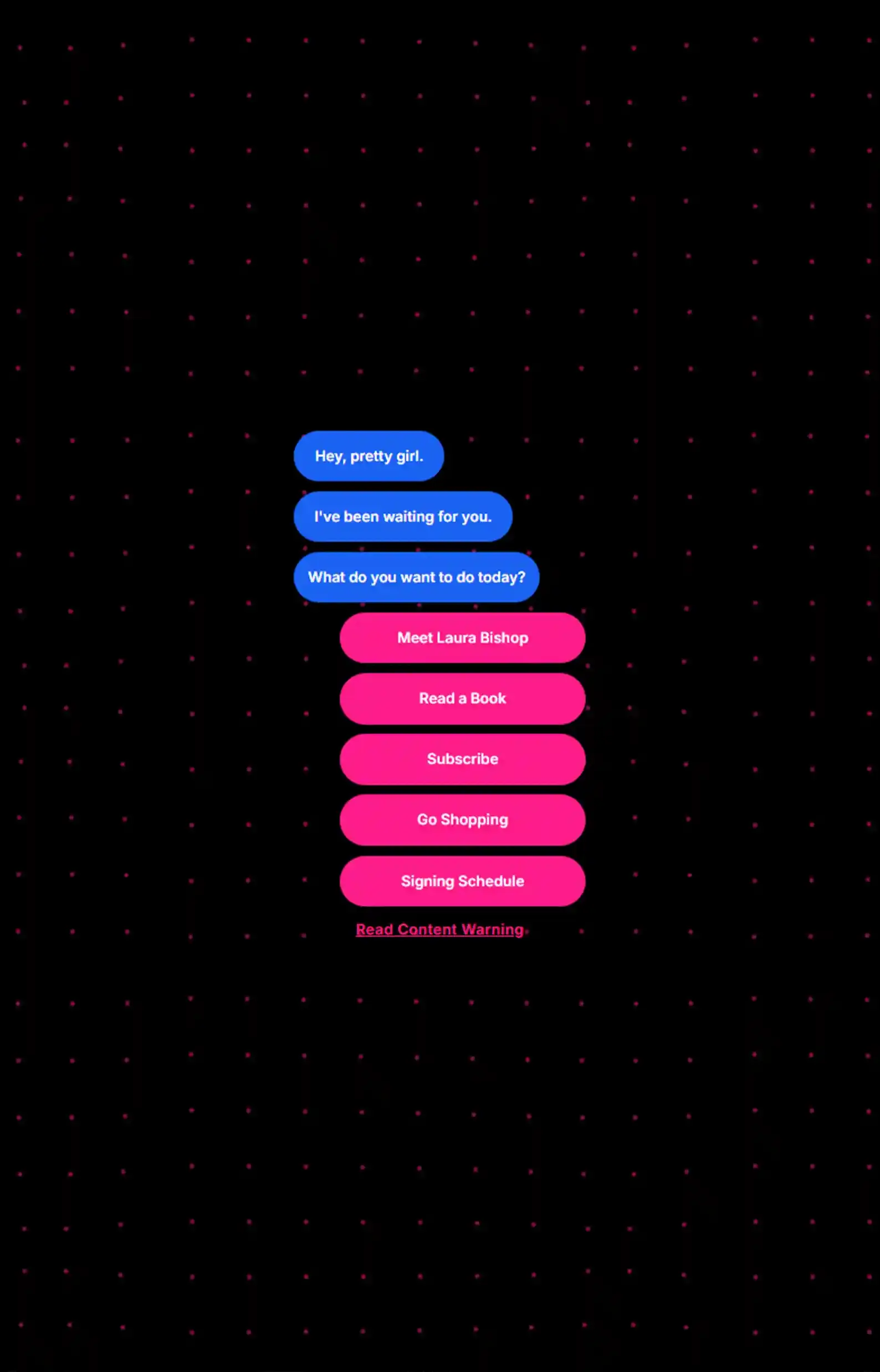
First Impressions:
- A text thread menu design that plays on the themes in the author’s books.
- Simple navigation and design help guide the reader.
I’ve seen many website designs in my time, and this one took me by surprise a bit!
It’s perfect for mobile, simulating a text chat with your stalker boyfriend, which carries the simplistic style.
With the only options being to explore the books, the trigger warnings, events, and more, the reader’s journey is laid out before them loud and clear, but it can still be hard to explore.
However, on some pages, there’s no back button, so the design can definitely be improved to enhance the user experience.
8. Michelle Heard’s Website
Supreme Reader Experience
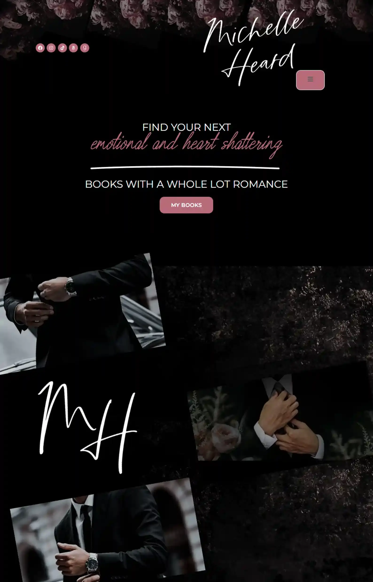
First Impressions:
- Seductive imagery and floral accents breathe life into the site.
- Bright, bold text paired with cursive fonts helps create a romantic, dark atmosphere.
The website’s romantic luxury aesthetic drags the reader in with soft pinks balanced by demanding dark shades.
And once the site has its claws in you, Michelle provides a clear path for readers to follow, with subgenre categories in the menu, a Coming Soon section with her books in the pipeline, and her latest book below the intro for readers to jump into next.
To guide readers through the site, every CTA stands out with simple copy that tells you exactly what to do next.
9. S. Massery’s Website
Stunning Storefront
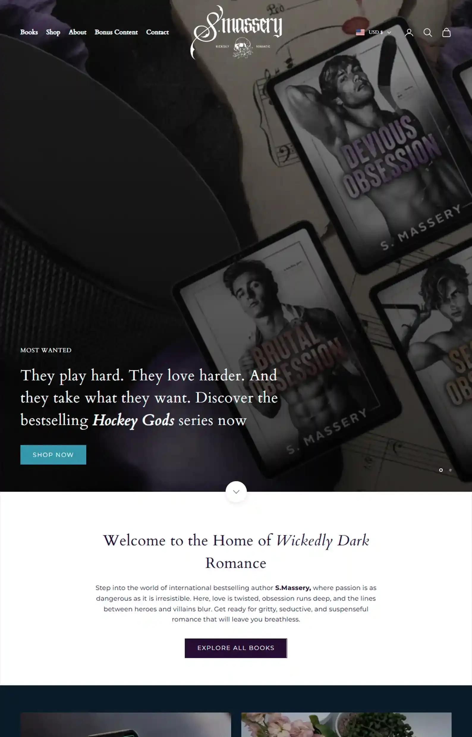
First Impressions:
- Lovely carousel intro displaying her hottest series and her newest official merch.
- Navigable pages and categories enable an optimized shopping experience.
This is another great e-commerce dark romance website.
The author sprinkles in quotes from her books, reviews, deals, and fun details about herself to show readers why her work is worth buying.
She includes bonus content and curated bundles and deluxe editions to add value for fans looking to support her.
If you’re looking to build a complex storefront for readers to support you, this is a great example of how to do it.
10. Devyn Rivers’s Website
Moody Central Hub
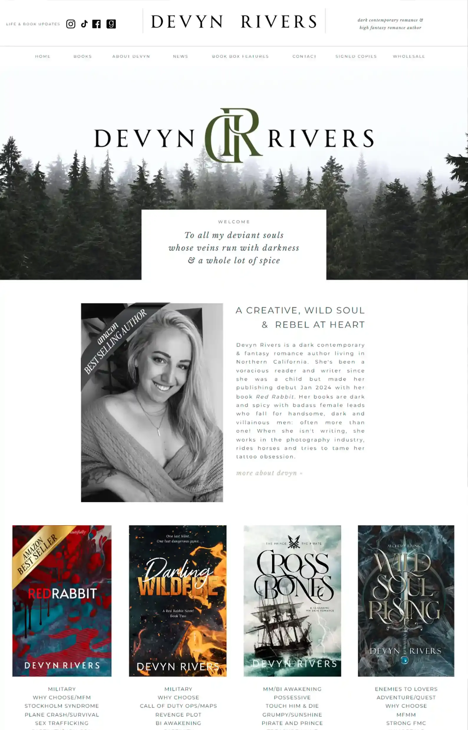
First Impressions:
- A muted design with forest greens and greys delivers a melancholic ambience.
- Clear menu design for easy browsing.
The author uses a moodboard-like layout with gentle fonts and colors to create a medley of elegance and melancholy.
Her content and colorful book covers can’t help but pop on this dark romance author website.
Instead of having busy pages filled with content, the author opts for more tabs in the menu, making it simple for readers and industry professionals to navigate and find what they’re looking for.
The author also includes sections for wholesalers and Book Box Co. to encourage collaboration and keep herself open to opportunities at all times.
For authors looking to expand and collaborate with industry professionals, it’s vital to make it easy for them to get in touch, as Devyn Rivers has shown here.
11. Keri Lake’s Website
Haunting Community Hub
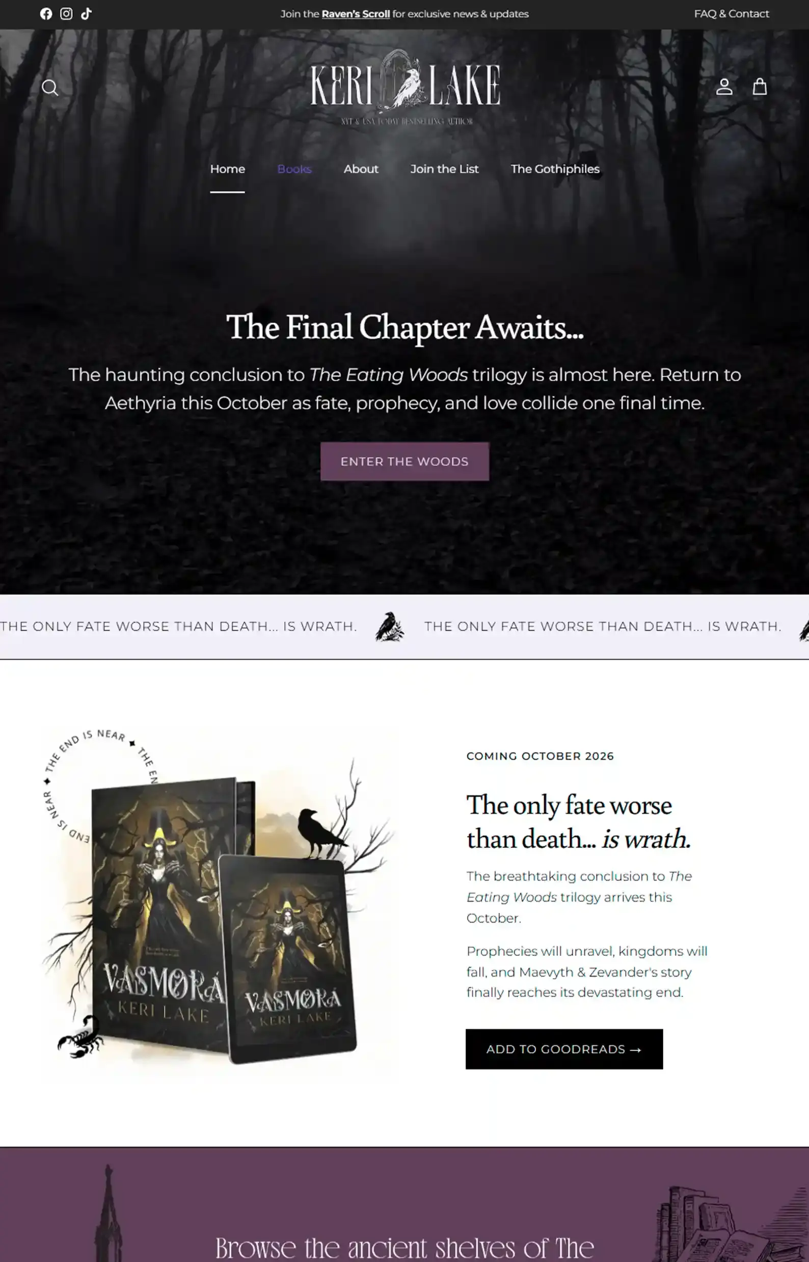
First Impressions:
- Bone-chilling intro of crows sweeping past a grim forest, accompanied by captivating copy promoting her latest work.
- Gothic design elements and eerie typography flawlessly represent the tone of the author’s work.
Keri’s dark romance author website has a ghostly presence to it, balanced by gorgeous purples and illustrations.
While I love the site because it’s appealing to the eye, her drive to grow her community is what sets it apart.
In the menu, readers have two places to join: her Gothphiles Facebook group and her email list.
She tempts readers to join with captivating copy for both groups, promising excerpts, sneak peeks, and dark secrets.
This is a good example of how to match your author voice throughout your website and engage readers.
12. Runyx’s Website
Bountiful with Bonuses
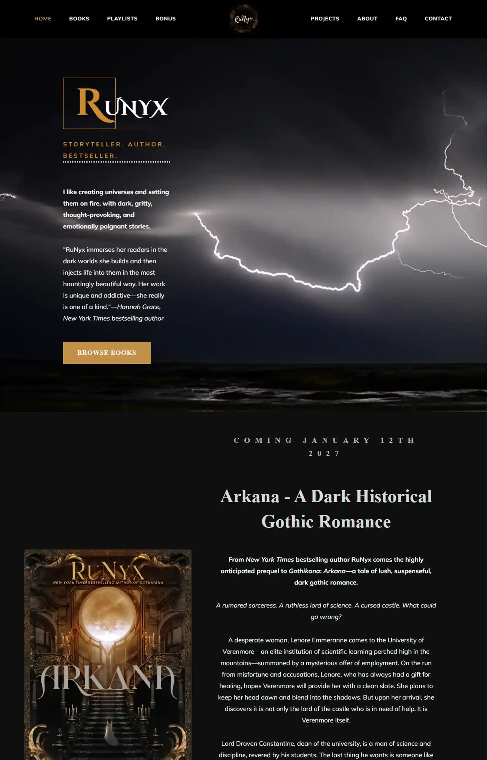
First Impressions:
- Electric intro (pun intended), with a word from the author on her style of writing and a quote from a bestselling author about Runyx’s work.
- Additional pages and extra content help keep readers on the page longer.
This author website puts the dark in dark romance.
While I feel the visuals could be brighter by adding contrast and creating a better viewing experience, the site is still easy to navigate.
What I truly enjoyed about Runyx’s dark romance site was its extra pages.
If you want readers to return to your site frequently, you need to make it worth their while.
And Runyx does that with plenty of bonus scenes, an informative FAQ section, a detailed page on her writing projects (categorized by series), and an expansive playlist page.
The author provides upfront value, which will intrigue readers and encourage them to become loyal fans.
We Can Give Your Darkness a Home…
Dark romance has been blowing up on social media over the past few years, and it’s not enough for authors to just ride the wave. Trends come and go.
You have to ensure longevity by building a polished digital presence that creates an experience true to your books, and that’s exactly what the websites above do.
I hope this list has given you some ideas for building your own site. But if you’re not sure where to start, we can help.
While you write your next morally grey love interest, we’ll build a custom website that’s unmistakably you, translating your themes and rich atmospheres into a digital experience readers won’t forget.
Book a call with me, Matt, and we’ll discuss your goals to see if we’re a good fit. Plus, you’ll get a homepage concept completely free of charge so you can see what we can do for you without paying a cent.