
Every author website needs five core pages:
- Homepage: your reader-winning intro and featured book
- Book pages: one per book, with clear buy links
- About page: your headshot and your story
- Newsletter sign-up page: a reader magnet (like a free ebook) in exchange for an email
- Contact page: for readers, press, influencers, and your agent
Plus these pages if they apply to you:
- Series reading order: if you write series
- Media kit: if you want press or podcast bookings (it can live on your contact page)
- Speaking or services page: if you coach, speak or sell courses
And optional but recommended:
- Extras: maps, glossaries, family trees. Build them once, and they keep rewarding readers for years.
- Blog or news page: only if you’ll keep it fresh.
Having these pages is the easy part, though. Your author website may already have them and still do almost nothing for you.
Picture a reader clicking through from your ad or your book’s final pages. They can’t find your next book or a reason to join your list, so they leave. You worked hard for that click and got nothing back from it.
Often the fix is small. We’ve seen the same ad, the same offer, and the same budget bring in more than four times the sign-ups, just by changing the page readers landed on. Keep reading, and I’ll show you how!
We’ve built hundreds of high-performing author websites, and the ones that sell books get these pages right. Below, I’ll walk you through what to put on an author website, what each page needs, with real examples from sites we’ve built, including the one mistake I see on almost every site we redesign.
Prefer to watch? In this video, I walk through your author website’s real job and the pages that do it, with more examples from sites we’ve built.
Homepage: A Gripping Intro and Your Featured Book
Most authors treat their homepage as a place to list their books, which would be a huge waste of your site’s most precious page. Think of it instead as a personalized welcome mat for every reader who steps into your universe.
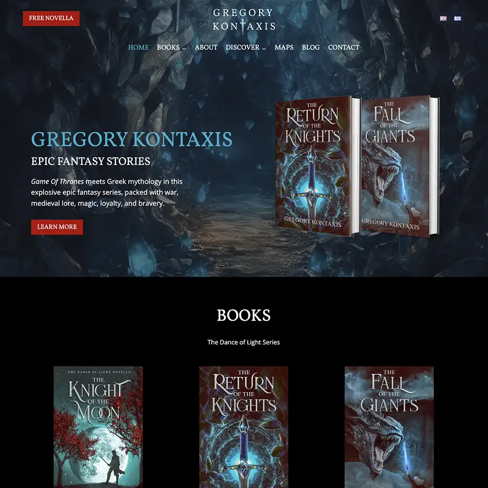
That welcome mat shouldn’t just signal your genre. It should showcase your secret sauce: that very specific sub-sub-genre that makes your books yours. You have one, because no two writers are alike and no two books read the same.
You get about two seconds to answer one question for a stranger landing on your site: what kind of book do you write? Your homepage needs to answer it instantly, through the design, imagery, typography, and overall look and feel, before they’ve read a word.
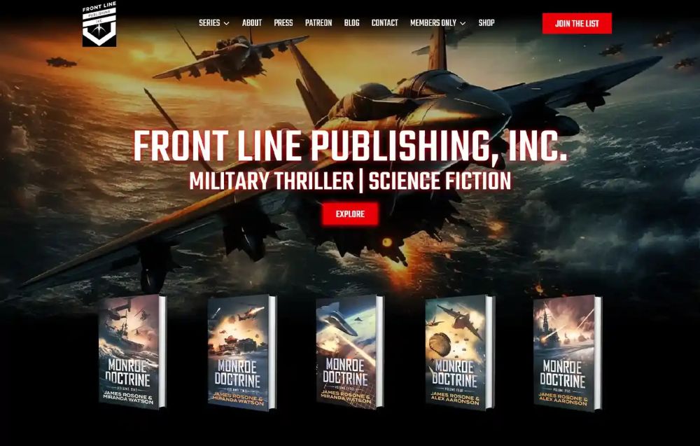
Take Frontline Publishing, a site we built for an action author. Do we even need to tell you this author writes military action thrillers? It’s obvious the moment you arrive, because we built it that way.
And here’s how that looks on a fantasy romance homepage we built for L.S. Westhoff:

This intro works because it checks every box:
- It fits the series’ themes.
- It puts the book front and center.
- It describes the kind of story Westhoff writes.
- It shows her awards and achievements, which builds authority.
All of that happens before you even scroll.
Pick your featured book
Your website goals decide which book gets homepage space. Do you want to promote a new release? Introduce new readers to your most popular series? Spotlight a debut?
Pick the book that fits your goal and put it as far up your homepage as you can. Tease the story with a mini blurb and some tropes, and link through to the full book page.
Readers also come looking for what’s next. Show when the next book is due, whether pre-orders are open, and whether there’s a signed or special edition, so they don’t have to hunt for it.
Think trailer, not movie
Below the intro, your homepage should be a fast preview of everything, with clear buttons into the pages that go deeper. Don’t cram every book, award, and blurb onto it, and don’t strip it bare either. Its job is to point, not prove. Prove it on the page it points to.
This homepage we launched for epic fantasy author Davis Ashura shows how.
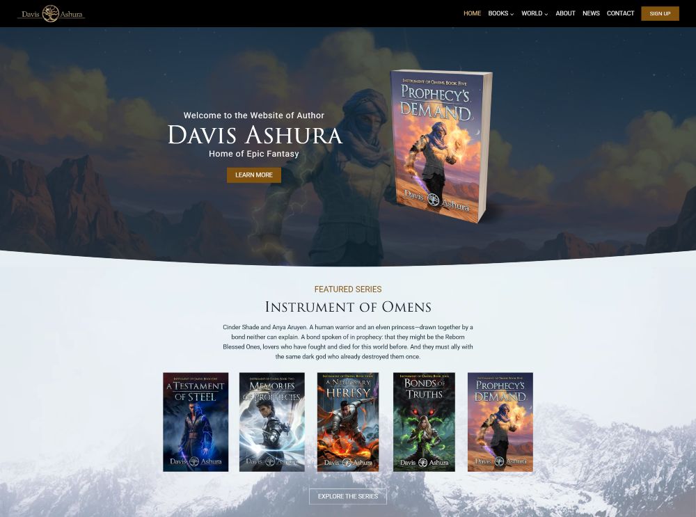
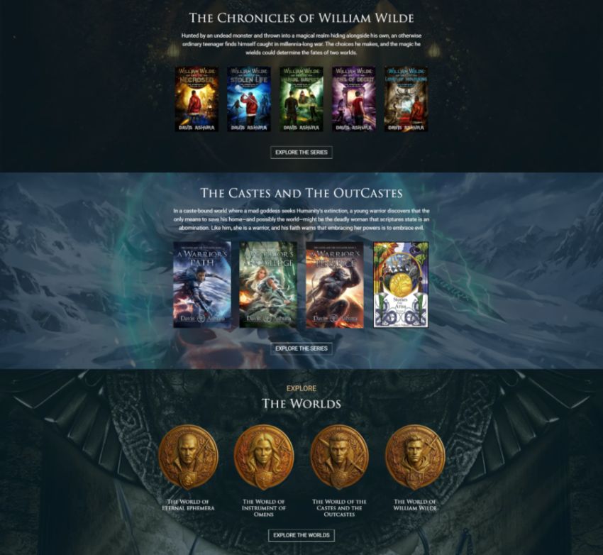
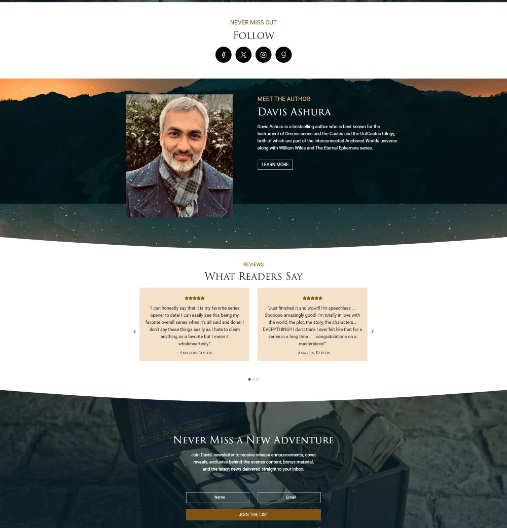
You’re welcomed by his latest release, then his latest series, then his earlier series, each with a clear link to explore further. After that comes a short explore-the-world section, a social follow bar, a brief about section, featured reviews, and a newsletter sign-up.
Book Pages
Your books are the whole reason you have a website. Each one needs its own page, and that page has one job: a confident sale.
Here’s my checklist for a clean book page:
- Book blurb: An engaging pitch that gives readers a sneak peek of the story. Grab it from the back of your book or your Amazon page.
- Book cover: A clear image of the cover. Use thumbnails for your book listings and a larger size for your homepage.
- Retailer links: Link to every store that sells your book, or send readers to your shop if you sell direct. Buying should take one click. Make the buy button stand out more than the cover or the blurb, and never bury it under paragraphs of praise. If readers have to hunt for it, you’ve lost the sale.
- Reviews: Readers trust your work more when they see social proof. Gather your best reviews and show them in a carousel on your book pages and homepage.
- Also See (optional): Other books in the series, or other books in that subgenre.
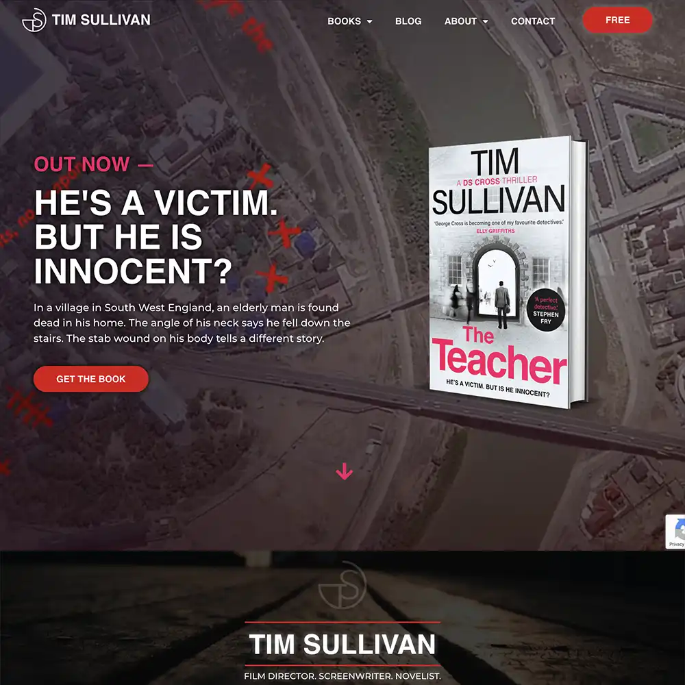
Here’s a book page we built for thriller author Tim Sullivan:
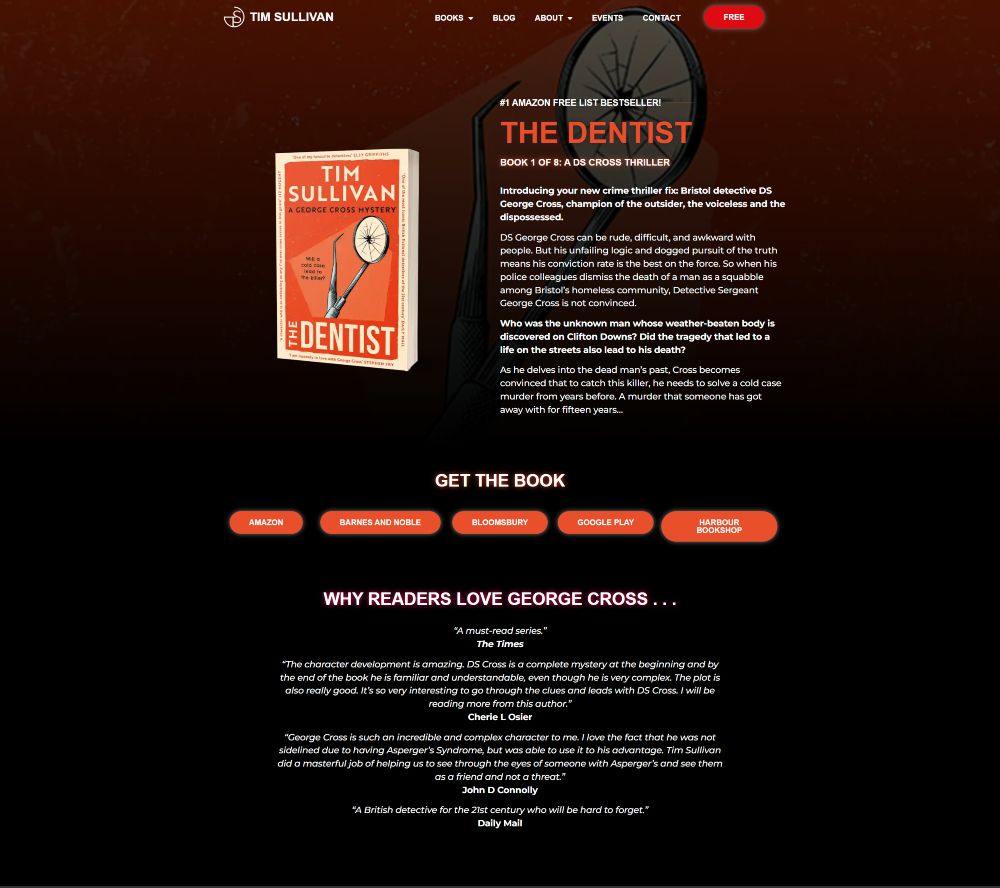
My team made this site eerie and creepy, and that feeling carries straight through to the book page. Every checklist element stands out while the style and atmosphere pull you in.
Tim’s book page hits every item on the list, even the optional one.
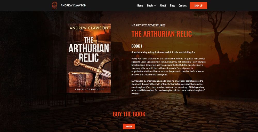
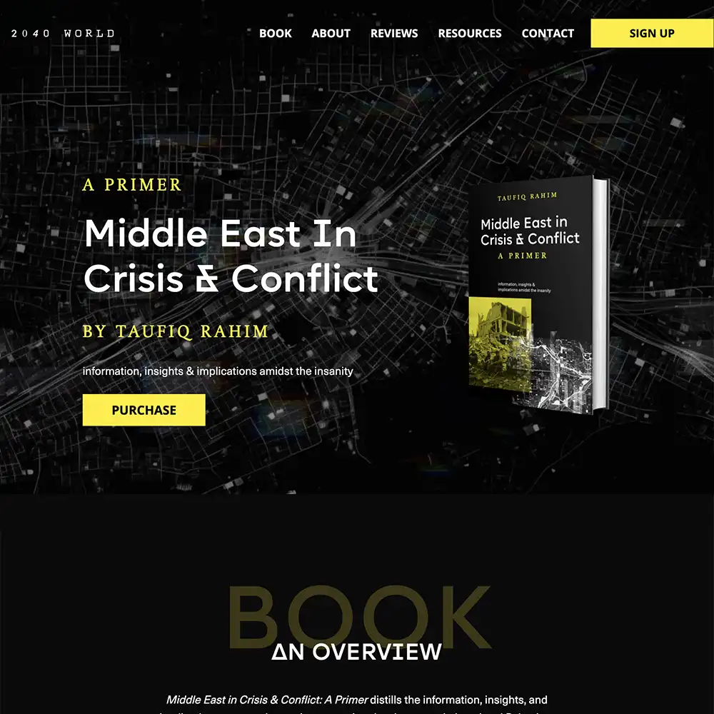
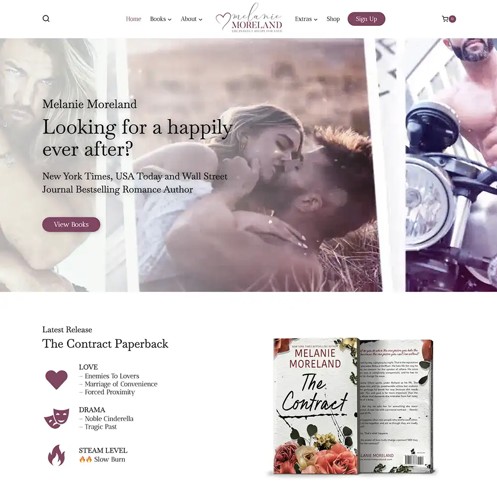
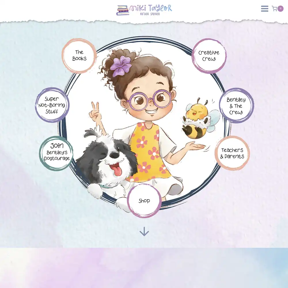
Andrew Clawson’s book pages, which we built for his mystery and adventure novels, take the buy button even further: one big, bright orange button to Amazon that’s impossible to miss.
Series Reading Order Page
If you have a series, you need this page.
Think about a reader who finds your book three first. They need to know where to start. Without a reading order page, they guess, get confused, or give up.
It’s also one of the few pages on an author website that readers actively search for. People type “[author name] book series order” into Google all the time. A dedicated page puts your own site in front of them instead of a third-party list site or a retailer page.
And readers themselves say they want this. In this video, I go through a Reddit thread where readers explain when and why they visit author websites, and checking reading order is the first reason they give. On Amazon, editions, box sets, spin-offs, and multiple series all get mixed, and working out where to start can become a mess. Your website is the one place you can make it clear.
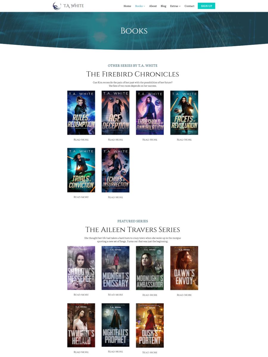
T.A. White’s site, which we built, does this well. Her series are clearly separated, the reading order is obvious, and her latest release sits at the top of the homepage so readers know what’s new the moment they land.
What you should include on yours:
- Every series, listed in reading order
- Each book’s cover and title, linked to its book page
- Prequels, novellas, and short stories, with a note on where they fit
- Where a new reader should start (usually book one or a free prequel)
- A sign-up form for readers who want to know when the next book drops
Write standalones? Skip this one, or add a short “Where to start” note to your main books page.
About Page
Your About page has one job: trust. It’s where a ‘maybe’ turns into a book buyer, and it’s the first page anyone checks before reaching out to work with you. You only need to share what you’re comfortable sharing.
Here are the About page must-haves:
- A professional headshot: Bonus points if the vibe matches your genre. Only if you’re comfortable sharing your face.
- An attention-grabbing one-liner to open your bio.
- An engaging bio: Everything a reader needs to know about you, including your journey, personality, credentials, and previous works. Skip the Wikipedia-style list of dates and awards, and tell it as a story written for your specific reader.
- Ways to get in touch: Social media links and a link to your contact form.
- Optional: An FAQ, social proof, or any details that let readers into your world.
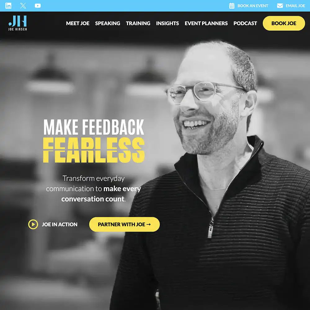
Here’s the About page we built for speaker Joe Hirsch:

Most About pages open with credentials. Joe opens with a question aimed at you: “What conversation are you avoiding right now?” By the time he tells you he’s a keynote speaker, you’re already hooked.
The copy is Joe through and through, conversational and bold, and the headshot is warm and welcoming.
When you finish the bio, your eyes go straight to links asking you to take action. Not ready yet? Keep scrolling, and you’ll see more credentials that back up his brand.
It’s a great model for non-fiction authors and speakers whose work is themselves. If you write fiction, the same page can point readers to your most popular books and warm them up to the mind behind the curtain.
Newsletter Sign-up Page
If I could only build you one page, it would be this one. Readers may only visit your site once. If you catch them on that visit, you can keep the conversation going, even if they never come back.
Every reader should see the chance to join. Add a bright button to your menu that says “Sign Up” or “Free Book” so it stands out. Then put a sign-up form in your footer and on your homepage, so readers who never touch the menu still see it.
The menu button leads to your sign-up page, and that page needs a real reason to join. A box that just says “Join my newsletter” is a request to clutter their inbox, not an offer. Give readers a reader magnet instead: a free novella, a prequel, or the first three chapters of your best series.
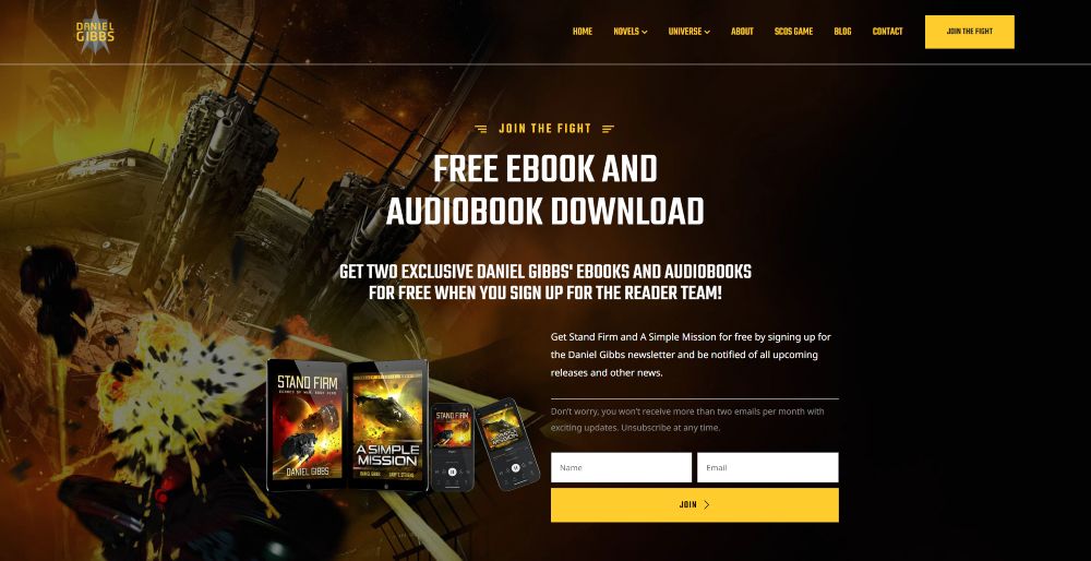
Daniel Gibbs has one of the most value-packed sign-up pages we’ve built: two free prequel ebooks, plus their audiobooks, for his most popular series. Once readers are hooked on the prequels, the next book in the series is the obvious next step.
Then keep the page simple. Kate Jones‘s sign-up page shows how:

Kate’s page has three focuses: the book on offer, a call to action that makes readers want to join, and the form.
Too many elements will crowd the page and distract the reader. You can even drop the “First name” field and ask only for an email address.
How clear the page is matters as much as the offer itself.
We recently ran an ad campaign for a historical regency romance client, sending readers to a simple sign-up page that promised a free ebook. We restructured the page but kept the main items the same: the same ebook, the same offer, the same ad spend.
The new page simply made it super clear what readers were getting, and how and why the book was worth their time.
Within a week, sign-ups had more than quadrupled.
Once you collect emails, you also need a privacy policy that explains how you store and use reader data. Link it in your footer and next to your sign-up forms.
Note: If you’re a speaker or offer services, swap this for a “Book a Call” page with a contact form to collect leads.
Contact Page and Media Kit
You probably think of your contact page as something for readers.
Its real audience is anyone deciding whether to work with you: a podcast host, a journalist, another author whose readers would love your books, maybe even a film producer. Skip it, or bury it three clicks deep, and you close the door on opportunities you can’t imagine yet.
Give them a simple contact form, your social links, and a media kit, so they can grab what they need without emailing you first. The media kit can be its own page or a section of your contact page:
- Your agent’s or publicist’s contact details, for media appearances or film rights (fingers crossed)
- A short bio and a long bio
- High-resolution headshots and book covers to download
- Past interviews, features and speaking appearances
Below is a contact page we designed for non-fiction author Chunka Mui:

He has two clear paths to working with him, speaking or advisory, plus one general contact form for everything else.
Blog
I’ll be honest: if you won’t keep a blog or news page updated, don’t start one. A dead blog is worse than none at all.
Readers in that Reddit thread video earlier in this post were clear about this: they stop visiting author websites that feel dead. Brandon Sanderson’s site came up as the example readers love, because its progress bars and news updates show exactly what he’s working on and when to expect it. You don’t need his fame to do the same.
If you know your readers’ interests (the ones that relate to your work), write about them. Those posts can show up when readers Google that topic, or in Google’s AI Overview, which links back to you as a source.
For example, a fantasy author could write about how they built their world maps.
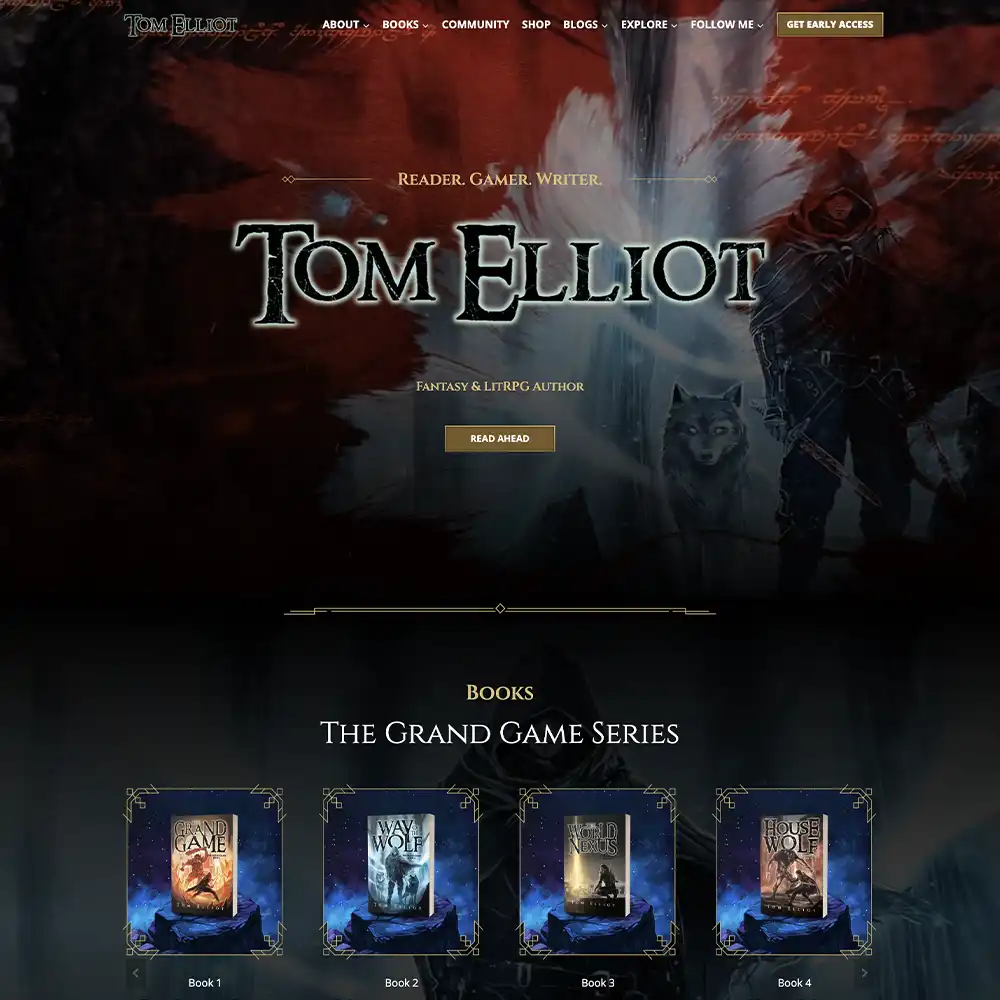
Take this blog page we built for Tom Elliot’s LitRPG website:

Tom’s main blog mostly holds release updates. His Patreon blog, shown above, is where he posts more often.
You can tell from the snippets that he’s more candid there. That encourages readers to join his community and builds a stronger bond with the readers he already has.
Extra Content
If you want to keep readers on your site (and keep them coming back for more), extra content is how you do it. And unlike a blog, extras don’t need constant upkeep. A good map, glossary, or family tree keeps rewarding readers for years.
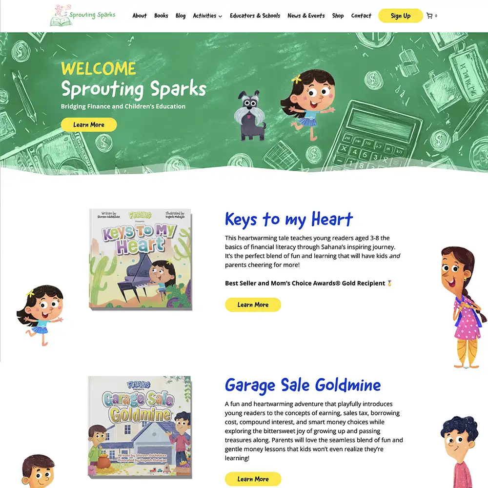
Match your extras to your genre. Fantasy or sci-fi? Maps and glossaries. A complicated cast? A family tree. Historical fiction? A what-actually-happened breakdown. Writing for kids? Fun downloads for parents and teachers.
For example, check out this adorable Extras page we built for children’s author Anna Kay:

The extras you pick should match your audience, and that’s exactly what Anna Kay did here. Each page has interactive content that excites kids and teaches them a thing or two.
It shows she cares about her young readers. It also gives parents a reason to check back in and maybe recommend her site to other parents.
Other Work and Services
Podcasting, YouTube videos, coaching, courses. If you do more than write books, that work needs a home on your website.
A reader who likes your books probably wants to see what else you’re up to and support you in it. A dedicated page also makes it easier for that work to show up on Google.
Here’s a courses page we designed for author and writing coach C.S. Lakin:
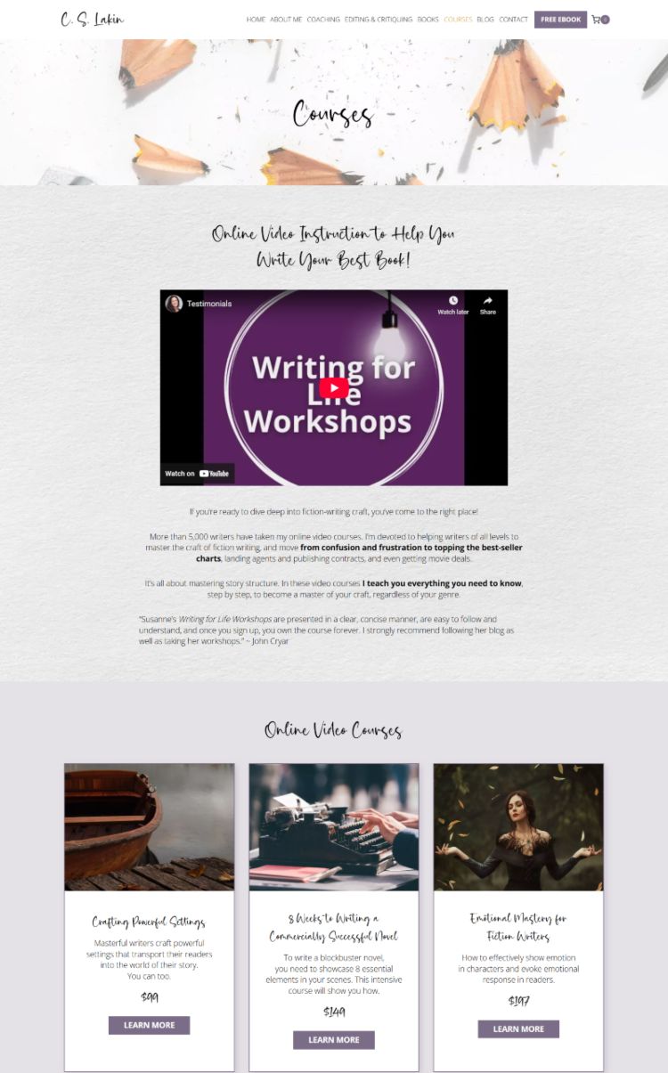
Lakin’s website represents her brand well because she does more than write books. Her courses page is informative, with credentials and course details, and still warm and friendly.
From the copy down to the cursive fonts, you feel inclined to trust her. Each page on her site can stand on its own, and that’s the standard to aim for.
The Mistake That Breaks Every Page
Remember the mistake I mentioned at the start? You can nail every page on this list and still lose readers if your site is a maze.
Think of your website like a store. If customers can’t find what they want, or can’t find the checkout, they walk out, even if they love the atmosphere.
Your site is a maze if:
- Your menu has ten items when three would do
- Your content is scattered with no clear order
- Your pages are so cluttered that readers can’t tell what to look at first
- Your buttons say “click here” instead of telling readers where they’ll land
Every one of those is a wrong turn, and every wrong turn is a reader walking back out the door they came in.
So clean up your navigation first: fewer menu items, clearer labels, and one obvious path through your site.
Want to Start Building Your Website?
Think of your author website as a reader support system. Readers arrive with specific questions, and if your site answers them fast, they stay, sign up, and come back.
My website design team lives by this checklist. With this foundation, we’ve helped authors sell millions of books.
You don’t need much more than this. But building it takes more than a list.
If you’d rather not mess with the techy details and want to focus on writing, we can handle the design and build for you.
Here’s what Lynn Westhoff said after we launched her site:
“Working with Rocket Expansion was one of the best decisions I’ve made for my writing career. They delivered a website that is visually stunning and packed with features that enhance my ability to engage with readers and promote my books effectively.”
Lynn Westhoff, fantasy romance author
See how our author website design process works, or inquire here to book a call with me, Matt Ziranek. We’ll sit down on Zoom, talk through your goals, and see if we’re a good fit.
You also get a free homepage concept before you commit to anything. No cost, just an honest look at what we can do for you.
Still deciding whether you need a website yet? Start with our post on when to make an author website.