
Romantasy is exploding online right now, which makes standing out a real challenge.
Your author website is what turns that attention into readers. It’s the difference between a scroll-past and a sale.
At Rocket Expansion, we specialise in building author websites for fiction writers. We’ve built sites for million-book-selling authors, TEDx speakers, and writers across every fantasy subgenre. This list is curated from our own research into what makes a romantasy website actually work.
Here are 19 romantasy author websites we’re obsessed with, and what you can learn from each one.
If you’d like help building your own, reach out and let’s talk.
1. Rebecca Yarros’s Website
Genre Bending

First Impressions:
- Contrasting black, white, and pink banners help blend multiple genres while serving different fans.
- Clean navigation and a well-structured layout make browsing effortless.
Fourth Wing’s release kind of coincided with the birth of romantasy as we know it, so how could I not have the author’s site on this list?
And some may not know that Rebecca Yarros writes across a couple of genres. Alongside her viral Empyrean series, she has an extensive collection of romance novels for readers to browse.
This is a good example of how to approach a multi-genre site. Most elements complement her branding, while others maintain focus on her biggest series.
It can be tricky to pull off, but I think the way it’s segmented while still flowing side by side is what makes it work.
2. Carissa Broadbent’s Website
Friend of the Fans

First Impressions:
- The author’s aesthetic book covers lead the site’s design, with romantasy-forward icons and fonts.
- Her fun and friendly author voice is felt in every piece of copy.
Carissa Broadbent started out in self-publishing and clearly curated her persona and brand to get where she is now.
Her readers matter to her dearly, and you can see it on every page. She writes as she does on her social media, full of personality and heart.
Readers can find juicy extras like merch (a must for fans!), recaps, bonus content, and a glossary.
But by far my favorite section is the FAQ under About.
When authors have as much hype as her (and as many books), she knows firsthand how confusing it can be to get started.
She gives readers what they want, answering popular questions like where to start and how many books there will be in her popular series.
3. L.S. Westhoff’s Website
Otherworldly Design

What Lynn Said About Working With Us
“A Game-Changer for My Author Career – Working with Rocket Expansion was one of the best decisions I’ve made for my writing career. Their expertise in building author websites is unparalleled. They delivered a website that is visually stunning and packed with features that enhance my ability to engage with readers and promote my books effectively. The process was smooth and collaborative from start to finish. I was particularly impressed with their customer service; they were always available to answer questions and provide insights. I wholeheartedly recommend their services to any author looking to make a significant impact online.”
First Impressions:
- Bursting with magical energy through vibrant colors and eye-catching imagery.
- Clear reader pathways and intuitive navigation streamline the reader journey.
The best romantasy author websites transport readers to another realm – and this one does it effortlessly.
Well… not effortlessly. My team really put their best into making that happen.
We used gold embellishments, electric imagery, and genre-specific copy to create an immersive experience that feels unmistakably romantasy.
And we made sure curious readers are rewarded for exploring, with easy-to-find extras, like excerpts, character profiles, videos, and more.
Want to see more beautiful creations from my team? Check out our gorgeous fantasy and sci-fi websites here.
4. L. Penelope’s Website
First Impression Done Right

First Impressions:
- Celestial design that immerses the reader and reinforces the author’s brand.
- CTAs are like north stars, efficiently guiding readers and writers to rich content.
L. Penelope’s romantasy author website is like its own little galaxy on the internet.
Swirls of purple and gold create this really mystical atmosphere, while the graphics and typography sell this as a polished package.
But it’s not all style; there’s loads of valuable content here for both readers and writers.
In particular, I love the “New to My Books” banner at the top of the homepage, which directs visitors to a page that recommends where to start depending on what you’re in the mood for.
It’s a smart way to welcome new readers and give them a clear entry point into her world.


5. Callie Hart’s Website
Scenic User Experience

First Impressions:
- An interactive experience where every scroll reveals a new scene.
- Bold typography keeps your focus on the story, even as the visuals evolve.
To fully appreciate the changing backgrounds, I highly recommend viewing this romantasy author website on desktop. Whenever you move your mouse on the intro, puffs of smoke swirl about, adding another layer of immersion.
The mobile experience is pretty polished too, making this unique design easy to browse on any device.
Every page feels like a gallery viewing with distinct imagery and an atmosphere that perfectly matches the content.
Through thoughtful copy, Callie Hart’s personality still shines, creating a complete brand experience.
One suggestion I would make is to feature the newsletter sign-up on the site instead of on a separate page that’s a little hard to find.
6. Jacqueline Pennewill’s Website
When Gothic Meets Ethereal

What Jacqueline Said About Working With Us
“Working with Rocket Expansion was a wonderful experience from beginning to end. They were incredibly kind, collaborative, and supportive throughout the entire process—guiding me every step of the way. They truly listened to my vision and then elevated it, bringing ideas and expertise that made the final result even better than I imagined. Their knowledge, attention to detail, and proactive communication made everything smooth and stress-free. A total pleasure to work with. I couldn’t recommend them more “
First Impressions:
- Greys and blacks enhance the atmosphere with shimmers and celestial imagery.
- Classic, bold fonts and poignant copy really help the atmosphere seep through the screen and into your bones.
My team really put their eerie, mystical tools to the test with this one, and we couldn’t be happier with the result.
This site gives off an otherworldly vibe, with a balance of light and dark on every page.
The copy also contributes to this, perfectly showcasing the author’s tone and writing style.
Readers can further immerse themselves in Jacqueline’s world through extras under Explore, essays and podcast episodes under Media, access to a community under Book Club, and more.
You can get something just as beautiful for your own platform. Just get in touch with me, Matt, through this quick inquiry form, and I can help you decide on your next best steps.
7. Penn Cole’s Website
Fiery Authority

First Impressions:
- Sizzling intro where the backdrop aptly fits the author’s main book series.
- Sleek page layouts that use white space to organize content and draw attention to copy.
Penn Cole’s bestselling debut series takes center stage, and the website consistently guides readers toward it.
Her authority and accolades add credibility while encouraging new visitors to take the leap and buy her books.
Fans are catered to, with book updates, announcements on book cover editions and events, FAQs, and a page dedicated to expanding on the lore of her book under Enter Emarion — plus more!
This site easily walks the line between atmosphere and professionalism.
8. Jasmine Walt’s Website
Weaving E-commerce & Magic

First Impressions:
- Beautiful Illustrations and aesthetic pictures of book covers give you a glimpse into the author’s world.
- Excellent navigation makes an advanced online shop feel effortless to browse.
This romantasy author website strikes an impressive balance between branding, atmosphere, and e-commerce.
From captivating copy that perfectly fits the genre to reviews and descriptions of the books, to the organized shop.
Everything has its place and serves its purpose effectively.
Generous white space keeps each page uncluttered, allowing content a chance to shine and guide readers.
Jasmine Walt’s voice comes through clearly on every page, and her commitment to her fans is evident, especially on the FAQ page.
If you want a feature-rich shop on your site without sacrificing branding, this site is a great example to follow.
9. Holly Renee’s Website
Digital Fantasy Garden

First Impressions:
- Floral theme with an animated logo makes for the perfect balance of fantasy and romance.
- Illustrative design and playful typography make every page feel vibrant.
This site will make readers feel as if they’ve stepped into a whimsical garden, full of personality and sparkle.
The bold design stands out, but the content still feels friendly and down-to-earth.
Flowers move, stars pulse, and some words are circled and underlined — and all I wanted to do was keep exploring to see more.
But my favorite aspect of Holly Renee’s romantasy website is her About page, which reads like a beautiful journal while still looking professional.
10. Tara Lytle’s Website
Magical Branding

What Tara Said About Working With Us
“I worked with Rocket Expansion to build my author website, and I’m really glad I did. They actually took the time to understand me as an author – not just what my site should look like, but who my readers are and what I’m trying to build long-term.
That made a huge difference. The site feels clean, professional, and still very me, which isn’t easy to pull off.
The process was smooth, communication was solid, and I never felt lost or pushed into decisions.
They explained things clearly and were thoughtful every step of the way.
If you’re an author who wants a website that feels intentional and aligned instead of generic, Rocket Expansion is a great team to work with.”
First Impressions:
- An enchanting video sweeps across the intro, creating a vibrant atmosphere.
- Charming embellishments and curvy fonts emphasize the mystical yet romantic tone displayed on every page, cemented by gorgeous blues and purples.
This imaginative creation was woven together by yours truly.
Tara wanted a site full of magic and life, while staying true to her brand, and we think we accomplished just that.
For example, scrolling down on the homepage reveals adorable ornaments where you can hover and learn more about What to Expect from Tara’s Books.
It’s easy for readers to discover more about her world with delightful maps, character descriptions, and reviews for her books.
The site includes plenty of useful info for Press & Media, so Tara is prepared for possible future opportunities.
We love creating epic intro videos like this one. If you want something that immediately captivates readers when they land on your site, we’d love to help.
11. Helen Scheuerer’s Website
A Glimpse Into Worlds

First Impressions:
- Captivating intro that spotlights the author’s latest work, with fitting CTAs.
- The Book Tab has dedicated sections that let each series shine.
I love the mood of this romantasy website.
The author’s stunning book covers are perfect for the genre, and the site’s design really lets those covers pop. Engaging copy also brings each series to life, enticing readers to dive in.
Her content is organized nicely, making it easy for readers to get their preferred editions, have their questions answered under FAQs and claim free books (in exchange for joining her email list, of course).
12. Clare Sager’s Website
Romantasy But Made Classy

First Impressions:
- Simple, yet timeless design with regal seals, ornamental lace, and floral patterns.
- Strong tagline and reviews in the intro establish the author’s authority immediately.
Book covers glisten, and elegant imagery invites the reader onward, creating an experience that’s regal and intentional.
To further enhance the atmosphere, fonts are sharp like daggers, and the copy is mystical and intriguing.
That said, I wish sentence case were used more, as the capital lettering can be a bit hard to read at times when stacked next to each other.
The site consistently guides readers toward the author’s series and latest releases, even featuring a section on the homepage with updates for audiobooks and edition releases for curious fans.
Another great addition is the multiple reading orders, providing readers several ways to experience her books, ensuring she satisfies every one of her target readers.
13. Angela J. Ford’s Website
E-commerce Beast

First Impressions:
- Evocative intro showcasing the latest entry in the author’s world, complete with tropes and clear CTAs.
- Pages are inspired by the aesthetics of Bookstagram and Booktok, making the author’s books extremely irresistible.
This is one of my favorite examples of an e-commerce author website. The romantasy styling elevates every part of the shopping experience.
Readers are spoiled with extras, from book boxes, special editions, hardcover books, and even a quiz to help you pick your next read.
Reviews can be found throughout the site alongside influencer videos, adding strong social proof for the books and products.
If you want your romantasy author website to function as both an online store and the central hub for your brand, this is an excellent blueprint.
14. Cat Sirota’s Website
Enchanting Elegance

First Impressions:
- A dark and mystical intro perfectly captures the atmosphere of the author’s debut book.
- Magical purples, blues, and greens combined with gorgeous banners and fantasy elements make this site a fantasy lover’s dream.
Here’s another romantasy author website created by my team.
We kept the layout elegant and streamlined, allowing the vibrant color palette and immersive copy to transport readers into Cat Sirota’s realm.
Cat’s conversational brand shines bright, especially on her About and Blog pages, helping readers form a genuine connection with her.
Readers can uncover awesome extras, including a gorgeous world map showing locations in Cat’s book, and comprehensive character sheets that are useful for new readers and fans alike.
Like what you see? We’ve created plenty more stunning author websites here.
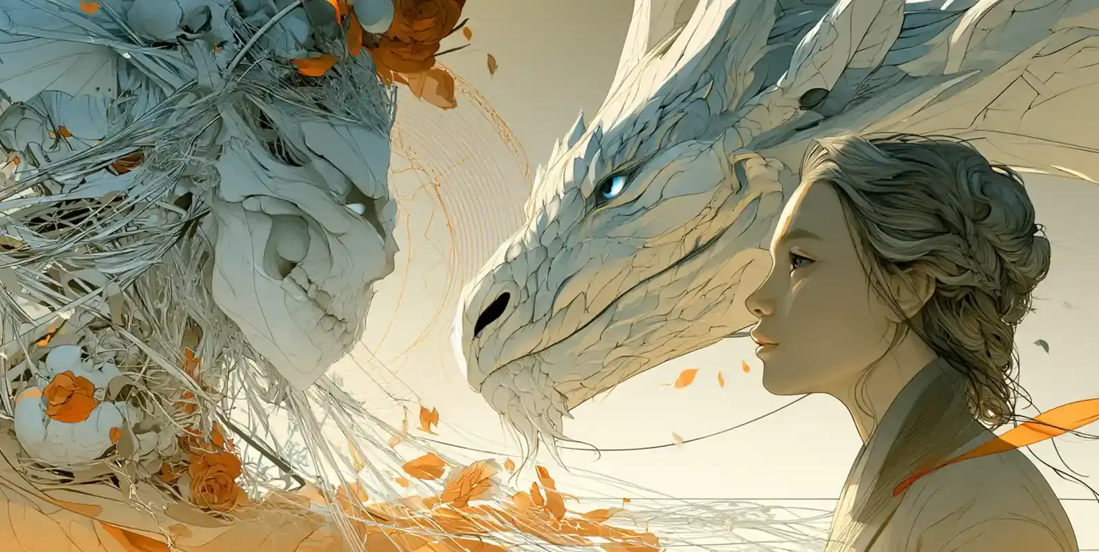
15. Keri Lake’s Website
Chilling Design

First Impressions:
- Haunting intro with a video of a grim forest, establishing her darker subgenre of romantasy clear as day, or should I say night.
- Gothic imagery like skulls, ravens, and rickety tree branches sends shivers down your spine in the best way.
The clean layout and site structure are made dark and foreboding through eerie visuals and chilling copy.
And it never feels overdone.
The author swiftly leads you exactly where she wants you to go, showcasing her books, inviting you into her private community, and enticing you to grab a freebie.
But by far, I love her About page the most. She maintains this ominous voice while sharing more about herself. And the progress updates on upcoming books are a wonderful touch that fans will adore.
16. Sophia St. Germain’s Website
Personable Meets Magical

First Impressions:
- Strong branding that blends a cozy journal aesthetic with romantasy elements.
- Clean design, with clear CTAs to support the branding and flow.
Floral patterns and journal-inspired details keep this site down to earth and warm. It’s a breath of fresh air.
Typography is bold and easy to read, and menus are easy to browse through.
Readers can easily find juicy extras, events, and audiobooks thanks to a clean, focused layout.
There are a few times where background images clutter the text a bit, but overall the site is intuitive and easy to navigate.
17. S.M. Gaither’s Website
Digital Canvas

First Impressions:
- Artistic design with brush strokes, cute illustrations, and what looks like neat pencil scribbles underlining the menu.
- Simple navigation made all the better by a creative design that compels.
Fantasy-forward and full of charm, we have S.M. Gaither’s romantasy author website.
The illustrations and icons used make you feel as if you’ve stepped into a storybook. When you hover over buttons, there’s a splash – nice touch!
The FAQ section is great for readers, helping them navigate her work and answering their most pressing queries.
Lastly, I like how straightforward her shop is, with books grouped by series with categories under each for what format the reader would prefer.
18. Kate King’s Website
Wicked Good Design

First Impressions:
- Simple, yet attention-grabbing intro that immediately shows what readers will find in terms of tone and genre.
- Rich purple hues and distinctive typography create an immersive atmosphere.
If you’re looking for a romantasy author website that’s simple, charming, and trope-forward, this is an excellent example.
Kate King puts tropes in her intro and carries them through to each book page, making it easy for readers to find exactly what they’re in the mood for.
Thoughtful touches like backgrounds using her book covers and illustrations of the couples from each book keep things cohesive and engaging throughout the site.
19. R.M. Gray’s Website
Starry Bordeaux

First Impressions:
- Ethereal design that delights the eye as you browse.
- Gorgeous icons and decorative borders bring this site to life.
Curly fonts, ornate border designs, and deep yet soft hues give this romantasy author website a Bordeaux feel, and it works beautifully.
The author’s voice grounds the unique styling, using friendly yet whimsical wording that aptly represents her work and genre.
It’s really fun to look at, but there are moments where the borders feel a bit overbearing. In some places, the background imagery competed with the beautiful copy instead of supporting it.
There’s also an icon in the top right that leads you to what seems to be a mystery game. Instead, it simply links back to existing pages on the website.
I was kind of bummed, hoping to find some hidden lore linked to her books – but alas! It was just an atmospheric room.
In my opinion, these aspects need a bit of polishing, as you don’t want your readers to miss content because it’s being clouded by design.
Ready to Build Your Own?
We had a blast putting this list together and hope it sparked some ideas. Translating your books into a website that actually feels like you is hard work. That’s exactly what we do at Rocket Expansion.
We’ll capture your story, reflect your brand, and build something your readers will love. Book a quick Zoom with me and if we’re a good fit, you’ll get a free homepage concept before committing to anything.


 34")