You’re ready.
Your book is aching, waiting to be read, to be shared.
But…you don’t exactly know how it’s supposed to look.
Well, you know what books look like, you’ve looked at books. You’ve read books. No one’s questioning that.
But how do they get it to look like that?
Book formatting is the silent hero behind every book. Without it, there would just be chaos on a page.
Read on to find out almost every excruciating detail a beginner would need to know when formatting a book for publication or a manuscript for agents and publishers.
Do You Need To Format Your Book?
Writers are told to just sit down, get writing, and don’t worry about anything else that could get in the way of you putting words on the screen. Now you’re hearing that you have to make sure what you write is in spick and span condition?
Surely not, right?
Unfortunately, yes, actually – but with a catch.
By all means you should get scribbling or tippy-typing away but at some point, you have to make sure your manuscript is fit to be read by others, unless you’re only writing for yourself.
Some writers get the margins, indents, and fonts down to perfection before they write ‘Once upon a time,’ while others will only spare a thought on the format when they finish off with ‘The End.’
Neither type of writer is wrong, you can honestly pick your poison when it comes to the timing of formatting your book. But so long as you know it needs to get done eventually.
When you’re sharing your manuscript with your writer’s group, beta readers, or editors, they expect a certain standard when they read it. And when you’re looking at hiring an editor to take a fine-tooth comb to your manuscript, you don’t want to spend extra cash on them fixing what you can do yourself.
Plus, having some pride in how you present your manuscript will show your respect for the craft of writing.
Editors, literary agents, and publishers will know you mean business, and better yet not turn you away because of a sad-looking manuscript. If you plan on self-publishing your book, it will make your life easier when formatting your book for publication – which we will also cover below.
Why Formatting A Book Makes A Difference
Besides your own level of care for the craft, book format makes a difference to the readers who get to see the end result of your published book, even if they don’t know it.
Book formatting isn’t just an admin task that’s boring to do. It accomplishes these very important points:
- Smooth reader experience: They won’t notice all the hard work put into formatting a book, but they will definitely notice when it’s not done right!
- One of these things is just like the others: Especially if you’re self-publishing, you want the reader not to know the difference between your book and a traditionally published one.
- It’s cool to fit in: Your book format should slot in with the other books in your genre so your target reader feels at home when reading it.
- All about the visuals: Little elements you add like section breaks and chapter heading designs will add fun aesthetics, especially for fiction – but don’t go overboard, it must still be professional.
- Keep it accessible: Some readers have disabilities, and a well-formatted book will make sure not to exclude this group.
- Make your mark: The fonts and design elements may not be wowza, but they’ll be yours, so use them to correlate to your author branding.
Format for Writing A Book (Before Sending Your Manuscript Out)
Before we get to the whirlwind of how to format a book for publishing, we’ll ease you in with the standard book format tips your manuscript needs. This will get it ready for the eyes of editors, alpha readers, agents, and publishers.
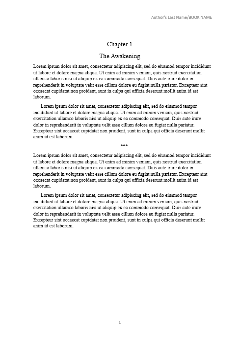
- Font size: 12-point
- Font type: Times New Roman
- Alignment: Left justified
- Spacing: Lines should be double-spaced. Speaking of spacing, double space after a period is no longer the standard, Grandpa!
- Margin: 1 inch on all sides of the page.
- Indents: It should be 0.5 inches and hitting tab to indent doesn’t count.
- Page Numbers: This should begin on the page your story starts, and it can be in the header at the top right or in the footer in the middle (remember to keep the font simple).
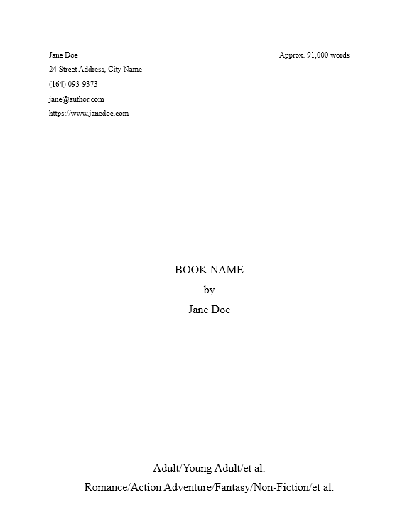
- Title Page:
- Title & Name: Center your manuscript name about a third of the way down the page and below that add By Author Name, or By Pen Name writing as Real Name.
- Personal Details: Far left at the top should be your Name, address, number, email address, and author website (if you have one).
- Manuscript details: Far-right at the top should be the word count rounded to the nearest thousand, and the genre and subgenre should be centered at the bottom of the page.
- Chapters: Use a page break after the end of each chapter.
- Scene Breaks: Add a blank line or three asterisks before going to the next scene in a chapter.
- File type: Most industry professionals are familiar with .docx or Word documents.
- Guidelines: Agents and editors may have their own requirements for book formatting so be sure to follow those before submitting.
Book Format Example 1: Manuscript Title Page
Your manuscript title page should look like this.
Book Format Example 2: Manuscript Chapter Page
Your manuscript should look essentially like this with all the formatting applied.
Book Format Considerations Per Genre
Now, obviously, standards change with different genres to accommodate the needs of the genres and what makes sense for them. So, Let’s quickly cover that:
Fiction Book Format
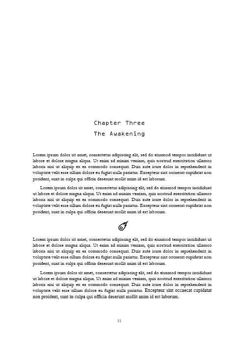
How you format a novel doesn’t differ much from the standards above. For example, the font size can be 12- or 11-point, you can decide which looks best for you.
What’s fun about novel formatting is you can add some flare by using elements in your chapter heading or scene breaks to give it a fanciful distinction when you’re publishing.
You can even give a one-liner as the chapter heading like ‘The Awakened’ instead of a simple Chapter 3.
Book Format Example 3: Book Chapter Page
This is how a chapter in a fiction book should look.
Non-Fiction Book Format
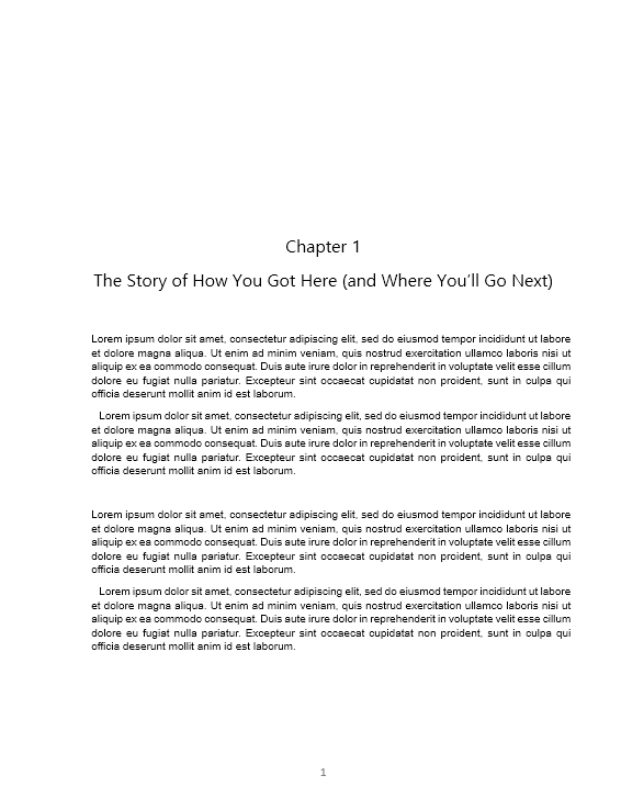
Chapter headings will differ as they need to give more detail than fiction books. It will likely be lengthier than fiction.
Book Format Example 4: Non-Fiction Chapter Page
This is a simple example of how a chapter in a non-fiction book should look.
Also, non-fiction books will have more front and back matter like footnotes and table of contents (we’ll discuss this further down).
You may also have graphics like tables and charts that will need extra care when inputting.
Lastly, font size can be smaller for non-fiction, going as small as 10-point – but make sure your readers won’t have a hard time reading it.
Children’s Book Format
Book formatting plays a huge part in how a children’s book turns out. You may add text to the bottom and top of an illustration, vary the sizes and types of fonts, and mix it all up on another page entirely.
If you’re an illustrator, this should be easy to figure out on your own, but if you have an illustrator you’re collaborating with, you should consult them on how you both can make the most impact on the page.
Children’s books have the luxury of using larger font sizes that can be 14-point and over. They have a lot of creative wiggle room!
How To Format A Book For Publishing: Print Books
For self-publishers, and those curious about how the process is done, here are the steps to take when formatting a book for print.
Book size and layout
There could be a whole blog about book size and layout. But alas we don’t have the time and honestly, it’s something that will just take a bit of practice on your end to get right.
So, we’ll instead briefly define these super important book formatting elements and give some tips on how they’re used:
Trim
A trim is the height and width of a physical book. Take into account the word count of your book, the genre, and the text size you want to go for. You can take a measuring tape and check the size of other books in your genre to see what could work for you.
Here are some standard trim sizes:
- Paperbacks: 5×8 inches or 5.25×8 inches.
- Hardcovers: 6×9 inches or 6.25×9.5 inches.
- Children’s books: 8×8 inches or 8×10 inches.
- Coffee table books like cookbooks and coloring books: 8×10 inches or 8.5×11 inches.
Margin
Margins are the superheroes that stop your text from running off the page and looking like a hot mess. For standard paperback books, you can use 0.625 inches on the inner and outer edges of the page.
Bleed
Bleed is what you need to give room for images, colors, and illustrations that make it to the end of the page. It’s a border beyond the edge of your document that helps you avoid printing errors.
Add 0.125 inches on top of the margin size for bleed and adjust from there if necessary.
Gutter
A book gutter is accommodated by the margin, meaning it’s the part of the book that is glued to the spine. With a wide enough margin, writing won’t sneak into the gutter.
Fonts
Firstly, if it wasn’t obvious, the text must be black on top of a white page. It’s boring, we know, but it’s easy to read (unless, of course, you’re writing a children’s book).
And, unfortunately, the font will stay almost as boring as Times New Roman. You do get to have a little fun when picking out your chapter heading fonts and book title design, but the body should remain simple.
Top Tip #1: You can copy the image design of your book cover title and paste it into the front matter to keep the experience continuous and professional
Here are some fonts you could try (keep in mind your genre):
- Arial
- Times New Roman
- Joanna MT
- Garamond
- Baskerville
- Janson
- Cochin
- Caslon
- Verdana
- Georgia
- Minion
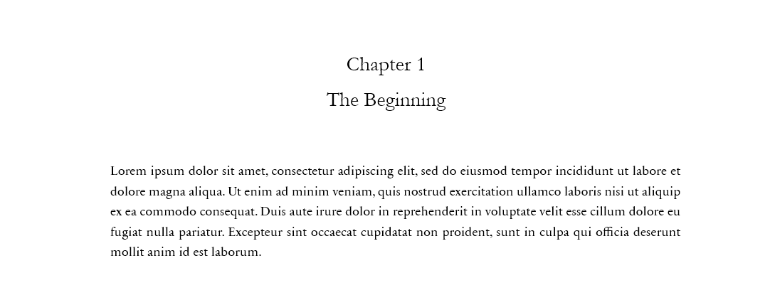
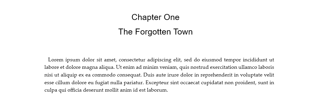
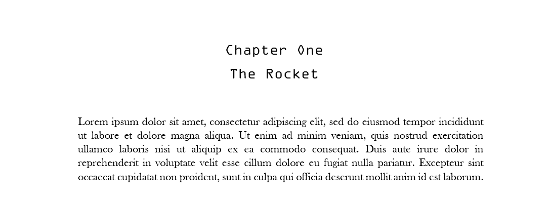
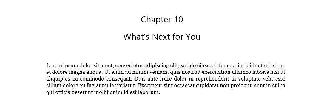
Book Format Example 5: Fonts for Different Genres
We put together some examples of fonts you could use for different genres.
Romance font
We used Sabon as the font for Romance.
Mystery font
We used Palatino as the font for Mystery.
Sci-Fi font
We used Baskerville as the font for science fiction.
Non-Fiction font
We used Georgia as the font for non-fiction.
Alignment
It’s finally time to justify the text (I know, exciting, right?). This will make the text run left to right without any jagged edges.
Justified text is something the readers don’t even notice but it makes the reading experience seamless, allowing them to focus on the words.
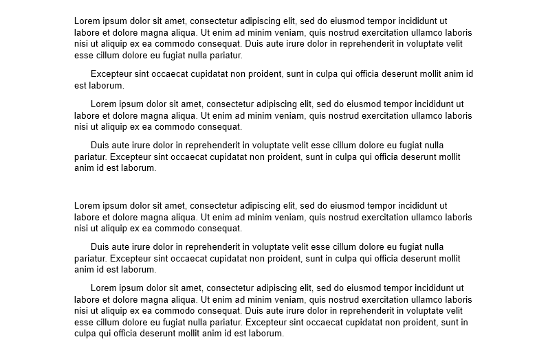
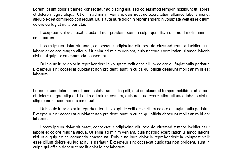
Book Format Example 6: Before and After Justifying the Text
We’re going to show the difference between the 2 justifying options:
Before: Left-Justified
This is how left-justified text looks.
After: Justified
This is how justified text looks.
Indents
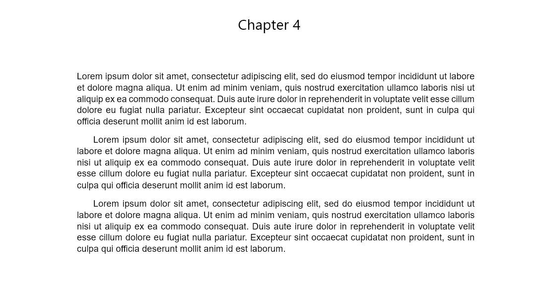
The beginning of a new paragraph, meaning the first line, should be indented 0.25 inches. This indentation doesn’t apply to the first paragraph of the start of a chapter or subheading. This is the classic style seen in older books.
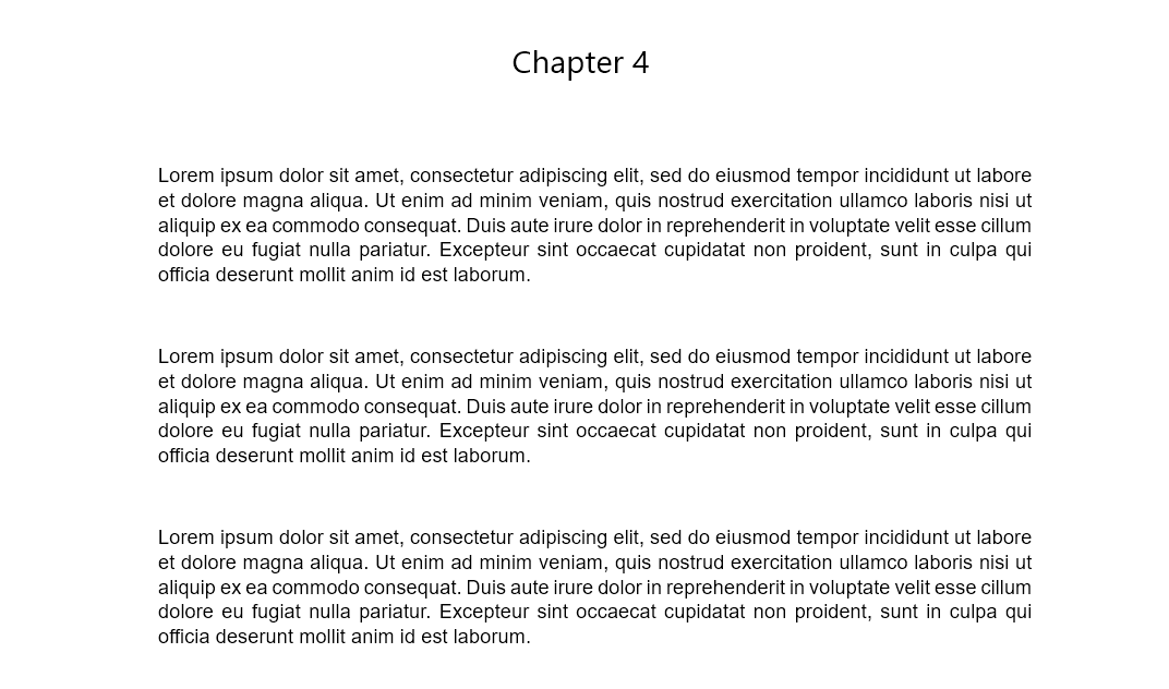
Instead of this, called the modern style of book formatting, you can separate paragraphs by adding an extra line before jumping to the next paragraph. Whichever one you pick, remember to stick to it for the entirety of the book.
Top Tip #2: Dialogue is indented, or formatted, just like new paragraphs.
Book Format Example 7: Indentation Classic vs Modern
We’re going to show you the difference between classic and modern at a glance.
Classic Style
The classic style uses line indention for the first line of a paragraph.
Modern Style
The modern way of spacing is to add a blank line between paragraphs.
Spacing
Single-spaced or 1.5 spacing should be fine, just have a look at what is easy on the eyes. Some book formatting software will allow you to edit spacing a bit more so you can play around and see which looks the best.
Front Matter
This is all the pages that come before the first chapter. There are usually more for non-fiction books, but that doesn’t mean you should put less care as a fiction author.
Here’s a list of the front matter you’ll need to consider:
- Title page: This comes after the book cover and has more information, like publishing company and series name, and you can use it for a space for your signature at book signings.
- Table of contents: This is the most useful for long books and non-fiction books and rarely used for fiction.
- List of other works you’ve published: You can list other books in your series, your standalone, or any of your other works.
- Dedication page: You have to shout out who you dedicate this book to, it’s tradition.
- Foreword: The introduction to the book written by another person, this could be a close friend or someone you admire that was generous enough to add something meaningful to your book.
- Reviews: Any professional reviews or reader reviews received about your book can be added in the front matter if you think it will look good.
- Prologue: This is an introduction to a story that is separate from your chapters but contributes to the narrative.
- Preface: An introduction where you talk directly to your reader.
- Maps: If you’ve written a book with worldbuilding elements, a map can be a great addition to help give your reader a visual for locations in the book. It brings your world to life.
Top Tip #3: If your front matter begins to look lengthy, use a Roman numeral numbering system for those pages to help the reader navigate it easily.
Back Matter
After you’ve concluded your story, you’re not done just yet.
Depending on the type of book you’ve written, your back matter will vary. Take a look at what can be included:
- Author bio: Tell the reader a bit about yourself.
- Acknowledgments: It’s time to say thank you to the whole crew that helped you get here! It’s not the most exciting text for a reader, but a book isn’t just a product, it’s a work of art, so give your thanks when it’s due!
- Note from the author: You can talk to the reader directly about the book.
- Glossary: If you’ve created your own world, having a glossary for meanings will be really helpful for your reader to keep up with the different terminology.
- Bibliography or Appendix: If you’ve written a scholarly work, you’ll need to list any books you’ve referenced.
- Index: A list of terms, used especially in non-fiction books, that links back to specific pages in the book to help the reader find useful information.
- List of other books you’ve published: You can list other books in the series or standalone, or any other work you do.
- Afterword: If you’d like to share how the book came to be and how it was developed, this is where you’ll do it. This is sometimes done by another person.
- A teaser: You can either add a chapter from your next book, or a book cover reveal for the next book release.
Chapters
You can have a smidge of creative freedom with the chapter headings, but remember (unless you’re going for a more literary direction – which we wouldn’t recommend) every chapter starts on a new page. Some books will go through the effort of always starting on the right-hand side page too.
Also, you can leave quite a nice gap between the chapter heading and the text, about one-third to halfway down the page.
Here are some more book formatting tips for chapter pages:
- It doesn’t have to say the word Chapter. It could have just a number or the name of the chapter.
- Center the Chapter heading.
- To add style, you can use a drop cap or make the first line capital letters.
- The chapter page doesn’t have to have a page number.
- For fiction and children’s books, you can use illustrations to make the heading pop.
- Don’t combine too many embellishments and styles on the page, for example, an illustration, drop caps, plus a fancy font. A little goes a long way.
- If your work is more literary, it is fine not to have any chapter headings but only scene breaks. Just make it distinguishable from scene to scene.
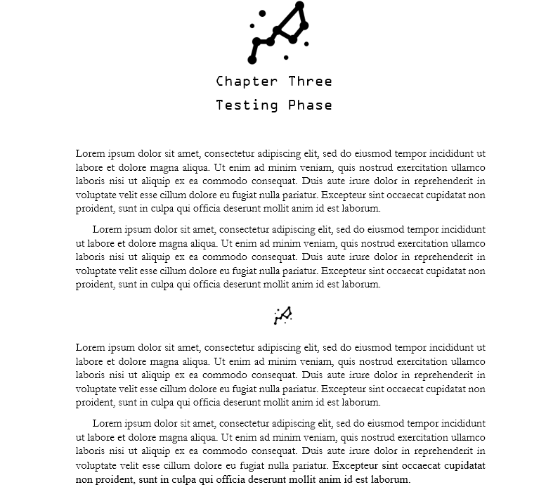
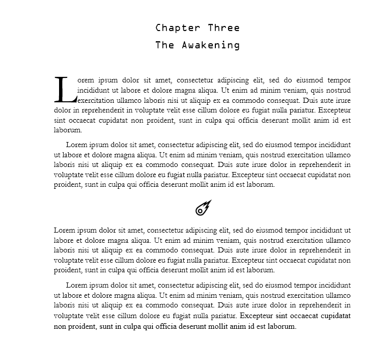
Book Format Example 8: Chapter Embellishments
These are simple examples of how you can design your chapter page. We went a sci-fi route.
Chapter design and scene break icon
We used an icon for the chapter heading and the scene break.
Drop cap and scene break icon
We used a drop cap for the chapter beginning and an icon for the scene break.
Widows & orphans
They’re not the most graceful terms, but they are the terms nonetheless.
When it comes to formatting a book for print, you need to look out for these 2 scallywags through every iteration of edits you make.
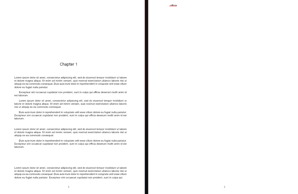
A widow is the last word in a sentence that has its own line. It looks like
this.
An orphan is when the word jumps onto a new page all on its own without the rest of the sentence.
You may not think about this eventuality but words do just flow and you have to straddle them where you need them to be.
To counter these two nuisances, fidget with your line height, letter spacing, and margins to ensure widows and orphans are nowhere to be seen in your book.
Context is important for that last sentence.
Book Format Example 9: Widow
Underlined in a red mark is the widow alone in the last line.

Book Format Example 10: Orphan
Underlined in red is the orphan on the second page.
eBooks Formatting
Ah, eBooks. A feature of the new age, but it feels like you’ve been around for ions.
They’re not exactly like their print counterparts.
The reason why eBooks have different formatting is that they appear differently on various devices and have different standards. For example, they’re in black and white – which means your book cover and any illustrations you have will be greyish.
Follow these book formatting tips to ensure your eBook looks just as effortless as your print book:
- You must have a Table of contents that links to pages in the book. Navigating through a book on a phone or Kindle is like navigating any sort of document, so this makes it simple.
- Your chapter headings can be a bit stylish, but remember: don’t get carried away!
- You can add hyperlinks that go to spots in the book or the internet. Feel free to use your front or back matter to link to your author website and author newsletter. Plus you can link to other resources to heighten the reading experience.
- Take advantage of endnotes, which are found at the end of the chapter or book, to reference other interesting information.
- Your text should be dynamic so that it accommodates all screen types.
- Complex graphs and illustrations may not translate well for eBooks so make sure graphics are simple and optimized.
- Go through multiple rounds of testing and proofreading on different devices to ensure everything looks perfect.
- Check which file format (Epub, MOBI KPF, PDF, or Docx) the different book-selling platforms require and convert it accordingly. But overall Epub does best for eBooks and PDF for print.
Book Formatting Software
Book formatting can be a finicky task but certain software can make it much easier to do.
In the table below we’ve listed out what we took away from each software at a high level. We recommend you use whatever suits your needs best, so do extensive research before clicking buy.
| Book Formatting Software | Cost | Usability |
| Microsoft Word | The Microsoft 365 package is $6.99 monthly or $69.99 yearly. | – Beginner-friendly, access to a few templates. – Quality control issues over different versions. – There are many limitations and low flexibility for book formatting needs. – Not good for image-heavy works. – Unless you own it, it’s expensive. – You can find cheaper versions |
| Google Docs | Free with a Google Account. | – Beginner friendly but has similar issues as with Microsoft Word, and has fewer book formatting options. – Not good for image-heavy works. – Used in a web browser. |
| Adobe InDesign | $31.49 a month, or $239.88 a year. | – This is what industry professionals use. – Tons of formatting options and flexibility. – Easy to make changes and create your own templates. – Very steep learning curve and is easy to use only after some practice and tutorials. |
| Atticus | $147 once-off payment | – Easy to use, template-driven software. – Medium flexibility with features for customization. – Doubles as a writing software |
| Vellum | $199.99 for eBooks, $249.99 for both print and eBooks. | – Easy to use, template-driven software. – Medium flexibility with features for customization.Mac only. – Similar to Atticus but not advised to write in. – Very expensive for the set of features. |
| Scrivener | $59,99 once-off payment (but you are charged for updates). | – If you’ve heard of how difficult it is to write in, you know what we’re going to say next: Steep learning curve. – Unintuitive and difficult to use. – Not many features (or understandable features) for formatting |
| Kindle Create | Free | – Doesn’t accommodate many types of novels. – Very few features. – Easy to use the few features it has, but it has many limitations that cause frustration. |
| Reedsy | Free | – You have to log in to use this software, meaning your book gets loaded onto their system. – Not a lot of features. – Templates can be limiting. – Used in a web browser only. |
DIY or Hire Someone To Format Your Book?
As with most things you do in the self-publishing world, hiring someone trades off money and professionalism for your time and effort.
If you have no issue learning how to format a book and you want to do it for all your book launches, then it shouldn’t be a problem! It’s a skill like any other that takes practice and time to master.
But if you’d like to forego the headache, there’s no shame in hiring some help. But you can hire any ol’ mope from the streets. Do your research and ask them as many questions as you need to see if they’re a good fit.
Top Tip #4: Ensure whoever you hire is familiar with the industry standards, and the requirements of your genre, and understands the direction you want to go in.
These elements will impact how much a book formatting service will charge you:
- The genre of your book.
- How long is your book?
- When you’d like it to be done (you have to accommodate how long they will naturally take too).
- Their level of expertise and experience.
- What file formats do you need it converted to?
At The End of The Book Format Rainbow
If you made it to the end, congratulations!
You’re dedicated to getting your book out there in a professional and high-quality fashion and just by that, we know you have what it takes to succeed.
But don’t get us wrong, book publishing is a tricky business, no matter which side of the fence you sit on, indie or traditional. And it’ll be a long hard road to get to that success.
Because we’re so familiar with the trials and tribulations authors go through (since we’ve worked with so many) we know exactly how we can help.
Trying to promote your book is a whole other ball game, and if you really want your book to sell, you’ll need a strategy. A crucial step any successful author will tell you to take is to get an author website.
We’ve built tons of author websites in our time and we’d love to keep helping more authors.
It’s truly a must for any serious author hoping to make a reality of their dream because you need an online platform to do it. So, when you’re ready, fill in this inquiry form and we’ll be happy to be a stepping stone on your hard-fought path.


