12 Fantasy Author Websites That Take Your Breath Away and Why
Building websites for fantasy authors is my thing right now. There’s a special place in my heart for the genius of someone who can create entire worlds of outlandish creatures and cultures and make them feel real. It gives me a lot of pleasure to create an online home for an author who does this and makes it feel like an extension of their world on the internet.
I’ve been searching for inspiration on which fantasy authors out there have truly epic author websites and I’ve realized there just aren’t any good posts on this.
So I decided to create my own.
Disclaimer: Two of these sites below are my agency’s own creations so, of course, I’m biased in this regard. I wouldn’t honestly add them if I didn’t think they were excellent. A guy can love his own work though right?
Here are Top 12 Breathtaking Fantasy Author Websites:
(in no particular order)
Henry Hneff
Goblin Workshop Online
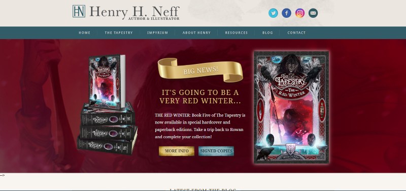
If ever one could imagine finding themselves in a goblin workshop on the World Wide Web, I think this fantasy author website is it. From the logo, excellently tasteful color scheme, and consistent use of fonts, Henry’s website is a design masterpiece.
The composition of the illustrations, placement of elements throughout the site, and use of contrast between the elements to give just the right weighting to more important elements of the page, like the series name or the book itself, are all beautifully done.
What makes Henry especially interesting as a fantasy author is that he’s also a highly competent illustrator. I get the feeling he had a large hand in the creative direction of the site. It feels like an artist’s work as much as a web designer’s.
Showcasing this differentiator as an illustrator/author are some beautiful time-lapse videos of his illustration process. This gives one that sought-after behind-the-scenes look at the creation of his world. It’s fan-gold! Even though I’d never heard of him till I found his site, after viewing these videos I have a lot of respect for him as an illustrator and artist. I’m sure this respect must be even stronger in his more dedicated fans.
Another thing that put this site right up there for me was the use of video on the opening page. There is a trailer for his Imperium book series! In an online world that loves video, I couldn’t think of a more engaging way to keep new visitors interested. The video is beautifully professionally animated, complete with a compelling voice-over and soundtrack. It’s extremely impressive.
I could go on and on about how much I love this site. There is a huge wealth of fan resources to explore. There’s clearly a lot more planned for it as well with many “coming soon” notices on several sections and pages. I look forward to seeing where it goes from here.
Reni K. Amayo
Single-paged Nobility
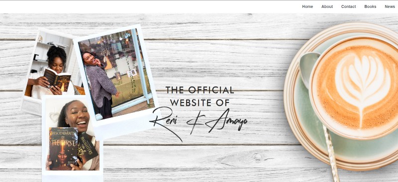
Reni’s website is a branding masterpiece. You get a feel for her personality and vibe as soon as you enter her website.
It may not have the atmosphere that the covers of her books, but it still makes you want to read her works while sipping on a cup of coffee in your favorite book-reading spot.
Her entire website is confined to one page, but boy is this one page done well. It’s sophisticated, almost regal, with professional design elements and a cozy brown color palate.
If you’re going to spend time on a page, this is the page to spend it on.
Melissa McPhail
Fan-love Central
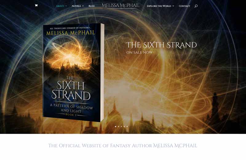
Okay, full disclaimer here, I’m a little biased about this fantasy author website. We built it. I won’t tell you how great I think it is because well, that just seems like bragging. We do happen to enjoy our own work quite a lot though.
What I will tell you are the features we built into it that we think make it work. Then you can decide for yourself what you think of it.
Rich, aesthetic visuals meet you as soon as you arrive. Her books are presented boldly and tastefully in a revolving splash banner as soon as you enter giving you immediate access to explore each further on their own pages.
Melissa’s gorgeous cover artwork is used throughout the site to give it a feel in harmony with her branding. Typography is consistent with her book covers so the site feels like an extension of her world and her books. Her cover artwork colors are also carried throughout the site: Dark tones with dramatic contrasts, with a rich teal-blue accent color.
The site is clearly made for her fans. I know this because this is what Melissa lives for. I can personally attest to the deep love she has for her fans. Her blog posts, often with close to 200 in-depth comments are evidence of this. Also, the depth with which she engages in her replies sometimes paragraphs long, shows how much she cares about really engaging with her readers.
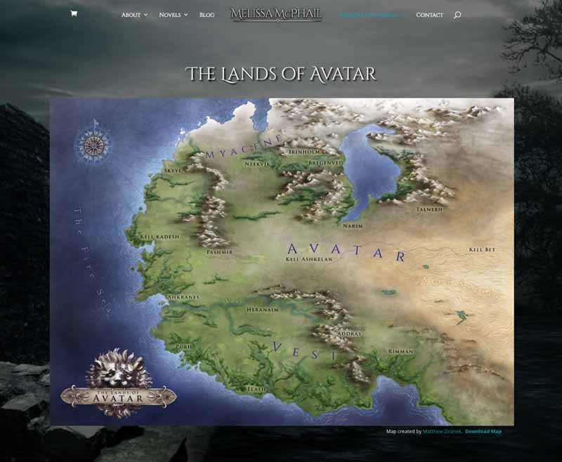
We carried this fan-love ethic through into her site in general. We produced 3 painstakingly, detailed, digitally painted world maps across 3 different continents of her series’ world. The maps can be downloaded directly from the website, giving even more value to her fans and visitors.
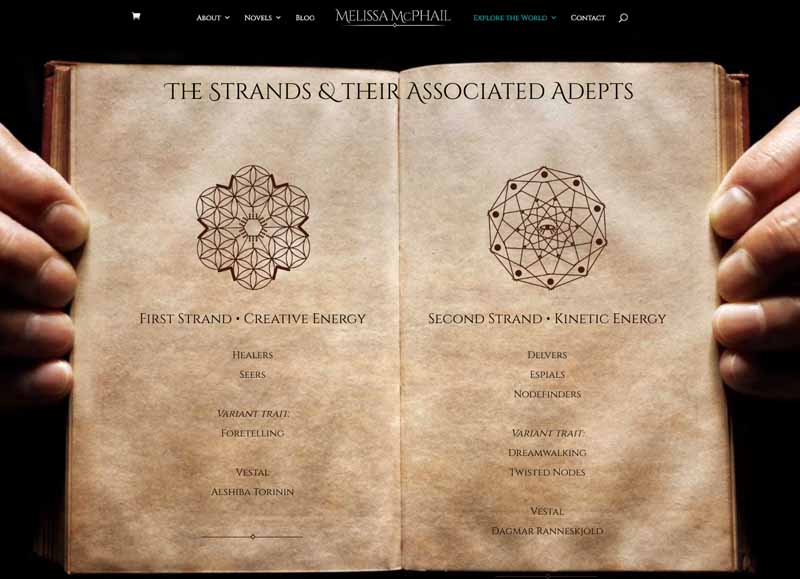
We also created several interesting fan resource pages to house important world lore, glossaries, and character information.
And of course, we made it incredibly easy for readers and fans to join her email list and connect to her on socials with email signups and social links on virtually every page. We also added a pop-up offering a special quote anthology from her books displaying once a day to new users. This all paid off. Signups instantly shot up to several times the rate they were on her previous website and continued at this rate months later.
All in all, we’re really proud of this fantasy author website as you can tell. We did everything we could to carry through Melissa’s branding used in her books and her general aesthetic preferences.
If you’d like to know more about the design process, we’ve written a full case study on this website.
Susan Dennard
Tasteful Personal Branding
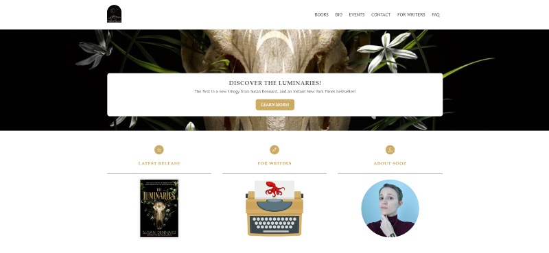
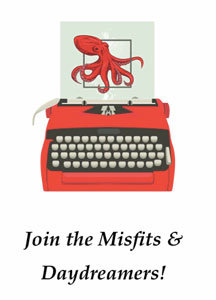
What I really like about Susan’s site is the unique branding throughout the site. It’s elegant and different. The subtle underwater ocean graphic is used on every page to bring texture and interest to the site. I also like how Susan’s symbol has become the playful bright red little octopus. It doesn’t seem to have anything to do with her genre, but who cares? Creativity doesn’t always need to be rational. Aesthetically it acts as an accent color and a kind of guide, to draw your attention through the site.
This creative, unique branding for her site is a clever solution for a fantasy author website that features several different series each with its own branding. The branding feels more like Susan’s style than any one of her books or series. It feels like an extension of her personality, something we might not otherwise see from a style more centered on her work.
Fonda Lee
Dark and Gritty
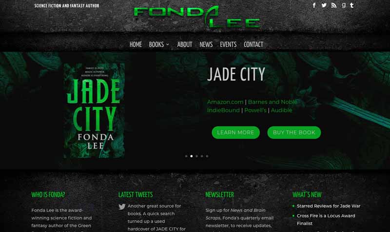
What I love about this site is the simple, punchy color scheme and style used throughout the site. It feels dark and gritty. You can tell you’ve arrived somewhere unique, with its own distinct online personality.
A slider banner greets you as you arrive showcasing Fonda’s books with invitations to learn more about each.
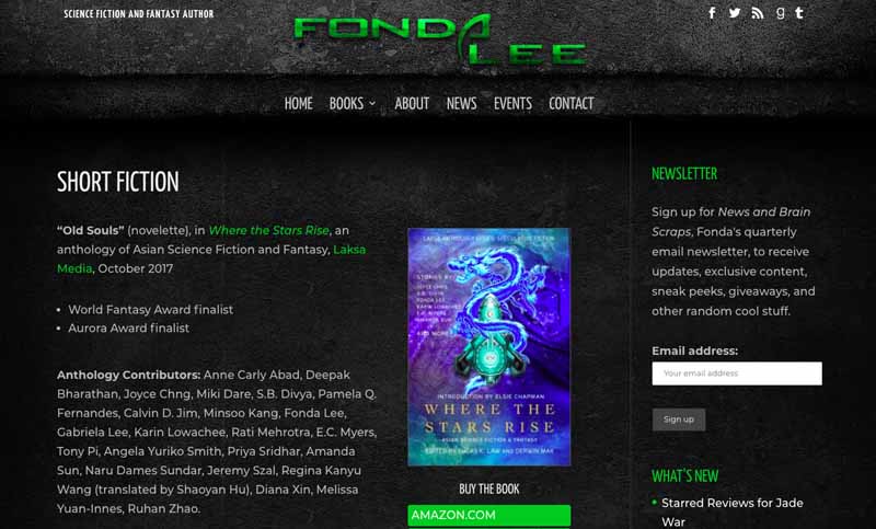
Apart from the cool style the website is essentially quite simple, leaning on the edgy backgrounds to create interest. Little imagery is needed past the already established gritty look and feel.
This simplicity of design gets the job done well though and for that reason, I’ve included it in this list.
Trang Thanh Tran
Moody sophistication
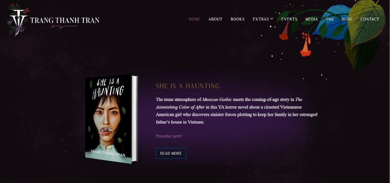
Trang keeps her website simplistic, gracing the tops and bottoms with lovely artwork.
This allows her unique book covers to stand out and grab attention – and wow are they fascinating to look at.
Although the website can give off a spooky vibe, you feel a personalization with it too. Trang has up playlists for her books, a FAQ page where she even pronounces her name in an audio log, and more stuff for users to discover.
We really admire her for adding a commissioned art section on her fantasy author website. She shares art that she’s found on various platforms that are inspired by her work and inspire her further in her writing.
She has built a community and continues to embrace it in every facet of this website.
T.A White
Modern, Professional
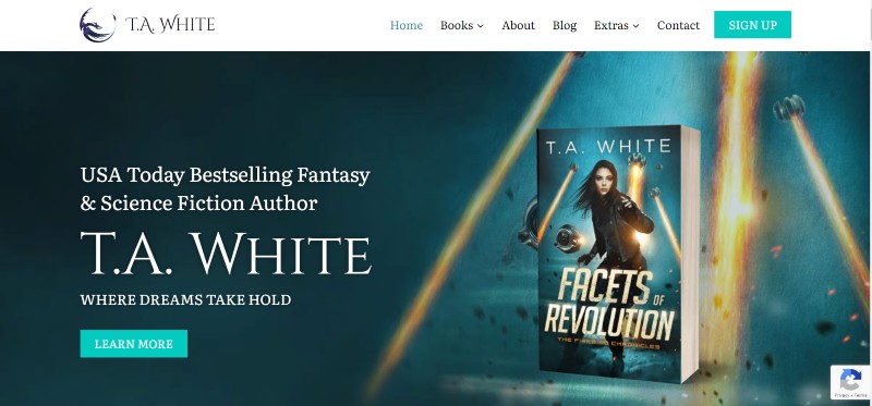
We really enjoyed designing this fantasy author website for T.A. White.
We wanted to go for a sleek design that surprised the user as they browsed the website. We did this through simple white space paired with interesting background images that complement their respective sections.
T.A. White gives her fans unseen stories in the form of deleted scenes from her books. She knows how to keep her fans happy!
Karuna Riazi
Contemporary
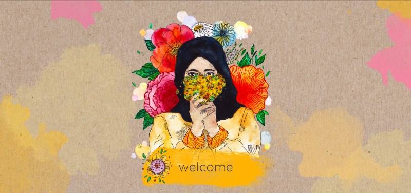
Karuna’s website opens up with a welcome screen that is so beautiful!
Once you click welcome, you enter her whole website. It actually greets you with a ‘Hello’ which feels very well, welcoming.
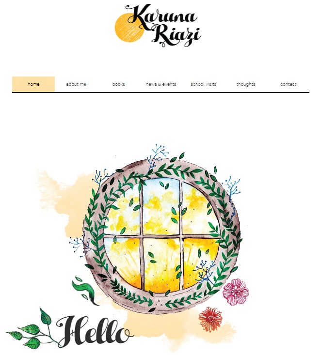
It uses white space well to let the content and artwork pop. The art and the content have space to breathe bringing the user a sense of calmness.
Navigation is a journey with this one. It’s easy to find content, but it takes a few more clicks than necessary to finally get to it. Otherwise, this website is pretty satisfying to look at.
This fantasy author website represents the genre and the author herself in a unique way that we haven’t seen too often. There’s just a soft nature that is felt throughout the pages that makes this website stand out.
Tomi Adeyemi
Branding in a Moody Atmosphere
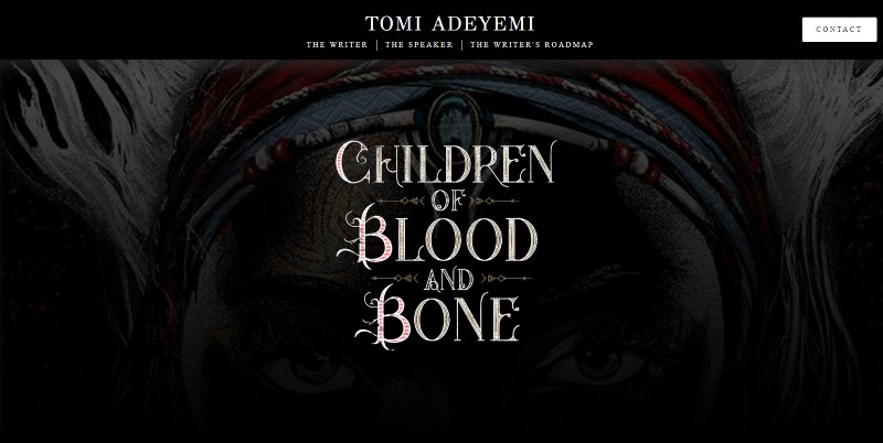
Tomi has a few sections on her website that have different functions. We’ll be focusing on her writer’s section.
Tomi takes you on a journey as you move through this section. As you scroll down, you read a few short lines that give you a sense of the world Tomi has built for her popular series. This is very engaging and aptly conveys the tone of her books.
We’re then led into some reviews that sing her praises, establishing her credibility (which makes you want to buy her books even more).
Then at the bottom of the page are her books with amazing animated art on the covers – the cherry on top of the cake.
This page is not over the top but has embellishments that give this website character without going overboard on the theme.
Davis Ashura
Rich Imagery and Contrast
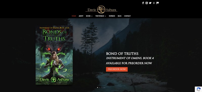
Another one of our own fantasy author websites. Davis’s audiobook series is his most popular, best-selling item. We showcased this front and center with an immediate link to learn more and purchase. Next, we featured all of his books across his 2 series with short blurbs and links to their own in-depth book pages also with links to purchase of course.
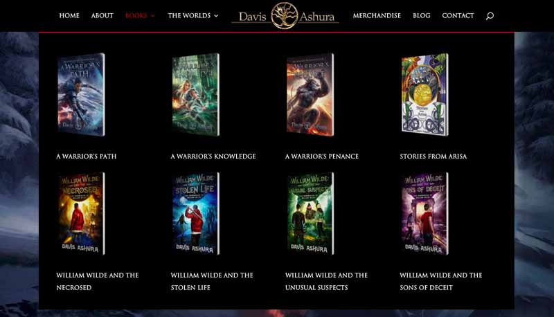
As with Melissa McPhail’s site, we added visual book graphic links to his books in the top menu. We wanted to draw the viewer to these pages more than anything else. Visuals of already beautifully designed books are an easy way to do this.
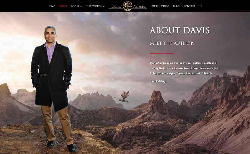
Davis’s About page is really one of my favorite parts of the site. We made it seem like he was standing in front of a dramatic landscape with a just noticeable dragon flying past in the background. A fancy scroll effect makes it seem like he’s in the foreground and gives this page a dynamic, alive feeling.
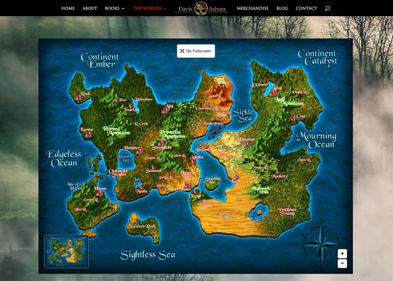
We really went to town to make his world maps page amazing. His maps are fully zoomable and scrollable, just like Google Maps are! So readers can intimately study the details of his world and easily track the journeys taken by his characters.
One of Davis’s main objectives was to increase fan engagement. To achieve this we added email sign-up forms on virtually every page. To entice signups further we added the first 6 chapters of his eBook and the first 4 chapters of his audiobook for the first book in his first series. This is really the perfect first offering because if they’re hooked after this they become book buyers and readers. This is easily encouraged with automated follow-up emails to subscribers making it easy to do precisely that.
One thing you can’t see on this author website is how much we beefed it up under the hood compared to the previous website he had. This website literally loads SIX times faster, giving a much more pleasurable user experience. This was a critical upgrade for him because, let’s be honest, who hangs around waiting for things to load these days?
Want to read more? We’ve published a full case study of Davis Ashura’s site here.
Gregory Kontaxis
A Greek Beast
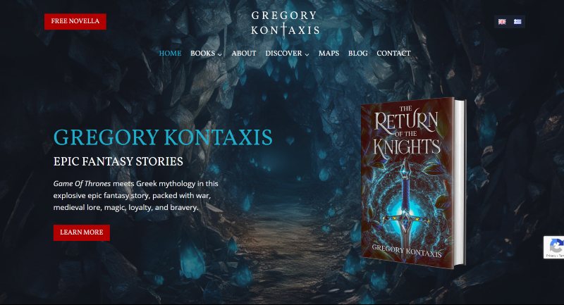
We built this Epic Fantasy author website for Gregory – emphasis on the epic.
The intro image feels like you’ve stumbled onto an enchanting cave, begging to be explored – this will be super engaging for fantasy fans.
The mystical atmosphere is supported by moody backgrounds and elements that suit this genre perfectly.
The reader magnet at the top left can’t be missed and the wording, ‘Free Novella’ makes it so enticing – because who wouldn’t want a free book?
But our favorite part of this website is the ability to change the language to Greek. See below!
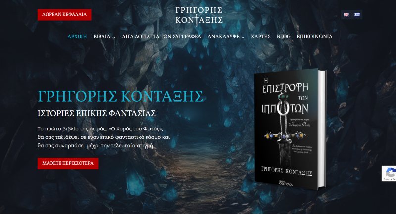
By clicking the Greece Flag at the top right, the site is transformed. Greek lettering and a stunning variation of the feature book’s cover now appear.
The author’s background and branding are prioritized here. And it’s done in style.
Kate Jones
Fantastical, Unique
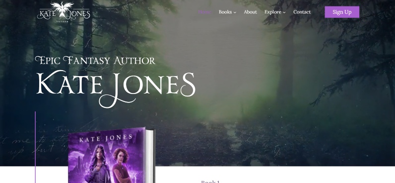
This is another Rocket Expansion fantasy author website for our list!
The introductory background video screams fantasy, letting users know exactly what they’re in for.
The pops of purples in greens in headings and backgrounds really set the atmosphere for the website while letting the content shine proudly.
A particularly fun section would be the characters page. It’s so unique to have well known characters from Kate’s books tell you about themselves from their perspective. Fans will love to see these characters in a different format, while others will be tempted to become readers.
Conclusion
I’ve tried to showcase a few different approaches to an awesome fantasy author website. A gorgeous, engaging website is a huge opportunity to differentiate yourself as something special and out of the ordinary. It’s an asset that can keep promoting you and positioning you as a credible, desirable source well into the future.
If you don’t already have a breath-taking author website, consider getting a hand from a professional web design agency. If you like our work, we’d be happy to help you with this.
- What did you think of my top fantasy author website choices?
- Are there any fantasy author websites you think should be on this list that aren’t?

Want help with your author marketing? Get our FREE ebook and cheat sheet: 6 Steps To Getting More Readers.
By subscribing, you agree to get emails from me, Matt Ziranek. I’ll respect your privacy and you can unsubscribe any time.