Top 20 Author Websites Every Author Must See (in 2024)

Getting readers to notice you in a sea of online sameness is hard. An author website helps you stand out online while positioning you as a writer worth reading.
But creating an engaging, professional author website isn’t easy. And a website that makes you look like an amateur, can be worse than no site at all.
A great author site needs to be:
- appealing to your audience
- quick-loading
- mobile-friendly
- and designed to grow your readers
To give you some direction and inspiration, we’ve put together a list of our top 20 favorite author websites in 2024. Take a page from the book of these authors and give your website the literary love it deserves.
Author Website Examples:
1. Chunka Mui
Carry your book branding into your website
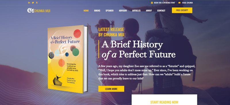
We had the pleasure of building this website for Chunka and I think it sells his platform perfectly. Not that my opinion is skewed or anything…
What makes this author website stand out is the bold colors contrasted by the white space design. It emphasizes the author’s brand and the content laid out.
There is plenty of useful, groundbreaking content for readers to learn more about Chunka and his work.
Actionable Tips:
If you have a book that you want as the main feature, consider using the style and colors from the book cover to dictate the design of the website.
And if you have information to share about your cause or core message, make sure to give that content plenty of room to breathe on the page.
2. Leigh Bardugo
Create rich, fan-focused content
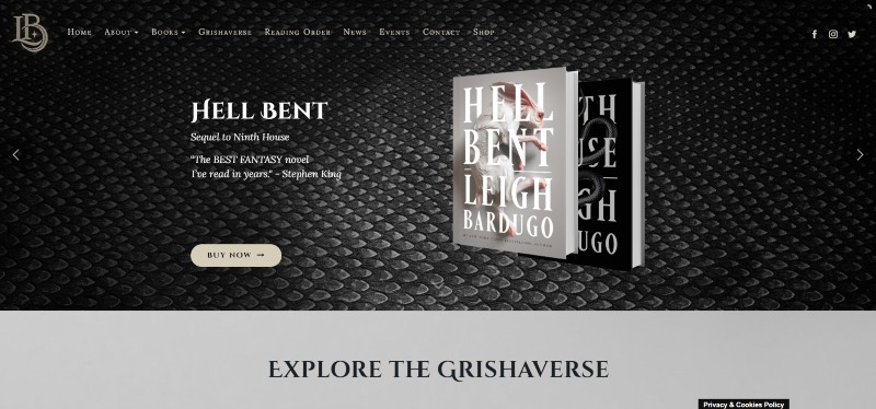
Leigh’s site has got that rich graphic novel-type feel.
The use of illustrations, textures, decorative fonts, and fan resources all come together really well and complement her edgy fantasy brand.
It’s engaging and well-made, catering to her fans and encouraging readers to jump on board and become fans.
Actionable Tips:
Planning an intricate universe for your novels? Use what you have to create some fun resources for your fans to explore on your site.
3. Austin Kleon
Keep your website fresh and worthy of revisiting
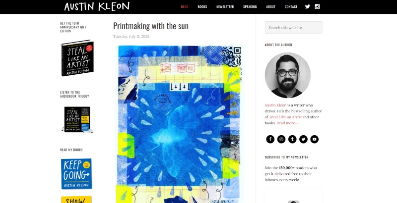
Austin Kleon’s blog is the main focus of his author website. This makes his website feel fresh all the time because he literally posts almost every day!
His books are also tastefully displayed in the sidebar. The longer you’re on his blog the more likely you are to check them out.
What makes his blogs successful is that he links to other resources and encourages others to link to his site. His blog is one of the most respected in the author blogging field – so what he’s doing is definitely working.
Actionable Tips:
If your platform thrives on blogs, podcasts, and other content media, then we suggest building your website with those elements at the forefront. Don’t forget to keep it up to date!
Your website will garner visitors that are super into your work and you can promote your work to them conveniently.
4. Helen Hoang
Make it easy for all types of people to read your books
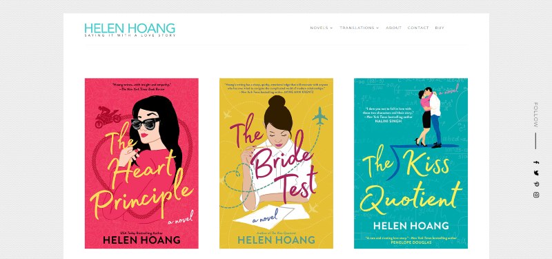
Helen has a tab on her menu just for translated editions of her books. They come in many languages, catering to a wider audience.
Her website carries her book branding nicely into an online format. Similar feminine color schemes with white space, yet still punchy and fresh.
Actionable Tips:
If your book covers stand out, then let your website design sit in the background as a supporting character. Keep your books in the spotlight.
5. Mike Michalowicz
Build a lovable personal author brand
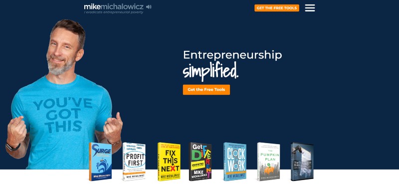
Mike pulls off what few business authors can: a cheeky, enjoyable brand of business education that makes you want to dive deeper.
Hover over his books on the home page and he transforms accordingly. And scroll to the bottom and click “I can’t stand this guy” for a laugh.
Actionable Tips:
Let your website match your personality if that’s your selling point. Excite visitors with an online experience that makes them stay on the site longer, like fun animations, quirky pictures of yourself, and content with a friendly tone.
6. T.A White
Showcase your series
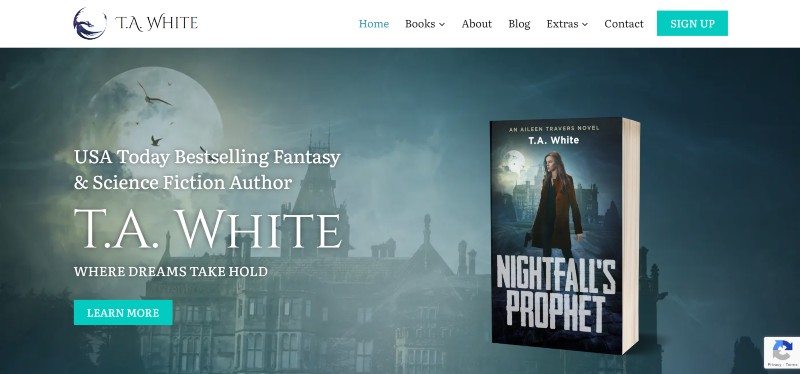
This is another one of our own author websites. We concentrated on representing each of her book series while keeping the main mystical feel.
The blend of fantasy and Sci-Fi is seamless with the genre-specific, clear fonts and color palette.
There are even a few deleted scenes for fans to sink their teeth into.
Actionable Tips:
You could frequently change your intro image to fit your latest book release, but have an overall design theme that suits all your potential genres.
Be sure to leave room for each of your series to be displayed without overshadowing any of them.
7. Mark Dawson
Focus on growing your email list
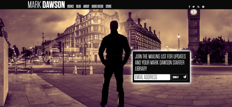
More than anything, Mark wants you on his mailing list. It’s hard getting readers to take the leap and just purchase a book.
Mark believes he can convince readers over time, through his author newsletter. And with a glowing opt-in box, and nothing else much to do on the home page at first glance, it’s hard to resist the urge to put your email in!
When it comes to the design of his author website, it’s characterized by high contrast and dark, moody pages that fit his genre.
Actionable Tips:
If you want to focus on growing your mailing list, it needs to be front and center on your website. But you can still give your books the stage they deserve by featuring them on other pages of your website.
This is a great way to have each portion of your website fulfill a specific purpose.
8. Miki Taylor
Showcase your illustrations
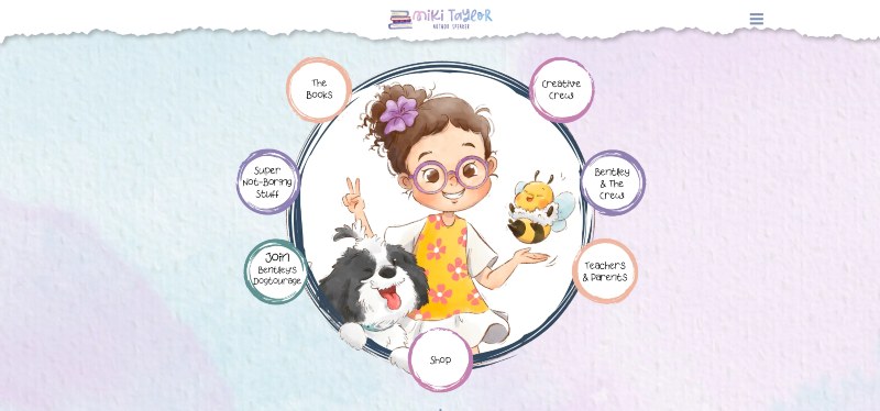
With characters as cute as Miki’s, we had to use them on her author website.
Even though the website is designed with children in mind, adults will have a blast exploring it, appreciating the conversational, quirky tone used.
The menu style is accented by colored bubbles, emphasizing the playfulness of this author website.
Every little extra has a story behind it, giving more value to kids.
Actionable Tips:
Your cute illustrations with unique designs and colors should be celebrated on your website!
From the backgrounds to the intro imagery, and even your menu design – you can stray from the conventional while creating a succinct online experience for your readers.
9. Mark Manson
Let your content do the talking
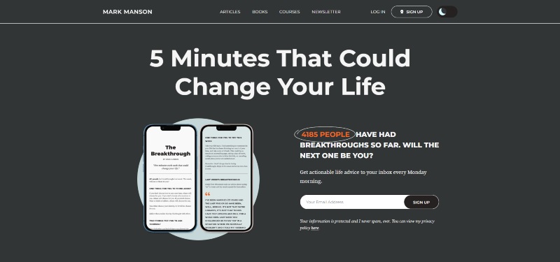
Mark’s site is fun! Much like his writing in general, you just kind of love his insouciant attitude and the website reflects this well while still being quite organized.
He has clearly worked out his funnel very well, both in terms of customer journey and SEO. There are various tiers of membership to his content.
He’s getting an estimated 250K organic visits a month! He definitely understands SEO and content marketing. All-round this is a brilliant site that is no doubt a huge success for its author.
Actionable Tips:
If you want readers to enter your funnel, you should provide as much gripping, premium content for them to subscribe to.
Utilize SEO and other content marketing strategies to make your site a hub for gathering interested readers for your platform.
10. Daniel Gibbs
Bring your books’ world-building to life online
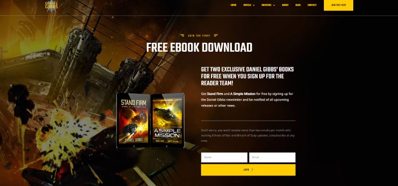
Another one of our author websites! Daniel Gibb’s site loads with an engaging full-screen background video.
Daniel went to a huge effort to create a fully fleshed-out world for his readers using interactive star maps and ship diagrams. He’s even got a full-on encyclopedia of his universe!
His author funnel is very slick, offering books for both his series. With such professionally produced high-value lead magnets, his email list grows rapidly.
Actionable Tips:
Create an intro that is as action-packed as the novels you’ve written.
And if you have a complex universe, laying out timelines for your books will give fans and newcomers a better understanding of your world. They’ll also feel more confident that they’re in the right place – given that this genre is their jam!
11. George Weigel
Organize your content better than a news site ever could
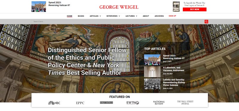
We think the author website we designed for George aligns well with his genre and work as an author. It is content-focused, holding true to the message it is getting across.
This is a great balance to achieve on a website as less is more and you allow your work to speak for itself.
Actionable Tips:
If you have heaps of content to display, don’t be afraid to let less important site features like CTA’s play second fiddle.
You need to decide what you want out of your website and let the rest become neat peripherals.
12. Brené Brown
Engage with your community
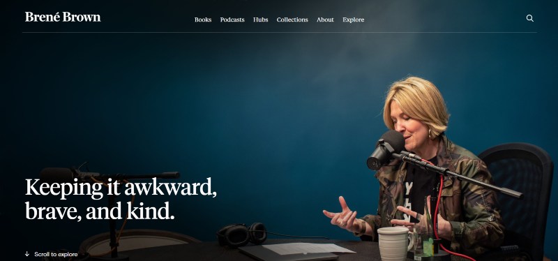
This website is well-designed, easy to navigate, and feels smooth and sleek. High-quality photography helps sell the value behind the words. Has a ton of great-looking downloadables and shareables.
Actionable Tips:
You can professionally display your works while still keeping your personality vibrant throughout the website. Keep the language conversational and the colors warm and welcoming.
13. Charlie Cochet
Display your massive collection of books and related content
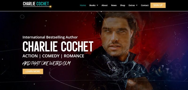
We built this behemoth of a website for Charlie. Her website is jam-packed with books and content yet a breeze to navigate through.
There’s no shortage of things to see with the exclusive content like playlists, signed copies of books, interviews, etc.
Not to forget the mix of stand-out and cursive fonts with bright colors that keep the eyes entertained.
Actionable Tips:
Fans of the romance genre don’t shy away from the seductive and quirky, so neither should you. Let your genre dictate the atmosphere proudly.
And if you have merchandise to sell, you can include a Shop page to display it.
14. Wilbur Smith
Use your books’ themes to create ambiance
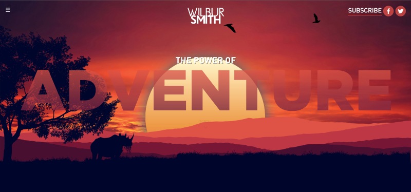
The homepage you land on is fantastic with striking colors and clean navigation.
The website feels alive with the engaging animated elements, making you feel like you’re about to embark on an adventure of Wilbur’s choice.
Actionable Tips:
Instead of a flashy intro, you can go for alive and realistic.
And you can have each page have a theme that goes along with the specific book’s concept to serve as the gripping element.
15. The Winter Skye Series – Valencia Weaver
Create a vibrant playground for your younger readers
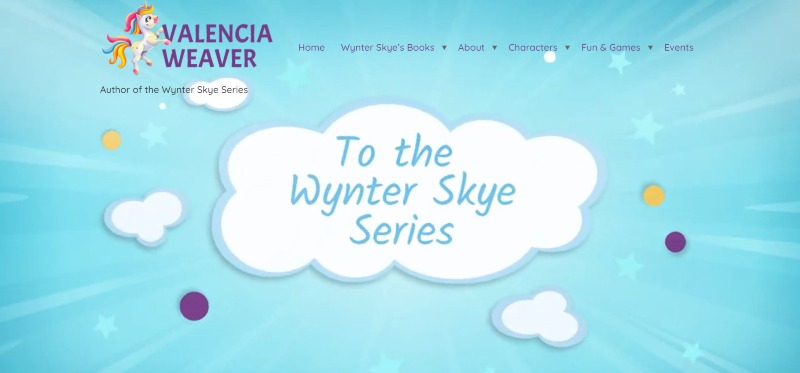
When you get to make a fun site like this, you’ll enjoy every second of it. And we definitely did!
Amusing animations pop and excite across this website, making it an entertaining experience for the user. The extras for kids make your stay on this website rewarding.
Actionable Tips:
If your books are vibrant, your website should be too. It gives readers an idea of what’s to come.
And don’t forget to tailor your reader magnet offering to your target reader – like coloring pages for kids in the case above.
16. Gary Vaynerchuk
Showcase all the ways readers can stay connected
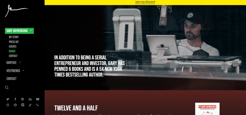
Everything Gary is on his author website. It feels so easy to sink into his world and get engaged with his many facets of entertainment.
Fans will feel welcome here and newcomers will have a new obsession.
Actionable Tips:
If you have many streams of media that some fans may not know about, create a user journey on your website to introduce them to it.
You can expand your following in each venture by sharing it with your audience on your website.
17. R.J. Palacio
Let your book do the talking
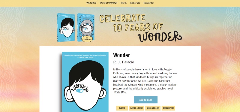
A fun and cute layout, Palacio’s author site uses a simple color scheme to focus on her playful character art. She’s created a whole bunch of downloadable resources and even some merchandise.
Actionable Tips:
If you have one successful book that you want every new reader to start with, make that the main focus of your website.
This doesn’t make you a one-hit wonder (excuse the pun) but rather lets your best work strut and collect a following.
18. Tim Sullivan
Use video to set the right atmosphere to attract your target readers
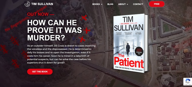
This is another author website designed by yours truly.
The background video creeps you out in the best ways possible. Plus, there are transitioning icons that continue the ominous atmosphere and keep the visitor on their toes.
The dark colors with pops of blood-like pigments are enough to make your skin crawl, and that’s how you know you’re exactly where you need to be.
Actionable Tips:
If your intro creeps out a website visitor and they leave, they were never your target reader anyway. Embrace your genre completely when designing your website as potential readers that love your genre will eek with excitement when the find your site.
And don’t forget to back your books up with stunning testimonials that sing your praises in a meaningful way.
19. Good Life Project – Jonathan Fields
Create an entry point to grow your community
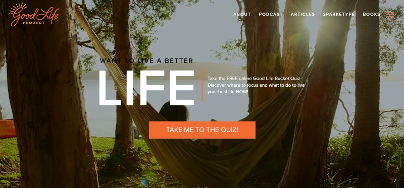
A site that stylishly broadcasts “feel good” vibes. Combines warm colors with professionally shot uplifting background video which gives it some class.
This is an all-around very professional and engaging site. The Opt-in bar is perfectly aligned with what the book promises and sends you to a quiz.
This site does all the right things and does them well while keeping true to its brand.
Actionable Tips:
If you want to foster a community, then make sure your opt-in hints at the type of community it will be.
You can use a quiz, like the example shows, to discover more about your audience and how you can make your community happier.
20. Maggie Carpenter
Let your genre and personality shine through
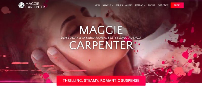
We’re in love with this author website…and not just because we built it!
Maggie’s author website has a tone that’s emphasized by the images that are revealed as you scroll.
But what leaves a lasting impression is Maggie’s voice atop the sultry design.
She’s conversational, cheeky, and admirable. She knows the less desirable tropes that can be assimilated with her genre and she squashes them, saying you’re in for something even better with her books.
Actionable Tips:
You can use your voice as the driving factor of your website, keeping the target reader locked in and enticed from beginning to end.
Even if it’s in a genre like romance, you can still be friendly while maintaining the desired atmosphere.
Author Website Must-Haves
Your Author Website…
These stunning author websites weren’t built overnight. They took time, effort, and website-building expertise to get it just right.
If you don’t feel like figuring out how to build your own awesome author website yourself, then we can help!
We’re a professional web design agency that specializes in working with authors. Fill in this inquiry form and take one step closer to your dream online presence.

Want help with your author marketing? Get our FREE ebook and cheat sheet: 6 Steps To Getting More Readers.
By subscribing, you agree to get emails from me, Matt Ziranek. I’ll respect your privacy and you can unsubscribe any time.